 Visualizing data can make digesting numbers easier and ideally lead to more efficient and accurate decisions.
Graphs and visualizations aren’t without their risks, though. The choice of scales, graph types, and styles can all have an effect, for better or worse, on how your audience interprets the findings.
Here are 10 best practices (and what to watch for) that we’ve compiled from our own experiences graphing and displaying data as well as recommendations from well-known data visualization authors.
1. Watch for chart junk
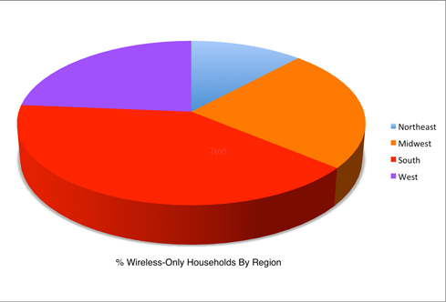
Visual elements on a graph that aren’t necessary to convey information, or worse, that distract from the main point, are what Tufte calls chart junk. Common chart junk suspects include pictures, thick gridlines, shadows, or 3D elements (like this figure).
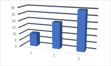
Despite Tufte’s strong condemnation, not all graph pictures are necessarily chart junk. Tufte has a way of exaggerating to make a point and there is some evidence that the right pictures on a graph can improve recall and interpretation.
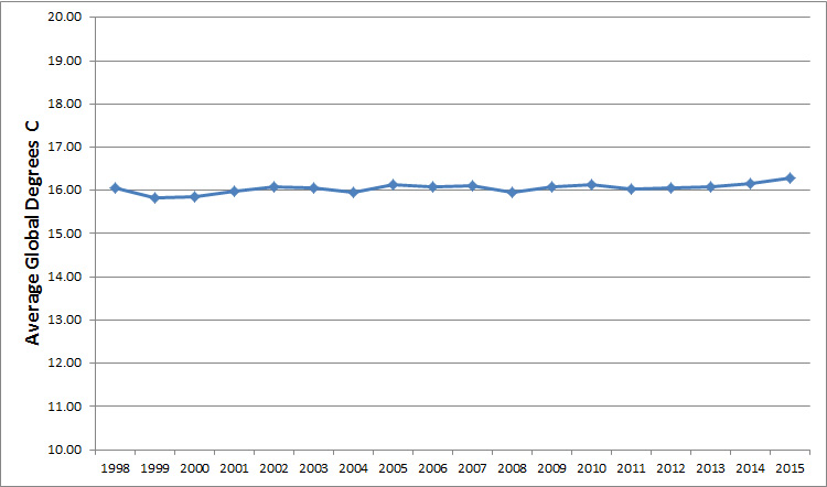
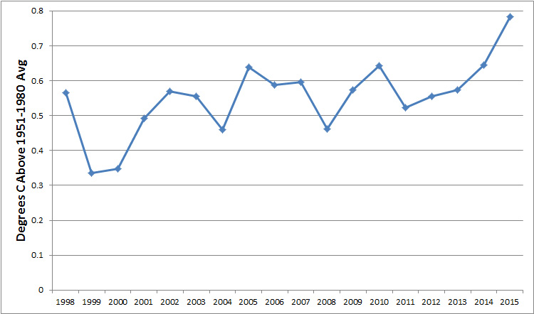
2. Y-scaling matters
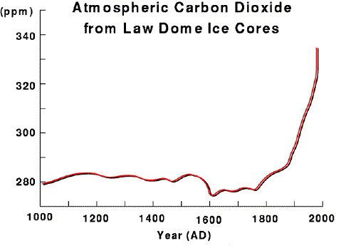
The y-scale (vertical axis) you choose can either intentionally or unintentionally obscure or magnify differences in data. While you don’t want to mislead or be misled, keep in mind there is no objective graph; always assume there’s an agenda behind each graph (some more benign than others). The context matters and the reader should understand the context and consequences of how the y-scale was chosen. These two figures graph the same global temperature data but have different y-scales.
 |
 |
3. Zero is not always a hero
Don’t always think graphs have to start at zero. While it’s a good idea to have best practices when displaying data in graphs, the “show the zero” is a rule that clearly can be broken.
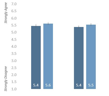
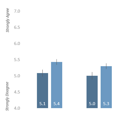
4.Consistently scale the y-axis
Whatever y-scale you decide on, be consistent when presenting multiple graphs in the same report by using the same y-scale (if possible). These two figures show similar results but because the y-scale differs it looks like the scores on the right are much lower.
 |
 |
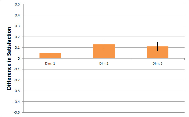
5.Difference and raw scores can tell different stories
Difference scores (the difference between two data points) can help clear the noise on graphs that have many data points. Difference scores draw attention to important differences that may get lost with raw scores. Accentuated differences can suggest a difference is more impactful in the real world, even if the difference is modest. Be careful with difference scores though; they can be harder to interpret than the original values.
 |
 |
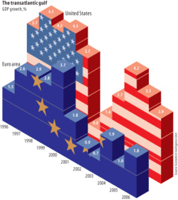
6. Be wary of 3D
The volume of an object increases at a faster rate than its area. Therefore, showing 3D graphs for comparison actually depicts a bigger difference than the data or just generally results in poorer decision making.
 |
 |
Some research has found [pdf] 3D doesn’t hurt as much as the visualization gurus suggest it does, but I still recommend minimizing 3D when 2D conveys the needed information.
7. A table might be better
If you find yourself with too many bars on a graph, a display of numbers in a table is often a better visualization. It can reduce chart junk and even subtle biases including exaggerated differences or questionable y-scales.
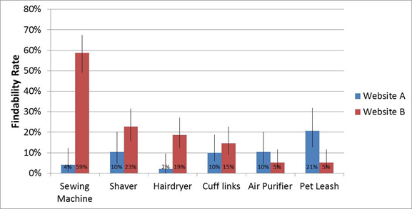
8. Indicate sampling error
Consider indicating sampling error by providing confidence intervals or some other indication of statistical significance when needed so your audience can differentiate real differences from random noise.
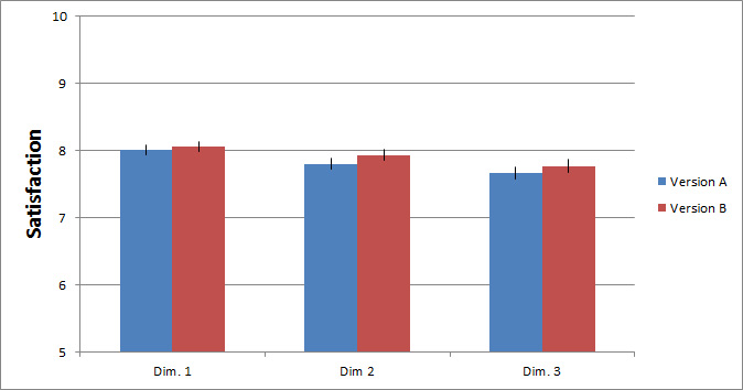
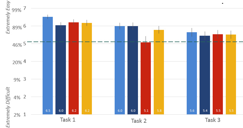
9. Compared to what?
When possible provide a comparison to improve interpretation, such as to an external benchmark, like an industry average or best in-class competitor. This figure shows task-ease data using the SEQ and includes the industry average (horizontal dashed-line) and three competitor scores per task. These comparisons help make the metrics more meaningful and answer the question: Is this good or bad?
10. When in doubt, test
If you have time, usability test your visualizations to see whether your audience’s understanding and interpretation matches yours. Like usability testing of products, don’t just ask people if they “like” the graph; use a mix of open and closed-ended questions to assess their comprehension. In fact, you may find that some of the “rules” on good visualizations proclaimed by experts aren’t supported by data—as is the case with chart embellishments and 3D perspectives.


