 In an earlier article, I described the PURE methodology.
PURE stands for Practical Usability Rating by Experts.
Evaluators familiar with UX principles and heuristics decompose tasks into small steps and rate each step based on a pre-defined scoring system (called a rubric), as shown in Figure 1.
| The step can be accomplished easily by the target user, due to low cognitive load or because it’s a known pattern, such as the acceptance of Terms of Service agreements. | |
| The step requires some degree of cognitive load by the target user but can generally be accomplished with some effort. | |
| The step is difficult for the target user, due to significant cognitive load or confusion; some target users would likely fail the task at this point. |
Figure 1: Scoring rubric for PURE.
The PURE method is analytic. It’s not based on directly observing users trying to complete tasks in an interface. It relies instead on experts making judgments on the difficulty they think users would have as they work through the steps users would take to complete tasks.
It’s not a substitute for usability testing, but like other analytic techniques, such as an expert review or keystroke level modeling, it’s a cost-effective technique to identify problems in an interface when testing with actual users is too expensive or difficult. But it’s also a new method and the more it’s used, the more questions come up and the more the method can evolve to better address the needs of its practitioners. Here are five practical tips we’ve learned.
1. It’s more than a score
The main output of a PURE evaluation is a score for each step in a task and an overall score for the task and product experience (see Figure 2). We’ve found this score to have a reasonable correlation with post-task and post-study attitude metrics like SEQ, SUS, and SUPR-Q. But a PURE evaluation can and should be about more than just the score it generates.
Like benchmark usability tests that have an emphasis on metrics (e.g., completion rates, SUS, or SUPR-Q, the PURE method generates more than metrics: It reveals potential problems in a task.
In conducting a PURE evaluation, you can identify points of confusion, challenges, usability issues, or bugs in the interface. While these issues impact the score (more problems mean a higher score—like in golf), it also informs the product team on what likely needs fixing. Be sure to document these issues as you would for a usability test or an expert review, so they can be addressed.
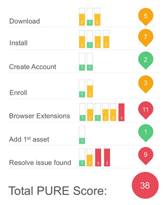
Figure 2: Example PURE scorecard.
2. How to present issues
Along with the score, we recommend providing reasons for what’s driving the score; it’s most important for problems that make the score worse (higher scores). For any task experience, especially those that are rated worse (2s and 3s in yellow and red respectively in Figure 2), the product team will want to know what the problems are (or at least the perceived problem).
Just like in a usability test that has a low completion rate or low SEQ score, providing evidence for what’s driving the poor numbers can lead to more buy-in and action from stakeholders. We recommend a screenshot pointing out the problem area and color the problem according to the same severity color ratings (green, yellow, red). An example is shown in Figure 3.
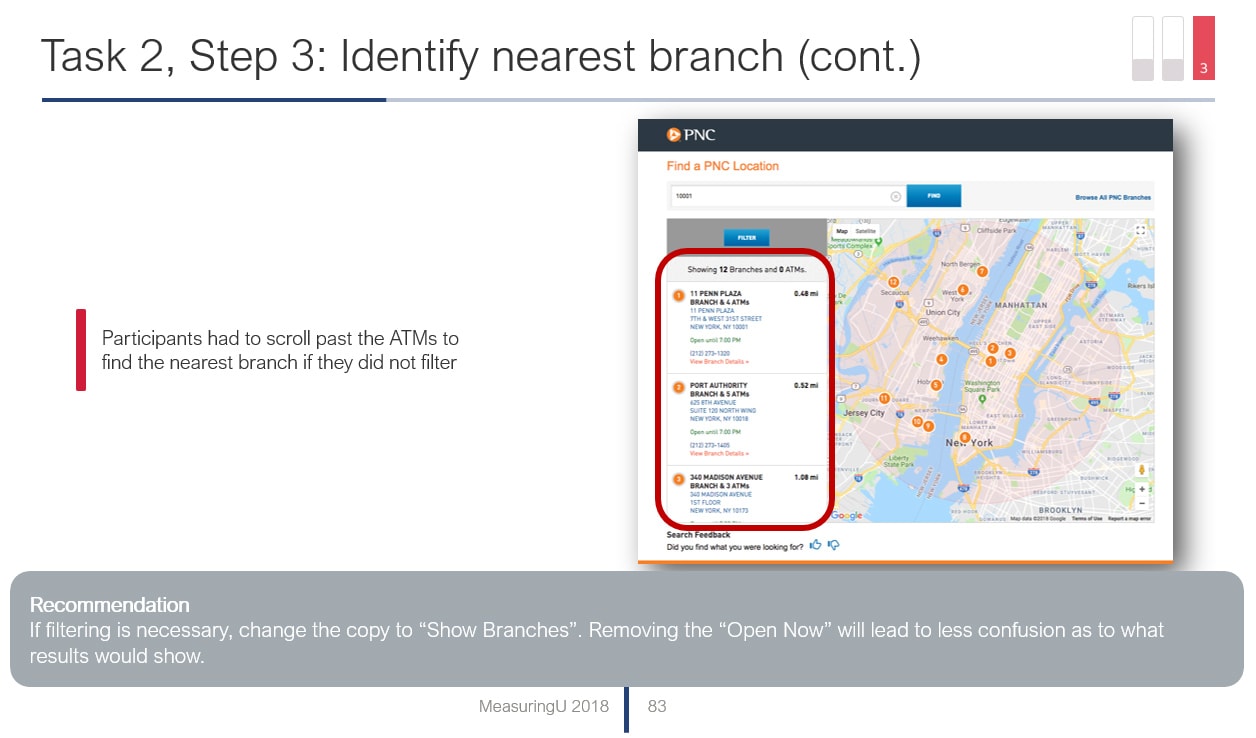
Figure 3: Example output from a PURE evaluation from our retail banking analysis.
One organization we worked with that conducted a lot of PUREs from different teams wanted a consistent look to their reports. They created a style guide to simplify the output. One request was they only wanted issues identified to match the task score. So, if a task step had a 2 rating (medium), then all the problems in that task should only be colored yellow. You may also decide to go this route in a style guide, but we found we like having the flexibility of showing screens that contain a mix of cosmetic and severe issues. We try to include recommendations and positive issues, not just problems—similar to how we present our usability studies.
3. A score of 1 doesn’t mean a perfect experience
The best score a task step can receive is 1 (green colored). But this “best” score doesn’t necessarily mean the task step is perfect. It can still have problems, but the problems may be of minor impact on the experience. This is partially the consequence of the simple 3-point scale. It has its pros and cons. It keeps things simple for executives but only 3 points of discrimination restrict evaluators to working within the limits of the scale. That means saving ratings of 2 and 3 for more consequential problems in the interface and 1s are used for no or very minor problems. It’s fine to then illustrate any problems associated with 1s in your report.
4. Using the mean score vs. modal score
We recommend using multiple (between 2 and 5) evaluators to come up with a score. With human judgment comes disagreement and we definitely see this with teams that use PURE. Inevitably someone thinks a task flow is a 2 instead of a 3, or even a 1 instead of a 3. This diversity of opinion is actually a benefit for UX analytics methods. The challenge is you need to come up with a score for each task despite the disagreement. An organization can use one of two approaches, both of which have their pros and cons.
- Modal score: Take the score that occurs the most (the mode). For example, if three evaluators rate a step 2, 2, and 3, the mode is 2. Majority rules here but you still have problems if, for example, you use two evaluators (2 and 3) or you have more than one mode (1, 2, and 3). In such cases, you need to reconcile differences and pick a score. We call this step PURE fun.
- Average score: You can avoid some of the rancor by averaging scores (the arithmetic mean). Using the same 2, 2, and 3 score example results in a score of 2.33. Thus, the score incorporates the disagreement, but also adds more fidelity to the 3-point scale. If all three evaluators agree on a 3 severity, it would receive a score of 3; if two agree on a 3 severity, the score becomes 2.66. The major disadvantages here are that it adds complexity to your scores. You need more values to display and when you use different numbers of evaluators (2 or 4, for example) you will have more fluctuations in your scores to display.
5. Scores can change
One of the best uses of the PURE method is to compare interface experiences. This can be to a competitor or to a previous or proposed version of the interface. This relative comparison allows you to quickly identify strengths and weaknesses in different experiences. If one interface has a score of 3 and another a score of 1 for the same step, you know one is superior (and you should describe why).
However, we’ll often find that after comparing multiple interfaces, we need to go back and change a number on an earlier interface we evaluated. One reaction I’ve seen is that it feels like cheating by going back and changing a score. While the ratings (1, 2, or 3) should be meaningful on their own, they should also be reflective of reality and what users likely experience with the interface. That means you should update your scores if you really feel they’re in error.
In other words, if one product experience has a PURE score of 30 and another of 20, the product with 20 should be perceived as the easier experience. If it doesn’t, you should have a good reason to justify it (step 2). For this reason, we recommend varying the order in which evaluators review an interface (like in a usability test) to offset some of this inherent sequential effect.


