 When it comes to collecting numeric ratings in online surveys, there is a definite allure to using sliders rather than the more common numeric scales with radio buttons.
It just seems like you should get higher-quality measurements with sliders. Sliders give respondents many more response options, and they appear more engaging than multipoint scales.
The devil is in the design details, however, regarding how well sliders actually work and how respondents feel about them. Published research on direct comparisons of ratings with sliders and numeric scales have been mixed. For example, manipulating a slider can be more physically and cognitively demanding than just clicking a radio button.
In our research, we found no substantial (nor statistical) differences in mean scores or response distributions between five-point UX-Lite™ rating scales (interpolated to 0–100 points) and 0–100-point sliders for ratings of entertainment services.
However, in a Monte Carlo study, we did find that standard sliders had a moderate sensitivity advantage over five-point scales. These results were similar to earlier research with the Subjective Mental Effort Questionnaire (SMEQ; Sauro & Dumas, 2009 [PDF]).
Our previous research focused on comparing sliders with five-point numeric rating scales presented on desktop displays. Estimates of the percentage of respondents who use mobile devices to complete surveys are as high as 57% (Toepoel & Funke, 2018), so it is important to understand how differences in the display and manipulation of scales affect rating behavior.
In this article, we describe research in which respondents used sliders and numeric scales to complete a short survey on either a desktop or mobile device.
Experimental Design
We conducted an experiment in which 212 respondents (U.S. panel agency, late January 2021) used radio buttons and sliders to rate online shopping websites (Amazon, Walmart, Target, Walgreens, CVS, Wayfair) and seller marketplaces (Craigslist, eBay, Etsy, Facebook Marketplace) with the UX-Lite (two five-point items) and a single eleven-point Likelihood-to-Recommend (LTR) item.
About half (109) of the respondents completed the survey on a desktop computer, and the other half (103) used a mobile device. All respondents chose ratings using both numeric scales and sliders. The order of presentation and assignment of scale type to website type was randomized in accordance with a Greco-Latin experimental design.
Design of the Numeric and Slider Scales
Figures 1 and 2 show numeric and slider examples of the UX-Lite and LTR on a desktop web browser. Figures 3 and 4 show how these scales appeared on mobile devices.
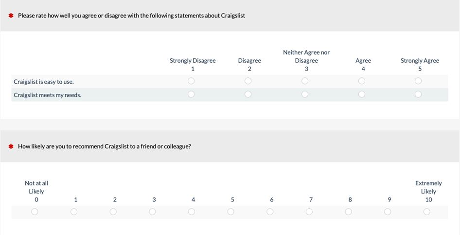
Figure 1: Example of numeric versions of the UX-Lite and LTR on a desktop web browser (created with MUIQ®).
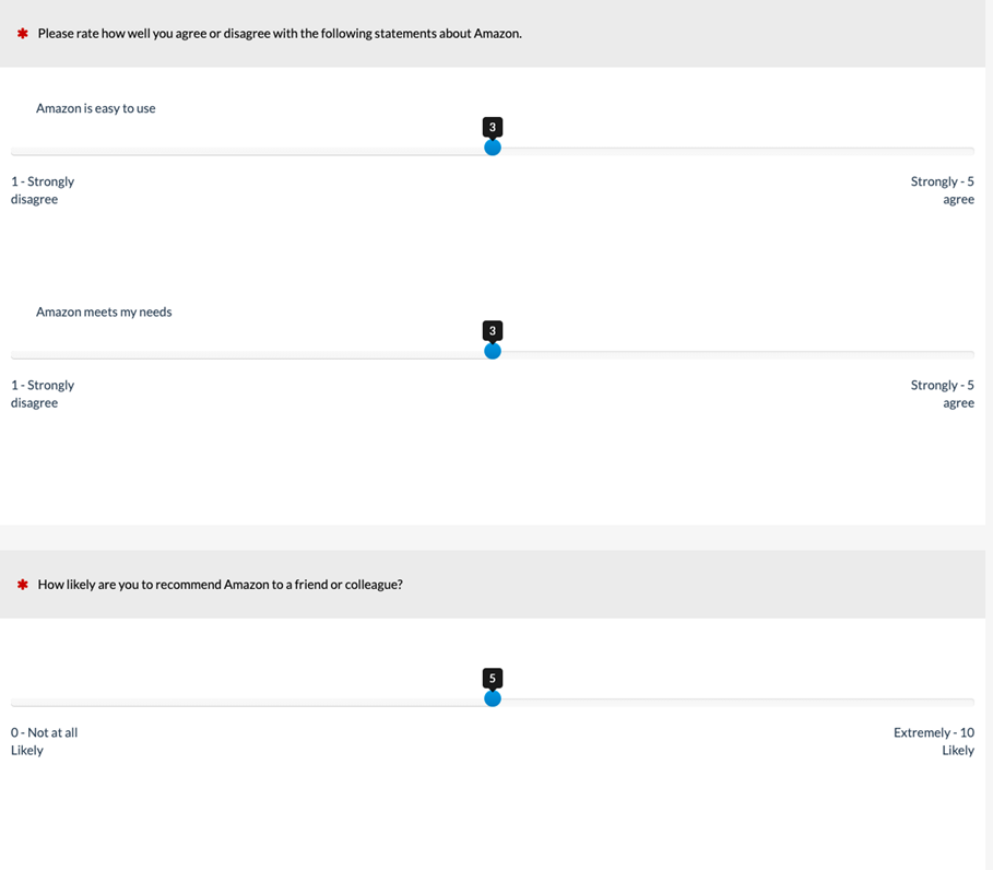
Figure 2: Example of slider versions of the UX-Lite and LTR on a desktop web browser (created with MUIQ.)
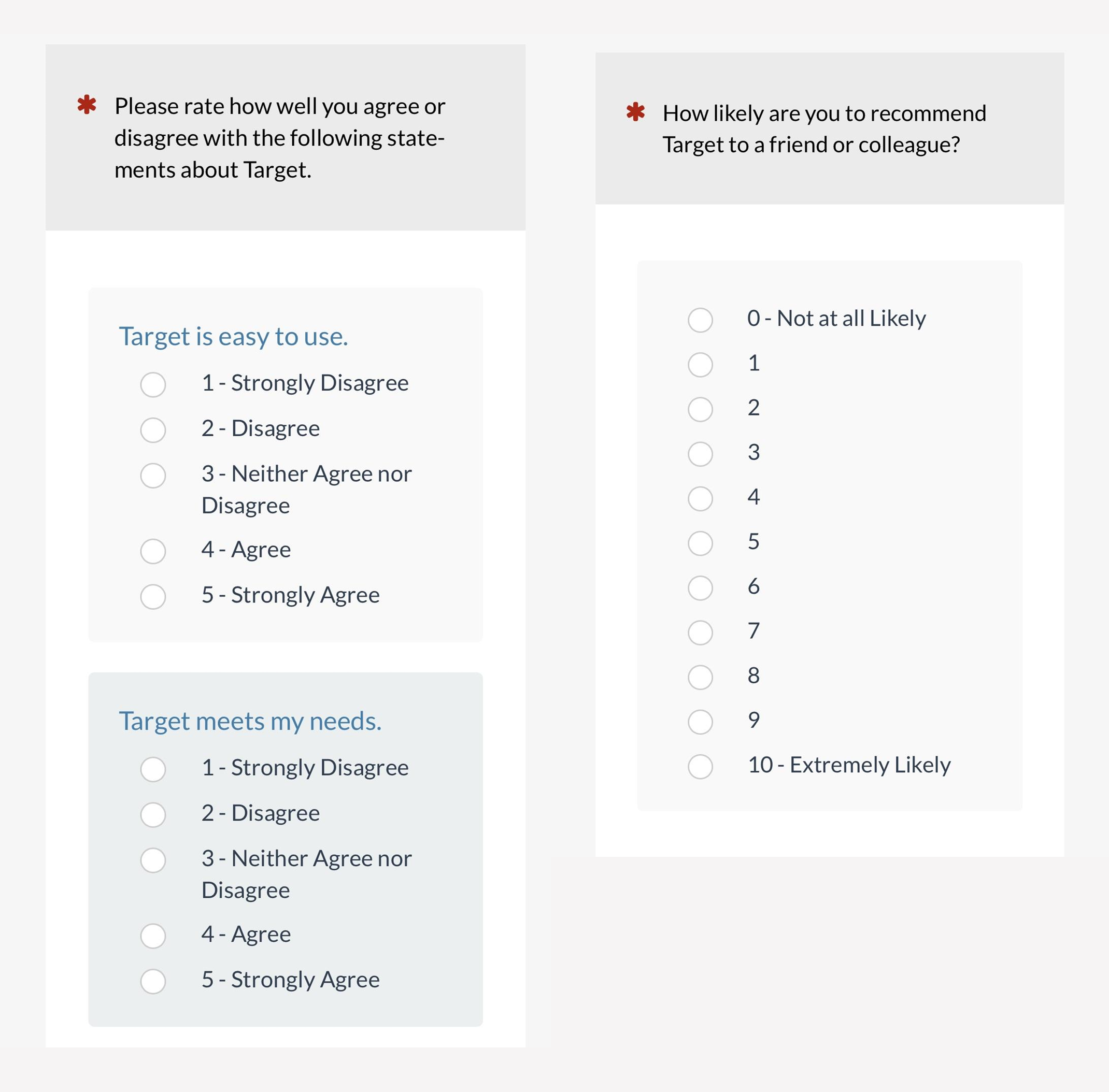
Figure 3: Example of numeric versions of the UX-Lite and LTR on a mobile screen (created with MUIQ).
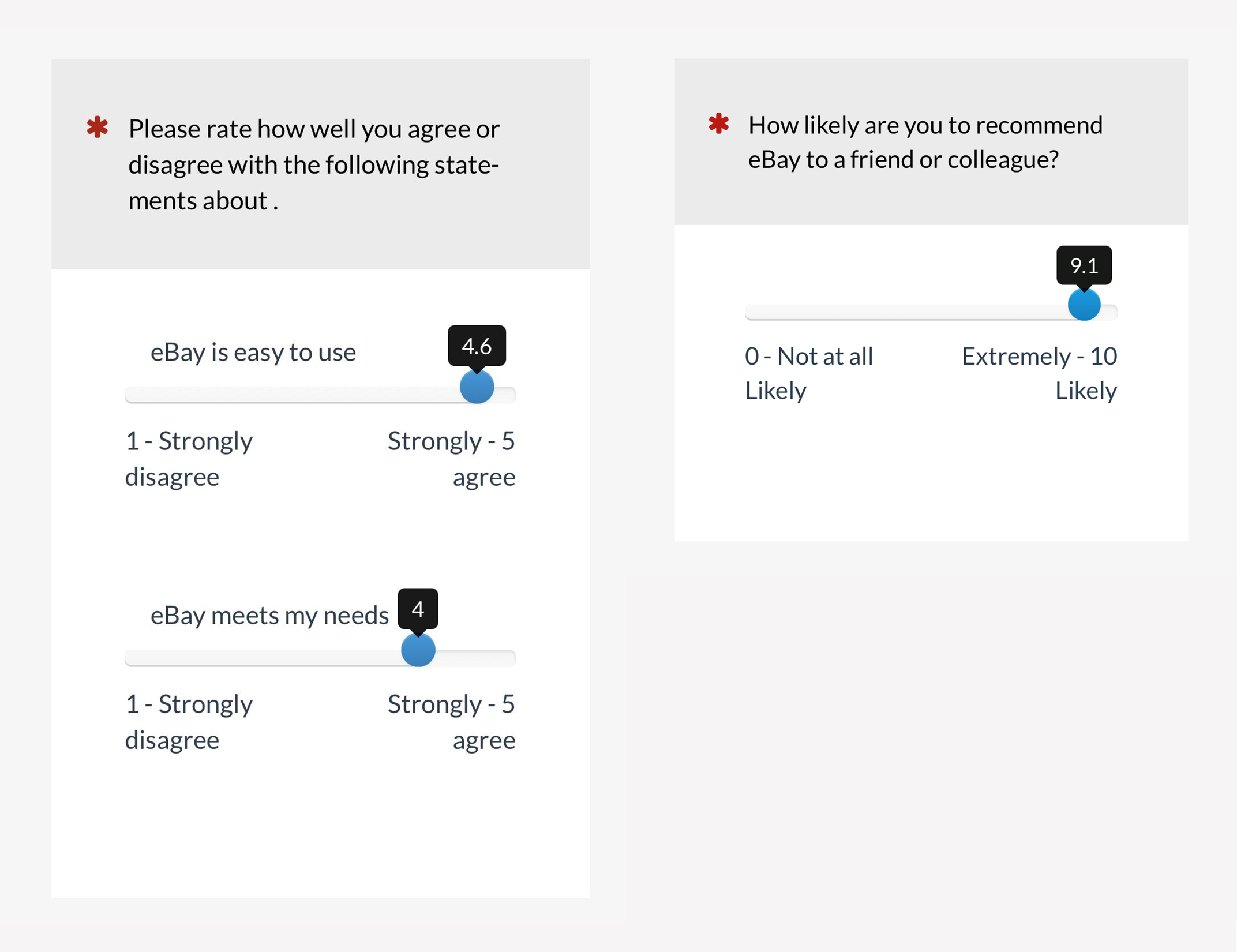
Figure 4: Example of slider versions of the UX-Lite and LTR on a mobile screen (created with MUIQ).
It isn’t possible to test every potential variant of rating scales in a single experiment. For the current experiment, we explored variation in orientation, screen real estate, scale formats (radio buttons vs. sliders), and scale lengths (1–5 and 0–10).
Orientation
As shown in Figures 1–4, the orientation of desktop scales was horizontal, while the orientation of mobile scales was vertical for numeric scales and horizontal for sliders.
In a previous article, we analyzed the results for the numeric scales (horizontal on desktop, vertical on mobile). There were a few instances (out of many opportunities) in which the response distributions differed, but we found no significant difference in means. Our results were consistent with those reported by Funke, Reips, and Thomas (2011), who, in a fully crossed experimental design with horizontal and vertical numeric scales and sliders, found no significant effects of orientation.
Screen Real Estate
On the desktop, the screen real estate required by sliders was greater than that required by numeric scales. On mobile devices, this was reversed, largely due to the vertical orientation of numeric scales.
Numeric Scale Format
All numeric scales used radio buttons for selection, with a number assigned to each radio button and verbal endpoint labels (negative-tone endpoint on the left or top, associated with the lowest number on the scale).
Slider Scale Format
Within the general category of slider scales, there are different formats. For example, some sliders display a limited number of response options (e.g., five), so the only difference with a standard numeric scale is the user interface used to select the response option (click for numeric; drag-and-drop for slider). Often, sliders cover a wide range of response options (e.g., from 0 to 100). Some sliders require dragging the slider control to the desired position with a mouse, finger, or other pointing device—a user interface that might be difficult for some users (e.g., Chyung et al., 2018).
Other slider designs allow, in addition to sliding, simply clicking the approximate position and then fine-tuning as required with any combination of dragging and dropping (which is the case for sliders in MUIQ). These types of sliders are also known as visual analog scales (VAS). The name comes from old pencil-and-paper scales where users marked a position on a line to indicate the magnitude of an attitude or sentiment (typically a ten-centimeter line with the marked position measured by hand to produce a rating from 0 to 100).
Sliders also differ in their starting position (typically on the leftmost point, the rightmost point, or the center point) and sensitivity (e.g., the extent to which they allow selection of values between response options).
In this experiment, the slider sensitivity was 0.1, and the numeric range of the sliders matched those of the corresponding numeric scales (1–5 for UX-Lite, 0–11 for LTR). The selected value appeared in a tooltip as shown in Figures 2 and 4. The slider’s initial position was in the center of the scale, but it had no value until the user moved the slider by clicking a different part of the scale or dragging the slider to another position.
Scale Length
The UX-Lite items were 1–5-point scales. The LTR item was a 0–10-point scale.
In this article, we focused on the findings for the UX-Lite items. We’ll present the other findings in future articles.
Results
UX-Lite Means
As a standardized measure, the UX-Lite is computed by averaging its two items and interpolating to a 0–100-point scale. Figure 5 shows the UX-Lite means (with 95% confidence intervals) as a function of device (desktop, mobile) and format (radio button numeric scale, slider).
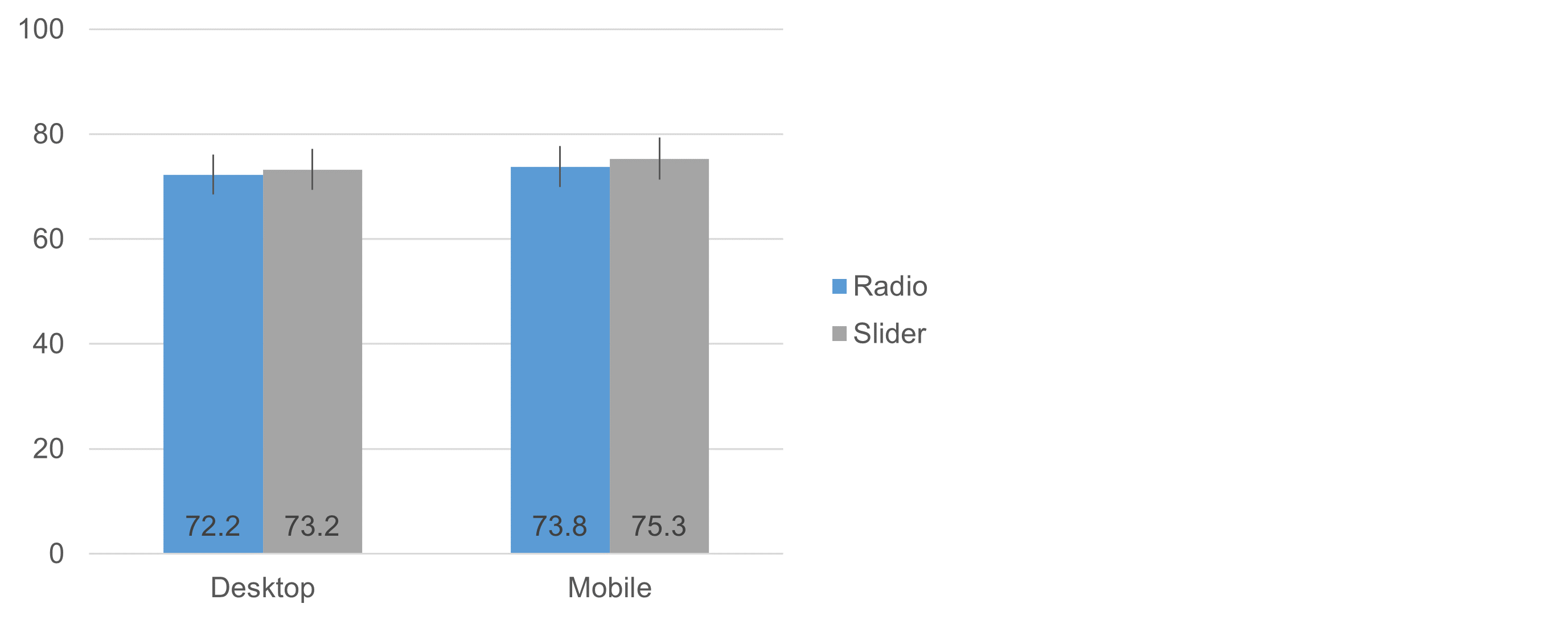
Figure 5: UX-Lite means (and 95% confidence intervals) for radio button numeric and slider scale ratings on desktop and mobile devices.
While the mean values of the sliders were slightly higher on both desktop and mobile, analysis of the results found the differences weren’t statistically significant. Specifically, an analysis of variance indicated no significant interaction between the independent variables of device and scale format (F(1, 210) = 0.02, p = .88). The main effect of scale format was also nonsignificant (Radio mean: 73.0, Slider mean: 74.2, observed difference of 1.2 with 95% confidence interval from −4.7 to 2.3, t(211) = 0.70, p = .49), as was the main effect of device (Desktop mean: 72.7, Mobile mean: 74.5, observed difference of 1.8 with 95% confidence interval from −2.4 to 6.0, t(210) = 0.85, p = .40).
UX-Lite Item Response Distributions
Figures 6 and 7 show the UX-Lite item response distributions for numeric and slider formats (a within-subjects comparison because each respondent had the opportunity to provide UX-Lite ratings with each format). We used the following assignments to place slider responses into discrete bins matching the 1–5-point ratings with radio buttons.
- 1: Slider responses less than 1.6
- 2: Slider responses from 1.6 to 2.5
- 3: Slider responses from 2.6 to 3.5
- 4: Slider responses from 3.6 to 4.5
- 5: Slider responses greater than 4.5
Focusing on the commonly used percentage metrics of top-box and top-two-box scores, we found no statistically significant differences for either Ease or Usefulness, although some comparisons approached significance (assessed with McNemar mid-probability tests). The numeric scale and binned slider distributions were not identical, but they also were not radically different.
- Ease top-box: p = .08
- Ease top-two-box: p = .89
- Usefulness top-box: p = .42
- Usefulness top-2-box: p = .11
Figure 6: Distributions for UX-Lite Ease item for numeric and slider formats.
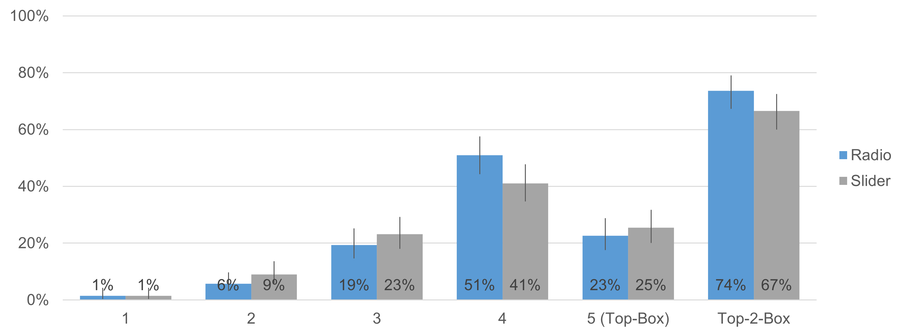
Figure 7: Distributions for UX-Lite Usefulness item for numeric and slider formats.
Table 1 shows the results for eight N-1 Two-Proportion Tests on top-box and top-two-box comparisons for desktop versus mobile UX-Lite ratings.
| Analysis | UX-Lite | Format | Desktop | Mobile | d | z | p |
|---|---|---|---|---|---|---|---|
| Top-Box | Ease | Numeric | 25.7% | 27.2% | −1.5% | −0.24 | 0.81 |
| Ease | Slider | 28.4% | 37.9% | −9.4% | −1.45 | 0.15 | |
| Usefulness | Numeric | 23.9% | 21.4% | 2.5% | 0.43 | 0.67 | |
| Usefulness | Slider | 22.9% | 28.2% | −5.2% | −0.87 | 0.38 | |
| Top-Two-Box | Ease | Numeric | 76.1% | 84.5% | −8.3% | −1.51 | 0.13 |
| Ease | Slider | 78.9% | 80.6% | −1.7% | −0.3 | 0.76 | |
| Usefulness | Numeric | 71.6% | 75.7% | −4.2% | −0.69 | 0.49 | |
| Usefulness | Slider | 62.4% | 70.9% | −8.5% | −1.31 | 0.19 |
Table 1: Tests of top-box and top-2-box comparisons of UX-Lite item response distributions as a function of device (desktop vs. mobile).
Summary and Takeaways
We conducted an experiment (n = 212) to see how two independent variables, scale format (radio button numeric scales vs. slider scales) and device (desktop vs. mobile), affected UX-Lite rating behaviors.
No differences in means: Despite the different form-factors between sliders and radio buttons, we found no statistical differences in mean scores when using the two five-point rating scale items in the UX-Lite. There were no significant main effects or interactions, with observed differences of less than two points on the UX-Lite’s 0–100-point scale (Figure 5).
Possible smaller effects on response distributions: None of the top-box or top-two-box analyses of response distributions as a function of scale format were statistically significant, but two approached significance (top-box for the Ease item and top-two-box for the Usefulness item) (Figures 6 and 7). This was also the case for top-box and top-two-box analyses as a function of device (Table 1, all p > .10).
Small differences not ruled out: The main takeaway from these results is that, for these item designs, there do not appear to be great differences in rating behaviors for radio-button numeric scales versus sliders or desktop versus mobile variables. If the differences were large, our experiment would have been powerful enough to detect them. On the other hand, it is too early to claim that the differences, if they exist, are so small as to have no practical significance, especially for researchers interested in the results of top-box or top-two-box scoring.
Used only two five-point items: One study can’t cover all aspects of this topic. We used only two instances of a five-point scale, the UX-Lite’s two items. In future articles, we will present the results for ratings with an eleven-point scale (LTR) and user preferences for these numeric and slider scale designs.
Acknowledgment
Thanks to Jonathan Clancy for his efforts in designing and conducting this experiment, analyzing data, and writing the initial drafts of this article.


