 Despite the attention consumer-based mobile apps, websites, and software get, a lot of the world depends on business software.
Business software supports core functions for organizations such as productivity tasks, communication, accounting, and sales.
Along with features and capabilities, the user experience of software is a key determinant of how likely users adopt new technology and recommend the product.
Benchmarking is an essential step in a UX measurement plan, and helps designers make systematic improvements in a product’s user experience.
We’ve found that usability accounts for between 30% and 60% of the variation in Net Promoter Scores. A positive experience leads customers to recommend a product. A negative experience, predictably, causes customers to actively discourage others from buying a product.
In the latter part of 2016 and beginning of 2017 we collected data from 1,048 participants to learn about their attitudes toward the functionality and usability of common business-related software. Measuring user attitudes toward the experience is an important step in benchmarking and improving a product.
This was an update to data we collected on a similar set of products in 2014 using a similar methodology. We increased the number of products benchmarked and split our articles into business-focused software and consumer-focused software (coming soon).
The 13 business products include a mix of productivity and communications software (both web and desktop):
- AutoCAD
- Blackboard
- Box
- Canvas
- GitHub
- GoToMeeting
- Hootsuite
- QuickBooks
- Salesforce
- Slack
- Tableau
- WebEx
- WordPress
Participants came from the United States. A bit over half (55%) were male and tended to be older with 76% above 30. Participants were asked to reflect on their most recent experiences with the software and answer a number of items, including the System Usability Scale (SUS) questionnaire and the likelihood-to-recommend question (used to compute the NPS). The full details are available in the report. Here are some highlights.
Loyalty
Net Promoter Scores
The most popular method to measure loyalty is the Net Promoter Score. It’s calculated using the 11-point (0 to 10) likelihood-to-recommend question. It’s computed by subtracting the percent of detractors (0-6) from the percent of promoters (9-10).
Across the 13 products the average Net Promoter Score is -11% with a range of -36% to 17%. This average is lower than the average NPS scores from 2014 and 2011 because we’ve excluded the consumer products.
We have data from five business software products for multiple years. The biggest drop we observed was from AutoCAD that had an NPS of -36%, down from 34 from 2011. The major reason cited for detracting is likely its steep learning curve and competition from other entrants.
“This software is outdated and difficult to use.”
“I feel like Rhino does the same capabilities as AutoCAD but a bit better with more options.”
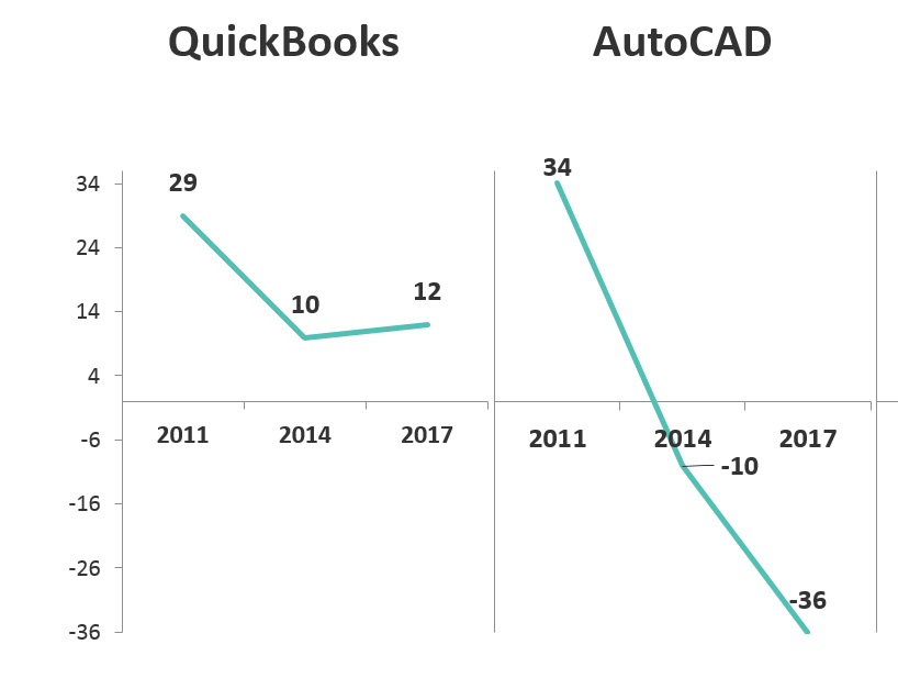
Figure 1: NPS scores from QuickBooks and AutoCAD from 2011, 2014, and 2017.
Additional Loyalty Measures
In addition to the NPS, we also captured metrics that help build a more holistic picture of customer loyalty and the potential impact of word-of-mouth. These include:
- Retro-Recommend Rate: The percent of customers that actually recommended the software in the preceding 12 months. Hootsuite had the highest rate with 64% of participants reporting they recommended it to someone in the last year.
- Product Referral Rates: The percent of customers to whom the product was recommended. Slack had the highest percentage, 57%, who reported being referred.
- Promoters Actually Recommending: By looking at the percent of promoters that recommended and who were referred to the product by others, you can estimate the value of a promoter. Box led this group with 86% of promoters having recommended in the last year and is consistent with its high growth rate as businesses look for more secure storage options compared to Google Drive and Dropbox.
System Usability Scale (SUS) Scores
We used the popular System Usability Scale (SUS) to compute the perceived ease of use of the 13 products. SUS is a 10-item questionnaire with possible scores ranging from 0 to 100. The average SUS score from over 500 products (including websites and business software) is 68. The average SUS score from this group is 66, with a low score of 56 and high score of 73.
Raw SUS scores were converted to percentile ranks, which translated the average raw score into 44%—meaning this group of products scores slightly below average in perceived usability.
The product with the lowest SUS score in this dataset is Tableau, with a SUS score of 56 (at the 21st percentile). What’s interesting is that Tableau is largely intended to make visualizing data and using spreadsheets easier. One participant commented:
“While Tableau can be a great tool to use for data analytics, it takes some time to learn all of its functions and to apply it to the appropriate work space.”
The SUS scores for the five products from the previous reports had relatively stable SUS scores fluctuating by only around 1 point, with the exception of Salesforce, which saw a decline of 5 points from 2014 (67 to 62). One participant’s reason for being a detractor exemplifies the correlation between ease of use and NPS:
“[Salesforce] is extremely complicated to use. There are a ton of nuances that you wouldn’t know unless you had extensive training and had someone to ask questions every time you needed to do something that you haven’t done before. I don’t like the way the pages are laid out either…they don’t appear organized.”
Usefulness & Ease
This year, we began to report on a new measure, UMUX-LITE. It’s based on earlier work harkening back to the Technology Acceptance Model (TAM) but includes only one item each for ease (how easy is the software to use) and usefulness (how well the capabilities meet the users’ needs).
In aggregate, it provides a measure of acceptance or even more broadly satisfaction or quality of the product. Figure 2 shows a scatterplot of the normalized version of the two components of the UMUX-Lite scores. All the software products are rated above average for usefulness but most below average for usability.
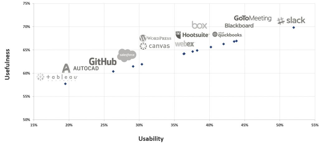
Figure 2: UMUX-LITE scores
We’ll continue to collect UMUX-LITE scores as it’s become an important benchmark for many organizations as part of using a single (succinct) score to quantify software acceptance and satisfaction.
Usability Correlates with Loyalty
We’ve again seen the strong correlation between usability and loyalty (r = .63) when correlated at the product level [pdf]. That means SUS scores here explain (predict) around 40% of Net Promoter Scores with this type of software.
Illustrating this strong correlation, Figure 3 shows the SUS scores for detractors, passives, and promoters (computed at the individual level for all responses).
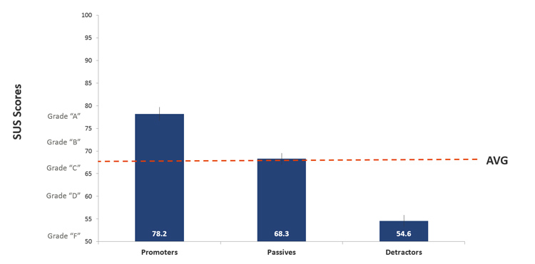
Figure 3: SUS scores by NPS segment.
This figure shows that on average promoters have SUS scores of around 78. This pattern is consistent with research we conducted seven years ago that found that SUS scores above 80 have a good chance of having promoters. The average SUS score for passives is the global average SUS score of 68. On average, detractors provide SUS scores of 55, which fall in the 18th percentile.
Summary
Benchmarking is an important step in improving the user experience of software and should include measures of usability and loyalty. Third-party benchmarks like the ones described here complement internal benchmarking programs by providing more context. It’s a lot easier to know how well your product is doing if you know where it stands relative to the competition or the industry average.
The full list of benchmarks and select verbatim responses are available for purchase in the Net Promoter & UX Benchmark Report for Business Software (2017).
")
")
")