 For some, the idea of involving users in design decisions conjures up images of interfaces being designed by focus groups.
Steve Jobs is famous for saying that users don’t know what they want. And Henry Ford famously said, “If I had asked people what they wanted, they would have said faster horses.”
Jobs and Ford had a point. We can’t rely on the end user to innovate.
Good interfaces require design skill and insight into human behavior.
But design decisions must also be informed directly by user behavior, not just by corporate opinions or by our best guesses. Incorporating user feedback into design decisions helps designers make better design decisions with data.
Here are five examples of how designers can make better design decisions with data.
1. Icons
From the business analyst to the CEO, we all like to tell designers what’s “intuitive” and what’s “terrible.” This seems to especially happen with the design of icons. Icons, ideally, use compact images to afford users a quick and intuitive way to access a function. In fact, icons often fall short of representing abstract software functions.
![]()
Design question: Which icon best matches the intended function?
How to test: To test the effectiveness of an icon, use a combination of association, recall, and free response.
- Association: Provide an icon and present qualified participants four options—the intended one and three others—in randomized order. Count the number of correct selections and use confidence intervals to determine the percentage of all users that would likely make the intended association.
- Recall: Display an icon briefly and then ask participants to write the words or functions they remember about the icon. Summarize the results in word clouds and count how often the key words were listed.
- Free response: Show participants an icon and ask them to list words or phrases they associate with it.
2. Remote-Control Layout
Remote controls are the gateway to all kinds of user interfaces, from TVs to stereos to cable DVRs to Apple TVs. The number and placement of buttons, for better or worse, and the available functions play a major role in the experience.
Design question: What are the effects of reducing the number of buttons on a remote control?
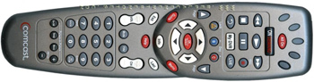
How to test: To test the effects of changing the number and types of buttons on a remote, create two low-fidelity remotes (one of the old and one of the proposed) and have a set of participants perform the same tasks on both remotes. See how much longer it takes, or how much more difficult it’s perceived, if at all, for participants to complete a set of common functions with the new device.
We recently completed a similar study and had two remote prototypes 3D printed and configured to work a cable TV interface via a USB cable. Prior to testing we just didn’t know what would happen with substantially fewer buttons. The study results led to some design improvements but also confirmed earlier choices as being helpful.
3. Button Placement
Opinion varies as to ideal button placement and design. This includes the alignment, position, and color of the Search, Submit, OK, and Cancel buttons, among others. The “right” configuration, we’ve found, depends on context.
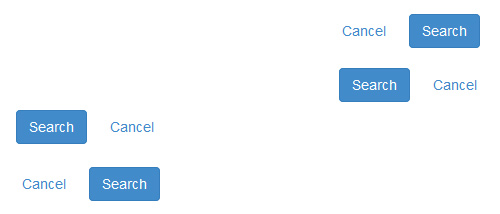
Design question: Which order of buttons results in fewer errors and more efficient form submission?
How to test: Create a combination of button layouts in forms that mimic the context in which they’ll be used. Measure the time it takes participants to complete actions and count any errors participants make. Even finding no difference in time or error rates is a result, it suggests that if a difference in performance does exist between buttons, it’s small or even imperceptible to users.
4. In-Store Pickup versus Delivery
In an effort to compete with Amazon, many retailers now offer in-store pickup for online shoppers. Customers have one more alternative to consider when determining the speed and cost of obtaining the products. The way you present your speed vs. cost alternatives impacts sales fulfillment and cart abandonment. It’s important to make it easy for customers to understand their choices and weigh the pros and cons–easier said than done.
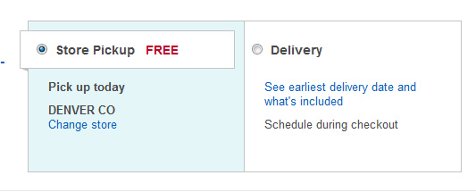
Design question: Which explanation of shipping fees comparing in-store pickup to shipping is best understood by customers?
How to test: Have participants select a shipping option from a design mockup of the checkout screen. Give them a few scenarios. For example:
- You want it as soon as possible.
- You want the lowest delivery cost.
- You want it soon but in-store pick-up does not work for you.
Then determine which design alternative is leading to the most correct decisions. Also include secondary measures of perceived difficulty and task-time.
5. Colors and Nomenclature
The labels and color schemes of common functions can help or hinder navigation. While few universal labeling or color schemes are bound to work well, the context of the application and the user background may reveal common patterns.
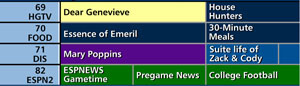
Design question: What color do users associate with a sports category or movies and what label do we give to a category?
How to test: Have participants select which category they most associate with a color. For terms, have participants select which term they would use to describe a function or a collection of items. Next have qualified participants select among a set of alternatives when naming a category. You can do this as part of a survey or in an open-card sort.


