 Too much to do and too little time—that’s product design.
The list of bug fixes, feature requests, pet projects and product enhancements are almost always too long to address.
While the product can be a website, desktop software or an enterprise accounting system, it’s a problem that predates software development and is as old as manufacturing.
If you tried to fix or improve everything, you’d never get any new products released. You have to prioritize.
Prioritize is exactly what the Quality Function Deployment (QFD) method does. It provides a structured way to prioritize features, functions or even website content by taking into account both business priorities (the voice of the company) and the customer/user priorities (the voice of the customer).
To prioritize, the QFD separates what you do from the how you do it. In the rush to clear off the design changes it’s easy to lose sight of what customers need by rolling out new features and changes instead. If you’re looking to scale your UX stragetgy, the QFD is a good place to start.
The QFD has its roots in manufacturing (like Keystroke Level Modeling) and was developed in the late 1960’s. The main output is a decision matrix which looks like a house, and so QFD is often used interchangeably with “house of quality.” See Figure 1 below.
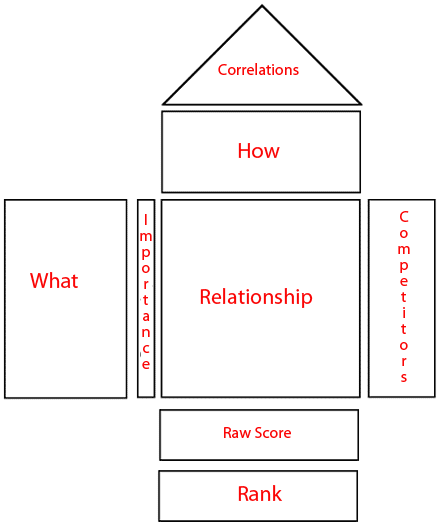
Figure 1: House of Quality components from a QFD process.
The QFD house of quality was applied in the early 1970’s in the designing of oil tankers at Mitsubishi and new vans for Toyota. It’s been credited with saving significant product development costs. It became popular as part of the Six Sigma quality initiative, where I was introduced to it. Like other Six Sigma tools, the QFD is a natural fit for helping improve the user experience because it shares a key with many UX methods: User and customer input.
For physical products, customer requirements often involve things like reliability, battery life and durability. For websites and software, identifying customer requirements involves an understanding of what users are trying to accomplish. This usually involves trying to complete some productivity task, find information or purchase something.
B2B Website Redesign Example
Here’s an example of a website redesign: A B2B electronics company that sells through channel partners and to companies but not directly off the website (the details have changed but it’s based on a real experience.) Everyone at this company knows the website needs to be improved but not everything can be done. What should be on the short list for the redesign? The QFD can help and you can download an excel template to follow the example.
Step 1: Identify customers wants and needs: Brainstorm as many possible features, functions and task-based activities that customers would want to do with a product or in this case the website. Look at the competition, survey and interview existing and former customers, review call center data and interview stakeholders. These are your “What’s.” For an informational-based website, most of the customer requirements are essentially tasks that users attempt so a good task-analysis can help identify these. Here’s a selection of some tasks from the B2B electronics website.
Tasks (The What’s)
- Find detailed technical specifications (like CPU and power consumption).
- Find and download drivers.
- Contact a salesperson.
- Have a personalized profile to save products I’m interested in.
- View products for an industry (e.g. entertainment, medical).
- Share my purchase with others.
Step 2 : Identify the voice of the customer: Here you’ll want to have customers tell you what they think is important, not what you want them to think is important. An essential part of this step is realizing that everything can’t be important. If you ask customers and users what’s important, they will often tell you everything is important. You need a way to force users to choose which tasks are really important and which are just nice to have tasks features.
You can get sophisticated with conjoint analysis, but I’ve found the fastest and easiest way to get a forced rank is to run a top-tasks analysis. Provide customers with a long list of the tasks/features and functions in randomized order and have them pick only five (or three or four if the list is less than 30).
The tasks users choose will follow a Pareto-like distribution with a handful of tasks emerging as very important and most as secondary or not important at all. Use the ranking or the percent of users that pick each task as the weights in the QFD. You’ll want higher numbers to indicate higher importance so if you use ranks, reverse them so a “1” is the least important. The table below shows the relative rank and the percent of users who picked the task as one of their top five (out of 35 possible tasks) in a top-task survey.
The Ranked Tasks
| Rank |
% Who Picked | Tasks (The What) |
| 1 | 80% | Find detailed technical specifications (like CPU and power consumption). |
| 2 | 73% | Find and download drivers. |
| 9 | 27% | Contact a salesperson. |
| 19 | 1% | Save products I’m interested in to an account page. |
| 12 | 13% | View products for an industry (e.g. entertainment, medical). |
| 25 | 1% | Share my purchases with others. |
Step 3 : Identify the How’s (The Voice of the Company): Either use existing lists of enhancements and fixes or generate a new list based on the customer rankings. The following are some example “How’s”, for the B2B website.
The How’s
- Integrate Facebook and Twitter into the product pages to promote sharing
- Improve the search function and search results
- Integrate product videos
- Provide 3D rotation of products
- Add a customization feature
- Add a Filter by Location
- Integrate detailed product specs and drivers from the main product page
Step 4: Relationship between Voice of the Customer and Voice of the Company: Next determine how each of the “How’s” impact each of the customer “What’s” using the following scale:
9 = Direct and strong relationship
3 = Moderate relationship
1 = Weak/Indirect relationship
blank= no relationship
The 1’s, 3’s and 9’s are mostly a convention and help accentuate the differences when we need to prioritize. Place each value in the cell where the “What” and the “How’s” meet and leave the cell blank if there’s no relationship.
In our example, “Integrate Facebook and Twitter buttons into the product pages” has a strong association with “Sharing my purchases with others.” Something like product videos will probably have a modest impact on detailed specifications as users could view the products to get a better sense of size and even see what external ports are supported.
Figure two below shows the “What’s” and the “How’s” and the relationships between the two in the cells with higher numbers indicating a stronger relationship, and blank cells meaning no relationship.
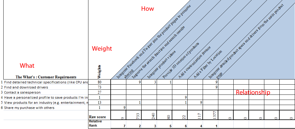
Figure 2: A house of quality matrix with the Customer Requirements “What’s,” the importance of each (Weights) and the Voice of the Company (How’s) across the top. Click the image to enlarge.
Step 5: Generate Priorities: Multiply the importance by the relationship and add up each sum in the “How” columns. The excel template will do this for you. The sum of each column represents the overall magnitude of each feature/function will have on the customer. Higher numbers represent more of an impact. The actual value of each of the totaled columns is less important than the relative ranking, which the tool also calculates.
Step 6: Examine Priorities: You should see good gaps between features now. The two highest ranked features (Integrating the product specs and Improving search) are well above the next five. A blank row means that a customer want isn’t supported. That’s not necessary a bad thing if it’s a low priority task. In this example, none of the new features supported “Contact a salesperson.” Assuming adding the contact information doesn’t introduce new problems, it would also be a good addition to the redesign.
QFD in Practice
This is a simple example of using QFD as a decision tool. Instead of relying solely on the loudest customers, the most senior VP or the easiest thing to fix, you can instead incorporate all these voices into a single matrix. The QFD houses can become more advanced by incorporating competitive information, specifications, and positive and negative relationships between the “How’s.” Adding each of these parts to the house takes extra time, but it can be worth it depending on the complexity and consequences of the project.
We’ve found a simple QFD that balances the internal need to build and improve with a clear prioritized top-tasks list of customers really helps to narrow the scope and improve the quality of redesigns. We then use these tasks in competitive benchmarking, and collect the classic usability metrics both before and after a site or functional redesign to show quantifiable improvements in the user experience.