 One of the best ways to make metrics more meaningful is to compare them to something.
The comparison can be the same data from an earlier time point, a competitor, a benchmark, or a normalized database.
Comparisons help in interpreting data in both customer research specifically and in data analysis in general.
For example, we’re often interested in customers’ brand attitudes both before and after they experience a website.
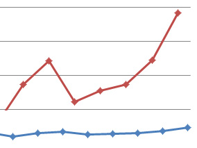
This measure of brand lift can be seen in the graph below for a group of participants who provided their attitudes before and after using both the Budget and Enterprise websites.
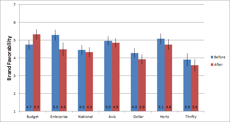
Figure 1: Average brand favorability score (before and after) and 95% confidence intervals for participants who rented a car on Budget and Enterprise websites.
A challenge with displaying multiple points on a single graph like this one is that your reader may not know what’s important to pay attention to or the point you’re making with the data.
When making a comparison, it’s often the difference that’s of interest, rather than the absolute number. In graphs like this one, that difference can get lost.
Difference scores
One way to draw attention to the difference rather than raw values is to use difference scores. Difference scores are, as the name implies, the difference between two points. They are a simple linear transformation (like a z-score or log) and are used in some statistical calculations, too. For example, the paired t-test is actually a test on the difference scores (usually between two treatments) from the same participants in a study.
The graph below shows the same brand favorability data from above, but this time as difference scores (after minus before).

Figure 2: Brand favorability difference score (after minus before) and 95% confidence intervals around the difference for participants who rented a car on Budget and Enterprise websites.
Now your reader can see the differences: Budget shows an improvement in attitude (being positive) and Enterprise shows a large drop in attitude, and to a lesser extent the other brands drop, as well.
You’ll often encounter difference scores in the general media. For example, a popular one is when displaying global temperature. Instead of showing the average global temperature, you’re more likely to see something called a temperature anomaly. An anomaly is a fancy name for a difference score. In this case, it’s the difference from the current year average global temperature from a multi-decade average (often Jan 1951–Dec 1980).
For example, here are the temperature anomalies from 1998 to 2015 that I graphed from Berkeley Earth’s data. The anomalies are meant to highlight the differences in temperature and the differences relative to a mid-20th century average.

Figure 3: Global temperature difference scores (anomolies in C) based on average global land and sea temperatures relative to the average temperature from 1951-1980.
Here’s the same data but this time graphed as raw temperatures (in degrees Celsius).
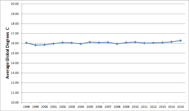
Figure 4: Raw global average temperatures (in Celsius) from land and sea from 1998 to 2015.
The graph of the temperature anomalies (difference scores) highlights the differences between average temperature each year and over time—even if that difference is more modest when expressed as raw values. Both graphs show the same changes per year, which is less than 1% for most years.
Note: It’s actually quite difficult to find temperatures expressed as raw values, which makes interpreting them (and understanding their implications) for the layperson more challenging. I had to re-create the raw temperatures myself.
The dangers of difference scores
When comparing difference scores to raw data, it’s important to remember that difference scores are presented on different scales than the raw values. You can skew a reader’s perception of the data—and its relative importance—by changing the scale the data is presented with. (But that’s a topic for a future article on visualizations.)
In the examples above, the first graph had a y-axis spread of about 1 degree Celsius while the second was 10 degrees Celsius. The first graph can give the overall impression of a bigger difference than really exists.
As another example from customer research, we were working with an Internet retailer to understand what different changes to the interface would have on attitudes toward purchasing (referred to as dimensions). We used a large sample size (over 2000 participants) and randomly assigned people to one of two page designs.
The graph below shows the difference in attitudes (referred to as satisfaction in this graph) between the two versions by dimension. Version B has higher ratings across all three dimensions, and the differences are statistically significant. The visualization of the raw scores don’t highlight the difference, even with the scale range being restricted from 5 to 10 (instead of from 0 to 10).
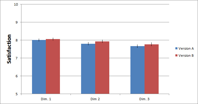
Figure 5: Raw satisfaction scores on three dimensions of two website designs.
The next image shows the difference in ratings across the same three dimensions between Version A and B.
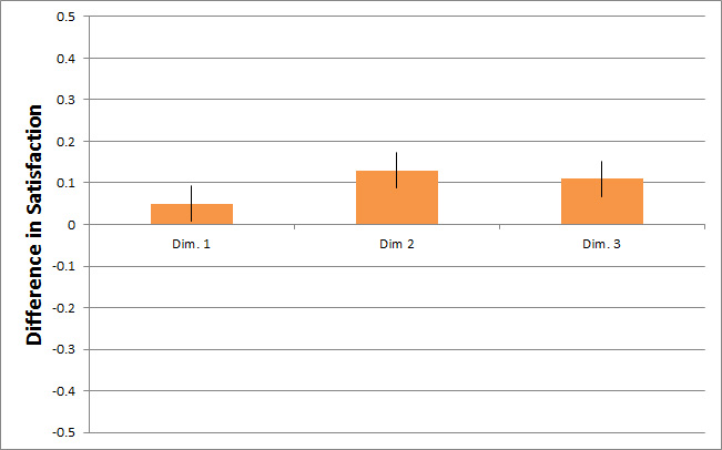
Figure 6: Difference scores by dimension on three dimensions comparing two website designs.
You can see right away that there are positive differences. However, that doesn’t change the fact that the differences represent only around 1% difference in average satisfaction scores! While that difference is statistically significant, how that translates into different buying behavior on a website is unclear.
And that’s the major risk with difference scores. While they can be essential for showcasing important differences that raw score graphs can’t show, they can also make differences look bigger and by extension more important. And while they might be impactful and more important, the graph alone can’t tell you that.
Notice too, that the scales change, which accentuates the difference. In the first graph the spread is five points and in the second it’s one point. Anomalies and difference scores can be used to highlight differences and convey a message. In these two examples they’re that brand attitudes changed and temperatures fluctuated. But it’s up to the graph creator to help convey and the viewer to understand what those differences translate into in real life.
If you have a point you want to make, difference scores can help you make it more strongly (for better or worse). And the adage that you can show anything you want with statistics can also apply to visualizations of statistics too. Statistical differences and visual differences don’t necessarily mean practical significance.
Summary
When displaying data to communicate a change, difference scores may be the way to go. Here are five things to consider when viewing or creating graphs with difference scores:
- Accentuated differences: Difference scores help clear through the noise on graphs with many data points to draw attention to important differences that may get lost with raw scores.
- Overstated impact: An accentuated difference has the drawback that it can suggest a difference is more impactful in the real world, even if the difference is modest.
- Know how the difference is derived: With difference scores you should consider how the difference is derived, such as from an earlier time point or reference value. Always consider the reference point to help understand whether the difference is likely major or minor.
- Differences can be harder to interpret than raw values: It’s usually harder to understand what an anomaly of .7 C is or what a difference of .11 satisfaction points mean. Consider the impact each has—often a more difficult question to answer.
- Scale dimensions change: Graphs of difference scores will be displayed using a different scale range than the original score, again exacerbating the visual difference. When critically examining data, look at the raw and difference scores to better understand the impact.
Graphs of difference scores are a helpful visualization technique to help highlight differences compared to displaying raw scores. Their main advantage can also be a disadvantage as even small differences can look important. In customer research and analysis in general, while the graph maker can help, it’s ultimately up to the viewer to understand if differences depicted have an impact that’s meaningful or more modest.


