 Last year a friend was getting married on the island of Kauai in Hawaii.
If you’ve ever flown to Hawaii from the mainland US you might have heard of the “Halfway to Hawaii” game.
It’s something the flight attendants organize to help distract folks from the long flight. All the passengers are invited to guess at what time our plane will be exactly halfway to Hawaii from the departure city.
We are given some important details to assist us in our guess:
- Departure time: 11:20 am Mountain Time
- Estimated arrival time: 2:50pm Hawaii-Aleutian Time
- The total distance: 2,992 miles
- Our current average flight speed: 450 mph
- Winds: head wind of 17 mph
- Estimated flight time: 7 hours 0 minutes
Triangulation
The Halfway to Hawaii game is like many research problems we’re presented with in User Research. We’re given pieces of information and we need to determine how each of these fit together to provide answers or solve problems.
In the face of uncertainly around which data points are relevant or which approach is the best, we recommend and take a triangulation approach: multiple methods and multiple metrics. There are many methods in UX research and rarely does one method always solve the issues. It’s difficult to know which one will uncover the insight, determine the root cause of interface problems or provide the recommendation to improve the user experience.
It’s an approach that Joe Dumas recommend almost 10 years ago in his paper User-based Evaluations in The Human-Computer Interaction Handbook (pp. 1093-1117).
It’s also similar to one of the most fundamental principles of statistics. Errors in our measurement tend to cancel out. Sometimes our samples over estimate and sometimes they underestimate. The average tends to be a better measure of what we’re measuring than any single data point.
You don’t need to be a statistician to both appreciate and use this concept of triangulation.
Multiple Methods
When we want to uncover usability problems in a website and propose changes for a new design we use multiple methods. For example, we will often propose:
Voice of the Customer (VOC) Survey: Collecting data on who the users are, what users are doing on the website and problems they encounter. It’s also a great way to uncover how goals differ from mobile vs. wired users of a website.
Moderated Usability Study: When we moderate we’re able to ask questions, probe on interactions and ensure the website and all technology are working properly. When interesting things happen, we’re there to see it, record it and follow-up on it.
Unmoderated Usability Study : With a larger sample size and less effort on our moderators we can obtain data from hundreds of users in a few days. This allows us to see less common but still important “long-tail” issues. It also allows us to see if different user segment have different experiences and we can obtain more precision in our metrics for benchmarking.
Open Card Sort: Navigation labels and categories are usually one of the root causes of a poor website experience. Having users sort items or information into groups and naming them is great input into the first design iteration to test.
Multiple Measures
Within each method there are multiple ways to measure the user experience. For example, in both moderated and unmoderated usability tests, after each task, we collect completion rates, task-times, task-difficulty and task-confidence. Sometimes differences between designs are obvious just from the completion rate, whereas in other cases there’s very little difference in completion rates but we see higher variability in times and lower task difficulty. The graph below shows the same task on three different mobile carrier websites. The differences in completion rates are modest 84% vs 93%.
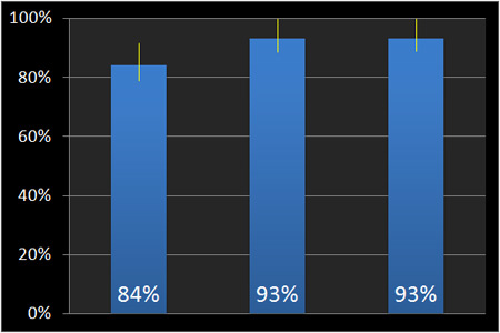
Figure 1: Completion rates and 90% confidence intervals for the same task on three mobile phone carrier websites.
The difference in perceived task-difficulty shows a larger difference. The graph below shows the same three tasks as measured using the Single Ease Question (SEQ) and suggests while users are completing the task, they didn’t think it was terribly easy relative to the competing website.
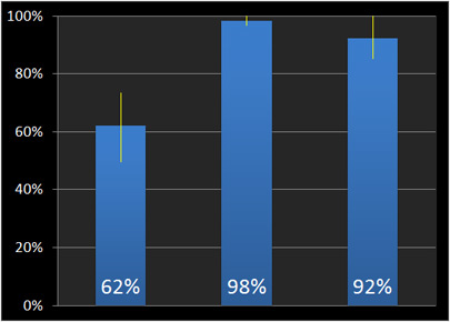
Figure 2: Single Ease Question percentile ranks and 90% confidence intervals for the same task on three mobile phone carrier websites (the same as those shown in Figure 1).
In a card sort sometimes it’s the label names, the items in the categories or the item that was most difficult to sort that provides the most insight.
And regardless of the method, the verbatim comments from users help put the “why” into the numbers and make for great highlight clips.
Halfway to Hawaii
The flight attendants told us that the right guess is usually correct to within a few seconds. I already had a spreadsheet open so I felt compelled to give it a try along with 178 of the 220 passengers on our flight that ultimately submitted guesses.
Like my approach to user research, I used multiple methods to converge on an informed guess. Here’s what I did. All times are expressed in the destination time zone.
First I started with the two easiest calculations.
- Half the estimated flight time: 3.5 hours after our actual take-off puts us halfway to Hawaii at 11:17am
- Half the estimated flight time: 3.5 hours before our scheduled landing puts us halfway to Hawaii at 11:20am
- At our current Net Air Speed of 433mph (speed – head winds) it would take us approximately 3.45 hours (3 hrs and 27 minutes) assuming a constant speed to go a distance of 1496 miles. This puts us halfway to Hawaii at 11:14am.
The average of all 3 guesses is 11:17 am.
We had two guesses, one for me and my wife so we split the minute to increase our odds of winning. She picked the lower end at 11:16:19 seconds and I picked the upper end at 11:17:19 seconds. Of those 178 guesses, my wife won!
Her answer was correct to within 20 seconds. We won a CD with some great ukulele music which we played during our trip. It was a convenient excuse to tell our friends about the halfway to Hawaii game and well, throw a little math into their Mai Tai. My wife explained to our friends that she thought I over overestimated some of the times in my methods so she picked a lower time.

The Halfway to Hawaii game shows that in addition to a structured approach to decision making, good luck, err, intuition will also help lead to correct answers. It’s hard to know which method or which metric will generate the right insights ahead of time. By using multiple methods and measures and in effect “averaging” the results you provide the most reliable picture of the user experience.

")
")