 There’s a plethora of both big and small data to describe the customer experience.
It comes in both qualitative and quantitative forms.
In all cases, visualizing data is one of the most effective ways to uncover relationships and patterns, which leads to better insights and improvements in user experiences. Here are five techniques to use to better visualize your data.
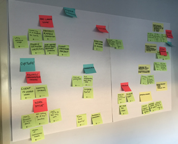
1. Affinity diagrams
An affinity diagram is a visual technique for organizing seemingly disconnected information. It’s typically used with sticky notes as shown in the figure below. Its main benefit is taking what may seem like disconnected information and finding potentially hidden associations and patterns to reveal latent themes using a low-tech and easy approach.
2. Fishbones
A cause and effect diagram (aka fishbone) provides a visual display of possible causes of a problem. It reminds us that there are usually multiple causes, rather than a single cause, that lead to a problem. Teams brainstorm multiple causes of a stated problem to get at the root cause and generate ideas for reducing or eliminating the problem.
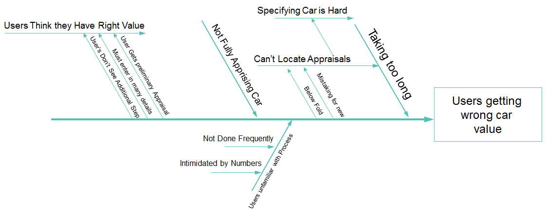
Fishbones, like the affinity diagram, are also low-tech. You just need a piece of paper or a whiteboard for team settings (no need to save the fish bones from dinner last night). They are a popular tool used in Six Sigma but you don’t need to be a math major to use them. For example, the fishbone above shows the many possible causes of getting the wrong trade-in value for your car on a third-party automotive website. In this case, the causes came from watching videos of users attempting to find their car’s value.
3. Customer journey maps
Customer journey maps visualize the process people go through when engaging with a service or product. They provide a wealth of information in one place to sales, marketing, and product development teams by unifying fragmented data and identifying points of friction and opportunities for improvement. Finding and fixing the pain points in a customer’s journey aren’t just about damage control; it’s also about the innovation that comes from fixing the pain. The image below is an example of a Journey Map for a Shop Floor Supervisor.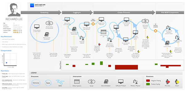
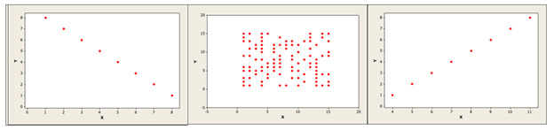
4. Scatterplots
Displaying two variables in a scatterplot allows you to see whether a relationship exists and how strong it is (either positive or negative). The figure below shows three hypothetical scatterplots; one with a strong positive association, one with no association, and one with a strong negative association.
 The graph below is a scatterplot showing the relationship between the Net Promoter Score (NPS) and System Usability Scale (SUS) score for 20 consumer software products.
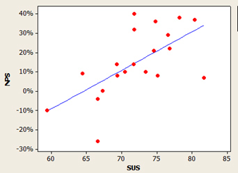 The diagonal pattern shows a strong positive association (r = .63 in this case), meaning higher attitudes toward usability (SUS) are associated with higher likelihoods to recommend (NPS).
5. 2×2 Graphs
Displaying data in two dimensions can also lead to better decisions. This works for data from Stephen Covey to Stephen Hawking.
For example, to better prioritize project to-do lists, organize tasks on both urgency and importance. Tasks that are BOTH urgent and important should get attention first (not just urgent ones).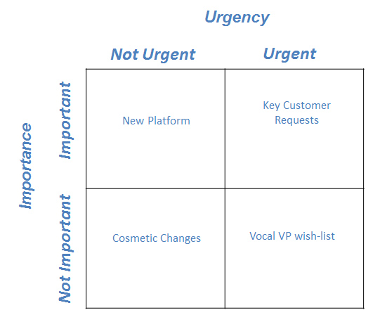 The diagonal pattern shows a strong positive association (r = .63 in this case), meaning higher attitudes toward usability (SUS) are associated with higher likelihoods to recommend (NPS). 2×2 graphs are also a staple of a key driver analysis by showing statistical importance and satisfaction. Drivers that are both important and low in satisfaction identify key areas for improvement.
They can also be used to identify disasters in the user experience, as shown in the figure below. By examining users reported confidence (or over confidence) by their ability to complete a task you can identify tasks that exhibit a false sense of accomplishment—which can be worse than task failure alone (see upper-left corner of the chart). In contrast, you want as many task experiences to be successful and elicit confidence in users (see upper-right corner).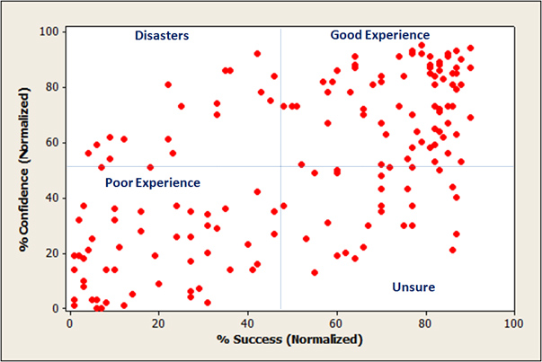


")