
Are People Who Agree to Think Aloud Different?
In an earlier article, we showed that only about 9% of panel participants will eventually complete a study in which they are asked to think aloud. That is, if you need ten usable think-aloud videos, expect to invite around 111 participants. On the surface, this means you’ll need to plan for a lot of people
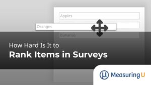
How Hard Is It to Rank Items in Surveys?
Ranking questions are a popular way to understand how respondents in UX research prioritize items such as product features, habits, purchases, color schemes, or designs. Forcing participants to make tradeoffs on what’s most important versus least important helps avoid the “everything is important” problem you get when you ask respondents to simply rate how important
How to Compare Two Dependent Proportions
In math class, we spend a lot of time learning fractions because they are so important in everyday life (e.g., budgeting, purchasing at the grocery store). Fractions are also used extensively in UX research (e.g., the fundamental completion rate is a fraction), typically expressed as percentages or proportions. Unfortunately, fractions are also hard to learn,

UX and NPS Benchmarks of Home Paint Websites (2023)
Watching paint dry might be the definition of boring, but the process of picking a paint color and actually painting usually isn’t. Shopping for paint, however, can be frustrating. One early pain point is picking the right brand and color of paint. The process of selecting a paint often starts online at paint websites. Paint

Does Thinking Aloud Reduce the Evaluator Effect?
In Think Aloud (TA) testing, participants speak their thoughts while attempting tasks. The process is meant to help researchers identify usability problems and potential fixes. Indeed, in an earlier analysis, we found an increase in problem discovery. Our evaluation of 153 videos, split between TA and non-TA, revealed that evaluators uncovered 36–50% more problems with
Are 3D Graphs Always Worse Than 2D Graphs?
There are many ways to visually display quantitative information. Excel offers dozens of chart types and color combinations, including those in 3D. But is it good practice to use 3D graphs? Edward Tufte is a famous and vocal critic of using 3D elements or any other decoration in graphs. In his book, Visual Display of
Essential Metrics for Click Testing
Click testing is an efficient UX research method for understanding where people click on an image. In an earlier article, we reviewed when and why to use a click test. It is often used in the design and release phases of product development, and it generates mostly quantitative data. We also showed how click testing

Classifying Tech Savviness Levels with Technical Activity Checklists
In an earlier article, we demonstrated the validity of measuring tech savviness with technical activity checklists (TAC™) by analyzing the correlation between TAC scores and successful completion rates in four usability studies. The TAC scores significantly correlated with success rates (i.e., people with higher levels of tech savviness tended to complete more tasks). On average,

How Have UX Job Titles Changed in the Last 15 Years?
What we do on the job can change. Jobs change and job titles change. Sometimes the titles change more than the jobs. For example, what do you call someone who professionally creates software? One analysis shows that the most popular job title associated with this function has evolved from Computer Programmer in the 1980s, to

UX and NPS Benchmarks of Home Improvement Websites (2023)
The home improvement industry has experienced continued growth in the United States over the last several years, with market value projected to exceed $600 billion by 2025, according to Statista. Since the COVID-19 pandemic forced people into lockdowns in 2020, interest has increased in do-it-yourself (DIY) projects such as painting, remodeling, and landscaping, contributing to
Does Removing the Neutral Response Option Affect Rating Behavior?
Many topics about the design of rating scales can provoke strong opinions and heated debates. The arguments include whether or not scales should include a neutral response. Unlike rating scales with an even number of points (e.g., 4, 6, or 10), rating scales with an odd number of points (e.g., 5, 7, or 11) contain

Validating a Tech Savviness Metric for UX Research
Some participants in usability studies complete a task effortlessly, while others struggle with the same task. In retrospective UX surveys, some respondents report having an easy time using a website and strongly recommend it to others, but others report having a much poorer website experience. Why? What explains the discrepancy between experiences, especially when the