 Can you think of a bad experience you had with a company?
Did you tell a friend about the bad experience?
Negative word of mouth can be devastating for company and product reputation. If companies can track it and do something to fix the problem, the damage can be contained.
This is one of the selling points of the Net Promoter Score. That is, customers who rate companies low on a 0 to 10 scale (6 and below) are dubbed “Detractors” because they‘re more likely spreading negative word of mouth and discouraging others from buying from a company. Companies with too much negative word of mouth would be unable to grow as much as others that have more positive word of mouth.
But is there any evidence that low scorers are really more likely to say bad things?
Is the NPS Scoring Divorced from Reality?
There is some concern that these NPS designations are divorced from reality. That is, there’s no evidence (or reason) for detractors being classified as 0 to 6 and promoters being 9-10. If these designations are indeed arbitrary or make no sense, then it’s indeed concerning. (See the tweet comment from a vocal critic in Figure 1.)
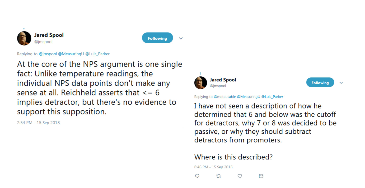
Figure 1: Example of a concern being expressed about the validity of the NPS designations.
To look for evidence of the designations, I re-read the 2003 HBR article by Fred Reichheld that made the NPS famous. Reichheld does mention that the reason for the promoter classification is customer referral and repurchase rates but doesn’t provide a lot of detail (not too surprising given it’s an HBR article) or mention the reason for detractors here.
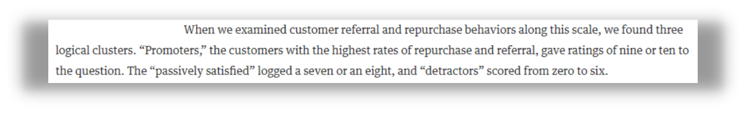
Figure 2: Quote from the HBR article “Only Number You Need to Grow,” showing the justification for the designation of detractors, passives, and promoters.
In his 2006 book, The Ultimate Question, Reichheld further explains the justification for the cutoff of detractors, passives, and promoters. In analyzing several thousand comments, he reported that 80% of the Negative Word of Mouth comments came from those who responded from 0 to 6 on the likelihood to recommend item (pg 30). He further reiterated the claim that 80% of the customer referrals came from promoters (9s and 10s).
Contrary to at least one prominent UX voice on social media, there is some evidence and justification for the designations. It’s based on referral and repurchase behaviors and the sharing of negative comments. This might not be enough evidence to convince people (and certainly not dogmatic critics) to use these designations though. It would be good to find corroborating data.
The Challenges with Purchases and Referrals
Corroborating the promoter designation means finding purchases and referrals. It’s not easy associating actual purchases and actual referrals with attitudinal data. You need a way to associate customer survey data with purchases and then track purchases from friends and colleagues. Privacy issues aside, even in the same company, purchase data is often kept in different (and guarded) databases making associations challenging. It was something I dealt with constantly while at Oracle.
What’s more, companies have little incentive to share repurchase rates and survey data with outside firms and third parties may not have access to actual purchase history. Instead, academics and researchers often rely on reported purchases and reported referrals, which may be less accurate than records of actual purchases and actual referrals (a topic for an upcoming article). It’s nonetheless common in the Market Research literature to rely on stated past behavior as a reasonable proxy for actual behavior. We’ll also address purchases and referrals in a future article.
Collecting Word-of-Mouth Comments
But what about the negative comments used to justify the cutoff between detractors and passives? We wanted to replicate Reichheld’s findings that detractors accounted for a substantial portion of negative comments using another dataset to see whether the pattern held.
We looked at open-ended comments we collected from about 500 U.S. customers regarding their most recent experiences with one of nine prominent brands and products. We collected the data ourselves from an online survey in November 2017. It included a mix of airlines, TV providers, and digital experiences. In total, we had 452 comments regarding the most recent experience with the following brands/products:
- American Airlines
- Delta Airlines
- United Airlines
- Comcast
- DirecTV
- Dish Network
- iTunes
- Netflix
Participants in the survey also answered the 11-point Likelihood to Recommend question, as well as a 10-point and 5-point version of the same question.
Coding the Sentiments
The open-ended comments were coded into sentiments from two independent evaluators. Negative comments were coded -1, neutral 0, and positive 1. During the coding process, the evaluators didn’t have access to the raw LTR scores (0 to 10) or other quantitative information.
In general, there was good agreement between the evaluators. The correlation between sentiment scores was high (r = .83) and they agreed 82% of the time on scores. On the remaining 18% where there was disagreement, differences were reconciled, and a sentiment was selected.
Most comments were neutral (43%) or positive (39%), with only 21% of the comments being coded as negative.
Examples of positive comments
“I flew to Hawaii for vacation, the staff was friendly and helpful! I would recommend it to anyone!”—American Airlines Customer
“I love my service with Dish network. I use one of their affordable plans and get many options. I have never had an issue with them, and they are always willing to work with me if something has financially changed.”—Dish Network Customer
Examples of neutral comments
“I logged onto Facebook, checked my notifications, scrolled through my feed, liked a few things, commented on one thing, and looked at some memories.”—Facebook User
“I have a rental property and this is the current TV subscription there. I access the site to manage my account and pay my bill.”—DirecTV User
Examples of negative comments
“I took a flight back from Boston to San Francisco 2 weeks ago on United. It was so terrible. My seat was tiny and the flight attendants were rude. It also took forever to board and deboard.”—United Airlines Customer
“I do not like Comcast because their services consistently have errors and we always have issues with the internet. They also frequently try to raise prices on our bill through random fees that increase over time. And their customer service is unsatisfactory. The only reason we still have Comcast is because it is the best option in our area.”—Comcast Customer
Associating Sentiments to Likelihood to Recommend (Qual to Quant)
We then associated each coded sentiment with the 0 to 10 values on the Likelihood to Recommend item provided by the respondent. Figure 3 shows this relationship.
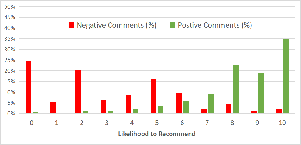
Figure 3: Percent of positive or negative comments associated with each LTR score from 0 to 10.
For example, 24% of all negative comments were associated with people who gave a 0 on the Likelihood to Recommend scale (the lowest response option). In contrast, 35% of positive comments were associated with people who scored the maximum 10 (most likely to recommend). This is further evidence for the extreme responder effect we’ve discussed in an earlier article.
You can see a pattern: As the score increases from 0 to 10, the percent of negative comments go down (r = -.71) and the percent of positive comments go up (r = .87). There isn’t a perfect linear relationship between comment sentiment and scores (otherwise the correlation would be r =1). For example, the percent of positive comments is actually higher at responses of 8 than 9 and the percent of negative comments is actually higher at 5 than 4 (possibly an artifact of this sample size). Nonetheless, this relationship is very strong.
Detractor Threshold Supported
What’s quite interesting from this analysis is that at a score of 6, the ratio of positive to negative comments flips. Respondents with scores above a 6 (7s-10s) are more likely to make positive comments about their most recent experience. Respondents who scored their Likelihood to Recommend at 6 and below are more likely to make negative comments (spread negative word of mouth) about their most recent experience.
At a score of 6, a participant is about 70% more likely to make a negative comment than a positive comment (10% vs 6% respectively). As scores go lower, the ratio goes up dramatically. At a score of 5, participants are more than three times as likely to make a negative comment as a positive comment. At a score of 0, customers are 42 times more likely to make a negative rather than a positive comment (0.6% vs. 24% respectively).
When aggregating the raw scores into promoters, passives, and detractors, we can see that a substantial 90% of negative comments are associated with detractors (0 to 6s). This is shown in Figure 4.
The positive pattern is less pronounced, but still a majority (54%) of positive comments are associated with promoters (9s and 10s). It’s also interesting to see that the passives (7s and 8s) have a much more uniform chance of making a positive, neutral, or negative comment.
This corroborates the data from Reichheld, which showed 80% of negative comments were associated with those who scored 0 to 6. He didn’t report the percent of positive comments with promoters and didn’t associate the responses to each scale point as we did here (you’re welcome).
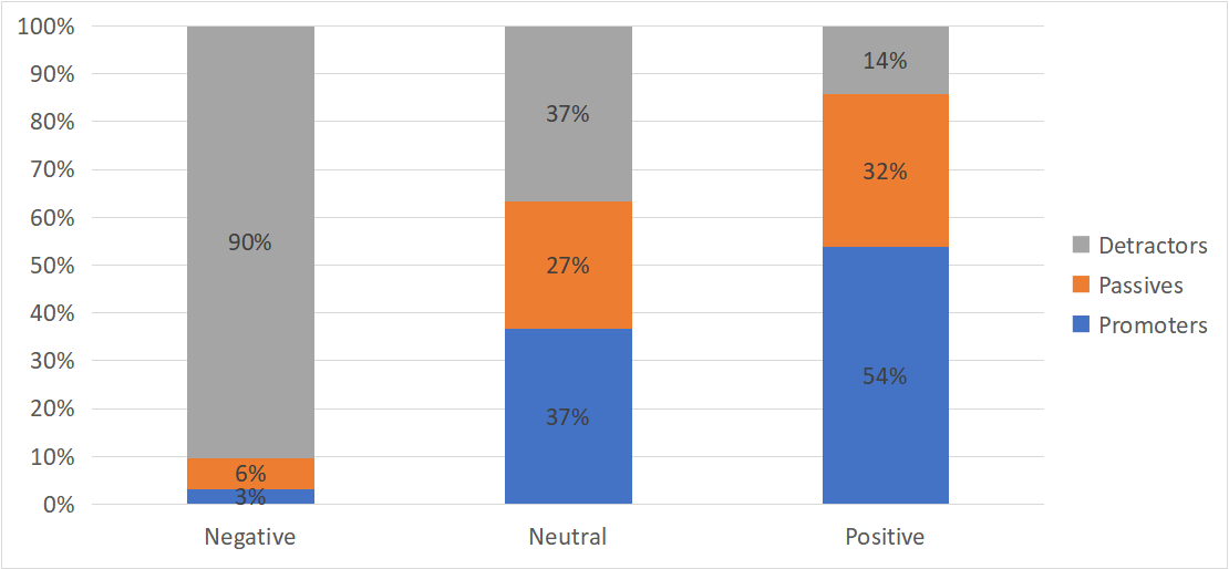
Figure 4: Percent of positive or negative comments associated with each NPS classification.
If your organization uses a five-point Likelihood to Recommend scale (5 = extremely likely and 1 = not at all likely), there are similar patterns, albeit on a more compressed scale (see Figure 5 ). At a response of 3, the ratio of positive to negative comments also flips—making responses 3 or below also good designations for detractors. At a score of 3, a customer is almost four times as likely to make a negative comment about their experience than a positive comment.
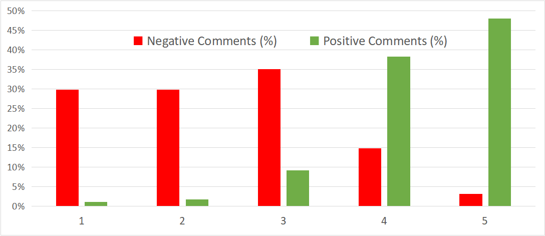
Figure 5: Percent of positive or negative comments associated with each LTR score from 1 to 5 (for companies that use a 5-point scale).
Summary & Takeaways
An examination of 452 open-ended comments about customers most recent experience with nine prominent brands and products revealed:
- Detractors accounted for 90% of negative comments. This independent evaluation corroborates the earlier analysis by Reichheld that found detractors accounted for a majority of negative word-of-mouth comments. This smaller dataset actually found a higher percentage of negative comments associated with 0 to 6 responses than Reichheld reported.
- Six is a good threshold for identifying negative comments. The probability a comment will be negative (negative word of mouth) starts to exceed positive comment probability at 6 (on the 11-point LTR scale) and 3 (on a 5-point scale). Researchers looking at LTR scores alone can use this threshold to provide some idea about the probability of the customer sentiment about their most recent experience.
- Repurchase and referral rates need to be examined. This analysis didn’t examine the relationship between referrals or repurchases (reported and observed) and likelihood to recommend, a topic for future research to corroborate the promoter designation.
- Results are for specific brands used. In this analysis, we selected a range of brands and products we expected to represent a good range of NPS scores (from low to high). Future analyses can examine whether the pattern of scores at 6 or below correspond to negative sentiment in different contexts (e.g. for the most recent purchase) or for other brands/products/websites.
- Think probabilistically. This analysis doesn’t mean a customer who gave a score of 6 or below necessarily had a bad experience or will say bad things about a company. Nor does it mean that a customer who gives a 9 or 10 necessarily had a favorable experience. You should think probabilistically about UX measures in general and NPS too. That is, it’s more likely (higher probability) that as scores go down on the Likelihood to Recommend item, the chance someone will be saying negative things goes up (but doesn’t guarantee it).
- Examine your relationships between scores and comments. Most companies we work with have a lot of NPS data associated with verbatim comments. Use the method of coding sentiments described here to see how well the detractor designation matches sentiment and, if possible, see how well the promoter designations correspond with repurchase and referral rates or other behavioral measures (and consider sharing your results!).
- Take a measured approach to making decisions. Many aspects of measurement aren’t intuitive and it’s easy to dismiss what we don’t understand or are skeptical about. Conversely, it’s easy to accept what’s “always been done” or published in high profile journals. Take a measured approach to deciding what’s best (including on how to use the NPS). Don’t blindly accept programs that claim to be revolutionary without examining the evidence. And don’t be quick to toss out the whole system because it has shortcomings or is over-hyped (we’d have to toss out a lot of methods and authors if this were the case). In all cases, look for corroborating evidence…probably something more than what you find on Twitter.
