 If you took an intro to stats class (or if you know just enough to be dangerous), you probably recall two things: something about Mark Twain’s “lies, damned lies …,” and that your data needs to be normally distributed.
Turns out both are only partly true. Mark Twain did write the famous quote, but he attributed it to Benjamin Disraeli (and there’s no record of Disraeli saying that). The second about normal data is also partly true, but as with most things in statistics, it’s nuanced and complicated.
Earlier (well, over 10 years ago, but who’s counting), we wrote about the non-normality of Net Promoter Score data. The same points we wrote about then also apply to other types of UX data collected in surveys and usability evaluations. It’s worth repeating some of those points here because, understandably, researchers want to avoid analytical methods that are potentially misleading.
First, a note on what we mean by normality.
What It Means to Be Normal
A normal distribution (sometimes called a Gaussian distribution so you can sound smarter) refers to data that, when graphed, “distributes” in a symmetrical bell shape with the bulk of the values falling close to the middle.
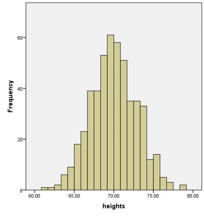
Normal distributions can be found everywhere. Height, weight, and IQ form some of the more well-known normal distributions. Figure 1 shows the distribution of the heights of 500 North American men.
You can see the characteristic bell shape. The bulk of values fall close to the average height of 5’10” (178 cm) and roughly the same proportion of men are taller or shorter than average.
But does that happen with UX data?
UX Data Doesn’t Look Normal
Figure 2 shows graphs of four popular UX metrics: a binary completion rate (0 = fail and 1 = success), the post-task Single Ease Question (SEQ®), task time from 134 users from a recent benchmarking study on educational software, and System Usability Scale (SUS) scores from a 2012 benchmark on an automotive website from 343 participants.
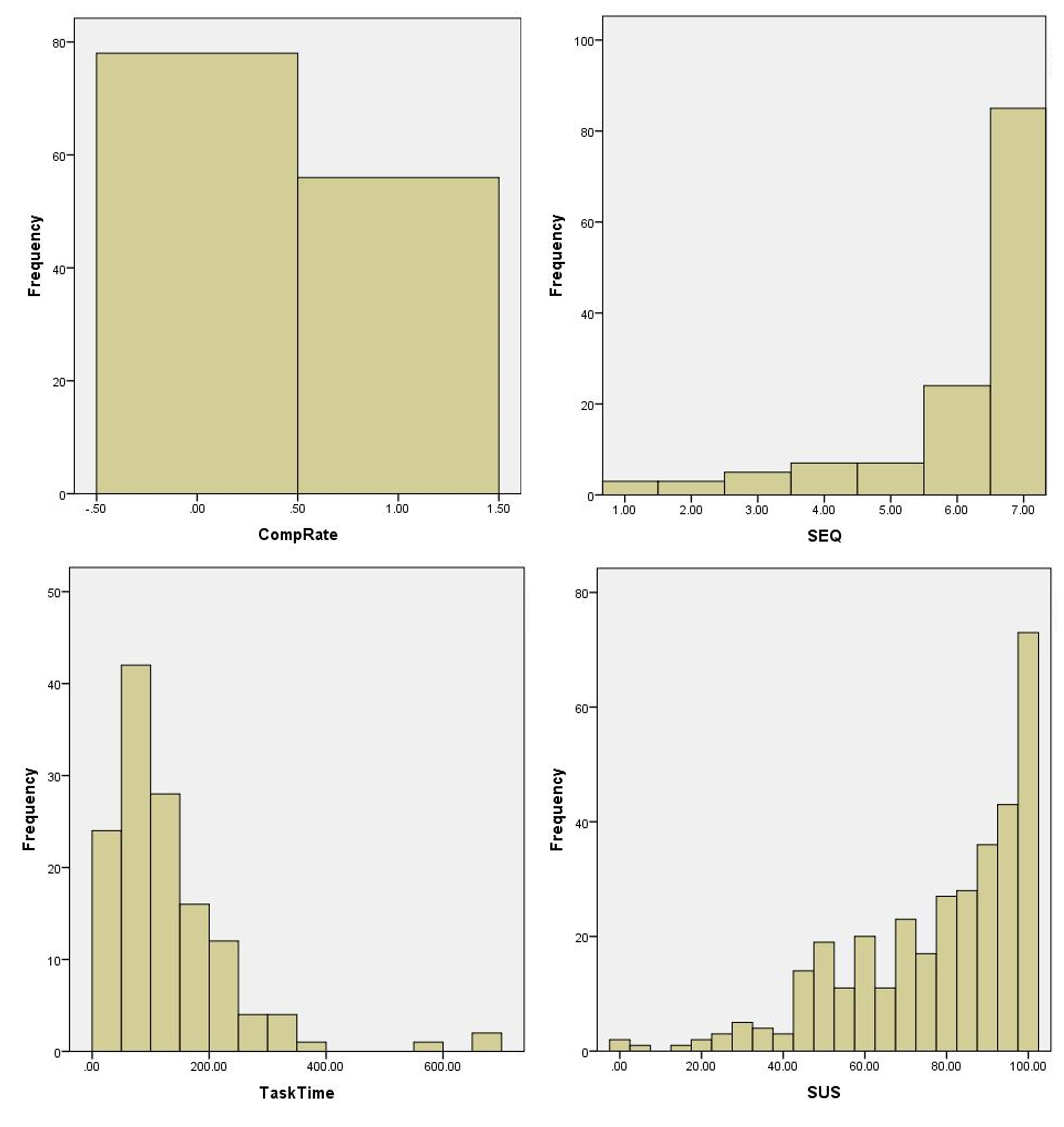
The graphs look neither bell-shaped nor symmetric. It’s no wonder researchers have concerns about using common statistical techniques such as confidence intervals, t-tests, and even means and standard deviations! But why should we even care about normality?
Why Normality Is Important
Normality is important for two reasons:
- Sampling error patterns: Many statistical tests assume sampling error is normally distributed.
- Accurate estimates of parameters: The normal distribution is also used as a model to allow us to estimate parameters of central tendency (middle of a distribution, usually the mean) and the chances of certain values occurring (such as the chance of being 6’7″). We can’t speak accurately about the percentage of responses above and below the mean, for example, if the distribution of our data is not normal.
Sampling Error and What It Looks Like
When we sample a portion from a population of users or customers, the metrics we collect from the sample will differ from the population metrics. When we calculate the mean from a sample, it estimates the unknown population mean. It is almost surely off—over or under—by some amount.
The difference between our sample mean and population mean is called sampling error. Sampling error is one of the four horsemen of survey errors, but it also applies to non-survey UX data such as completion rates and time.
Many statistical tests assume that the distribution of sample means is normally distributed. When the raw data is normal, the sampling distribution will also be normally distributed (looking like the bell curve in Figure 1). But when the data doesn’t look normal, what happens to the sampling distribution of means?
The distribution of sample means is theoretical. In theory, we would sample from our population, compute the mean, graph it, and repeat this process millions of times. But, of course, we can’t do that. So how can we graph sampling error to see what it looks like?
An alternative approach to visualize the sampling error distribution is based on the concept of statistical bootstrapping (not to be confused with self-funded business bootstrapping, although there are some similarities). We can take our sample of data and then take smaller samples, compute the mean, graph that, and iterate. In this way, we use a few lines of code to simulate the hypothetical exercise by repeatedly taking a lot of smaller random samples from a larger sample of data.
The Distribution of Sample Means
To graph the distribution of sample means (sample error) we wrote a small computer program that randomly takes a sub-sample of 10, 20, 30, and 50 data points from the larger samples of four UX metrics shown in Figure 2 (which had 134 task-based and 343 SUS responses). After each iteration, the program would replace all the values (called sampling with replacement).
Figure 3 shows the graphs of each distribution of sample means for the four UX metrics at each sample size.
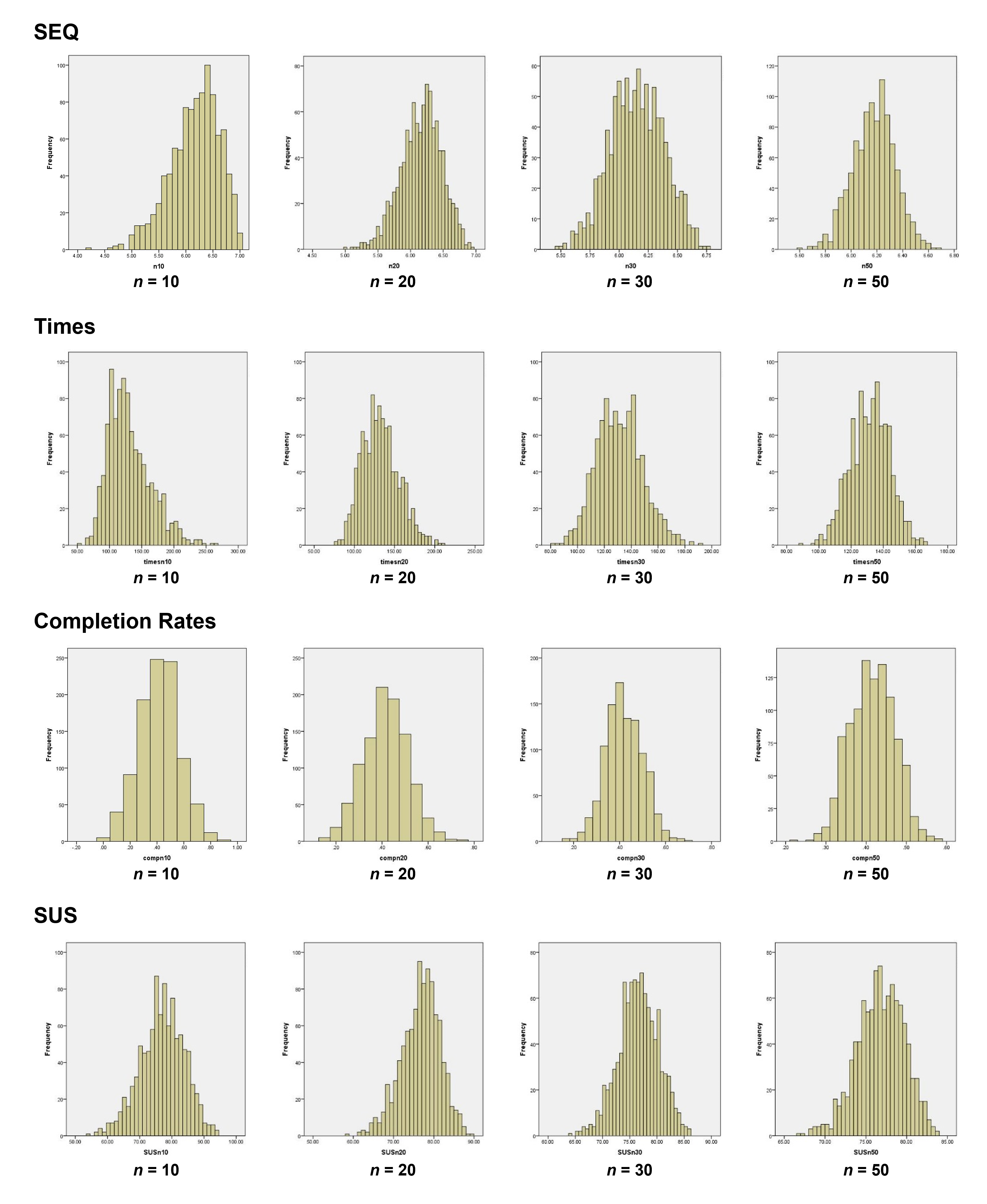
The distribution of the SEQ means at sample sizes of 20, 30, and 50 are bell-shaped, symmetrical, and normal. Even when the sample size is as small as 10, they approach a normalized look. That’s despite the raw scores looking very skewed and non-normal!
We can see this same pattern for the time, SUS, and even the binary completion rates. The slight irregularities in the bars on each histogram are mostly a function of how the software (SPSS) creates the “bins,” often rounding at odd points. But all rapidly show the characteristic bell-shaped distribution despite the raw data looking very far from normal. In other words, the sampling distribution is normally distributed.
Technical Note: One approach to assess normality is to use a normality test that generates a p-value. These tests of normality tend to be either underpowered when n is small or overly sensitive to minor deviations from normality when n is large, so we do not recommend them. Looking at the data in a normal probability plot (also called a Q-Q plot) provides the most reliable assessment of normality. We used histograms here because it’s easier to recognize the famous bell shape.
The Central Limit Theorem
What we’re seeing in action is something called the Central Limit Theorem. It is one of the most important concepts in statistics. It basically says that the distribution of sample means will be normal regardless of how ugly and non-normal your population data is, especially when the sample size is above 30 or so.
As we can see from the re-sampling exercise, the Central Limit Theorem often kicks in at sample sizes much smaller than 30 (the sample of 10 looks roughly normal). Exactly how normal the data appear, and at what sample size, will depend on the data you have.
Even when sampling distributions are not normal for small sample sizes (less than 10), statistical tests—for example, confidence intervals, t-tests, and ANOVA—still perform quite well. When they are inaccurate, in most cases the typical absolute error is a manageable 1% to 2% (Boneau, 1960; Box, 1953).
In other words, when you think you’re computing a 95% confidence interval, it might be only a 94% confidence interval; an observed p-value of .05 might actually be .04 or .06.
In short, for most UX data from larger sample sizes (above 30) don’t worry too much about population normality. For smaller sample sizes (especially below 10) you may find a modest but tolerable amount of error in most statistical calculations.
When the Population Distribution Matters and What to Do About It
While the shape of your sample data probably doesn’t affect the accuracy of statistical tests, it can affect statements about what percent of the population scores fall above or below the average or other specific points.
Rating Scale Data
Consider a statement such as “We can be 95% sure half of all users provided an SEQ rating above the observed average of 6.2.” Using the mean to generate statements like this assumes the data are symmetrical and roughly normal. We can see from Figure 2 that this is not the case for the SEQ or the other UX data.
With rating scale data, the solution is easy. If you want to make statements about the percent of users that score above a certain point, just count the discrete responses over that point. For example, suppose 67 of the 134 users (50%) provided scores of 6 or 7 (top-two-box score). Using a binomial confidence interval, we can be 95% confident between 42% and 58% of all users would provide a score of 6 or 7.
Time Data
Another alternative is to transform the scores so that they follow a normal distribution, for example, a log transformation. We recommend this corrective procedure when working with small samples (n < 25) of task-time data. With normally distributed, transformed data, even these percentage statements are accurate.
Binary-Discrete Data
Binary data—0s and 1s—is maximally discrete, and depending on the underlying proportion, can require relatively large sample sizes to approach normality and for the distribution of means to approach continuity. One of the reasons the adjusted-Wald binomial confidence interval, which we recommend, works well with small samples is because its adjustment of the proportion helps to smooth the distribution of means.
Summary
Is UX data normally distributed? No, it’s not. But it shouldn’t be of much concern when running statistical tests to compare means (for example, for a t-test or ANOVA), especially when your sample size is reasonably large (> 30). When the data do depart from normality, most statistical tests still generate reliable and accurate results, even with small sample sizes (< 10).
When sample sizes are small and the underlying distribution is very non-normal (such as with binary completion rates), be careful when estimating the center of a population (like the average rating or average time) and putting an interval around the most likely range for the population averages. Keep in mind that there are methods for restoring the accuracy of confidence intervals (e.g., log transformation for times and adjusted-Wald transformation for binomial confidence intervals).
Normality is a concern when making statements about percentages of the population that score above or below certain values. In such situations, use the response frequencies or transforming the data are appropriate alternatives.
While you can’t ignore the normality of your data, we think it should be less of a concern than its representativeness. That is, be sure your sample is representative of the population you’re making inferences about.


