 The seven-point Single Ease Question (SEQ®) has become a standard in assessing post-task perceptions of ease.
Since the SEQ’s inception, we have collected data from thousands of task experiences to generate a normalized database of scores. We have also established its strong correlation to task completion and task time.
Over the years, some researchers have created variations in how the SEQ is displayed, and we wanted to understand their potential impacts on scores.
Other than changing the number of points, we have also wanted to understand the impact of other slight variations on the presentation of the scale, including numbering, labels, and orientation (polarity).
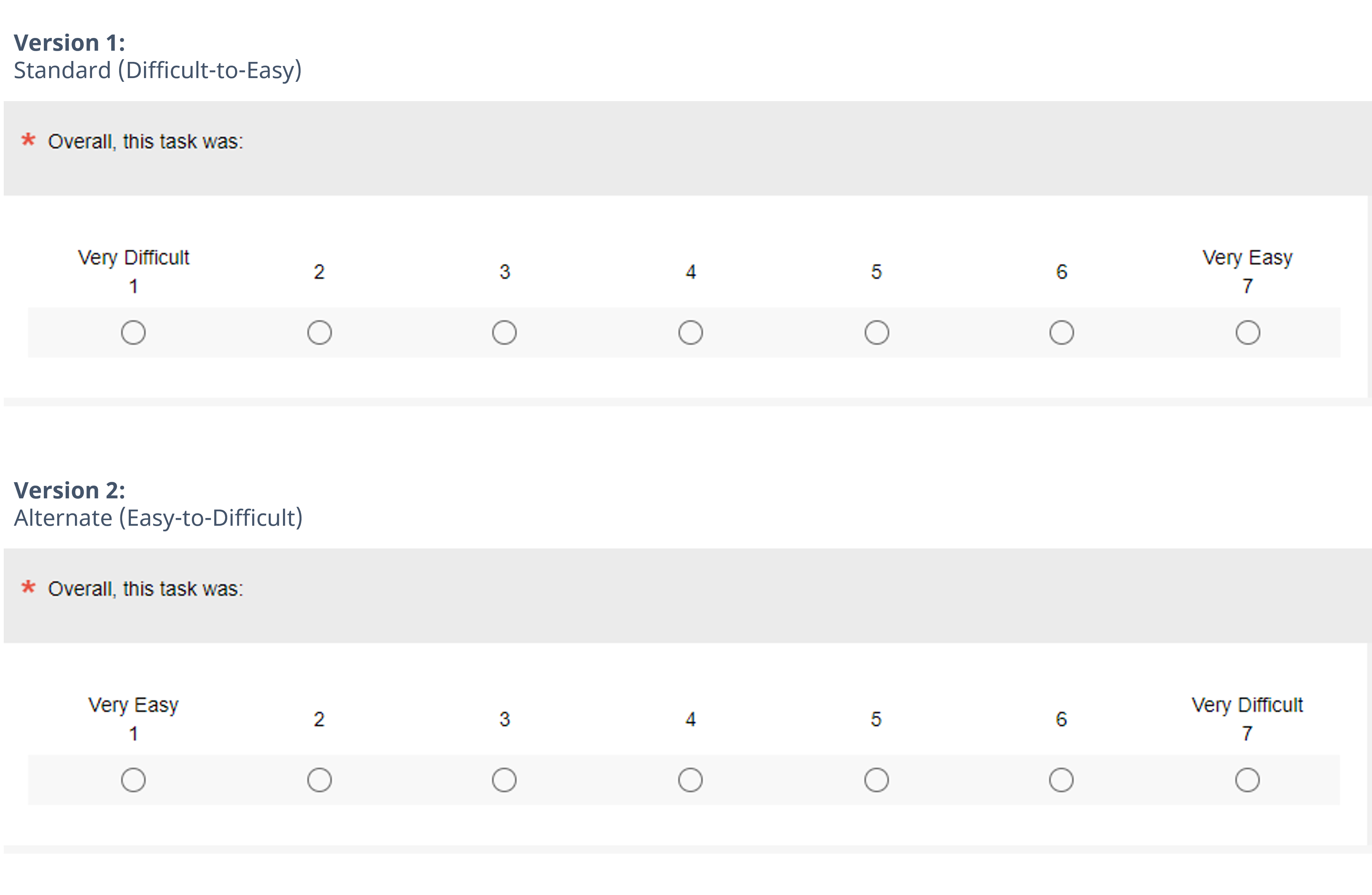
We recently investigated mean differences for data collected using the two SEQ formats (Figure 1) in a within-subjects Greco-Latin square design that, in addition to manipulation of item format, also manipulated task difficulty. The versions only differed in the polarity of their endpoints (Very Difficult on the left for standard; Very Easy on the left for alternate).
It seemed plausible, through a combination of left-side and acquiescence bias, that the scale format would affect mean scores, producing significantly higher means for the alternate version. What we found, however, was that the differences in SEQ format did not significantly or consistently affect SEQ means, overall or when analyzed by task difficulty, for either within- or between-subjects analyses.
Case closed. Or so we thought.
For this article, we shift our focus from the mean SEQ to analyses of whether the item formats had significant effects on response distributions. We investigate the presence or absence of a left-side bias, for which this experimental design is uniquely capable. As we detail in this article, we found an interaction effect: some differences emerged as a function of task difficulty, especially when a task is hard to complete.
Experimental Design: SEQ Standard vs. Alternate Formats
Using our MUIQ® platform for conducting unmoderated remote UX studies, we set up a Greco-Latin experimental design to support a within-subjects comparison of standard and alternate versions of the SEQ in the contexts of attempting easy and hard tasks.
- Easy: Find a blender on the Amazon website for under $50. Copy or remember the name of the blender brand.
- Hard: Please find out how much the monthly cost of an iPhone 12 with 64GB of storage with service for one line is on the AT&T website. Copy or remember the monthly cost (including all fees).
We collected data from 301 participants (sampled in February and March 2022 from a U.S. panel provider). After attempting each task, participants completed either the standard or alternate version of the SEQ, following the experimental design. After completing both tasks, they indicated whether they preferred the standard or alternate format.
In this experimental design, there were three independent variables:
- Item Format: Standard or alternate, as shown in Figure 1
- Rating Context: Easy or hard task
- Order of Presentation: The Greco-Latin design had four orders of presentation (standard/easy then alternate/hard (n = 75); standard/hard then alternate/easy (n = 75); alternate/easy then standard/hard (n = 76); alternate/hard then standard/easy (n = 75))
Participants were randomly assigned to one of the four orders of presentation. Across the experiment, this controls for the “nuisance” variables of Rating Context and Order of Presentation while enabling balanced analysis of item format and task difficulty.
Results
Our first analyses determined whether there were significant differences in top-box and top-two-box scores, where “top-box” is defined as the percentage selection of “Very Easy” (response option of 7 in the standard format and 1 in the alternate format). We then investigated whether there was evidence for a left-side selection bias. This analysis used all the data collected in the study (n = 301, 602 ratings, one for each participant and each of the two tasks).
Inside every within-subjects experimental design is a between-subjects design defined by the first task experienced by the participants. Focusing on the first task results in the loss of half the data in this experiment (dropping the data from the second task so there is one rating per participant rather than two). However, this enables analysis of the effects of interest without the possibility of asymmetric transfer from the first to the second task across the Greco-Latin experimental design. We conducted both types of analyses (within-subjects design using all data and between-subjects design using first-task data).
Did Item Format Affect Response Distributions?
Within-Subjects Analyses on Full Data: No Main Effects
Figure 2 shows the overall response distributions collapsed over task difficulty. Combined this way, the distributions are similar, with no significant difference for top-box or top-two-box percentages.0
Statistical Tests: McNemar test: Top-Box − z = 0.07, p = .94, observed difference = 0.3% with 95% confidence interval from −8.5 to 9.2%; Top-Two-Box – z = 0.60, p = .55, observed difference = 2.7% with 95% confidence interval from −6.0 to 11.3%.

Interaction Effect: Hard Tasks Generated Different Results
The story changed a little when we separately analyzed top-box data from easy and hard tasks, as shown in Figure 3.
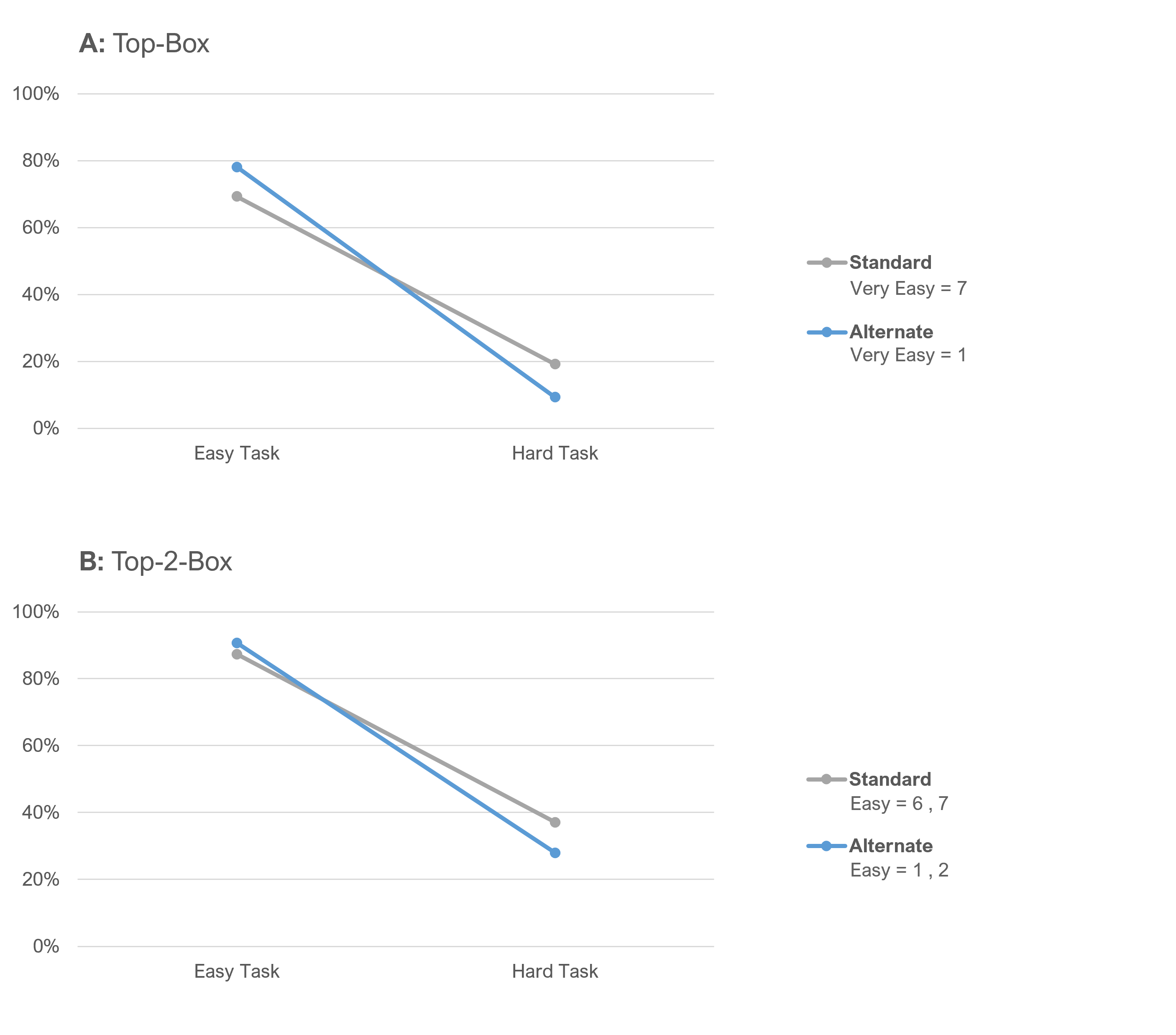
Notice that the lines in Figure 3 cross, indicating an interaction effect. If there were no interaction effects, the links would be parallel. While the data is similar when the task was easy, there was an unexpected divergence when the task was hard, especially noticeable in the top-box scores.
Table 1 provides more detail on what we’re seeing in Figure 3. It contains the results of N−1 Two-Proportion tests with 95% confidence intervals for the comparison of top-box (extreme Easy responses) for easy and hard tasks.
| Task Type | Box Type | z | p | d | lower | upper |
|---|---|---|---|---|---|---|
| Easy Task | Top-Box | 1.73 | 0.08 | 8.8% | −1.2% | 18.6% |
| Hard Task | Top-Box | 2.44 | 0.01 | 9.9% | 1.9% | 17.6% |
| Easy Task | Top-2-Box | 0.94 | 0.35 | 3.4% | −3.8% | 10.5% |
| Hard Task | Top-2-Box | 1.70 | 0.09 | 9.1% | −1.5% | 19.5% |
Table 1: Standard vs. alternate comparisons of extreme Easy response percentages for easy and hard tasks (all data).
The outcomes for top-box and top-two-box were similar, but the magnitudes of the differences were attenuated for top-two-box relative to top-box results. The only clearly significant difference was for top-box scores from the hard task (p < .01), while the only clearly nonsignificant difference was for top-two-box scores from the easy task (p < .35).
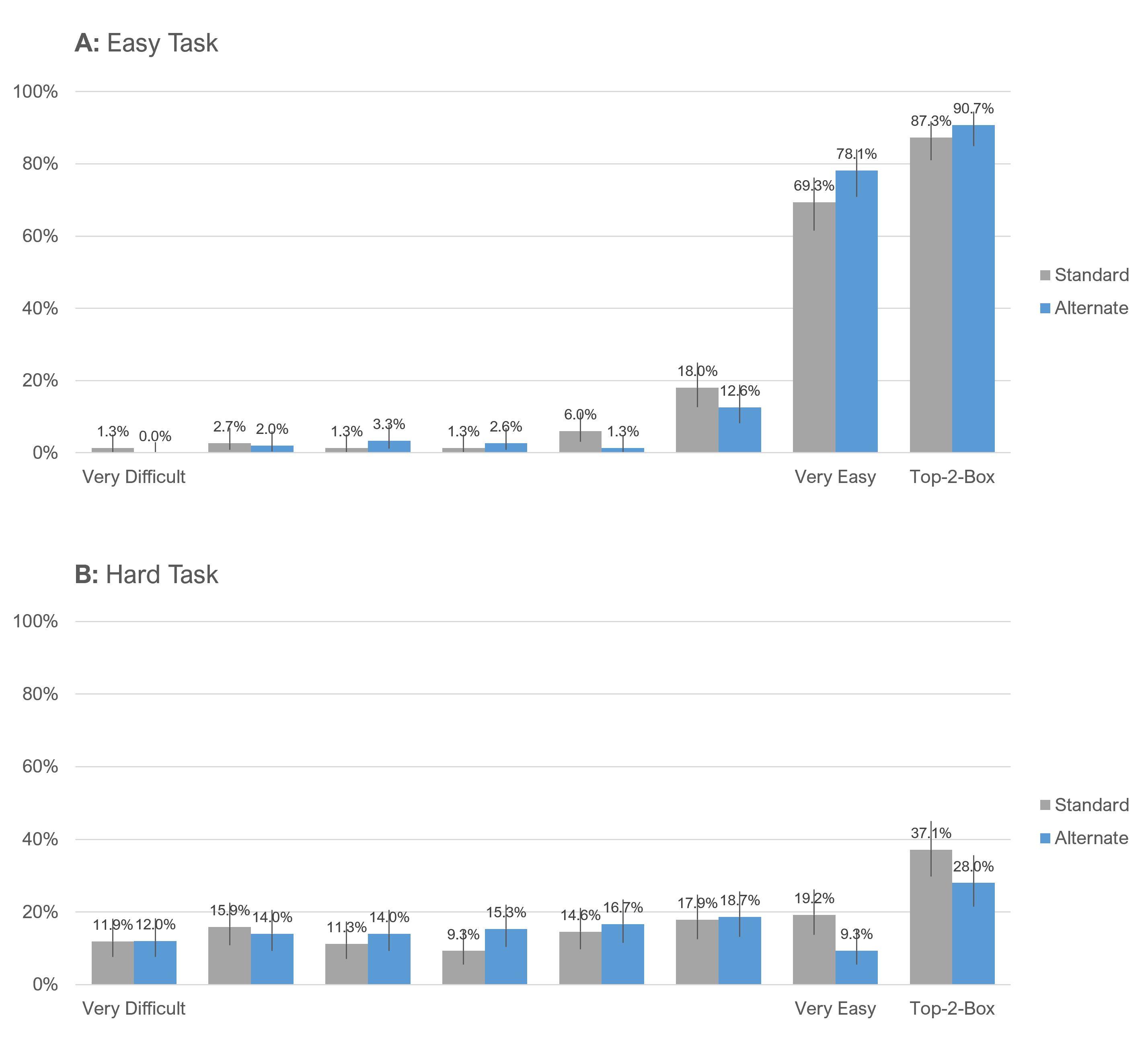
We can see the interaction effect in Figure 4, which shows the full response distributions for these comparisons. In particular, notice Tile B where the top-box score (Very Easy) differed by 9.9 points for the hard task.
Analysis of Initial Ratings Only (Between-Subjects Analyses)
To remove possible carryover effects from our experimental design from the multiple ratings, we looked at just the initial ratings by each participant.
The SEQ distributions for initial ratings showed a similar but stronger pattern as we saw with the full sample, especially for the hard task. Figure 5 shows the top-box and top-two-box analyses.
Again, we see strong visual evidence of an interaction effect. Notice the separation of the points on the hard task.
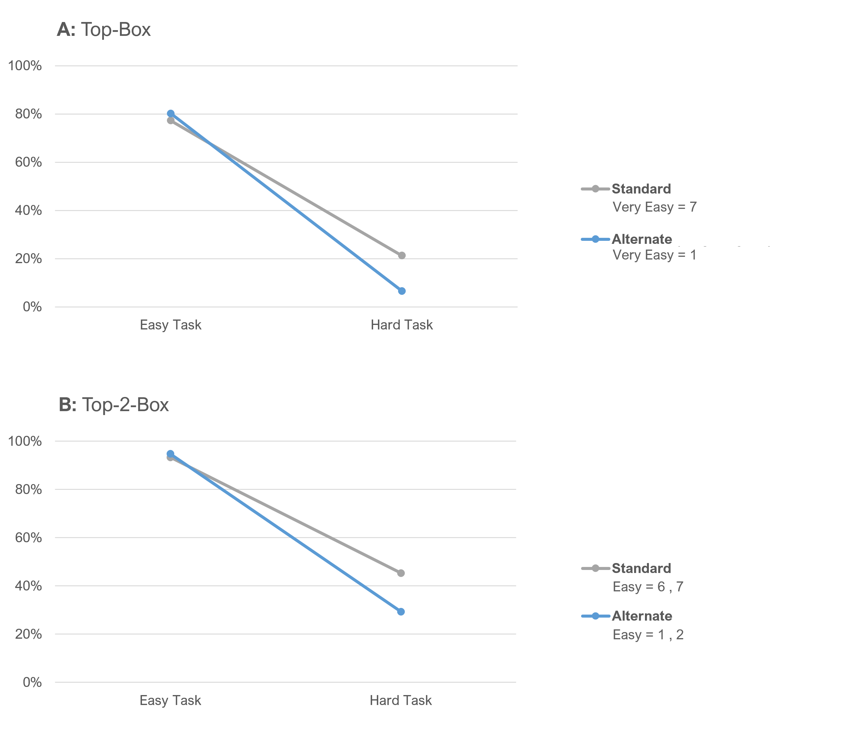
Table 2 confirms the interaction effect is statistically significant for top-box and top-two-box scores for the hard task.
| Task Type | Box Type | z | p | d | lower | upper |
|---|---|---|---|---|---|---|
| Easy Task | Top-Box | 0.44 | 0.66 | 2.9% | −10.2% | 15.9% |
| Hard Task | Top-Box | 2.58 | 0.01 | 14.7% | 3.3% | 25.3% |
| Easy Task | Top-2-Box | 0.36 | 0.72 | 1.4% | −6.7% | 9.5% |
| Hard Task | Top-2-Box | 2.02 | 0.04 | 16.0% | 0.5% | 30.7% |
Table 2: Standard vs. alternate comparisons of extreme Easy response percentages for easy and hard tasks (initial ratings).
Figure 6 shows the full response distributions for the between-subjects (initial ratings) portion of the data. Again, notice the large separation in ratings between the standard and alternate for the Very Easy rating in Panel B for the hard task—a substantial 16-point difference.

These analyses demonstrated an interaction between SEQ format and task difficulty. Top-box and top-two-box percentages were almost the same for both formats in the easy task but were significantly different in the hard task. But why?
Was There Evidence of a Left-Side Bias?
So, we have evidence of differences in extreme SEQ ratings of Easy when a task is difficult, but is there any evidence that this might be due to or at least influenced by a left-side bias?
Because the experimental design for this study was balanced, one way to check for a left-side bias is to ignore everything about SEQ format and task context, and just count the number of selections of 1 and 7 across all the data. If there’s a consistent left-side bias, there should be more selections of 1 than 7.
Because each participant in the study provided two SEQ ratings, there were a total of 602 SEQ ratings. Of those 602 ratings, there were 152 selections of 1 (25.25%) and 151 selections of 7 (25.08%), a difference of just 0.17%.
Focusing on just the 301 initial ratings, we found 75 selections of 1 (24.92%) and 80 selections of 7 (26.58%). Not only is this difference not statistically significant (N−1 Two-Proportion Test: z = 0.47, p = .64, observed difference = 1.66% with 95% confidence interval from −5.3 to 8.6%), there were more selections of 7 than 1—the opposite of what you would expect if a robust left-side bias was present.
This pattern is also evident in Figure 5, which showed no difference in initial selection frequency for 1 and 7 for the easy task, but significantly more selection of 7 than 1 for the hard task.
What’s Causing the Interaction Effect?
If left-side or right-side (acquiescence) biases aren’t good explanations, what could be causing the interaction effect between versions? We’re not quite sure, but we do see something happening.
When tasks are harder, participants appear to be more repelled by the Very Easy (1) option on the left side and/or attracted by the Very Difficult (7) option on the right side. We’ll look to isolate these effects in future studies.
Summary and Takeaways
Following up on our earlier analysis of mean SEQ from this experiment, which found that the differences in SEQ format did not significantly or consistently affect SEQ means, overall or when analyzed by task difficulty, for either within- or between-subjects analyses, we turned our attention to frequency analyses.
When combining data across all the conditions other than SEQ format (Figure 2), the distributions of response frequencies were very close. However, when we looked for interactions in response frequency as a function of task difficulty, we found a consistently significant difference in the selections of extreme responses of Very Easy (“top-box”) when the task was difficult (Figure 5). Additional analyses eliminated the hypothetical left-side bias as a potential contributor to the significant differences.
If there’s no left-side bias in play, then how might we account for this difference in response distributions of Very Easy between the SEQ formats when tasks are hard? There’s no compelling justification for hypothesizing a right-side bias. Any acquiescence bias should also be evenly distributed across this experimental design, so that’s not an answer. There is always the possibility that despite its statistical significance in this experiment, it was a fluke (Type I error), which can only be investigated through replication. Whether or not we can explain it, the effect was consistent in this data.
Takeaway 1: UX practitioners can consider these SEQ formats to be “mean equivalent.” In other words, as long as your key dependent measure is the mean of the SEQ, you should get the same result with either format.
Takeaway 2: UX practitioners should not consider these SEQ formats to be “distribution equivalent.” If your key dependent measure will be a top-box or top-two-box score based on SEQ ratings, then you can’t count on getting the same result with the different formats, especially if your tasks tend to be difficult.
Takeaway 3: Unless there is a compelling reason to do otherwise (e.g., comparison with historical data), we recommend using the standard format for SEQ response options (Difficult–Easy). This will improve the consistency of UX measurement, and we know from experience that communicating with stakeholders is easier when higher numbers represent a better outcome.

")
