 Many factors, including features and price, influence whether customers recommend software products.
But usability consistently tops the list of key drivers of customer loyalty.
Typically, usability accounts for between 30% and 60% of the “why” when customers do or don’t recommend products.
A positive experience leads more customers to recommend a product. A negative experience, predictably, causes customers to actively discourage others from buying a product.
With our panel partner, Op4G, we collected data from over 2100 participants to learn about their attitudes toward the functionality and usability of a mix of popular software products. This was an update to data we collected on a similar set of products in 2011 using a similar methodology.
The products include:
- Adobe Photoshop
- Adobe Reader
- AutoCAD
- Black Board
- DropBox
- GitHub
- Google Calendar
- GoTo Meeting
- HootSuite
- iTunes
- McAfee Anti-Virus
- Microsoft Excel
- Microsoft PowerPoint
- Microsoft Word
- Mint
- QuickBooks
- Quicken
- Sales Force
- TurboTax
- WebEx
Participants came from the US. A bit over half (57%) were female, and the average age was 33. Participants were asked a number of loyalty and usability questions, including the likelihood-to-recommend question, used to compute the Net Promoter Score* and the System Usability Scale (SUS), the most common measure of overall usability. While the sample characteristics weren’t identical to those in the 2011 sample, they include similar user profiles and do enable us to make comparisons.
* My friends at Satmetrix want to be sure you know that Net Promoter, NPS, and Net Promoter Score are trademarks of Satmetrix Systems, Inc., Bain & Company, and Fred Reichheld
Net Promoter Scores
The Net Promoter Score is calculated using the 11-point (0 to 10) likelihood-to-recommend question. It is computed by subtracting the percent of detractors (0-6) from the percent of promoters (9-10).
Across all 20 products the average Net Promoter Score is a 15% with a range of -26% to 40%. Google Calendar, DropBox, and TurboTax got the highest Net Promoter Scores. (A full list of product Net Promoter Scores can be purchased in the detailed benchmark report.) This is slightly (and not statistically significantly) lower than the average Net Promoter Score of 21% for the data we collected in 2011.
McAfee Antivirus moved from a -22% in our 2011 data to 10%. Microsoft Word saw the biggest drop, from an NPS of 44% in 2011 to 8% now. Excel and PowerPoint were flat, suggesting that Microsoft’s drop isn’t exclusively due to Microsoft’s new SaaS-based Office 365 model. It may instead be due to the threat of the free Open Office. One participant stated why he was less likely to recommend Word:
“Microsoft Word is wonderful, but if you don’t already have a full copy provided with your computer the price is a bit out there. So depending on my friends’ computer preinstalls or their budget, I may suggest Open Office instead.”
iTunes and AutoCAD also dropped in Net Promoter Scores while Quicken saw a major increase.
Note that Net Promoter Scores have twice the margin of error as other metrics, so some changes that we observed and which we called out in the report are due to mere statistical noise.
The importance of product-level benchmarks
Net Promoter Scores can vary substantially within a company. Products in the Microsoft Office Suite varied by 28 percentage points and Intuit’s products (Quicken, TurboTax, QuickBooks and Mint.com) varied by 27 points. Isolating your benchmark to the relevant product enables you to home in on what needs improving, especially in cases where the consumer may recognize the product without knowing the company that makes it.
Did you recommend (Retro Recommend Rate)
In addition to asking customers how likely they are to recommend (in the future), I asked whether they had in fact recommended any products in the past 12 months. Humans are notorious for being poor predictors of their future behavior, so this information nicely complements the likelihood-to-recommend question.
Across all products the average retro recommend rate was 29%. For the average product, in other words, around one third of the participants said they did recommend it to a friend or a colleague.
Some additional data points: Drop Box has 56% of current customer reporting a retro recommendation whereas Microsoft Word has 10%.
Product Referral Rates
Another great measure of customer loyalty is the referral rate: the percentage of customers to whom the product was recommended. Again, this is another way to gauge word of mouth as a supplement to the retro recommend rate and likelihood-to-recommend rate.
Across all products the average referral rate was a 40%. This means, for the average product, a bit less than half the users said they were referred by a friend or a colleague to the product. The referrals for a product come from a high of 65% for SalesForce.com and a low of 16% for iTunes.
System Usability Scores (SUS)
I used the popular System Usability Scale (SUS) to compute the perceived ease of use of the 20 products. SUS is a 10-item questionnaire with possible scores ranging from 0 to 100. The average SUS score from over 500 products (including websites and business software) is a 68. The average SUS score from this group is a 72, with a low score of 59 and high score of 82.
I converted the raw SUS scores to percentile ranks and found that the average score translates into a 63%–meaning this group of products has higher perceived usability than 63% of all products tested. This is almost exactly the same average SUS score (73) we saw in 2011.
The biggest drop we observed was with iTunes. Participants rated its usability well above average in 2011, but that dropped from an 86 to a 72 in this year’s data. The drop may have resulted from bloated product features and from music-management options that have appeared since 2011. For example, one participant said,
“If I could use any other program for my iPod I would! iTunes is a pain in the rear and I hate using it. I’ll wait till I have a lot of music I want to download before I use it so that I can do it all in one day. Plus they are constantly having updates and changing the way the page looks. Every time I use it I have to figure out where they moved stuff to.”
TurboTax seems to have enduring usability, despite, or perhaps because of, its dreaded use case (filing taxes). One participant reported,
“I use TurboTax every year to file my income taxes as well as my mom’s. Its step-by-step format makes it extremely easy to complete my taxes. It is very user friendly.”
Learnability
Items 4 and 10 from the System Usability Scale provide a measure of learnability. TurboTax and Google Calendar had the highest learnability scores. Not surprisingly, the products that take time to master (and often require special skills) have the lowest learnability scores: Photoshop, SalesForce, and AutoCAD. This was borne out by three participants:
“Photoshop is hard to learn! Fortunately, there are tutorials everywhere online. I mean, there is a reason that there are classes solely created for learning Photoshop.”
“Photoshop is a professional graphics program that has a bit too much of a learning curve for someone who just wants to edit photos.”
“I always enjoyed using AutoCAD but it’s not easy to learn and really get your feet under you.”
Full SUS scores and learnability scores by product are provided in the benchmark report.
Usability & The Net Promoter Score
There is a strong correlation between usability and loyalty. In general, if a product has a higher SUS score, people are more likely recommending it. In this dataset, the SUS score has a strong positive correlation (r = .81) when correlated at the product level [pdf]. That means SUS scores here explain (predict) around 64% of Net Promoter Scores.
Illustrating this strong correlation, the graph below shows the SUS scores for detractors, passives, and promoters (computed at the individual level for all 2100 responses).
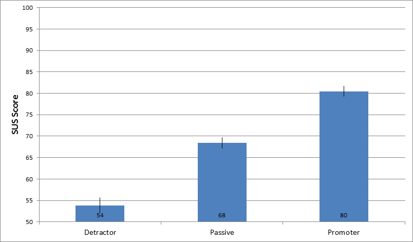
This figure shows that SUS scores above 80 are associated with promoters. The average SUS score for passives is the global average SUS score of 68. On average, detractors provide average SUS scores of 54. That SUS score falls at the 18th percentile.
These breakpoints are similar to the 2011 data which also showed that software products with the highest usability (those in the top-tenth percentile) are associated with the most positive word-of-mouth promotion.
Conclusion
For software products, include measures of customer loyalty and usability in any metrics program. Collect the metrics internally and at various levels of the product experience (overall, purchase process, and feature usage).
Third-party benchmarks perfectly complement internal metric programs because they include current and former customers. It’s a lot easier to know how well your product is doing if you know where it stands relative to the competition or the industry average.
The full list of benchmarks, and select verbatims, are available for purchase in 2014 Usability & Net Promoter Software Benchmark Report.


