 Happy New Year from all of us at MeasuringU®!
In 2021 we posted 49 articles and welcomed several new clients to our UX testing platform MUIQ®, where we continue to add new features to reduce the friction in developing studies.
We hosted our eighth UX Measurement Bootcamp, again as a virtual event. Going virtual still has its challenges, but the upside is that we had a fantastic group of 50 attendees from all over the world.
Building on the success of our virtual training and taking to heart the requests we’ve received, we are developing a new offering: through MeasuringUniversity™, we will make many of our courses and webinars available online, starting with this year’s webinars on the Net Promoter Score: Data, Drivers, and Diatribes, and continuing with the Evolution of the UX-Lite™.
If you’ve followed MeasuringU for a while, you know we don’t just regurgitate fluff content; we conduct original research and go deep on topics.
We covered a lot of topics in 2021, including UX metrics, methods, rating scales, and UX industry benchmarks. Here’s a summary of those articles with some takeaways from each.
Standardized UX Metrics
This year, two of our key initiatives were to develop well-grounded statistical methods for the analysis of Net Promoter Scores (NPS) and to create a new standardized metric, the UX-Lite™, derived from the UMUX-Lite.
Net Promoter Score
We published nine articles on the analysis of the NPS, and two on the more social aspects of the acceptance and use (or misuse) of this metric, plus the development of a new NPS calculator based on this research.
- Confidence intervals for Net Promoter Scores: While there have been prior methods for computing confidence intervals for the NPS, all fell short in some way. We started the year by laying out how to use an adjusted-Wald method and two alternate methods (trinomial means and bootstrapping) to compute confidence intervals for the NPS.
- Evaluating NPS confidence intervals with real-world data: In this article, we evaluated the three NPS confidence interval methods using data from 17 real-world NPS studies. When sample sizes were large the methods produced similar intervals, but the adjusted-Wald method was more precise at smaller sample sizes and had accurate coverage across a large range of sample sizes, making it the method of choice.
- How to statistically compare two Net Promoter Scores: We can use the same standard error calculation that comes from the method we recommend for generating accurate confidence intervals to compare Net Promoter Scores. We worked out how to use the adjusted-Wald method to conduct a test of significance between two NPS. (e.g., Figure 1).
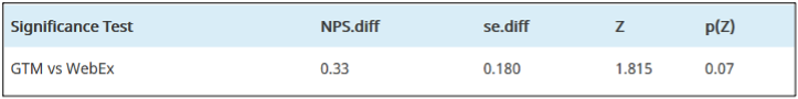
Figure 1: Significance test comparing the NPS for two online meeting services (GTM NPS: 19%, n = 36; WebEx NPS: −16%, n = 31), adjusted difference = 0.33 (33%), p = .07.
- Evaluating NPS significance tests with real-world data: We used sets of real-world NPS data to compare the new adjusted-Wald test of significance with two other ways of assessing NPS differences—a t-test using trinomial means and a randomization test. We found that the adjusted-Wald method worked as well as trinomial means, and both were better than the more conservative randomization tests. For consistency with using adjusted-Wald as the preferred method for confidence intervals, we recommend also using that method for significance testing.
- Sample size estimation for NPS confidence intervals: Once you work out a method for computing confidence intervals (from the standard error), a logical next step is to do the algebra to get a method for estimating sample sizes that will achieve specified precision objectives. In this article, we published the general formula plus a lookup table for common precision objectives. You are totally welcome!
- Sample sizes for comparing Net Promoter Scores: As we did for confidence intervals, we worked out sample size estimation processes to plan NPS comparison studies. To do this, we had to define and deal with different ways to best estimate NPS variability.
- How to compare a Net Promoter Score with a benchmark: This article described special considerations when conducting tests of significance against a specified benchmark, such as using one-tailed instead of two-tailed testing, and provided methods for making NPS benchmark comparisons with a test of significance or an appropriate confidence interval.
- Sample size estimation for NPS benchmark tests: A benchmark test compares one sample of data to a fixed criterion (e.g., is the NPS greater than 30%?). For this article, we worked out special formulas and a lookup table to help researchers estimate sample sizes when they need to exceed a specified NPS benchmark.
- How to statistically analyze Net Promoter Scores: We summarized the statistical methods we developed in 2021 for analyzing the NPS, including screenshots from our new NPS calculator (Figure 2). This article is a good place to get a high-level overview of the statistical calculations you need, letting you dive deep into the linked references.

Figure 2: Comparison of an NPS with a benchmark (from the MeasuringU NPS calculator).
- Campbell’s Law and the Net Promoter Score: One criticism of the NPS is that some enterprises have employee incentives that lead people to manipulate scores. This is an example of Campbell’s Law—the more you use a measure to make important decisions, the more it becomes susceptible to corruption.
- Why do people hate the Net Promoter Score? In addition to Campbell’s Law, we investigated other criticisms of the NPS. Some criticize the NPS for displacing other measures (e.g., satisfaction), and some enterprises force its use in contexts where it seems irrelevant (e.g., when recommendation makes little sense). Additionally, the NPS suffers from bad word-of-mouth from some leading UX personalities, and it can be overused or over-emphasized, leading to customer resentment. Rather than hating the NPS, however, UXers should understand and deal with the forces driving negative attitudes toward it.
UX-Lite™
The UX-Lite is a new questionnaire that evolved from the SUS and the UMUX-Lite. It has only two items, one measuring ease (“This website is easy to use”) and one measuring usefulness (“This website’s capabilities meet my requirements”).
The verbal complexity of the Usefulness item of the UMUX-Lite stands in stark contrast with the simplicity of its Ease item.
We continued the work we started in 2020, publishing nine articles on the UX-Lite (derived from the UMUX-Lite). Several of these articles describe our research to find measurement-equivalent but simpler wording for the metric’s Usefulness item (“This product’s capabilities meet my requirements”—originally published in Finstad, 2010).
We also published articles tracing the evolution of the UX-Lite from the UMUX-Lite and its predecessors and made some initial investigations into the best ways to predict System Usability Scale (SUS) scores from the UX-Lite. The new UX-Lite calculator is based on our research.
- Exploring another alternate form of the UMUX-Lite Usefulness item: In this article, we tested a proposed Usefulness alternate (“This website’s functions meet my needs”). The Usefulness alternates produced nearly identical UMUX-Lite means and top-two-box scores, but there was a significant difference in top-box scores.
- “Does what I need it to do”: Assessing an alternate Usefulness item: In this experiment, we compared the standard form of the UMUX-Lite Usefulness item with “This website does what I need it to do.” The UMUX-Lite means, top-box scores, and top-two-box scores were not significantly different, supporting the use of this alternate.
- The UMUX-Lite Usefulness item: Assessing a “Useful” alternate: We studied how well “This website is useful” worked as a Usefulness alternate. None of the effects we routinely assess in this type of study were significant (UMUX-Lite mean, top-box, and top-two-box scores), but the magnitudes of the effects were larger than we had seen in previous studies. We hypothesized that it might be easier for respondents to agree with something being useful than to agree it meets their needs.
- Replicating assessments of two UMUX-Lite Usefulness alternates: Because the initial results for the alternates “This website’s functions meet my needs” and “This website is useful” were not conclusive, we collected and analyzed more data. In these replications, the comparisons of “functions meet my needs” with the standard Usefulness item were small and nonsignificant, indicating that it is an acceptable alternate. The differences for “is useful” were relatively large and highly significant so, although it may be appropriate in some contexts as its own measurement, we do not recommend its use as an alternate for the Usefulness item.
- A review of alternates for the UMUX-Lite Usefulness item: Based on our research in 2020 and 2021, we found that UX practitioners can use any of five qualified versions of the Usefulness item:
- {Website}’s capabilities meet my requirements. (Original)
- {Website}’s functionality meets my needs. (Alternate)
- {Website}’s features meet my needs. (Alternate)
- {Website}’s functions meet my needs. (Alternate)
- {Website} does what I need it to do. (Alternate)
If five choices are giving you analysis paralysis, we tend to use “features meet my needs” as the default choice (for now).
- Measuring UX: From the UMUX-Lite to the UX-Lite: In this article, we reviewed the research that led from the UMUX-Lite (published in 2013) to a new metric, the UX-Lite, which we adapted from the UMUX-Lite. The article also shows examples and screenshots from our new UX-Lite calculator (Figure 3).
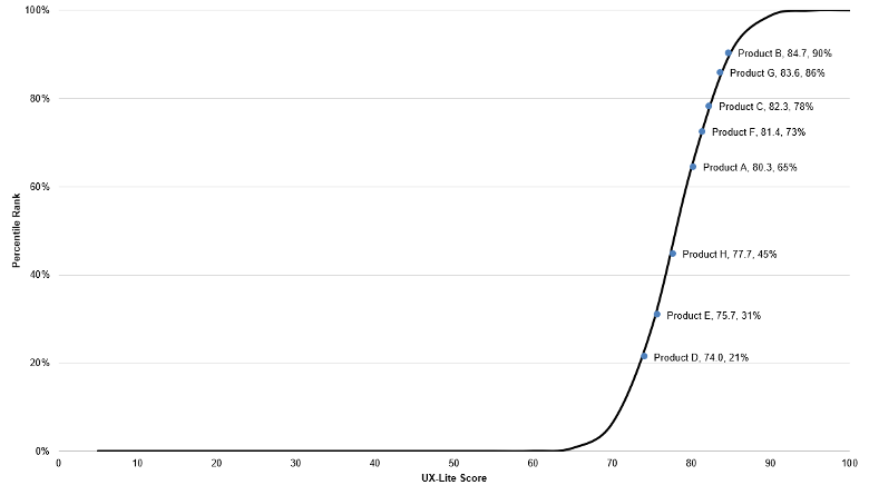
Figure 3: Example of a UX-Lite percentiles S plot.
- Evolution of the UX-Lite: This article traced the evolution of the UX-Lite, from standardized questionnaires created in the mid-1980s (SUS and TAM) through ISO-9241-11, up to adaptations developed and tested at MeasuringU.
- How to estimate SUS using the UX-Lite: We described three ways that researchers might estimate SUS from the UX-Lite: (1) use the UX-Lite as a direct proxy for SUS (two-item interpolation), (2) rescale the Ease item to a 0–100-point scale (one-item interpolation), or (3) use a regression equation derived from the Ease item.
- Accuracy of three ways to estimate SUS with the UX-Lite: Analysis of historical data in which UMUX-Lite and UX-Lite had been concurrently collected with the SUS showed that although direct comparison with UX-Lite scores works reasonably well, estimation was better when using either interpolation or regression based on just the Ease item—a finding that is both pragmatic and better grounded in usability theory.
UX Methods
This year, our articles on UX methods were devoted to survey methodology, including interpretation of survey questions, writing survey questions, types of survey errors, and picking the right type of survey question. Look for a new course (and book) on surveys for UX research coming to MeasuringUniversity in 2022.
- Five reasons to use open-ended questions: Reasons to use open-ended questions include conducting exploratory research, reducing bias, assessing unaided recall/awareness, following up after ratings, and revealing unanticipated events or attitudes.
- Seven ways to make survey questions clearer: To improve the clarity of survey questions, keep questions short, use simple language, prefer high- over low-frequency words, use the respondents’ vocabulary, minimize the use of acronyms, avoid complicated syntax, and avoid passive voice.
- Nine words to watch for when writing survey questions: When writing survey questions, there are nine words to watch for. Be cautious when using three absolutes (ever, always, never), the modal verbs (could, should, might, would), and ambiguous personal pronouns (you and our). Use them when they’re appropriate, but don’t use them thoughtlessly.
- Seven reasons people misinterpret survey questions: We discussed seven reasons people misinterpret survey questions: grammatical/lexical ambiguity, excessive complexity, faulty presuppositions, vague concepts, vague quantifiers, unfamiliar terms, and false inferences.
- Seven reasons survey questions are answered incorrectly: People answer survey questions incorrectly for a variety of reasons, including failure to encode a memory, forgetting, misinterpreting the question, flawed judgment or poor estimation, answer formatting, dishonesty, and not following instructions.
- Four types of potential survey errors: In this article, we discussed the four “horsemen” of survey sampling errors: coverage error (limited sample frame), sampling error (variability in the population), non-response error (some who are invited do not complete the survey), and measurement error (bias), and offered error reduction strategies for each type.
- Classifying survey questions into four content types: In survey design, question format follows content. Four important content types are attributes (e.g., demographics), behaviors (typically self-reports), abilities (assessment of knowledge/skill), and thoughts (including sentiments and judgments).
- A decision tree for picking the right type of survey question: We developed a taxonomy for selecting the right type of survey question, from the research goal to 17 question endpoints (see Figure 4).
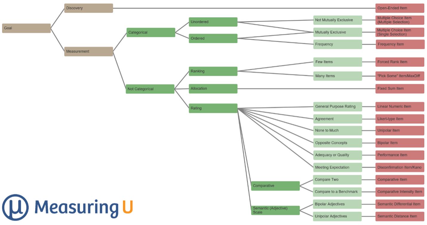
Figure 4: Decision tree for picking the right type of survey question.
- The anatomy of a survey question: When writing survey questions, it can be helpful to consider its anatomy, starting with the distinction between the stem and the response options, and then breaking the stem (as appropriate) into introduction, information, instructions, opinions, and the request.
- How to write a survey question: In addition to understanding its anatomy, if you’re struggling to write a survey question, try these steps: start with the concept/construct, investigate whether the question you need already exists, determine the type of question, brainstorm ideas, interview target respondents, craft the question, and select the response options.
- Censuses, polls, surveys, and questionnaires: How are they different? In this article, we discussed the properties of censuses, polls, surveys, and questionnaires to understand how they are similar, and more importantly, how they are different.
Research Methods
Our articles on research methods largely focused on statistical hypothesis testing, plus articles on how to tell whether you need to conduct quantitative or qualitative research, why research participants forget (and how to improve their recall), and how to measure users’ prior experience.
- How does statistical hypothesis testing work? In this article, we reviewed the basics of statistical hypothesis testing: (1) define the null hypothesis, (2) collect data and compute the difference, (3) compute the p-value, and (4) compare p to the alpha criterion to determine statistical significance).
- Statistical hypothesis testing: What can go wrong? Expanding on the basics of statistical hypothesis testing, we discussed how it can go wrong—the Type I (false positive) and Type II (false negative) errors.
- From statistical to practical significance: In addition to Type I and Type II errors, another “error” you can make when using statistical hypothesis testing is to stop after assessing statistical significance without also assessing practical significance (Figure 5).

Figure 5: Decision tree for assessing statistical and practical significance
- For statistical significance, must p be < .05? If you know just a little about statistics, you know that the value .05 is special. But how special is it? This article covers the history of p < .05 and when it is and isn’t reasonable to use .05 as the criterion for statistical significance.
- Quant or qual research? 27 words to help you decide: One way to help focus research is to think about whether research questions are best answered with primarily quantitative or qualitative data. We considered 27 keywords that appear in research questions: some suggest quantitative methods, some suggest qualitative methods, and some imply a mix of both.
- Four reasons why research participants forget: Reasons why research participants forget include retrieval failure (passage of time), reconstruction (filling gaps with generic memories), distortion (influenced by photos or videos of an event), and mismatching terms (different interpretations by researchers and participants).
- Six ways to improve participant recall: People forget, but there are six ways to help participants remember: shorten the reference period, provide landmarks such as holidays or events, ask people to think backward, decompose larger questions into smaller more concrete questions, use introductions to questions, and give more time.
- Three ways to measure a user’s prior experience: The prior experience of users has significant effects on attitudes and task performance. Three ways to measure prior experience are tenure (how long have people been using the product), frequency (how frequently do people use the product), and depth (how many features/functions of a product do people use).
Rating Scales
Our rating scale articles in 2021 covered many topics: the number of response options, horizontal versus vertical rating scales, select-all-that-apply versus yes/no forced-choice items, and sliders versus numeric scales on desktop and mobile devices.
- Do too many response options confuse people? When deciding how many response options to use in rating scales, we have encountered the claim that too many options can confuse people. In reviewing that claim, we concluded that the number of options isn’t confusing unless there are too many option labels, especially when labels include vague modifiers.
- Do people use all available response options? We found that respondents used all response options for scales with three, five, seven, and eleven points. An unexpected finding in the study was ceiling effects for three- and five-point scales, but not for seven- or eleven-point scales.
- Horizontal versus vertical rating scales: Rating scales are sometimes oriented differently on desktop and mobile devices, so it’s important to know whether this affects rating behavior. Published studies have had inconsistent results. In our study, we noted a few possible differences in distributions, but no significant effects on top-box or mean scores.
- Select-all-that-apply versus yes/no forced-choice items: In a literature review, we found four lines of research that reported respondents making significantly more selections when presented with yes/no forced-choice options than with select-all-that-apply formats, but the magnitude of the difference seemed to be different for two forced-choice formats: presentation in a grid versus as a series of separate yes/no questions.
- Sliders versus five-point numeric scales on desktop and mobile devices: We experimented with two independent variables: scale format (radio buttons vs. sliders) and device (desktop vs. mobile), in which respondents completed the UX-Lite. We found no significant differences in means with some possible small effects on item response distributions (but our results indicate that large differences are not plausible).
- Sliders versus eleven-point numeric scales on desktop and mobile devices: We also assessed the effect of radio button vs. slider and desktop vs. mobile on ratings with the eleven-point likelihood-to-recommend item. There were no significant differences in means or response distributions after categorization as Detractors, Passives, and Promoters.
UX Industry Reports
We conducted three mixed-methods benchmark studies using the SUPR-Q® and Net Promoter Scores and produced four articles from that research. Thanks to all of you who have purchased our reports. The proceeds from these sales fund the original research we post on MeasuringU.
- UX and Net Promoter benchmarks of auto insurance websites: Our retrospective analysis of six auto insurance websites found significant variation in user experience, a high level of mobile use, and that high-level UX metrics were significantly driven by responses to “When I use the website, I feel like I understand what I’m doing.”
- UX and Net Promoter benchmarks of food delivery websites: Results of our food delivery benchmarks included a Kano analysis of 14 features in which about half were classified as Performance and half as Attractive. The top Attractive feature was to provide online order modification within a grace period (Figure 6).

Figure 6: Results of Kano analysis of 14 current and proposed food delivery features.
- UX and Net Promoter benchmarks of mass merchant websites: The key findings from our UX report on mass merchant websites were that easy checkout experiences drive above-average SUPR-Q and LTR scores and that Amazon seems to have a trust issue that affects both UX and NPS.
- UX and Net Promoter benchmarks of drugstore websites: This article focused on the three drugstore websites that were part of our larger mass merchant survey. We found that drugstores differed from other mass merchant websites in ratings of usability, loyalty, and credibility, with key pain points of availability, performance, and clutter.
Coming Up in 2022
For 2022, we’ve planned a year’s worth of new articles, UX industry reports, and webinars, and we will continue expanding the offerings in our new MeasuringUniversity online courses.


