 Software dominates our professional and personal lives.
A product’s usability, in addition to its features and capabilities, is an important influence on how likely users are to adopt new technology and recommend the software.
Between 30 and 60% of the variation in Net Promoter Scores is determined by a product’s usability. Customers tend to recommend products they have positive experiences with. Similarly, bad experiences lead customers to actively discourage others from buying a product.
We continue to benchmark the user experience of popular consumer software products. From October through December of 2019 we collected our latest wave of data from 2,265 participants.
This is an update to data we collected on a similar set of products in 2017 using a similar methodology, and it complements our business-focused software article and report.
The 41 software products include a mix of popular productivity, storage, and security software:
- Adobe Illustrator
- Adobe Reader
- Adobe Photoshop
- Adobe Premiere
- Amazon Music
- Dropbox
- Duolingo
- Final Cut
- Firefox
- GIMP
- Gmail
- Google Calendar
- Google Chrome
- Google Docs
- Google Drive
- Google G Suite
- Hotmail/Outlook.com
- iCloud
- iHeartRadio
- iTunes
- Kaspersky
- LibreOffice
- McAfee Antivirus
- Microsoft Excel
- Microsoft IE/Edge
- Microsoft Office 365
- Microsoft Outlook
- Microsoft PowerPoint
- Microsoft Word
- Mint
- Mozilla Thunderbird
- Norton Antivirus
- OneDrive
- Quicken
- Rosetta Stone
- Safari
- Skype
- Spotify
- TurboTax
- VLC
- Yahoo Mail
All participants in the study were from the United States. A bit over half (52%) were female and tended to be younger (66% below the age of 35) and educated (87% had at least some college). Participants were asked to reflect on their most recent experiences with one of the software products and answer a number of items, including the System Usability Scale (SUS) questionnaire and the likelihood-to-recommend question (used to compute the NPS). The full details are available in the report. Here are some highlights.
Loyalty
Net Promoter Scores
The Net Promoter Score is the most popular method of measuring loyalty. It’s calculated using the 11-point (0 to 10) likelihood-to-recommend question. Subtracting the percentage of detractors (rating 0–6) from the percentage of promoters (rating 9–10) results in the NPS.
Across the 41 products, the average Net Promoter Score is 1% with a range of -55 to 43%. This is very close to the 2020 business software average NPS of -3% but much lower than the 2017 consumer software average NPS of 23%. Rather than implying a dramatic shift in users’ loyalty, the lower NPS more likely reflects the great increase in the number of products we evaluated in our latest research (41 products in 2020 compared to 17 products in 2017).
In this group of products, Google Chrome, Gmail, and G Suite had the highest Net Promoter Scores (NPS) with, respectively, 43%, 42%, and 39%: they have the greatest percentage of consumers who would recommend their product in comparison to consumers who would give negative word-of-mouth about their product. The lowest NPS went to Microsoft Outlook (-53%) and Microsoft IE/Edge (-55%).
We have been tracking ten of the products for almost a decade. The biggest drop we reported in 2017 was for iTunes, which had an NPS of 1%, continuing a downward trend (28% in 2011 and 14% in 2014). In this 2020 report, that trend has continued, with an NPS of -13%. iTunes has never been popular even with Apple fans, as evidenced by verbatim comments like
“I honestly prefer other media programs but having Apple products forces me to use iTunes for some tasks. If I could I would leave it behind.”
“I feel like iTunes leaves a lot to be desired. It is buggy and frequently crashes, and is not very easy to navigate — UI could DEFINITELY be improved. However, it’s kind of the only game in town if you’re a Mac user.”

Figure 1: Net Promoter Scores for iTunes from 2011, 2014, 2017, and 2019.
This will be the last time we include iTunes in our research. In June 2019 Apple announced it would be replacing iTunes with three separate media applications.
System Usability Scale (SUS) Scores
The popular System Usability Scale (SUS) provides us a score of perceived ease of use for the 41 products. The ten-item questionnaire gives scores from 0 to 100. The average SUS score, derived from scores from over 500 products, is 68. The average SUS score from this group is 72, with a low score of 58 and a high score of 86.
We converted raw SUS scores into percentile ranks, which translated the average raw score of 72 into the 63rd percentile—meaning this group of products scored above average in perceived usability.
The product with the lowest SUS score is GIMP, an open-source image manipulation program, with a SUS score of 58 (at the 25th percentile). Analysis of the verbatim comments of those who rated GIMP revealed they liked that it was free and had a variety of features, but they thought it was complex and unintuitive.
The SUS scores for Quicken, McAfee, and Excel had been relatively stable from 2011 through 2017, but each fell a bit in this evaluation, dropping from the low 70s to the mid-to-high 60s. After the recovery we reported in 2017, Microsoft Word dipped back to a mean SUS of 75. Analysis of verbatim comments from those who rated Word indicated some liked its ease of use and set of features, but others criticized it for formatting issues and for being unintuitive and complex.
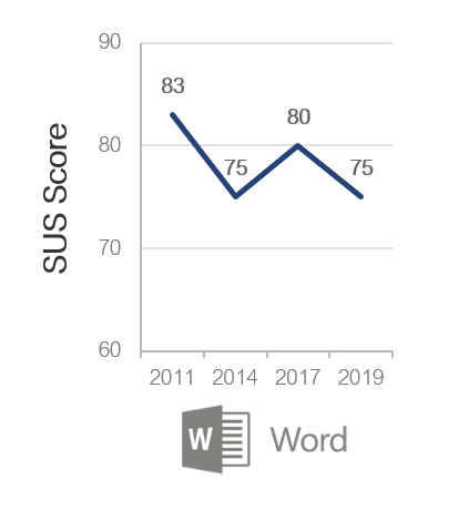
Figure 2: SUS scores for Microsoft Word from 2011, 2014, 2017, and 2019.
Usefulness and Ease
As in our earlier reports, we present findings for the UMUX-LITE, as it provides an easy-to-understand score that quantifies software acceptance and satisfaction, and it’s become an important benchmark for many organizations. The UMUX-LITE is based on the Technology Acceptance Model (TAM) but includes only one item each for usability (ease of use) and usefulness (meeting the user’s needs). In aggregate, it provides a measure of acceptance or, more broadly, satisfaction in or quality of the product. It has also been shown to correlate with and have means that correspond closely to concurrently collected SUS scores, enabling interpretation of its mean scores using SUS norms.
Figure 3 shows a scatterplot of the two components of the UMUX-LITE scores. The dotted red lines indicate the historical mean (68) of the UMUX-LITE across a number of studies. Most UMUX-LITE scores were above 68 for both items. When below average, low usability was more common than low usefulness. Products with below-average usability included Photoshop, Illustrator, and GIMP. iCloud and Microsoft IE/Edge had below-average usefulness.

Figure 3: Scatterplot of UMUX-LITE score components.
Usability Correlates with Loyalty
We again see a strong correlation between usability and loyalty (r = .54) when correlated at the product level. That means SUS scores explain (predict) around 29% of Net Promoter Scores for our selection of software.
Illustrating this strong correlation, Figure 4 shows the SUS scores for detractors, passives, and promoters (computed at the individual level for all responses).
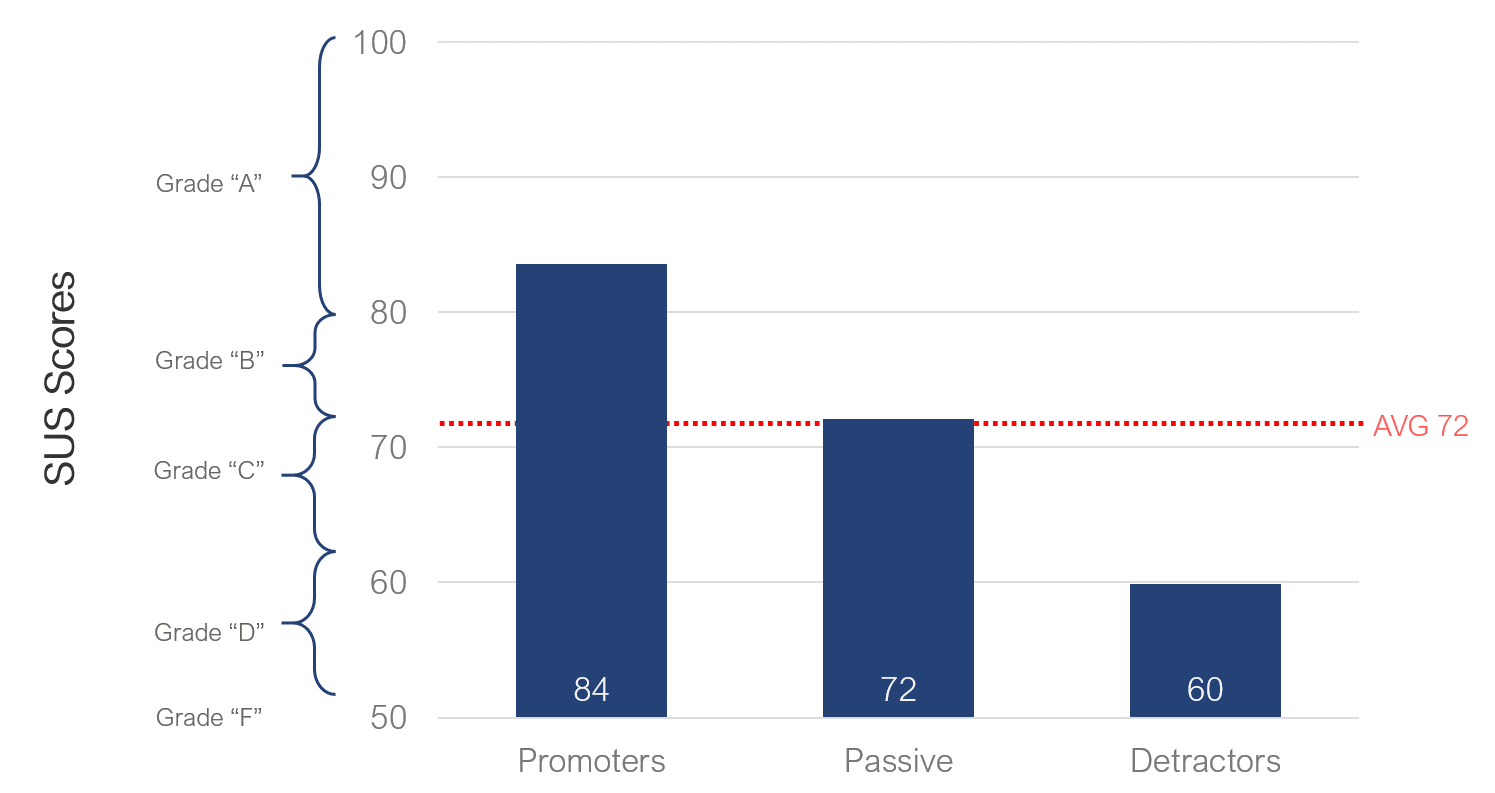
Figure 4: Average SUS scores for promoters, passives, and detractors.
This figure shows that on average promoters have SUS scores of around 84. This pattern is consistent with our findings for consumer software from 2017 and previous research we conducted that found SUS scores above 80 have a good chance of having promoters. The average SUS score for passives is 72. On average, detractors provide average SUS scores of 60; all differences are significant with p < .05.
Desirability
For this report, we gathered data to assess desirability. Using the Microsoft Desirability Toolkit as a base, our Desirability Analysis starts with a list of 118 adjectives (70 positives, 9 neutral, 39 negatives). Twelve adjectives are shown at random to each respondent, who can select up to three. We tally the total number of adjectives selected for each product, then calculate the percentage of positive and negative adjectives. We also note the most frequently selected adjectives per product, reporting the top one, two, three, or four, depending on the pattern of responses.
The products with the highest percent positive adjectives were Duolingo (87%: approachable, engaging, helpful, usable), Google Chrome (87%: usable, convenient, easy to use, helpful), and Google G Suite (86%: usable, time-saving, useful). The product with the highest percent negative adjectives was Microsoft IE/Edge (27%: annoying, ordinary) and Outlook (25%: business-like, ordinary).
Summary
Benchmarking measures of usability and loyalty is an important step in improving the user experience of software. Third-party benchmarks like this one complement internal benchmarking programs by providing more information and context about how well a product is doing relative to the competition or the industry average.
The full list of benchmarks and analyses of the desirability analysis, verbatim responses, and metrics are available for purchase in the Net Promoter Software & UX Benchmark Report for Consumer Software (2020).
")
")
")