We talk a lot about measurement at MeasuringU (hence our name).
But what’s the point in collecting UX metrics?
What do you do with study metrics such as the SUS, NPS, or SUPR-Q? Or task-level metrics such as completion rates and time?
To understand the purpose of UX measurement we need to understand fundamentally the purpose of measurement.
But settling on a definition of measurement is similar to settling on a definition of user experience. There’s inevitably (often heated) disagreement.
A good working definition offered by Douglas Hubbard in the book How to Measure Anything is
a set of observations expressed as a quantity that reduces uncertainty.
The purpose of measurement under this definition isn’t to reduce everything to a single number. It’s not to generate an exact amount. It’s not to have 100% accuracy and perfectly predict the future. And it certainly isn’t meant to tell you how to do your job. Measurement and statistical analysis don’t guarantee success; instead, they improve the likelihood of success.
UX Measurement
We can extend the idea about the purpose of measurement to user experience too. We can observe users struggling to complete a task, making mistakes, taking a long time, and expressing frustration. This gives us some idea about the experience. We can tell our stakeholders that we saw participants struggle, that we saw errors and bad interactions, and that some people complained.
Instead of saying an experience was “bad” or “good,” “intuitive” or “non-intuitive,” or “better” or “worse,” we can express these more precisely with quantities.
UX measurement is about quantifying observations and attitudes about an experience to reduce our uncertainty about how difficult or successful it actually was.
If we can be more precise in describing observations, stakeholders can then, hopefully, be more precise in their improvements.
There isn’t a single way to quantify the user experience. There isn’t a UX thermometer or tape measure. Instead, we rely on a combination of what people do (actions) and what people think (attitudes).
There are several UX metrics. The most common measures that assess task interactions are completion rates and times and errors. The most common way to assess attitudes are a questionnaire (either administered after a user attempts something; e.g., the SEQ) or a broader measure after several tasks or time with a product or website (e.g. SUS, SUPR-Q).
Use measures as your dependent, not independent, variable
With some idea about the purpose of UX measurement, you can then think of your metrics as outputs that depend on user interface inputs.
If you recall middle-school science (or social science) classes, you may recall the concepts of dependent and independent variables.
As the name suggests, dependent variables depend on or are affected by other variables. Dependent variables are also called outcome variables, which may be more helpful in remembering that this measure is what happens when you change things. The independent variables are what you manipulate to affect the dependent variable.
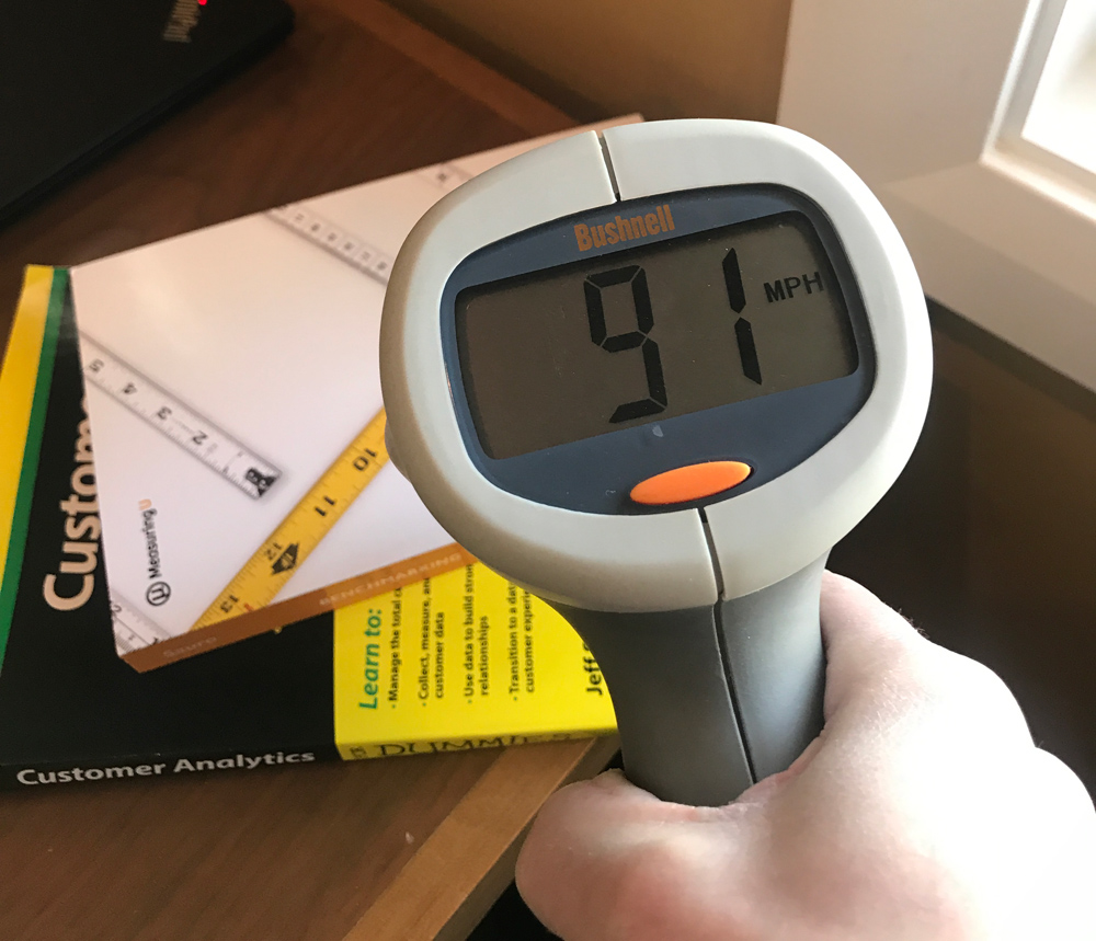
In science, some common dependent variables are temperature, time, speed, weight, and distance. You can see this on great display in science fairs.
For example, a few years ago for a science fair project we wanted to see whether putting a “Slow down” sign in our street would actually make drivers slow down. We used a radar gun and measured the speed in mph (our dependent variable) when the sign was present and when the sign wasn’t present (our independent variable).
We found having the sign reduced the average speed from 25 mph to 20 mph (about an 18% statistically significant reduction in speed) after clocking a few dozen cars.

Figure 1: Does the presence of this sign (independent variable) slow down cars (dependent variable is mph)?
The UX measures are your dependent variables (e.g. time, completion, SUS, SUPR-Q) and the independent variables are what you change or what was already changed in an interface (e.g. a redesigned form, new navigation labels, changed calendar input, or the seat selector on an airline website).
What do you do with UX measures?
With an idea about the purpose of UX measurement and separating dependent and independent variables, here are practical things to do with UX measures. I cover these approaches in more detail in Benchmarking the User Experience and we discuss this at our UX Measurement Bootcamp.
1. Describe whether designs help or hinder an experience.
Testing designs early and often is made easier by collecting measures early and often. Observe users attempting a task and note any problems they have. You can use prototypes or live products. There’s compelling research that even low-fidelity prototypes are indicative of the real experience. You can start simple by collecting only two dependent measures:
- Completion rate: Track whether users complete the tasks (you should know what users are trying to accomplish). Task completion is a fundamental metric. Not much else matters if users can’t complete what they want to do.
- Task ease: After users attempt a task, ask them to rate how easy or difficult it was with the one item Single Ease Question (SEQ).
For example, on the Frontier Airlines website some participants reported having difficulty selecting a seat (a usability problem). We indeed observed some users struggling because of a disappearing check mark (yikes!) and difficulty differentiating between an available seat and one previously selected or unavailable. This led to task failure for more than half the users and an overall low task-ease score (SEQ).
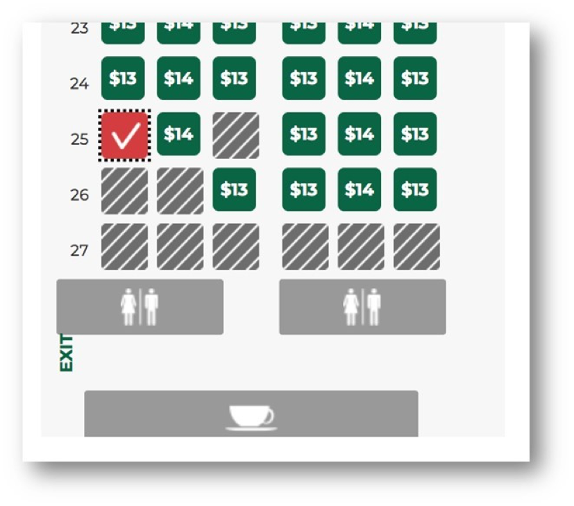
Figure 2: Example of a usability issue in selecting a seat on the Frontier Airlines website. The check mark disappears and previously selected seats are indistinguishable from unavailable seats
We can make the observation “There’s a problem with the seat selector” more precise by describing the impact on the dependent variable. “A problem with the seat selector contributed to less than half the users (41%) being able to select a seat.” It also impacted user attitudes as they rated the ease of the task below average (4.1 compared to the global SEQ average of 5.5.
2. See whether designs improved over time.
With the same measures of completion rates and task ease, add the dimension of time. Compare whether the outcome variables changed (ideally, they got better) after design changes. At each design iteration, look for improvements (ideally, statistical improvements) in your dependent measures. Can you show an increase in completion rates? Did the mean task-ease score increase?
One of the main reasons to benchmark is to establish one point in time before changes are made and compare it to a future point after changes were made. Compare the metrics at each phase to look for improvements (ideally, statistically significant improvements).
3. Compare your experience objectively to competitors.
In our benchmark reports, we compare a website to its closest competitors. This provides immediate context to task measures and overall website measures. Some tasks are inherently harder than others (selecting a cell phone and services versus finding a blender). But if a competitor website or product does it better, there’s good reason to pay attention. It’s something we discuss in Benchmarking the User Experience.
For example, booking a flight can be complex, so it isn’t much surprise to see some mistakes and failure along the way. However, some airlines definitely do this better (Southwest and American) than others (Frontier and Delta) as shown in Figure 3.
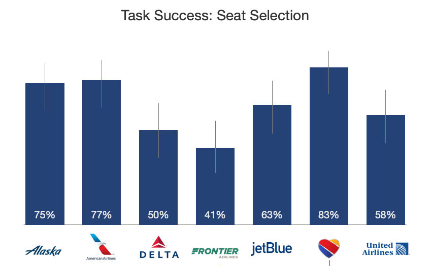
Figure 3: Completion rate differences among airline seat selection
Having measures allows designers to differentiate clearly an opinion from fact about an experience. You can show higher completion rates, lower times, and even fewer reported mistakes. (In our analysis, Delta had the highest number of booking mistakes, almost two times the other airlines.)
4. Compare your experience to industry standards.
One of the benefits of using standardized measures is you can compare the scores to published benchmarks. Both task- and study-level metrics have an average or best-in-class scores available. For example:
- SUS: Average is 68%
- SEQ: Average is 5.5%
- SUPR-Q: Average is 50%
- Completion rate: Average is 68%
These can be more specific to industries too. For example, in the US airline industry, which relies heavily on self-service, the average SUPR-Q score is 81% compared to the global average of 50%.
5. Get some idea about what might happen.
Reduced sales are bad for business. And so are increased calls to customer support. You want to anticipate problems before they happen and ideally prevent them. If you find a new design actually makes it harder for people to complete a core task it can have an eventual outcome on the health of the business.
In fact, our research has found that UX measures such as the SUS and NPS (both attitudinal measures) were leading indicators of software growth.
For example, if more customers are making mistakes in the booking process you can anticipate more calls to support and even some disgruntled users who are less likely to recommend (and use the airline again—if they have a choice).
What Measures Aren’t
With some idea about how to use UX measures, here are a few things you should not expect of measures:
1. Measures are not error-free.
Even things that you think are perfect measures, such as temperature, weight, and distance, are subject to the flaws and imperfections in the measurement device and how it obtains its measure. All measures have errors. Don’t expect a perfect error-free measure. Instead, understand how precise the measures are (using statistical confidence intervals) and the sources of random and systematic bias.
2. Measures are not a crystal ball.
We have shown that two common attitudinal measures correlate with future outcomes. But there is not a perfect correlation between current metrics and future outcomes. Predicting is hard—especially about the future.
3. Measures don’t tell you what to do.
One misconception about the value and purpose of UX measures is that they should tell you what to do. And worse, if they don’t, they’re flawed or have no practical value. An example of this misconception is shown in Figure 4.

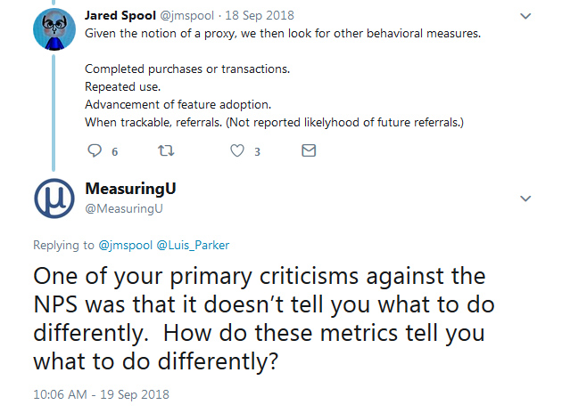
Figure 4: Example of a misconception that if a measure doesn’t tell you what to improve it has no value.
You don’t use measures to tell you what to do; you do things and see whether the measures changed. Otherwise, you’re confusing the independent and dependent variables (see section above).
This applies to temperature and weight as well as SUS and a completion rate (rhyme intended). Throwing out measures because they don’t tell you what to do means throwing out most measures in most situations.
When you change a design, did you reduce the number of errors? Were users able to complete it in less time? Were the attitude scores better?
The measure didn’t tell us what to do or change in an interface. Instead we see that an interface element (such as the seat selector on Frontier) caused confusion and errors.
Don’t expect a measure to be diagnostic (What color button do I use? Do we change the top navigation labels?). While some questionnaires can help narrow your focus, it’s a stretch to expect them to tell you what to fix. For example, the SUPR-Q has items on ease/navigation, trust, and appearance. Scoring lower on these attributes narrows the focus but won’t tell you exactly what’s causing it. Likewise, the UMUX-Lite has items that assess usefulness and usability. Scoring low on usefulness, for example, narrows in on functionality more than usability.
It’s not choosing between a measure or an observation; it’s choosing the right measures for your observations.
Thanks to Jim Lewis for providing comment on this article.


