 As the world continues to go mobile, there’s a huge demand for both mobile devices and cellular plans from mobile carriers.
A lot of that buying happens online. Having a good online experience for wireless carriers ensures customers select the right device and plan.
If customers can’t find the right device or have questions about the already complicated plans, they need to visit a store, call the company, or go to a competitor—all undesirable outcomes.
Benchmarking Wireless Carriers’ Website Experiences
To understand the quality of the online experience, we collected UX benchmark metrics on five popular carrier websites:
- AT&T
- BT (British Telecom)
- Sprint
- T-Mobile
- Verizon
A good benchmark indicates where a website falls relative to the competition and is an essential step to take to understand how any design changes contribute to a quantifiable improvement. See the introduction to UX benchmarking for more background on this essential UX method.
The Study
We conducted two benchmark studies: retrospective and task-based. In the retrospective study, we had 253 participants who recently visited or purchased from one of the carrier websites reflect on their most recent experiences. In the task-based study, we had 140 participants who recently visited or purchased from any wireless carrier website attempt a task on one of the five websites (randomly assigned).
The data was collected in November 2017. Participants in the studies answered the 8-item SUPR-Q (including the Net Promoter Score) and questions about their prior experience. Participants in the task-based study attempted one task on a website (to find a specific phone and plan).
The largest share of participants in the retrospective study visited a wireless carrier website at least a few times per month. The participants reported looking at wireless plans or paying bills. Visitors to BT.com reported also looking at news and entertainment. More details on the study are available in the report; here are the highlights of what we found.
Quality of the Website User Experience: SUPR-Q
The SUPR-Q is a standardized measure of the quality of a website’s user experience and is a good way to gauge users’ attitudes. It’s based on a rolling database of around 150 websites across dozens of industries. Scores are percentile ranks and tell you how a website experience ranks relative to the other websites. The SUPR-Q provides an overall score as well as detailed scores for subdimensions of trust, usability, appearance, and loyalty.
In general, the wireless carrier websites in this study scored from average to below average across the dimensions, with the industry average SUPR-Q at the 41st percentile (scoring better than 41% of the websites in the database). BT had the lowest SUPR-Q score of the group with a score at the 21st percentile. AT&T and Sprint led the group with scores at the 52nd percentile. Interestingly, the SUPR-Q scores were quite similar across all websites on both the perception and the task-based study. The biggest difference was on AT&T, which had a slightly higher SUPR-Q score on the task-based study (61% vs 52%).
We conducted a similar analysis in 2012 and the results show most websites improved. The average SUPR-Q score for this group increased from 26% to 41%. Comparisons to all subscales are also available in the report.
Usability Scores
Verizon had the highest usability score (at the 54th percentile) compared to Sprint, with the lowest at the 33rd percentile. The usability factor on the SUPR-Q predicts a SUS score; in the case of Verizon, it’s a SUS equivalent score of 73 and for Sprint, 66.
Loyalty/Net Promoter Scores
Let’s just say that there is NOT a strong drive to recommend wireless carriers to friends and colleagues. The average NPS for this group was a paltry -37%, which is a nominal improvement from the -47% NPS from our 2012 analysis. There are roughly four times as many detractors as promoters on wireless carrier websites.
AT&T and T-Mobile showed improvements in their Net Promoter Scores while Verizon and Sprint had lower scores compared to our data five years ago. AT&T had the highest score but still had a low NPS of -19%. BT had the lowest NPS at -56%, which was almost identical to its score from 2012 (and about the same as the much derided cable company Comcast).
Low Completion Rates & Interaction Problems
In addition to the low SUPR-Q scores, we also observed low task completion rates in the usability portion of the benchmark. Participants were asked to find the cost per month to purchase a Samsung Galaxy S7 with a qualifying plan. On average, only 7% of participants were able to do this successfully (no one did this successfully on the T-Mobile website; the high was 11% on the Sprint website). One reason for the unusually low completion rate was participants found the phone but not a plan. When we loosened the task-success criteria to only finding the correct phone, the rates increased to an average completion rate of 66%.
To understand the “why” behind the low completion rates and SUPR-Q scores, we examined what participants said in the verbatim comments and reviewed a selection of the session recordings collected from MUIQ. We selected 5 videos from each website and coded the usability issues. We found issues with navigation, search, and a lengthy process to find plan pricing.
Hard to Get to the Plans
One of the common problems we observed across the sites was the difficulty participants had in finding the plans and their prices. Website visitors had to go through multiple pages to see the plan options and prices (Figure 1 shows one of the many pages on AT&T). This was likely the driver of low task performance on AT&T and was echoed in the verbatim comments.
“How many pages do I have to go through just to see a stinking bundle.” –AT&T participant
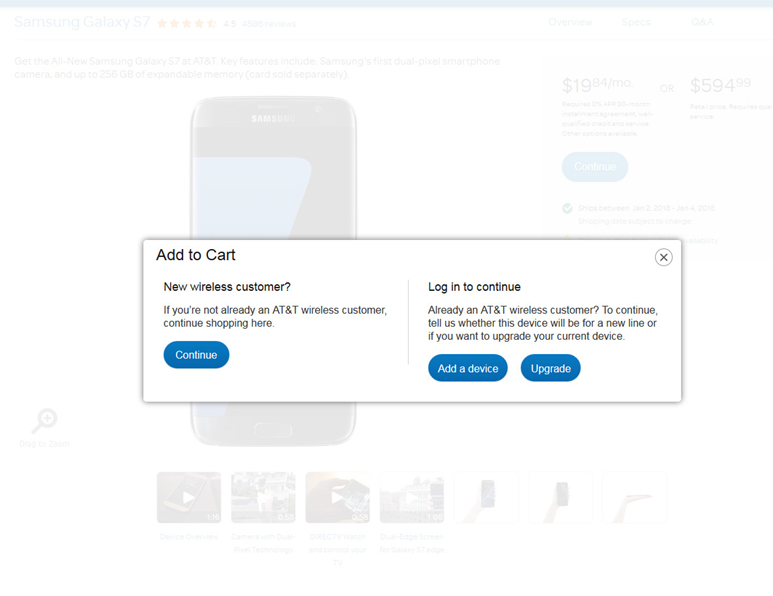 Figure 1: Participants had to go through many steps to see the total cost of a phone with a plan.
This was also echoed on Verizon where one participant commented:
“Sometimes I find these sites difficult to come down to the final number. Ok, the phone is $24 a month, but I know my bill will be over $100 when everything is added in.”
A video showing a participant struggling to find the plans on the Sprint website can be seen below.
Video 1: Video of a participant from MUIQ navigating on Sprint.com to find the plans after searching.
Search Problems
There’s also evidence participants had more general problems with the search across the websites.
When examining the usability study data on Sprint, one main reason for the high task failure rate was poor search results. A search of “galaxy S7” only displayed pre-owned phones.
One participant commented about the search on Sprint (the results are shown in Figure 2).
“I don’t like the search, it seems like it brought up CASES before it brought up the phone itself.”
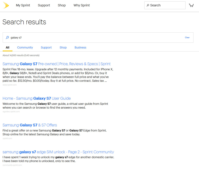
Figure 2: A search for “galaxy S7” on Sprint brought up pre-owned models first and the new phone with plans was buried in the search results.
Participants in the retrospective study also reported information was difficult to find from their own experience. On Sprint a participant recalled:
“Some details couldn’t be found on the website and had to call to get answers.”
A T-Mobile customer reflecting on their experience reported:
“I could not do what I was trying to do, I had to call a representative instead which was annoying.”
First Click
The first click is highly indicative of task success. An analysis of the click maps from MUIQ reveals participants tended to select a “Phones” option when provided. For example, 81% of participants selected “Phones” on the T-Mobile site, which you can see in Figure 3.
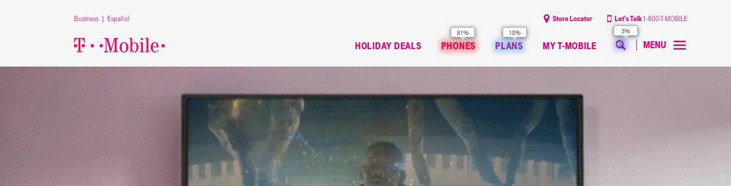 Figure 3: Most participants started by selecting “Phones” from the top-navigation.
On AT&T however, finding phones and their plans was less intuitive from the top-nav. On AT&T, the way to find phones on the menu was to select “Wireless”; you can see this in Figure 4. This is likely a consequence of a website serving lots of divisions and products within AT&T; it nevertheless suggests improvements in the navigation can help.
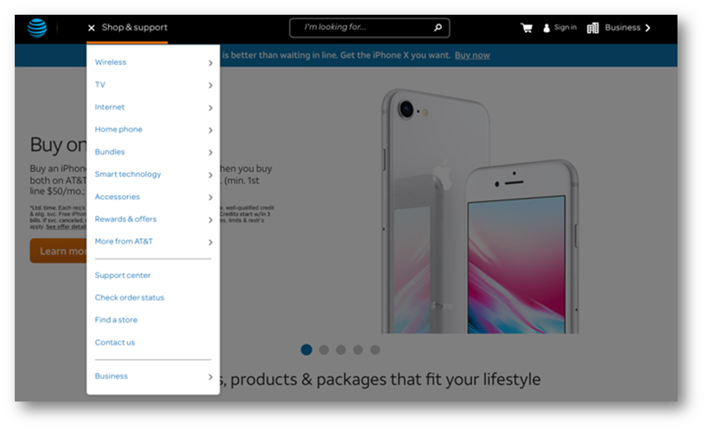 Figure: 4: Phones and plans are under the “Wireless” option of the hamburger menu.
On the BT website the problem is likely having multiple “Phones” options on the menu. Most participants (53%) selected “Mobile Phones” while others were split on “Compare Phones” and “Compare Mobile Phone Deals” as shown in Figure 5 .
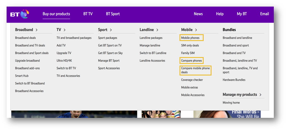 Figure 5: BT has multiple “phone” options from the mega-menu, which may confuse participants.
Summary
A two-part UX benchmark (retrospective and task-based) analysis of wireless carrier websites was conducted in 2017 using 393 participants. The overall user experience of the industry was slightly below average and improved relative to the 2012 analysis we conducted. In general, customers don’t recommend these experiences as there are on average four times as many detractors as promoters.
The highest NPS of this group was only -19% (for AT&T). Participants in a task-based study struggled to find the price of a phone with a qualifying plan. Finding plan pricing requires navigating multiple pages and using generally poor search and at times confusing navigation. Detailed metrics, illustrations of interaction problems, including a selection of verbatim comments, click maps, and videos are available in a downloadable report.
")
")
")