 We conduct most of our internal SUPR-Q® research on commercial websites in a wide variety of industries, but people who visit government websites also have user experiences. They need government websites to provide information (e.g., national park hours) and services (e.g., downloading a tax document). In general, government websites must work well for a broad range of users because governments are large, complex entities, and the U.S. federal government is one of the largest and most complex.
Fortunately, the four components of the SUPR-Q (Usability, Trust, Appearance, Loyalty) are well-suited for capturing the quality of these user experiences.
- Usability: Ease pleases. If a website isn’t easy to use, it will be frustrating and disappointing. For this SUPR-Q component, we collect ratings of ease of use and ease of navigation.
- Trust: Trust is a must. This is important for most commercial websites but critical for government websites. For this component, we obtain ratings of credibility and trustworthiness.
- Appearance: Being attractive is proactive. You get one chance at a first impression, and for websites, first impressions matter. Appearance might not be the foremost concern for users of government websites, but if a website is otherwise usable and trusted but still off-putting at first glance, some users might never experience the otherwise excellent design. We measure this component with ratings of attractiveness and the cleanliness/simplicity of presentation.
- Loyalty: Intention demands attention. The SUPR-Q assesses loyalty with two behavioral intentions—likelihood to recommend the website and likelihood to visit the website in the future. It might seem counterintuitive to think of recommending a federal government website to others. Suppose, however, that someone you know mentioned they were interested in visiting Yellowstone National Park—you might recommend that they consult the National Park Service website. Or, if a friend was interested in outer space, you might ask if they had checked out the NASA website.
To understand the quality of their online experience, we used MUiQ to collect UX benchmark metrics in 2024 on the following five U.S. government websites:
- IRS (irs.gov)
- NASA (nasa.gov)
- National Park Service (nps.gov)
- United States Government (usa.gov)
- United States Postal Service (usps.gov)
We computed SUPR-Q® and Net Promoter scores, investigated reasons for using the websites, measured users’ attitudes regarding their experiences, conducted key driver analyses, and analyzed reported usability problems. (Full details are in the downloadable report.)
Benchmark Study Details
In February and March of 2024, we asked 255 users of U.S. government websites to recall their most recent experience and perceptions of one of the websites on their desktop and mobile (if applicable) in the past year.
Respondents completed the eight-item SUPR-Q (which includes the Net Promoter Score) and the two-item UX-Lite® standardized questionnaires, and they answered questions about their brand attitudes, usage, and prior experiences.
Quality of the Website User Experience: SUPR-Q
The SUPR-Q is a standardized questionnaire widely used for measuring attitudes toward the quality of a website user experience. Its norms are computed from a rolling database of around 200 websites across dozens of industries.
SUPR-Q scores are percentile ranks that tell you how a website’s experience ranks relative to the other websites (50th percentile is average). The SUPR-Q provides an overall score as well as detailed scores for subdimensions of Usability, Trust, Appearance, and Loyalty.
The U.S. government websites in this study collectively performed reasonably well and averaged in the 63rd percentile. However, there was substantial variation between the sites. NASA had the highest SUPR-Q score (99th percentile), closely followed by the National Park Service (94th percentile). The poorest performer in the group was the IRS (16th percentile). To understand more of what’s driving these scores, we dug into the components of the SUPR-Q score.
Usability Scores
There was considerable variability in usability scores. NASA had the highest usability score (99th percentile). IRS had the lowest usability score, falling in the 3rd percentile (a very low score).
Comments related to usability on the IRS website included:
- “Sometimes I cannot find the exact information I am looking for and then I have to contact someone.” — IRS
- “It doesn’t feel easy to navigate. The interface kind of sucks.” — IRS
The top issue mentioned by participants about the IRS website was how difficult it was to find specific information. Some participants felt that it was difficult to find answers to specific questions or find more nuanced help. The pages are full of dense text and numerous links to other resources, making it cumbersome to read and find the correct place (Figure 1).

Figure 1: Screenshot of the IRS Credits and Deductions page. The headlines help, but the amount of text creates a dense page.
The findability challenges weren’t much of a surprise and corroborate our findings from a tree test of the IRS website navigation we conducted in April 2024. The average success rate in finding information was only 51%, with some task success rates below 30%. In fact, only the expert-trained LLM ChatGPT could find information using the website navigation structure, and even then, it struggled with one task.
In contrast, the NASA Latest News page is much less dense (Figure 2).

Figure 2: Screenshot of the NASA Latest News page. The combination of thumbnail images, headlines, and limited text helps to keep the page density low.
Loyalty/Net Promoter Scores
Two of the U.S. government websites (IRS and USA.gov) had negative Net Promoter Scores, and the two with the best SUPR-Q ratings (NASA and National Park Service) had the best NPS (between 40 and 50%). The average NPS for this group was 16% (more promoters than detractors). NASA was the most likely to be recommended with an NPS of 47%, and USA.gov was the least likely to be recommended (−13%). For the overall Loyalty component, NASA scored best (93rd percentile), and USA.gov scored worst (32nd percentile).
Unsurprisingly, respondents reported being most likely to continue using NASA and least likely to continue using USA.gov.
Comments related to NPS and loyalty across the sites included:
- “I only go to IRS because I have to, not because I want to and I wouldn’t recommend it.” — IRS
- “I don’t think I’d strongly recommend the website, but I wouldn’t be against recommending it either if the situation called for it.” — USA.gov
- “I would definitely recommend it because it has a lot of helpful information when visiting parks. It also has very up-to-date information on any closings or issues at the parks.” — National Park Service
- “Looking at the website again, it has a lot of images and information. I would definitely recommend this website to anyone I knew who was interested in space.” – NASA
Trust Scores
There was enormous variation in the percentile scores for the SUPR-Q components of Usability, Appearance, and Loyalty, but the Trust scores for all five websites were very high, from the 90th percentile for USA.gov to the 95th percentile for IRS and USPS and the 99th percentile for NASA and the National Park Service. According to the New Hampshire Department of Information Technology, simply using a .gov domain offers important advantages to smaller government entities over using .com or .org, primarily related to credibility, trust, and clarity of purpose.
Comments related to trust included:
- “The website is clear-cut and easy to use. Also, I believe it is trustworthy.” — USPS
- “I can trust the information on it with no question.” — USA.gov
- “It’s the most trustworthy source possible for the information (directly from the government), easy to navigate and find the information you’re looking for—you can very easily search state by state. The site is pleasant and well designed.” — National Park Service
- “I trust it to be the most accurate and trustworthy site to check any information about space.” — NASA
Websites and Mobile App Usage
As a part of this benchmark, we asked respondents how they accessed the U.S. government websites. All respondents reported using their desktop/laptop computers (this was a requirement for participation in the survey), with 66% also using mobile websites. Users reported visiting the U.S. government websites on a desktop or laptop computer a few times per year. Most users (79% averaged across the websites) had never used a mobile app for these services.
UX Problems
We examined the verbatim comments to better understand the user experience problems.
Difficulty Finding Specific Information
Among the top reasons respondents disliked the U.S. government websites was the difficulty of finding specific information. This was mentioned as an issue on all five U.S. government websites.
Comments related to finding information included:
- “I still didn’t find a clear answer to my question about depreciation recapture because my question was nuanced.” — IRS
- “Sometimes the information I needed was more difficult to find than it should be, and some of the landing pages could be more direct with their results.” — USA.gov
- “Sometimes it can be hard to find key information, such as the parks’ pet policies since you have to select multiple menu options to get to the right page.” — National Park Service (Figure 3)
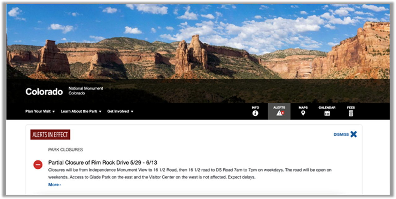
Figure 3: Screenshot of National Park Service website. Participants had difficulty finding information like campsite specifics, pet policies, lodging, surrounding areas, and permits.
Overwhelming Amounts of Information
Related to the difficulty of finding information, some respondents thought the websites tried to do too much and presented users with overwhelming amounts of information.
- “It can be a little overwhelming at first to navigate the site, given the wide scope of information given.” — National Park Service
- “One thing I noticed is that there is lots of verbiage with some run-on paragraphs, which could be more helpfully broken into smaller chunks.” — IRS
- “One wonders if there are other government websites that would be better for specific information and that maybe this site is too broad and trying to do too much. I’m not sure it does a good job of referring the reader to other sites which may be better information sources.” — USA.gov (Figure 4)

Figure 4: Screenshot of USA.gov website. Participants felt that the website covered a huge breadth of information, which made it difficult to home in on what was needed.
Some Information Was Hard to Understand
Aside from finding it, a common problem with the information presented on the websites was complex language that was hard to understand. Unsurprisingly, this was most evident on the IRS website (with content based on the very complex U.S. Tax Code).
- “Some of the language is a little technical.” — USA.gov
- “A lot of the information on the website is just very complicated, and I don’t always understand if I’m on the right page for the information I want.” — IRS (Figure 5)

Figure 5: Screenshot of the IRS website. Participants felt that the information on the IRS website was complex and could be difficult to understand.
Lack of Customer Support
When websites are complex, it is important to provide good customer support. Like with many other enterprises, however, participants sometimes experienced frustration with the support provided by U.S. government websites.
- “I could not find instructions to get a person on the phone without jumping through hoops.” — IRS
- “It is difficult to find the customer service phone number if you want to contact someone.” — IRS
- “[I] always feel like they want you to figure out your problems or issues by yourself and don’t want to lend a helping hand” — USPS (Figure 6)

Figure 6: Screenshot of the USPS website. Participants on this website mentioned issues getting customer support when needed.
Summary and Takeaways
An analysis of the user experience of five federal government websites found:
- The user experience differs widely by site. While the U.S. government websites in this study collectively had above-average SUPR-Q scores (63rd percentile), NASA and the National Park Service scored very high while IRS and USA.gov were below average. The NASA website was most likely to be recommended and USA.gov was least likely.
- People seem to trust U.S. government websites. There was enormous variation in the percentile scores for most SUPR-Q components (Usability, Appearance, Loyalty), but the trust scores for all five websites were very high, from the 90th percentile for USA.gov to the 95th percentile for IRS and USPS and the 99th percentile for NASA and the National Park Service.
- Findability challenges were a major problem. Among the top reasons respondents disliked the U.S. government websites was the difficulty of finding specific information. This was mentioned as an issue on all five federal government websites.
- Sometimes the amount of information was overwhelming. Related to the difficulty of finding information, some respondents thought the websites tried to do too much, presenting users with overwhelming amounts of information.
- Complex language was hard to understand. Once found, the information on the websites was presented with complex language that was hard to understand. Unsurprisingly, this was most evident on the IRS website.
- Lack of customer support can be problematic. When websites are complex, it is crucial to provide good customer support. As with enterprises, however, participants sometimes expressed frustration with the support provided by U.S. government websites.
For more details, see the downloadable report.
")
")
")