 It seems like there are endless ways to ask questions of participants in surveys.
Variety in question types can be both a blessing and a curse.
Having many ways to ask questions provides better options to the researcher to assess the opinion of the respondent.
But the wrong type of question can fail to capture what’s intended, confuse respondents, or even lead to incorrect decisions.
In surveys, questions can be broadly classified as open-ended (free responses) or closed-ended. Closed-ended questions themselves can be classified into multiple choice questions or rating scales.
Multiple choice questions (e.g. age, education level, or electronic devices owned) are usually more straightforward for researchers with little survey experience. When properly written, they’re also straightforward to the respondents as they usually involve concrete selections.
Rating scales however usually involve asking participants to rate abstract concepts, such as satisfaction, ease, or likelihood to recommend. The item selection can have a big impact on both the responses and interpretation.
There are different ways of classifying rating scales and slight variations can result in different looking rating scales, even though they’re variations on the same scale. For example, our MUIQ platform offers over 30 question types but I’ve identified 15 distinct ones.
I’ve adapted a classification scheme based on our experience at MeasuringU and from the classic text on survey research by Alreck and Settle. Here are 15 scales, in roughly the order of most to least commonly used.
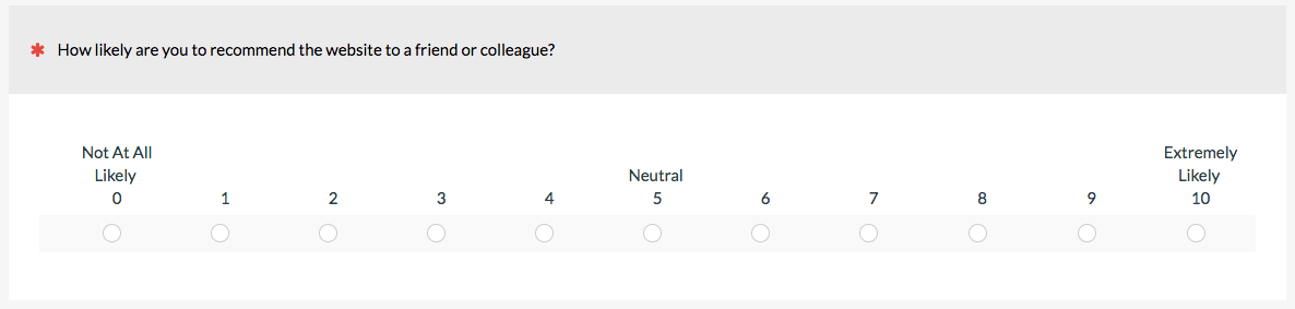
1. Linear Numeric Scale
In a linear numeric scale, participants provide some numeric response to a question or statement. This can include things like satisfaction, ease, brand favorability, feature importance, or likelihood to recommend. The Single Ease Question (SEQ) and likelihood to recommend item used in the NPS are examples of linear numeric scales. Linear numeric scales usually have at least the endpoints labeled. (Labeling, neutral points, and number of response options are the topics of other articles.)
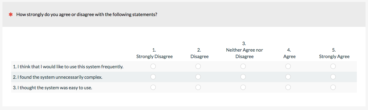
2. Likert
The classic Likert scale has participants agree or disagree (or approve/disapprove) to multiple statements. When numbers are associated with each response option, the Likert item can be seen as a special case of the linear numeric scale. The classic Likert item uses a 5-point response scale, but you can use 7, 9, or other points, too. (Although someone will have a strong opinion about the “right” number of steps.) Because the response scale is about agreement, be sure items are phrases participants can agree or disagree to. The System Usability Scale (SUS), SUPR-Q, and UMUX-Lite use a Likert scale with numbered values.
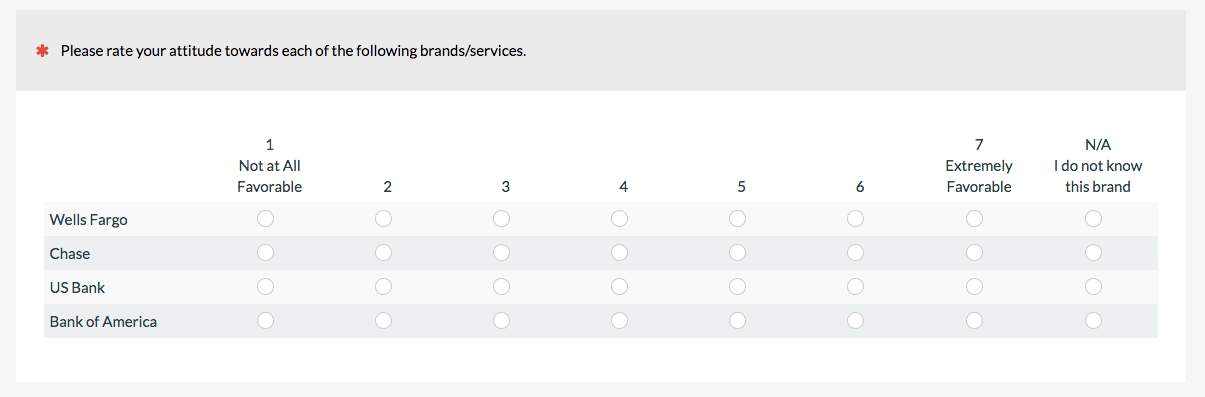
3. Multiple Rating Matrix
The matrix question is a compact way of presenting multiple linear numeric items and is the typical method for displaying Likert items, too. It’s probably not technically different from a linear numeric scale but I’ve separated it out because they’re so popular for online surveys. For example, when having participants rate their brand attitude, it’s common to use a matrix similar to the following one.
 Try not to use too many of these in a survey as it can be overwhelming to respondents.
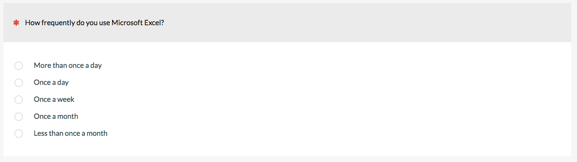
4. Frequency Scales
Understanding how often people perform (or think they perform) actions helps when product planning as in the example below. When listing the frequency of actions, consider both specific number of times (e.g. every day) as well as more general timeframes (sometimes, always, never—referred to as a verbal frequency scale). Also, be sure the frequencies are sequentially ordered and well understood. For example, is occasional more frequent than sometimes?

When we measure users’ attitudes toward the ease of use of websites or software using the SUS or UMUX-Lite, we ask how frequently participants use the software with a verbal frequency scale similar to the one below. (Frequency of use often predicts attitudes.)
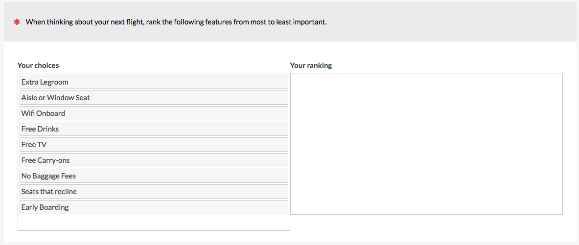
5. Forced Ranking Scale
Forced ranking scales are good for prioritizing product features. Having participants rate their interest on a linear numeric scale may result in the problem of every feature being important because there’s no disincentive for rating everything high.
I recommend keeping the number of items to fewer than 10 when possible and randomize their presentation order. With each option, respondents have to review the list to make a decision on ranking. To rank 20 items, for example, participants need to make 19 passes through the continually shrinking list. This process is easier with a drag-and-drop interface as in the MUIQ item below, but forcing people to rank items they have little opinion on may lead to drop out or error. It gets quite laborious to rank many items. If your list is long, consider a “pick some” question type (see #6).
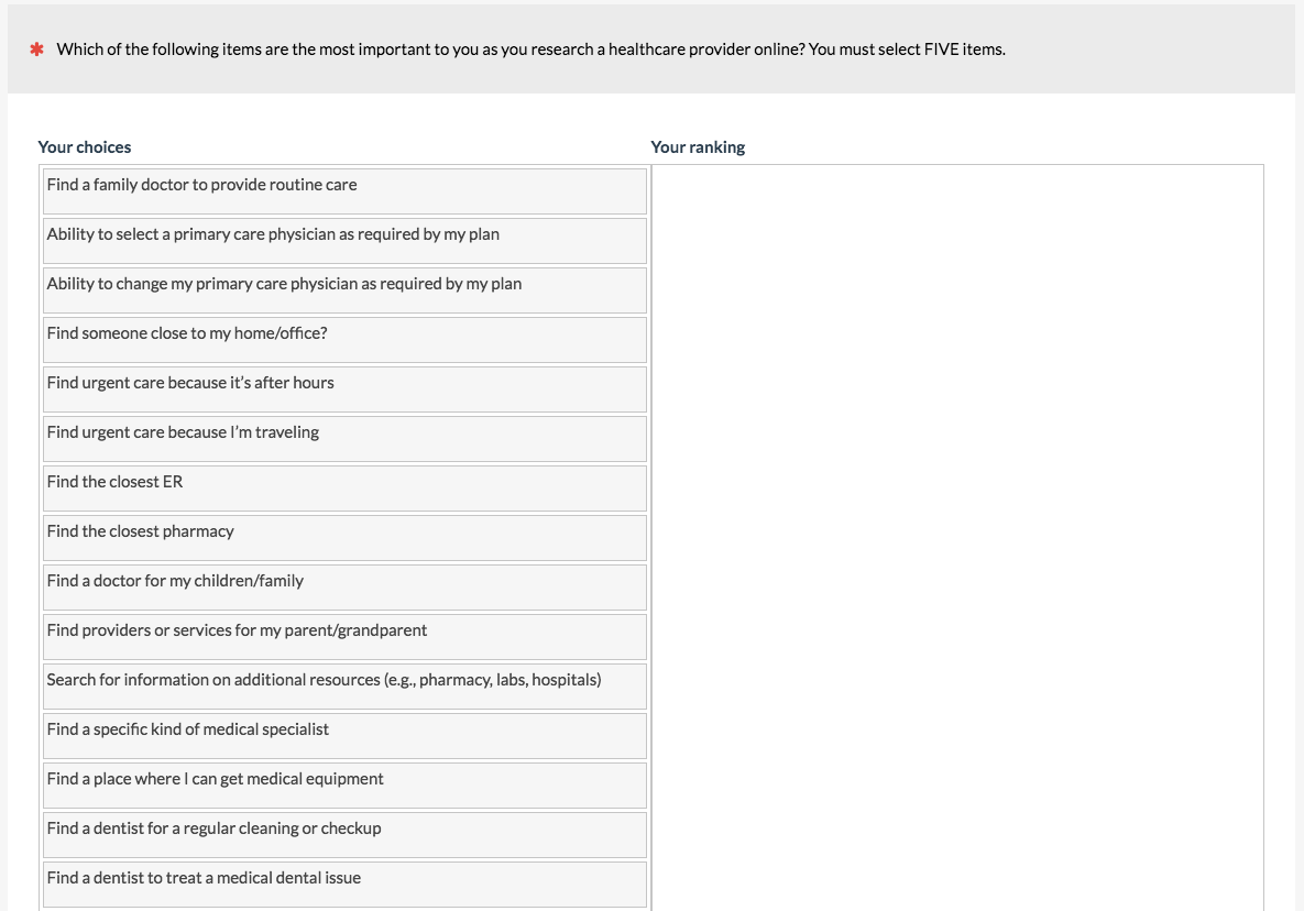
6. Pick Some (a.k.a Top Task)
When you have a long list for participants to prioritize (e.g. more than 10 and especially more than 20) but don’t want them to have to rank all of the items, have participants select a fixed subset, such as 3 or 5. This is what we do for a top-tasks analysis. Again, it’s important to randomize the order to avoid items near the top being favored. Surprisingly, we’ve found that this crude technique takes a fraction of the time as forced ranking and yields very similar results.
7. Paired Comparison Scale
When you want to force a choice between two alternatives (sort of a mini-rank) such as a preference for a website, brand, or design, use a paired comparison scale.
 Paired comparisons can also be used on specific attributes of a website, product, or brand as shown below for different aspects of two rental car websites. They’re also used in advanced question types, such as with the Max-Diff.
Items don’t have to be just text. You can present pictures (like alternate designs) or videos for respondents to select their preference.
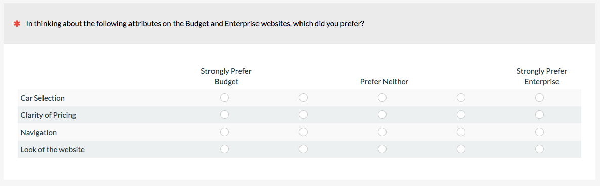
8. Comparative Scale/Comparative Intensity
You can have participants rate their preference and strength of preference all in one item using a comparative scale. The scale below asks participants to rate their preference and intensity for two rental car companies on four website attributes.
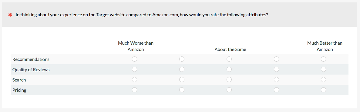
 It can also be used to gauge participants’ preferences toward a known external benchmark such as a famous brand or website (like Amazon).
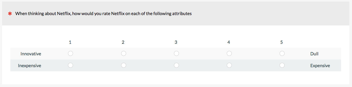
9. Semantic Differential Scale
When you want to assess where participants fall on a continuum of adjectives or attributes, use a semantic differential scale. You need to provide clear polar opposite terms (like hot to cold)—which can be easy in principle but hard in practice. For this reason, we don’t use these as often and prefer the next two options.
The semantic differential scale below asks participants to rate their experience with Netflix on two items.
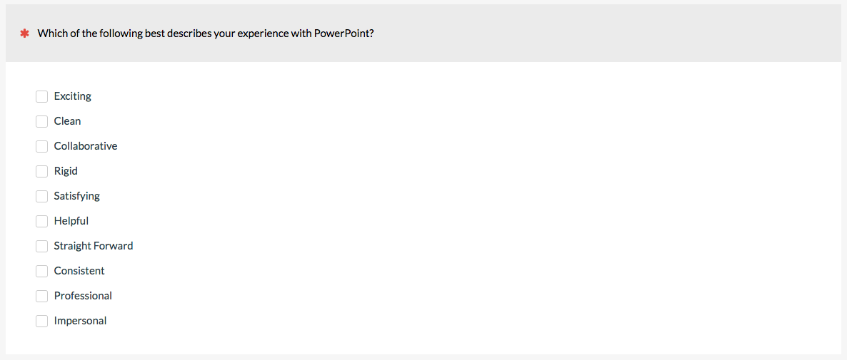
10. Adjective Checklist
When assessing brand attitude, the adjective checklist is a staple. It’s also the technique used in the Microsoft Desirability Toolkit. Instead of aligning opposite adjectives, you can list them (usually a mix of positive and negative) for participants to select. Again, randomize the presentation order.
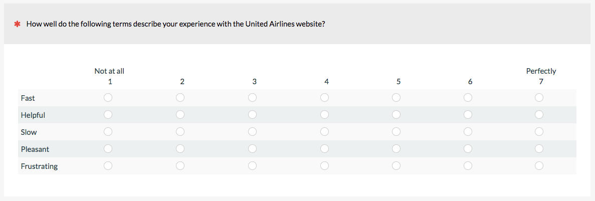
11. Semantic Distance Scale
A way to avoid the problem of having to find polar opposites on the semantic differential scale but still have participants rate each adjective is to have respondents rate an adjective, term, or phrase and provide some level of intensity. It’s sort of a cross between the adjective scale and semantic differential scale.
12. Fixed Sum
When you need responses to add up to a fixed amount, such as 100% or an amount spent (e.g. $100), a fixed sum approach might work. It can be another way to force respondents to decide which features are more important than others and is a popular technique for assessing the importance of new features, or even how participants allocate their budget (like the example below).
 You’ll want to minimize the mental load you put on your respondent by displaying a running total of the values they’ve entered and what is left (as shown in the MUIQ example above).
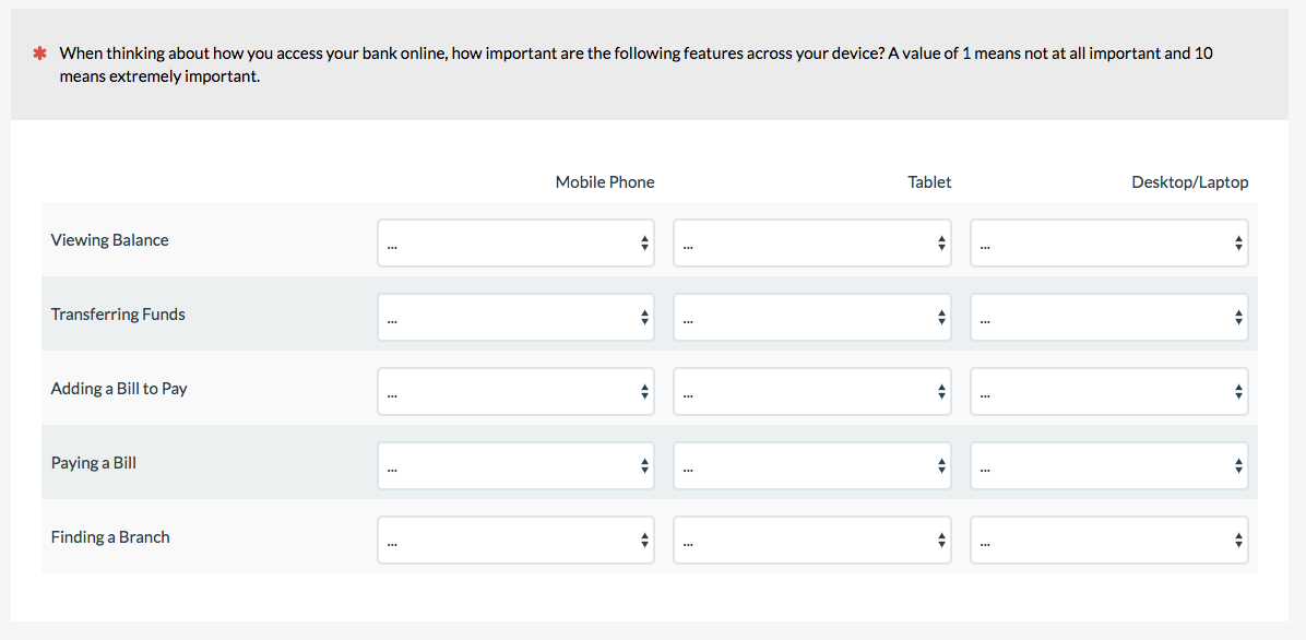
13. Compound Matrix
You can really cram a lot of things into one question by using drop-down lists or text fields instead of radio buttons or checkboxes. The compound matrix has participants rate two dimensions at the same time; for example, the importance of features by device type for online banking.
14. Pictorial/Graphic Scales
Instead of picking a number, participants can respond to pictures, such as stars as done on Amazon and Netflix. The stars represent a quantity that can be averaged similar to linear numeric scales.

The Wong-Baker faces pain scale is a common scale used to assess patient discomfort.

Pictorial scales can be particularly helpful when participants might not speak the target language well or even have trouble communicating (hence its widespread use in medical settings).
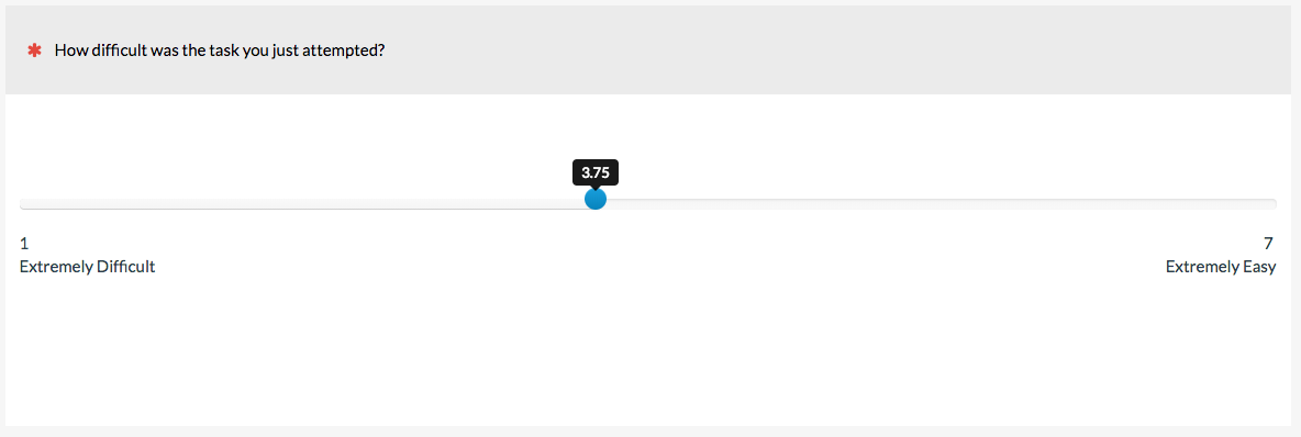
15. Visual Analog/Slider Scale
Imagine a linear numeric scale that didn’t have discrete points (e.g. 1 through 7) but instead allowed participants to select any value in between. This is the idea behind the Visual Analog Scale (VAS), often just called a slider scale. The analog is the continuum the slider represents; for example, from extremely difficult to extremely easy in the example below.
 The impact of slider scales attributes (labels, showing values, starting position of slider) is still being investigated. We’ve had success with participants understanding and using sliders in MUIQ and plan to continue research with and about them.