 There are many ways to visually display quantitative information.
Excel offers dozens of chart types and color combinations, including those in 3D. But is it good practice to use 3D graphs?
Edward Tufte is a famous and vocal critic of using 3D elements or any other decoration in graphs. In his book, Visual Display of Quantitative Data (p. 71), Tufte (1983) made the strong and specific claim that:
Volume increases at a higher rate than surface area. The number of information carrying (variable) dimensions depicted should not exceed the number of dimensions in the data.
However, Spence (1990, p. 683), in an article published in the Journal of Experimental Psychology: Human Perception and Performance, stated:
There is much advice in the literature regarding the suitability of graphical elements for the representation of numerical quantities. Tufte (1983), for instance, recommends avoiding all unnecessary elaboration such as extraneous dimensions that do not carry information about the data—thus the use of cylinders or boxes is anathema—but he offers no data in support of this recommendation.
In our practice, we generally prefer 2D graphs in our reports. Even so, we don’t necessarily discourage the use of 3D graphs when there is reason to believe the additional dimension might be advantageous. Strong claims of prohibition should be supported by data.
So, we searched the literature for data supporting the use or avoidance of 3D graphs.
Review of Experimental Evidence Comparing 2D and 3D Graphs
We reviewed data from seven papers, focusing on comparisons of 2D with 3D graphs.
Studies in Which 3D Bar Graphs Were Usually (but Not Always) Worse Than 2D
Selected Graph Design Variables in Four Interpretation Tasks
Casali and Gaylin (1988) conducted a factorial experiment (n = 32) in which they studied the effect of four graph types (line chart, point plot chart, bar chart, and 3D bar chart) and two coding types (color or monochrome) on task completion time and accuracy for four tasks (point reading, point comparison, trend reading, and trend comparison). They found no overall difference in color versus monochrome graphs.
They did find that 3D bar graphs took significantly longer for participants in point-reading tasks, where participants had to determine the exact numerical value of a specific data point relative to the scaled ordinate. They took almost twice as long, 35 vs. 18 seconds. In the trend-reading task, percent error scores were about the same for monochrome 2D and 3D bar graphs but were much higher for color 3D than 2D bar graphs (2D: 0%; 3D: 18%). Participants reported the highest mental workload for 3D monochrome graphs, with a mean rating of 6.12 on a 0–10-point scale. This was significantly higher than other bar graph conditions, including 3D color bar graphs (5.08) and 2D monochrome bar graphs (5.09).
Regarding the question of whether to use or avoid 3D graphs, the Casali and Gaylin findings were somewhat mixed. They reported significantly poorer performance for 3D bar charts for a few tasks and metrics, but sometimes there was an interaction between 3D and coding (monochrome or color). Unfortunately, those interactions were inconsistent, with monochrome 3D bar charts receiving the poorest ratings for mental workload but color 3D bar charts having higher percent error scores for the trend reading task. Sometimes, the 3D bar chart was no worse than the 2D bar chart (e.g., percent error scores for trend reading with the 3D monochrome bar graph, mental workload for the 3D color bar graph), but there were no tasks or metrics for which the 3D bar chart was significantly better than 2D.
Psychophysical Evaluation of Simple Graphs
Spence (1990) used a psychophysical method (constant-sum procedure) to assess the accuracy and speed of comparative judgments with eight data summarization techniques (tables and seven different types of graphs—see Figure 1 for key examples). There were two experiments.
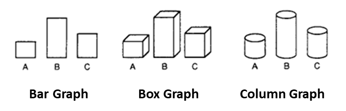
In the first experiment, 96 University of Toronto students (12 per data summarization method) reviewed 100 images of tables, bar graphs, 1D line graphs (horizontal and vertical), pie graphs (standard and elliptical disk), and 3D representations of bar graphs (cylinders and boxes) that varied in the magnitude of the difference participants estimated. Tables, pies, and bars had the highest accuracy rates; the elliptical disk graph had the poorest accuracy. Tables and lines took about twice the time of other representations.
Notably, the 3D box graph took only about half a second longer than the 2D bar graph (3D: 6 sec; 2D: 5.5 sec), and the 3D cylinder graph (5.4 sec) was about the same as the 2D bar graph. These results suggest that tables and 1D line graphs take longer to process, and tables enable greater accuracy, but graphs may be better for the casual reader who doesn’t have time to linger on the table values. (In a later experiment, Spence and Lewandowsky (1991) found tables were inferior to 2D graphs for more complex comparisons.)
Experiment 2 used the same stimuli with ten students who, in a fully within-subjects experimental design, made 960 judgments across three days for all pairs of graphs/tables. The accuracy of tables (2.8% error rate) was only slightly (not significantly) better than bar (2.9%), box (3.0%), and cylinder (3.0%) graphs. Table latency continued to be a bit slower (12.5 sec), and the bar, box, and cylinder graphs had equal latencies (10.1 sec). The vertical 1D representation (lines with the same orientation as the bar graphs) had the same latency and slightly higher percent error (3.2%) than the bar, box, and cylinder graphs. Spence concluded that bars (2D), boxes (3D), and cylinders (3D) were best all-around for displaying quantities. He also suggested that some types of additional elements in graphs (like pictures) may help memorability but do not provide data to support this hypothesis.
The results of Spence (1990) for 2D versus 3D graphs were, at a high level, similar to the results of Casali and Gaylin (1988). In Experiment 1, bar graphs led to a slightly more accurate interpretation than box or cylinder graphs (a difference of less than half a percent), and in Experiment 2, that difference dropped to just a tenth of a percent. In both experiments, the latencies for the bar, box, and cylinder graphs were almost the same (about a half second faster for bar than box in Experiment 1, identical times in Experiment 2). The 1D graphs tended to be less accurate and slower than 2D. Across the experiments, 3D was never significantly better than 2D.
There Might Be a Slight Halo Effect for 3D Graphs
Carswell et al. (1991) also found slightly worse performance across three experiments for some, but not all, 3D graphs. In Experiment 1, 24 students made 15 magnitude judgments (e.g., percent of a section on a pie graph) using six variations of graphs (Figure 2). Errors were greater only for 3D line graphs, which had 7% more errors than 2D line graphs (the errors made were consistently underestimation).

In Experiment 2, 48 students reviewed a deck of 30 bar or line graphs and had to determine as quickly as possible if the trend was increasing or decreasing (each graph illustrated economic trends over 12 months, some monotonic and some with two to six trend reversals). There was little difference in the classification times or errors for 2D and 3D bar graphs (2D: 40.9 sec, 3.94 errors; 3D: 40.1 sec, 4.52 errors). Classification was slightly faster for 3D line graphs (38.6 sec) than 2D line graphs (41.8 sec), but 3D line graphs had the highest error rate (5.17 errors; 2D: 4.67 errors). For the task of counting reversals, sorting times were faster and more accurate with 2D than 3D graphs (2D bar: 200.9 sec, 8.31 errors; 3D bar: 205.6 sec, 9.54 errors; 2D line: 162.8 sec, 7.72 errors; 3D line: 165.8 sec, 8.15 errors).
In Experiment 3, 50 students were randomly assigned to a 2D or 3D slide show presentation with graphs on a digital display about a fictitious institution of higher learning and quizzed to assess recollection of correct information. There wasn’t much difference in recall scores for most graphs (on average, less than a tenth of an item for 2D versus 3D bar and pie charts). 3D line graphs alone had a substantially lower number of correctly recalled items than 2D line graphs (2D: 6.12; 3D: 5.16). Participant ratings of the universities depicted in the slide shows were significantly higher for two attributes (modern, distinctive), but there was no difference in the likelihood of applying to the university if given the chance.
The 2D versus 3D performance metrics in Carswell et al. (1991) were similar to those in the earlier studies. Focusing on the bar graphs (because this type of 3D line graph is rarely used), the largest differences were for the reversal counting task (2D better than 3D), and there was an apparent halo effect so that some (but not all) attitudes toward the university in Experiment 3 may have been enhanced by the use of 3D bar graphs.
Detection of Statistically Significant Differences That Are Not Practically Significant
Siegrist (1996), inspired by Carswell et al. (1991), conducted an experiment using 2D and 3D bar and pie graphs that depicted three values rather than just two. Participants (49 college students) viewed 60 graphs and estimated the percentage of a pie chart segment or the percentage of one bar relative to another. The experimental metrics were percent error and decision latency. For pie charts, errors were slightly but significantly higher with 3D than 2D (2D: 2.7%, 3D: 3.2%, a difference of 0.5%), but there was no significant difference in latency. For bar charts, the latencies were slightly but significantly longer with 3D than 2D (2D: 11.1 sec, 3D: 11.6 sec, a difference of 0.5 sec), but there was no significant difference in accuracy. Bar chart errors and latencies had interaction effects associated with the location and size of the bar being judged such that 3D performance was better than 2D in a few conditions (e.g., errors for a large second bar, latency for a small third bar).
These findings highlight the distinction between statistical and practical significance. It seems unlikely that effects this small (half a percent difference in errors, half a second difference in latency) should have much influence in a real-world decision about whether to use 2D or 3D graphs.
More Differences Generally Favoring 2D but of Very Small Magnitude
In the first two of five experiments, Zacks et al. (1998) had 40 Stanford students judge the height of printed bar graphs in millimeters, first with the graph in front of them and, in the second experiment, by memory. There were four types of graphs, designated simple (1D), area (2D), volume (3D), and surface (just the top surface of the 3D type). Participants made their judgment by choosing from a group of bars the one that best matched the target bar in a graph with two bars. The 2D height judgments were slightly but statistically more accurate than 3D (2D error: 4.10 mm, 3D error: 4.62 mm, a difference of 0.52 mm). Overall, errors were larger in Experiment 2 (n = 40) when participants had to remember the bar they were judging, but this time although the magnitude was similar (2D error: 7.51 mm, 3D error: 7.94 mm, a difference of .43 mm), the 2D/3D difference was not statistically significant.
Experiments 3, 4, and 5 (each with n = 40) used magnitude estimation rather than perceptual matching to measure bar height judgments. The key outcome in Experiment 3 was that it replicated the perceptual matching result from Experiment 1, with 2D being slightly but significantly more accurate than 3D (2D error: 2.47 mm, 3D error: 2.81 mm, a difference of 0.34 mm). During the experiments, Zacks et al. found that graphical elements other than dimensionality seemed to have more influence on judgment accuracy, so in Experiments 4 and 5, they focused on those extraneous depth cues. These experiments, while interesting, are not relevant to the question of whether participants judge the magnitudes of 2D and 3D bars with equal accuracy.
In these experiments, accuracy judgments of the height of 2D and 3D bars were sometimes statistically significant and sometimes not, but even when significant, had overall differences of half a millimeter or less—likely not a practically significant difference.
Studies in Which 2D Graphs Were Usually (but Not Always) Preferred to 3D Graphs
Gratuitous Graphics? Putting Preferences in Perspective
Levy et al. (1996) conducted three studies asking Stanford University students about their preference for 2D vs. 3D graphs. In Experiment 1, from nine graph types generated with Excel to have numerous trend reversals, 161 students selected which graph they would use in a hypothetical business presentation for six scenarios (visualize patterns, the “gist” of the data, details, trends, contrasting, and memory). The graph types included a scatterplot, bar graphs (2D and 3D with two different perspectives), a 3D pie graph, and line graphs (standard, area, 3D volume, and 3D surface line similar to the 3D line graph in Carswell et al.). Participants heavily favored the standard 2D bar and line graphs.
Experiment 2 was similar to Experiment 1, with a slightly different set of scenarios and graphs. The nine graph types included a scatterplot, four types of bar graphs (one 2D), and four types of line graphs (one 2D). Each graph had two versions, one depicting a general trend with one reversal and one with six reversals. The results from 110 students again suggested a strong preference for standard 2D bar and line graphs. However, participants preferred 3D for two scenarios (when data had to be remembered and for showing detailed relationships).
In Experiment 3, 157 students considered the same scenarios from Experiment 2 but had to choose between 2D and 3D line and bar graphs. Participants generally preferred 2D with two exceptions, having no significant preference when choosing the graph to present to others and significantly preferring 3D when the graph needed to be memorable.
Across the three experiments of this preference study (e.g., no one had to actually remember data from graphs), participants strongly preferred 2D over 3D except when assessing the scenario in which the graph had to be memorable.
Chartjunk or Goldgraph?
Tractinsky and Meyer (1999), citing the finding of Carswell et al. (1991) that including 3D graphs in a presentation about a fictitious university appeared to favorably influence some attitudes toward the university relative to an experimental condition that included 2D graphs, reported the results of three experiments using a method similar to Levy et al. (1996). They argued that the choice of graph formats isn’t just a function of rational data presentation (efficiency perspective) but also depends on how presenters believe graphs differ in their persuasiveness and memorability (communicative perspective).
Figure 3 shows the graphs used in these experiments (their 2.5D graphs are the same design as the graphs designated 3D in previous research). In some experimental conditions, participants viewed the data in a table rather than a graph. The general method was for participants to imagine they played a particular role at a company (e.g., CEO seeking sales information, division head making presentation to CEO to support decision-making, division head making presentation to CEO to elicit a favorable impression).

In Experiment 1 (n = 242 Israeli college students), participants preferred 2D when the goal was decision-making but preferred 2.5D when aiming to impress. In Experiment 2 (n = 243 different students), the sales graphs were manipulated to show favorable, neutral, or unfavorable sales patterns, with the same results as Experiment 1 for decision-making scenarios (2D preferred) but a complex interaction for the impression scenario (2.5D preferred only when the sales pattern was positive).
For Experiment 3, rather than choosing the graph from a small set of choices, 81 participants used Excel to create their own graphs for scenarios like those used in Experiment 2. For the decision-making scenario, participants favored standard bar and line graphs. Again, the results for the impression scenario were complex and affected by the favorability of the sales data. In the impression condition, participants had an increased preference for depth cues and tended to use fewer bar graphs; in the unfavorable condition, they replaced bar graphs with pie charts and had the highest usage of 3D.
Keep in mind, though, that these data are based on the judgments of college students imagining what they would do in corporate settings they’ve never experienced.
Summary and Discussion
We conducted this review to see whether the literature supported Tufte’s claim that to avoid unspecified perceptual consequences due to “chartjunk,” the number of information-carrying dimensions in a graph should not exceed the number of dimensions in the data. We found:
The evidence does not support Tufte’s claim. As Carl Sagan famously said, “extraordinary claims require extraordinary evidence.” Extraordinary claims grab more attention, but, like Tufte’s claim that dimensions depicted should not exceed the number of dimensions in the data, they are rarely supported by extraordinary evidence. Reality is more complicated.
In most cases, 2D graphs are at least as good as or slightly better than 3D graphs. The claim the 3D graphs are junk might not be supported, but this doesn’t mean that they are superior. Accuracy and latency measurements generally favor 2D graphs, but only a few findings reported the 2D advantage was practically as well as significantly significant. For example, Casali and Gaylin (1988) reported that participants took about twice as long to determine the value of a 3D bar (a 17-second difference), and for color bar graphs, participants had an 18% higher error rate for 3D when judging trends. Later experiments that partially replicated Casali and Gaylin reported much smaller differences.
In rare cases, 3D graphs may have a slight advantage. Siegrist (1996) reported a few conditions in which a slight performance advantage for 3D depended on the location of the bar in the chart. Carswell et al. (1991) reported an unusual finding that the use of 3D might have a positive halo effect on some participants’ attitudes toward a fictional university. Participants in preference studies (Levy et al., 1996; Tractinsky & Meyer, 1999) generally chose 2D graphs for most scenarios, but there were a few exceptions (e.g., they believed 3D enhanced memorability and improved the impression others have of the presenter, especially when the graph presents a positive message like an increase in sales).
Other graph elements may be more important than apparent dimensionality. Most experiments did not manipulate just 2D versus 3D and often interacted with other elements (comparison of color versus monochrome in Casali and Gaylin, 1988; boxes and cylinders in Spence, 1990; number of points in the graphs across multiple studies; influence of nearby graphical elements on bar height judgments in Zacks et al., 1998). These findings demonstrate the difficulty of conducting definitive research on this topic.
When judging the practical consequences of experimental findings, account for external validity. In real-world interpretation of graphs, how much does it matter if there is a half-second difference in latency or a half-percent difference in accuracy? And how much should processing time weigh in the decision? After all, tables tend to take significantly longer for people to read (see Spence, 1990) yet are advocated as superior data displays by Tufte (1983, p. 178).
How valid are the preferences of college students when asked to imagine themselves in high-level corporate roles? Few results of these experiments seem to indicate real-world consequences, and as far as we know, there has been no experimentation to explore the extent to which intuitions captured in preference studies match actual memorability or impressions of presenters.
For most UX research, 2D is a good choice for graph dimensionality, but 3D appears to be mostly OK. Even though there does not seem to be a strong relationship between apparent dimensionality and how easy it is for users to read graphs, most experimental findings support the routine use of 2D graphs. If there seems to be a reason to use 3D instead (e.g., at the client’s request), then there is little risk associated with that choice.