 The time it takes to click on an element on a page is a function of its size (Fitts’ Law).
People can only keep 7 ± 2 items in short-term memory (Miller’s Magic Number).
When multiple similar objects are presented, people will prefer the most different one (Von Restorff Effect).
People like to have laws named after them (Sauro’s Law).
There’s something compelling about succinct “laws” to help make design decisions. Following laws or conventions can help prevent designers from making certain mistakes.
And though making graphs is hardly the same design activity as building web applications, it’s still a designed interface that represents data. Ideally, having laws or rules for presenting data can reduce mistakes in interpretation and even prevent deception.
Some widely believed rules, however succinct, shouldn’t be strictly followed. For example, we showed how starting graphs with 0 isn’t always a good idea. Context matters.
One such law, proposed by Edward Tufte several decades ago, stated:
“Volume increases at a higher rate than surface area. The number of information carrying (variable) dimensions depicted should not exceed the number of dimensions in the data” (Tufte, 1983, p. 71).
This law (or at least rule or strong claim) from the literature on the visual display of quantitative data has been used to argue for the use of 2D over 3D graphs. In earlier articles, we reviewed the literature on the use of 3D graphs and reported our research on how quickly and accurately people could judge the relative heights of 2D and 3D graphs. There are some exceptions, but in most cases, 2D graphs are as good as or slightly better than 3D graphs for accuracy of estimating values, accuracy of comparisons, and time to make decisions.
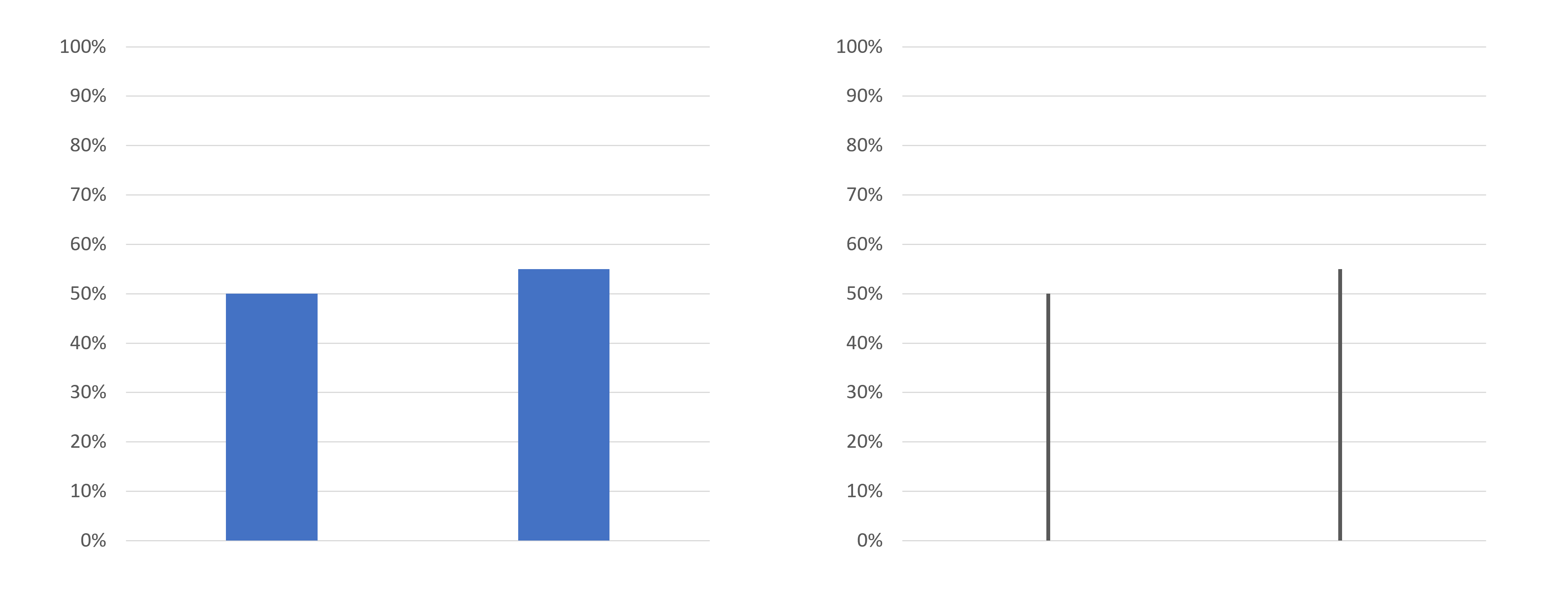
But what about 1D graphs? After all, area increases at a higher rate than height. If Tufte’s hypothesis suggests restricting the number of information-carrying dimensions to the number of dimensions in the data, then wouldn’t it be better to show lines instead of columns in bar graphs (Figure 1)?
In this article, we describe an experiment we conducted using the click testing feature of our MUiQ® platform to investigate how quickly and accurately people could compare two graphed values presented in 2D and 1D bar formats and which they preferred.
2D vs. 1D Bar Graph Study Details
In March 2023, we recruited 105 participants from a U.S.-based online panel company. In a fully within-subjects experimental design, participants viewed 30 graphs in an MUiQ timed click test using images like those shown in Figure 1.
Experimental Design
The 30 graphs showed two data points in which each pair varied in three ways:
- Dimensions: There were an equal number of 2D and 1D depictions (15 2D pairs and 15 1D pairs).
- Size Difference: The lower magnitude in all graphs was set to 50%, and the other magnitude was from 0 to 35 percentage points higher (eight gradations from 50% to 85%; i.e., 50% vs. 50%, 50 vs. 55%, 50% vs. 60%, … 50% vs. 85%).
- Placement: The higher percentage appeared on the left or right side for each combination of dimension and size difference (only once for each dimension when bars were equal).
Participants were instructed that they would see 30 images, one at a time, with 10 seconds to click on the bar that depicted the larger amount. Images appeared in randomized orders. The study advanced to the next graph when participants clicked on their selection (they couldn’t change their clicks or go back). Participants could pause between each graph and could resume when ready.
The accuracy of the judgments and the time to select the graph were the primary dependent variables. If participants didn’t make a selection within ten seconds, the trial was marked as incorrect. Twenty-eight of the 30 graphs shown to participants contained differences, while two contained no differences (both bars set to 50% to act as a control). At the end of the study, participants selected their preferred graph type (2D or 1D).
Study Results
We obtained results for accuracy, selection time, and preference.
Accuracy
We found no significant differences in selection accuracy between 2D and 1D graphs. Overall, participants were very accurate (> 98%). There were no systematic or statistical differences in error rates across dimension, size of difference, or placement (which side had the higher bar).
Time to Select
On average, participants spent about 1.4 seconds per selection across all trials (the same as in our previous 2D vs. 3D experiment). As expected, the distribution of these times had a strong positive skew. We conducted analyses on both log and raw times. The results were comparable, so the following analyses and figures show the results for raw times.
Dimensionality
Figure 2 shows the mean 2D and 1D selection times for each difference greater than 0. For every difference, the 1D selection time was significantly slower than 2D (on average 284 ms slower, about a quarter of a second, t(104) = 12.3, p < .0001).
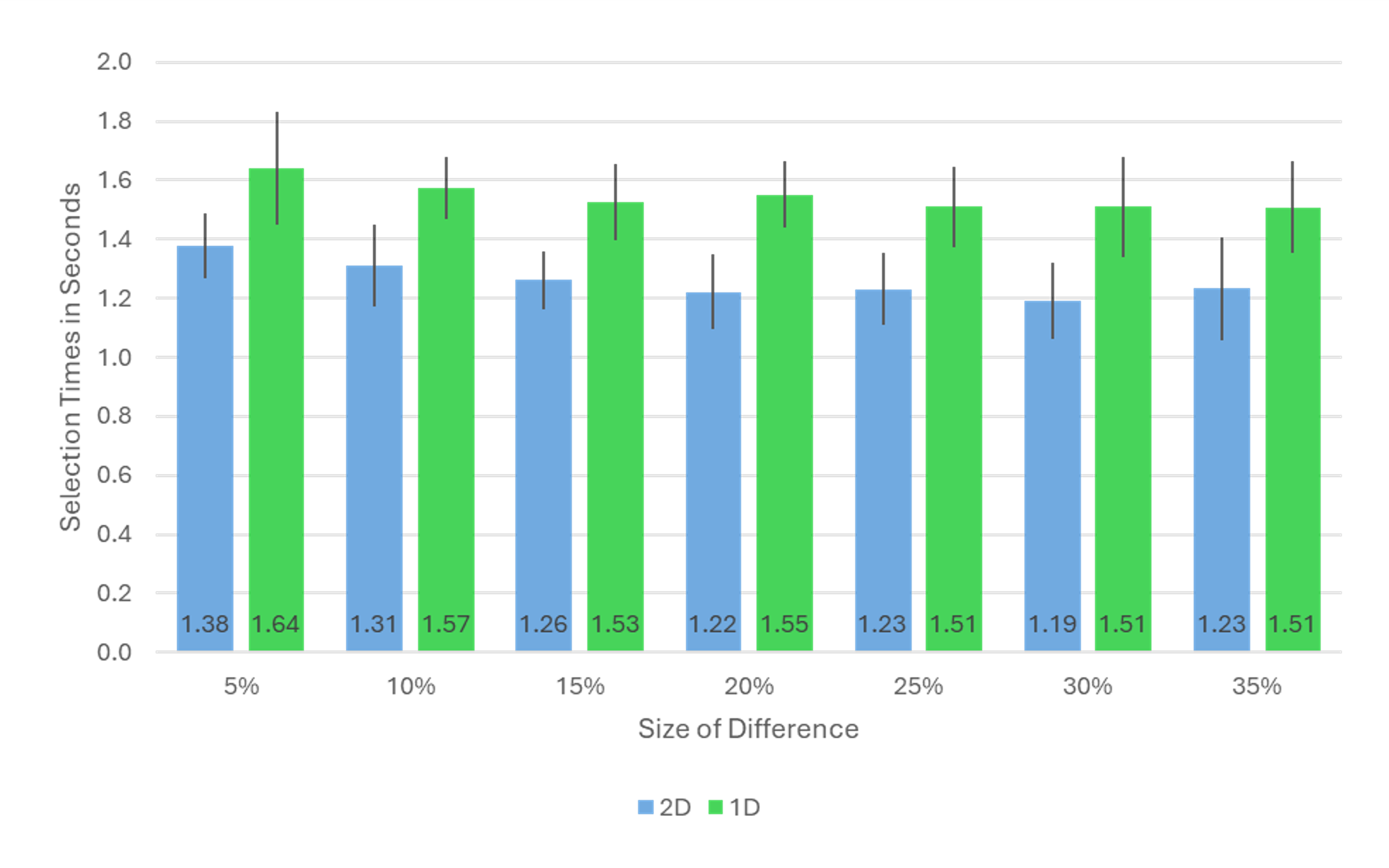
This result is different from our previous comparison of 2D and 3D bar graphs, where the overall mean difference was only about 77 ms. There is, however, a good explanation for much of the difference in these experiments, and it comes back to one of the laws that we mentioned at the beginning of the article.
In the previous experiment, the click targets were about the same size whether 2D or 3D. In this experiment, the line targets were much smaller than the column targets, so selection times were affected by Fitts’ Law. There’s nothing quite like referencing one law of interaction to assess another law.
Fitts’ Law is a model of human motor control that accounts for differences in the time needed to select a target. The model has two variables—distance and width—that affect target selection time. As you would expect, when targets are farther away from a starting point and are smaller, it takes more time to select them.
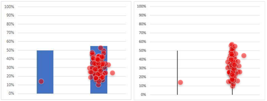
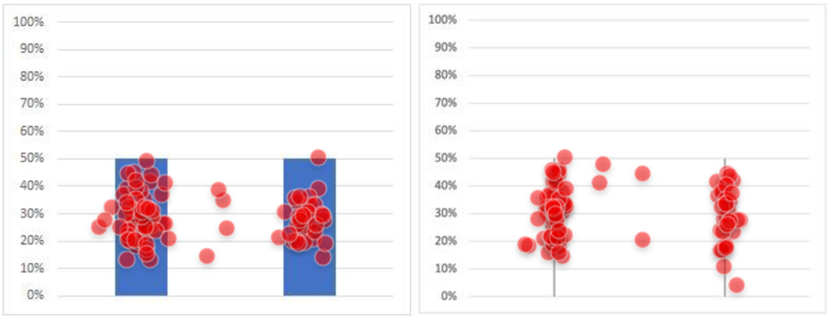
You can see the effect of this in Figure 3, which shows the click locations for one of the experimental conditions (5% difference with the larger bar on the right). For the column representation, the clicks were spread out across the visual target. For the line representation, the dot grouping was tighter. This means that we can’t interpret time differences as being due only to dimensionality because selection times were also influenced by the differences in target size. One way to manage this difference in future research would be to have participants click a target like a radio button placed below the image instead of clicking on the image.
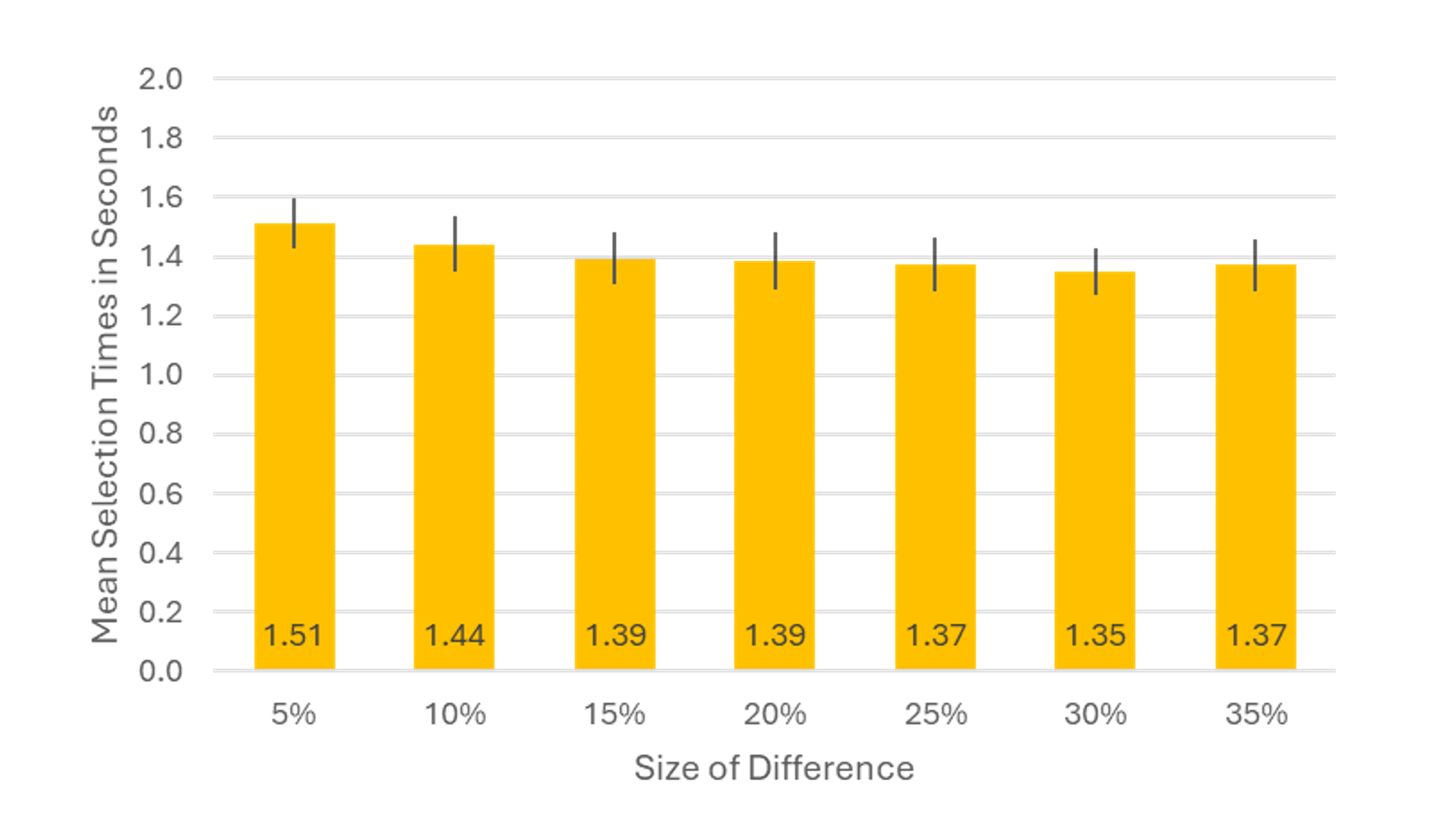
Size of Difference
As shown in Figure 4, the smallest difference averaged across dimensions (50% vs. 55%) took the longest for participants, consistent with our findings from the 2D/3D experiment. Selecting the smallest difference took participants about 9% longer compared to the average of the other difference comparisons (1.51 vs. 1.39 seconds).
Placement (Left vs. Right Side)
There was no significant difference due to whether the larger bar was on the left or right side (t(104) = .40, p = .69, d = 6 ms).
Control Pairs
In our 2D and 1D control pairs (both values shown as 50%), there was no significant difference in mean times to make a selection (t(104) = .50, p = .62; 2D: 3.3 s; 1D: 3.4 s; 95% confidence interval around the .1 s difference from −.44 to +.26 s). However, for both dimensions, participants spent over three seconds deciding which bar to click when they were the same height, overwhelming the small difference in selection times due to Fitts’ Law. Overall, the clicks were about evenly distributed between the left and right bars, with some respondents clicking in the space between the bars (Figure 5).
Preference
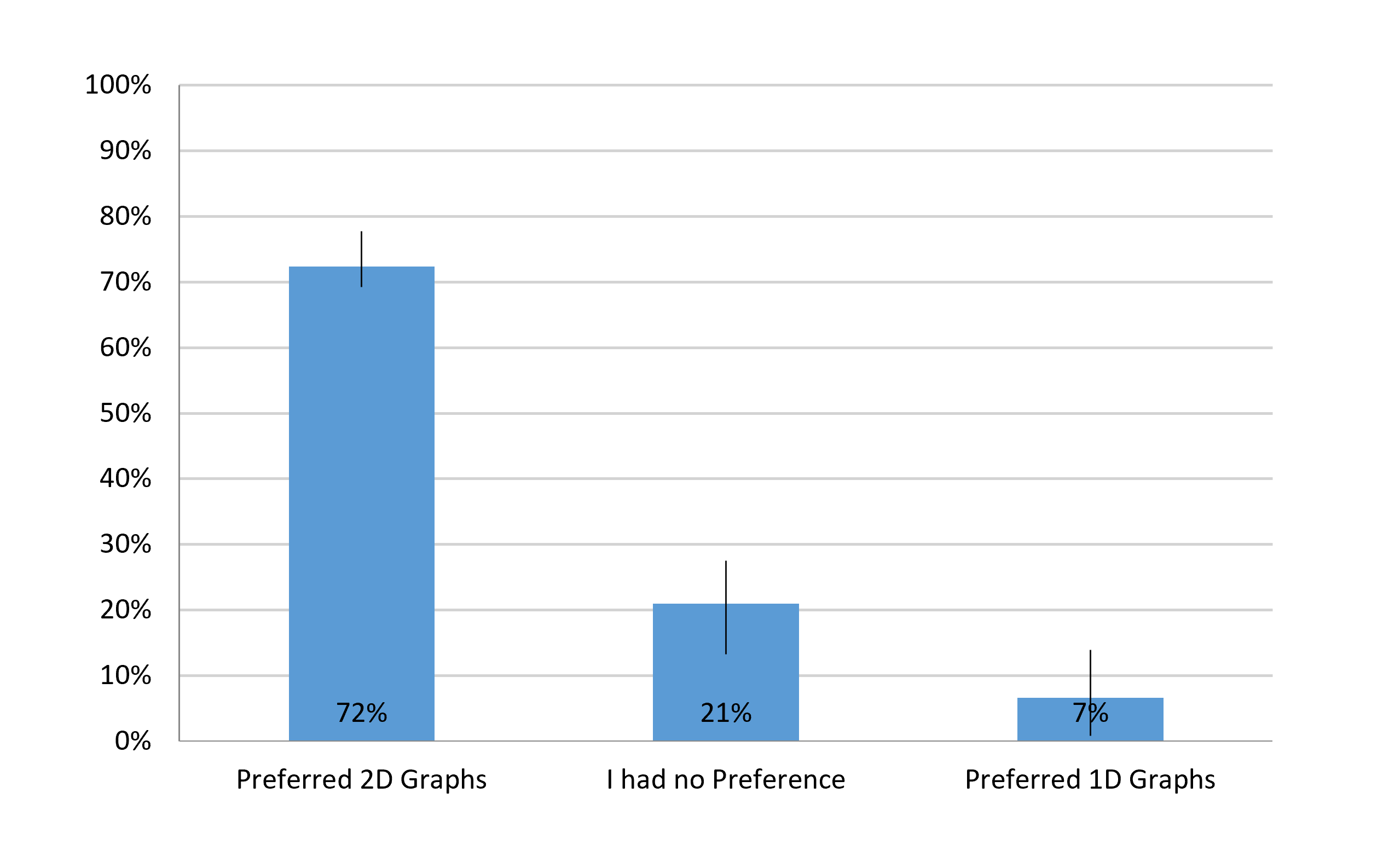
For those who had a preference, participants strongly preferred 2D over 1D graphs (2D: 72%; 1D: 7%), about a 10 to 1 ratio.
When asked to explain their preference, notable comments from participants included:
In Favor of 2D (72% of Participants)
- “It’s easier to distinguish which is bigger.”
- “The 2d graphs are more intuitive.”
- “It’s easier to read 2D graphs at a glance.”
- “I liked the 2D graphs because they fill up more white space and you can easily follow the top edge to the axis numbers.”
In Favor of 1D (7% of Participants)
- “I just liked when they were just lines because they were easy to identify.”
- “It was easier to see which was larger.”
Discussion and Summary
Our analysis of 105 participants comparing 2D vs. 1D bar graphs found:
There was no difference in selection accuracy. Overall, selection accuracy was very high (> 98%). There were no significant differences in selection accuracy between 2D and 1D bar graphs.
It took participants longer to select 1D graphs. When there was a difference in bar height, the overall mean selection time per trial was about 1.4 seconds. Participants took just over a quarter of a second longer to select the 1D visualization, but much of this difference is likely due to Fitts’ Law effects (taking longer to click on smaller targets).
Selection was slightly slower for the smallest difference. Selection times were comparable for all differences in bar height except for the smallest (50% vs. 55%). Selecting the smallest difference took participants about 9% longer compared to the average of the other difference comparisons (1.51 vs. 1.39 seconds).
The location of the larger bar (left or right) did not significantly affect selection time. The difference in selection times was only 6 ms, so there was no evidence of a substantial time difference due to scanning from left to right.
There were no statistically significant differences in the control pairs. When there was no difference in bar heights, participants took over three seconds to click a selection. Overall, clicks were about evenly distributed between the left and right bars, with some participants clicking between the bars.
Participants preferred 2D graphs 10 to 1. The preferences were 72% for 2D, 21% no preference, and 7% for 1D. For those who had a preference, the ratio in favor of 2D was over 10:1.
Limitations and future research: One limitation of this research was that the task was very simple—selecting which bar was higher rather than, for example, having to estimate the magnitude of the height of one bar or the difference between the two. In future research on data visualization where the sizes of the visual representations being manipulated have very different sizes, it will be important to change the selection method to something like radio buttons to avoid the influence of Fitts’ Law.