 The System Usability Scale (SUS) is one of the oldest standardized UX questionnaires. John Brooke is now retired; should the questionnaire he developed almost 40 years ago accompany him on the beach with a piña colada?
After all, the SUS was developed when there were green-screen computer monitors. How can it possibly apply to mobile apps or VR headsets? Technology has evolved, shouldn’t our questionnaires?
Language certainly evolves. Table 1 shows two versions of the SUS items: the currently most-used version (left) and a translation into Middle English (right). Now we’re not aware of any squires assessing the usability of their medieval windmills, but this shows how much language has changed (at least according to ChatGPT’s understanding of Middle English).
| Item | Current Version | Middle English Version |
|---|---|---|
| 1 | I think that I would like to use this system frequently. | I wene that I wolde lyke to usen this system ofte. |
| 2 | I found the system unnecessarily complex. | I fond the system overmuch wrethely complex. |
| 3 | I thought the system was easy to use. | Methought the system was esy to usen. |
| 4 | I think that I would need the support of a technical person to be able to use this system. | I wene that I sholde needen the support of a technical lede to kunnen usen this system. |
| 5 | I found the various functions in this system were well integrated. | I fond the divers functions in this system were well y-melled. |
| 6 | I thought there was too much inconsistency in this system. | Methought there was overmuch unsteadfastness in this system. |
| 7 | I would imagine that most people would learn to use this system very quickly. | I wolde wenen that most folk sholde lernen to usen this system full briskly. |
| 8 | I found the system very awkward to use. | I fond the system right unwieldy to usen. |
| 9 | I felt very confident using the system. | I felte right siker usen the system. |
| 10 | I needed to learn a lot of things before I could get going with this system. | I needed to lernen many a thing ere I might getten on with this system. |
Table 1: Two versions of the SUS items (current and Middle English versions). Note: We are NOT advocating a return to Middle English in UX research and design.
As a first step in addressing whether the SUS is antiquated, it helps to start with what it was designed to measure, which is Perceived Ease of Use or the closely related construct of Perceived Usability.
As a research and practice community, we certainly care about ease of use, actual and perceived. It would be hard to argue that the importance of the ease with which we interact with products and software has diminished. If anything, it’s become more important. But is the SUS the right tool to measure ease?
Criticisms of the SUS
Let’s start with some concerns about the SUS.
Issues with Word Choice and Writing Style
The SUS was created for a project in the UK in the mid-1980s, and its language reflects that.
For the most part, the original word choice was consistent with common US English. One exception was the word cumbersome, which appeared in the statement, “I found the system very cumbersome to use.” Following the use of the SUS with non-native English speakers, Finstad (2006) recommended using the word “awkward” instead, a recommendation that many UX researchers (including us) have adopted. This practice is supported by word frequency statistics (e.g., a Google search on “cumbersome” had about 91 million hits; “awkward” had about 374 million hits).
Some of the items seem wordy with overly complex syntax. Brooke has published two descriptions of the development of the SUS (1995, 2013), but he has not published any description of the rationale for its complex item syntax. There are some suggestive patterns. For example, every item starts with “I” followed by “think,” “thought,” “found,” “felt,” “needed,” or “would imagine.” This pattern is consistent with an effort to keep the item content focused on the respondent’s feelings and beliefs, but it is not consistent with modern practice. That said, there’s a pretty good chance that people completing the standard SUS skim through the items to pick out the keywords and probably care less about clunky syntax than UX professionals who strive to create the best possible wording.
Based on other research we’ve conducted with item wording (e.g., Single Ease Question®, UX-Lite®), we suspect that simplifying the wording of the SUS items would have little effect on SUS scores. Here’s an example of a possible simplification:
- I’d like to use this system frequently.
- The system is unnecessarily complex.
- The system is easy to use.
- I need the support of a technical person to use this system.
- The functions in this system are well integrated.
- There is too much inconsistency in this system.
- Most people would learn to use this system very quickly.
- The system is very awkward to use.
- I feel very confident using this system.
- I needed to learn a lot of things to get started with this system.
We have not tested this version of the SUS, although we probably will in the future.
SUS Items Are a Bit Redundant
The SUS items tend to correlate highly. Consequently, the reliability of the SUS tends to be high (generally estimated to be over .90). This suggests that it should be possible to reduce the number of items while still maintaining an acceptable level of reliability (e.g., > .70 for research instruments), increasing measurement efficiency.
Given that the fundamental construct measured by the SUS is Perceived Ease of Use, the most important item to retain is the third one (“I thought the system was easy to use”). We’ve found that this item by itself is highly predictive of the overall SUS score (accounting for over 90% of its variation and producing estimated SUS scores that differ from actual SUS scores by only 1.5%). Replacing the SUS with a single ease item in regression and structural equation models has little effect on those models. These findings support the practice of asking just the ease item to measure Perceived Ease of Use when it’s inadvisable to ask all ten SUS items (e.g., surveys with limited real estate for UX items).
Some SUS Items Do Not Apply in All Settings
One of the most maligned SUS items is the first one, “I think that I would like to use this system frequently.” The item works perfectly well in some settings, but what about systems used infrequently, such as for preparing tax returns or contacting customer assistance to report service problems? This was the impetus for research we conducted to see what would happen to overall SUS scores if this item (or any other single item) was removed.
We found that the mean scores of all ten possible nine-item variants of the SUS were within 1% of the mean of the standard SUS. Thus, practitioners can leave out any one of the SUS items without having a practically significant effect on the resulting scores, as long as an appropriate adjustment is made to the multiplier (specifically, multiply the sum of the adjusted item scores by 100/36 instead of the standard 100/40, or 2.5, to compensate for the dropped item).
Alternating Item Tone Harms More Than It Helps
When the SUS was developed, it was common practice in standardized attitudinal questionnaires to vary item tone between positive (its odd-numbered items) and negative (its even-numbered items) to control response biases (e.g., acquiescence). Some UX researchers expressed skepticism about this practice. For example:
Probably the most common criticism I’ve seen of the IBM questionnaires is that they do not use the standard control for potential response bias. Our rationale in consistently aligning the items was to make it as easy as possible for participants to complete the questionnaire. With consistent item alignment, the proper way to mark responses on the scales is clearer and requires less interpretive effort on the part of the participant. Even if this results in some response bias, typical use of the IBM questionnaires is to compare systems or experimental conditions. In this context of use, any systematic response bias will cancel out across comparisons (Lewis, 1999, p. 1025).
Later research in different research contexts confirmed this skepticism, finding little evidence of response bias when all items have a positive tone. Additionally, research has also found evidence that alternating tone leads to the presence of nuisance factors when assessing construct validity.
In 2011, we compared the standard SUS (alternating tone) with an all-positive version, finding no evidence for differences in the response biases between the different versions. A review of 27 SUS datasets found that 3 (11%) were miscoded by researchers, and 21 out of 158 questionnaires (13%) contained mistakes from users. We found no evidence that the purported advantages of including negative and positive items in usability questionnaires outweigh the disadvantages of mistakes and miscoding. These results were independently replicated in 2020.
Things the SUS Does Well
In Brooke’s original description of the SUS, he called it a “quick and dirty usability scale.” It has proven to be reasonably quick, but it’s not that “dirty.” There are some things the standard SUS does well.
It’s a Reliable and Valid Measure of Perceived Ease of Use (Usability)
Two of the most important indicators of the quality of a standardized questionnaire are its reliability and validity. Several decades of research have shown the SUS to be both reliable and valid.
Reliability: Reliability assesses the consistency of measurement, usually with coefficient alpha. Acceptable values of coefficient alpha in the development of standardized questionnaires range from 0.70 to 0.95. Various estimates of the reliability of the SUS range from .83 to .97, with most estimates close to .90.
Validity: There are different types of validity, including content validity, construct validity, and concurrent validity. The content validity of the SUS was established by the method of selecting its items. Its construct validity has been demonstrated by confirmatory factor analysis, regression analysis, and structural equation modeling. Estimates of concurrent validity (significant correlation with related metrics) from 2008 through 2017 range from .22 to .50 with the objective metric of successful task completions and from .50 to .96 with subjective ratings such as user-friendliness, the SUPR-Q®, and likelihood-to-recommend.
Redundancy Brings a Sample Size Advantage
With the redundancy of ten items comes the benefit of less variability in the overall SUS score, leading to increased precision of measurement and equal discriminative power with smaller sample sizes relative to smaller questionnaires with higher standard deviations.
For example, our best estimates of the standard deviations of the SUS and the UX-Lite are, respectively, 17.5 and 19.3. For a change in standard deviation from 17.5 to 19.3, using the math in our article on the effect of standard deviations on sample sizes, c = 19.3/17.5 = 1.1, c2 = 1.21.
That means the two-item UX-Lite requires about a 20% larger sample size than the ten-item SUS. For example, to maintain the precision of an estimated score, you’d need to increase the sample size by about 21%. So, if you usually test with 20 participants, you’d need to increase the sample size to 24 if you’re switching from the SUS to UX-Lite. Or if testing with 200, you’d need to increase to 240.
If using the single item to estimate the SUS (either as a stand-alone item or part of the UX-Lite), our best estimate of the standard deviation for the single item is 19.6 (from a regression estimate) and 25.6 for the interpolation estimate (from a database with 18,853 cases), making a strong case for estimating the SUS from the ease item with regression rather than interpolation. Planning for a standard deviation of 19.6 in place of 17.5, keeping everything else the same, would require a 25% increase in sample size (19.6/17.5 = 1.12, 1.122 = 1.25).
In most cases, we feel that the gain in getting separate estimates of ease and usefulness, which are combined in the UX-Lite by asking just two questions, makes the additional sample investment worthwhile. This is especially true if the study will measure important binomial metrics because appropriate sample sizes for binomial metrics will be larger than those for the UX-Lite. However, if the cost of the sample is a major consideration in your study planning, then it would be better to use the full ten-item SUS.
The Additional SUS Items Add Content
For some UX research, there is value in the additional SUS items. This is one of the reasons we developed individual item norms. We have worked with clients who want specific information about perceived complexity (Item 2), functional integration (Item 5), inconsistency (Item 6), learnability (Items 7 and 10), and confidence (Item 9) in addition to an overall score for perceived usability.
Varying Item Tone Enables Detection of a Type of Bad Data
In our practice, despite the potential advantages of the all-positive version of the SUS, we usually use the standard version for unmoderated usability studies and surveys. The primary reason for this is that the alternating tone makes it possible to detect certain types of respondent misbehavior—inconsistent responding, including straightlining all the SUS items with 1 or 5.
For example, it doesn’t make sense that someone would think a system was both very easy to use (5 on Item 3) and unnecessarily complex (5 on Item 2). When we see too many inconsistent responses (something our SUS calculator flags), we become suspicious of the data and look further. As discussed above, this pattern could indicate a respondent’s failure to notice the change in item tone, but it’s also likely the respondent is either rushing through the study as quickly as possible or just not even reading the items.
It’s the Gold Standard for Industry Norms
Because it’s been around for so long, the SUS has a better set of industry norms for its interpretation than any other open-source standardized UX questionnaire (Figure 1).
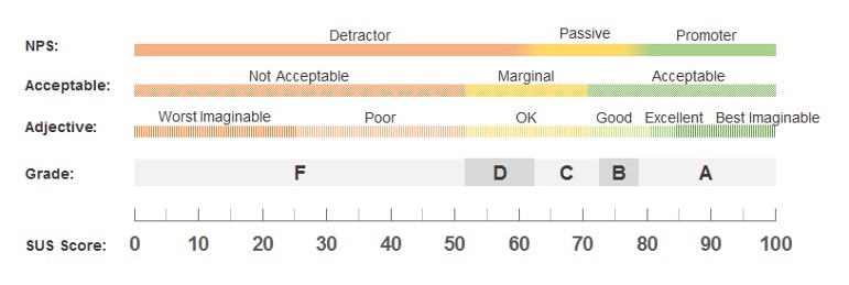
Figure 1: Five ways to interpret a SUS score.
The availability of these interpretive norms is the key reason why UX researchers developing new measures of perceived usability investigate how accurately they can predict concurrently collected SUS scores with the new scales. When this predictive accuracy of a new scale is high, researchers can use the existing SUS norms to interpret the new scale.
What We Think
This article was inspired by a LinkedIn post written by Rebecca Grier in which she posed the title question and said, “The SUS is like my grandmother’s measuring cups and spoons. They still work even though they are old.” We felt the answer needed more than a terse response on LinkedIn (as you can tell if you made it this far).
We generally agree. As with fine wine, age by itself isn’t a reason to stop using the SUS (but you certainly don’t want to serve vinegar). After all, we still use some technologies invented in the Middle Ages, such as windmills and eyeglasses.
We’ve used the SUS with many organizations for many years and plan to continue. We’ve also adapted the Ease item of the SUS into two questionnaires, the SUPR-Q and UX-Lite. This adaptation gives us the ability to generate SUS equivalent scores (taking advantage of the correlation between the single Ease item and total SUS score) using only a single item, making room in our questionnaires for additional items.
If an organization uses the SUS, we recommend sticking with it. Even our equivalent scores from the UX-Lite or the single SUS ease item may be off by 1.5–2.0%, which in some cases might be problematic, and the good measurement sensitivity of the SUS gives it a sample size advantage. Some organizations also find value in the content of the individual items and the rich set of interpretive norms for the SUS. For these organizations, we also recommend adding one item to the SUS—the usefulness item of the UX-Lite (“The features of this product meet my needs”). Doing this allows computation of the UX-Lite in addition to the SUS, capturing an important aspect of UX (Perceived Usefulness) that is not captured by the SUS.
For organizations looking to measure Perceived Ease of Use and Perceived Usefulness across product types (e.g., apps, internal systems), we recommend the UX-Lite. To measure important UX attributes of websites, we recommend the SUPR-Q (which includes a version of the ease item that can be used to estimate the SUS, and with the inclusion of the Usefulness item, enables concurrent measurement of the UX-Lite).
In summary, the SUS might show its age in some ways, but the investments UX researchers have made over decades in understanding its measurement properties and the advantages it has over alternate ways of measuring perceived usability suggest it isn’t quite ready to retire.