 Decisions should be driven (or at least informed) by data.
Raw data is turned into information by ensuring that it is accurate and has been put into a context that promotes good decision-making.
The pandemic has brought a plethora of COVID-related data dashboards, which are meant to provide information that helps the public and public officials make better decisions.
With the pressure to report data in near real-time, it’s not surprising that there have been examples of “bad” data. For example, positivity rate is a key metric researchers use to assess how prevalent COVID is in a community. Unlike raw case counts, positivity rate takes into account the number of tests being performed, so higher cases (a bad thing) can be differentiated from higher testing (a good thing), as long as the count of tests and cases are correct, which was recently NOT the case in California. Other states have been having an array of different measurement issues.
For example, several labs in Florida (where Jim lives) were reporting positive test results only, and positivity rates of 100% were therefore inflating the state’s overall positivity rate, making the figure suspect. At the same time, questions were raised about the quality of the positivity rate metric: positive cases were counted only once but all negative results were counted over a period in which the same people were tested multiple times—a practice that deflates the positivity rate.
As another example, in Colorado (where Jeff lives), a person who died from alcohol poisoning was later determined to have had COVID, and his death was attributed to COVID. Turns out this wasn’t an isolated case, and there were several cases of people dying with COVID versus because of COVID, making the death rate metric suspect. To address this distinction, Colorado recently changed the way it counts the number of people dying: they now track those who died with COVID as a contributing factor (smaller number) versus all deaths in which COVID was detected (larger number).
There are many more examples of problems with COVID data dashboards across the states and even across the world. It certainly raises the question of whether we can trust the data with all these problems.
The same concern about data integrity applies to data derived from UX research.
Data reviewing and cleaning are important first steps for working with data, particularly for large sample unmoderated studies, raw transaction or clickstream data, and survey data. In these types of studies, you aren’t directly observing participants, and often the size of the data makes it difficult to identify nonobvious problems. But even after going through the process of piloting and checking your study, and cleaning the results, bad data can still make its way into your final data set, especially when there’s pressure to get findings out fast.
How Can Poor-Quality Data Get into Analyses?
Some ways poor-quality data can make it into your analysis include
Tasks/questions misunderstanding: Some or all of your participants may misunderstand survey questions, response options, or task instructions.
Website/prototype issues: Perhaps a website was down or changed (such as a product being made unavailable) during the study.
Participant problems: A certain percent of participants may game the system, or so-called cheaters may provide false information or speed through the study to collect the honorariums. Even with data cleaning steps, identifying all poor-quality responders can be difficult.
How Should You Handle Bad Data?
Here are our recommendations on how to handle bad data.
- Investigate the problem and, if it exists, acknowledge it.
Be sure what you found is actually a bug and not a feature of the data. In some cases, we’ve been alerted to “problems” in survey or unmoderated data only to find that the root cause was a problem in data interpretation or expectation. In other cases, there were indeed problems.
For example, in a benchmark study we ran several years ago, we noticed very long task times with some participants (see Figure 1). A review of the videos showed that during the unmoderated study some participants were presented with a website intercept survey (see Figure 2). If the participant took the study, a couple of minutes were added to a task time that otherwise took only one minute.
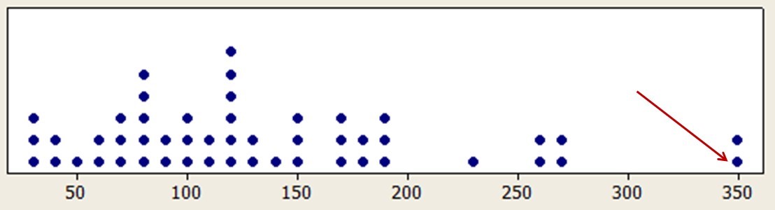
Figure 1: Extreme outliers in rental car task times due to the random presentation of an intercept survey.
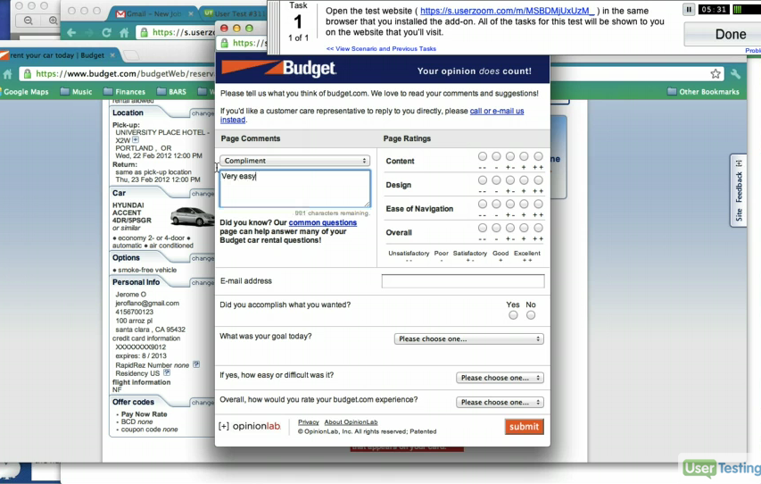
Figure 2: The rental car intercept survey.
In another example, we were evaluating a new website design for a PC manufacturer and were coding problems from watching a subset of videos. In one video we noticed the “Add to Cart” button disappeared, so the participant was not able to complete the task. Both of these examples turned out to cause problems with the data.
Tip: Use Bottom-Up and Top-Down Approaches to Find Bad Data
In the first example (with the unusually long task time), we used a top-down approach where we first noticed the issue in summarized time data that seemed unexpectedly long relative to the competitor. We then dug down into the individual responses and found the issue by watching the video. In the second example, we used a bottom-up approach where we noticed the issue first in the video and then looked at the summarized data to assess the magnitude of the problem … which is the next step.
- Assess the magnitude of the issue.
Just identifying the issue isn’t enough. Is all the data really “bad?” You must assess the magnitude of the damage. Is it affecting 1%, 10%, or 50% of the data? After investigation, we often find that suspected data quality issues aren’t as widespread as initially thought. Detecting potential data quality problems after investing significant time in analysis can feel like a gut punch—two punches if you have already reported the results to the client. So there is a strong emotional reaction to the situation that can make the problem initially seem larger than it turns out to be.
In the Florida COVID case, it turns out the problem with the labs affected less than 10% of the total sample, so even though it inflated the positivity rate, it was a slight, rather than a massive, inflation.
In the rental car example, we found evidence of it affecting only 1 out of 50 participants (2%). In the PC manufacturer example, we reviewed approximately 30 videos and found that 10 of them had the issue, a much more substantial 30% impact, but still a minority of the data. The bigger story here, though, was that we alerted our client to the problem, which turned out to be a bug with the new design that was affecting sales, and it was quickly resolved. We won’t claim our fix helped improve sales by $300 million, but I suppose left undetected and then generously extrapolating those lost sales for a year with lots of growth—maybe. But we will claim that our finding of the problem more than paid for the cost of the UX benchmark study we conducted that helped uncover the issue.
- Determine whether removing the data changes the conclusions or actions.
Now that you have some idea about the impact, does removing the bad data lead you to different conclusions? One of the benefits of relatively large sample sizes is that you can often drop 10–20% of the data and still draw similar conclusions, albeit with less precision.
As mentioned above, Colorado started reporting those who have died with COVID or because of COVID as separate numbers (Figure 3). As shown in the figure, unlike Florida, Colorado distinguishes between the number of people tested (smaller number) and the number of test encounters (larger number).
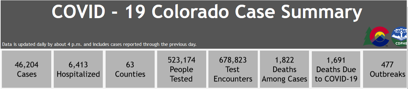
Figure 3: Colorado COVID case summary for July 30, 2020.
With these distinctions, it’s possible to perform more nuanced analyses. Removing nonlethal COVID cases from the count of COVID deaths sharpens the precision of estimates of its lethality rate while including them in the case count sharpens estimates of positivity rates. The difference in percentages for Deaths Among Cases and Deaths Due to COVID is nonzero but small (1822−1691 = 131; 131/46204 = 0.28%; adjusted-Wald 95% confidence interval ranges from 0.24–0.34%).
Quick Diversion: Distinction between Accuracy and Precision
As shown in Figure 4, accuracy and precision are not the same.
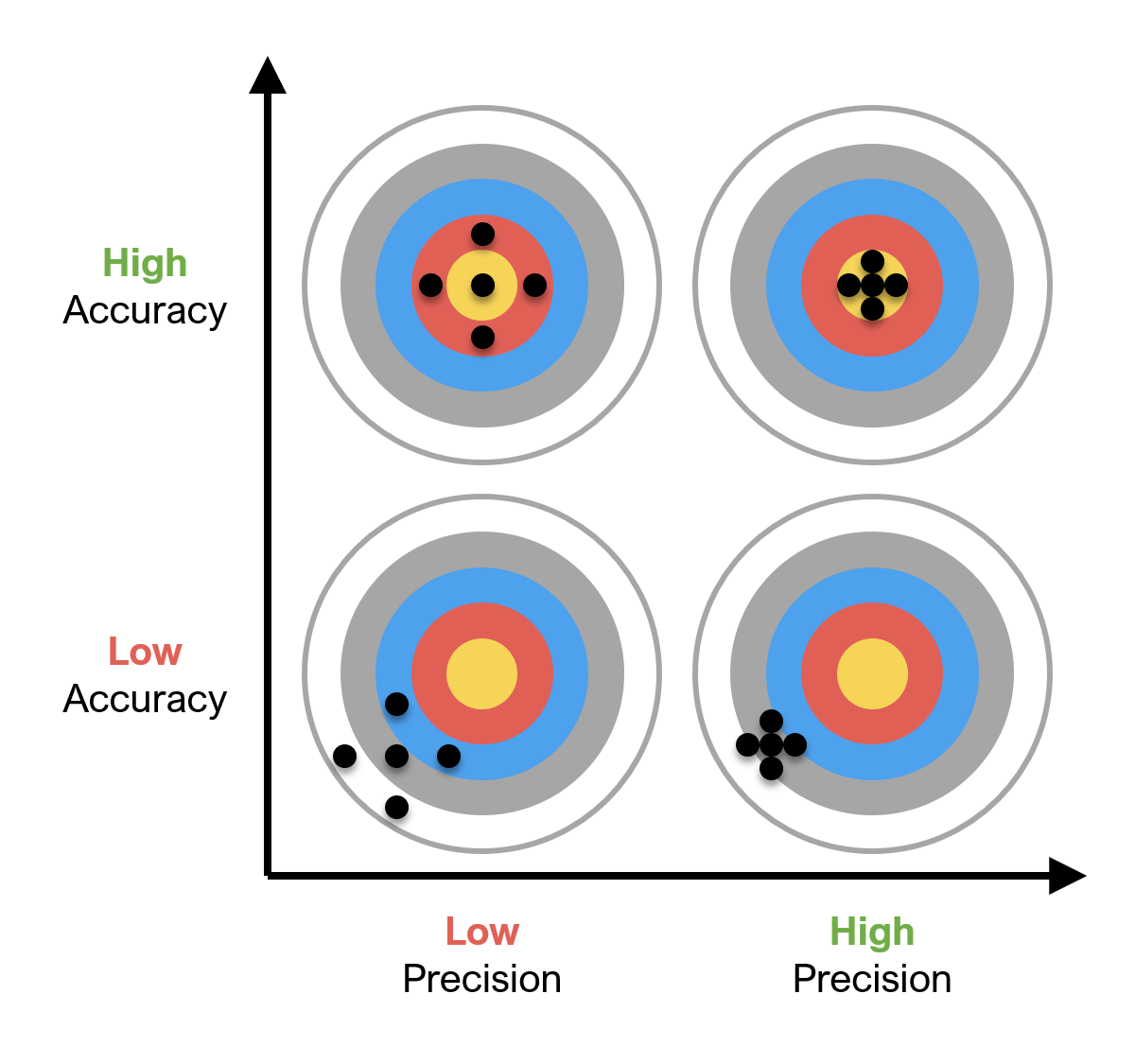
Figure 4: Accuracy versus precision.
When data are accurate, aggregate estimates of central tendencies, such as the mean, will be close to the true value of the population (the bullseye). When data are precise, the points cluster together and aggregate estimates of variability, such as the standard deviation, will be small.
Removing suspect data from a larger data set can affect accuracy or precision or both. If the suspect data turn out to be similar to the rest of the data regarding central tendency and variability, your revised computations will look a lot like the original ones, with some loss of precision due to the smaller sample size. If the suspect data are very different from the remaining data, then you might see some movement in the means due to eliminating bias introduced by the bad data. You might even see improvement in precision due to removing data that was increasing measurement variability. For example, we’ve seen cases where poor-quality responses from cheaters made its way into a comparison study. When we removed the data points (about 9% of the sample), the statistical differences remained and the size of the difference actually increased.
As an aside inside this aside, this reminds us of the famous darts scene from Young Frankenstein in which there is a “nice grouping.” We recommend that researchers avoid using this method.
Back to the Main Point
If the problem impacts a substantial amount and changes your conclusions, you should plan to re-collect your data. In most cases, you should be able to retain some data from the original study and re-collect just what you need to recover from the data quality problem.
- Identify the source of the problem and resolve it.
If you can replace the bad data or find a way to repair it, then you should. Identify the source of the problem and use what you learn to prevent the same problem from happening again. For example, if some participants misunderstood instructions, clarify the instructions. If you’re dealing with a poor-quality panel, drop them and work with a better one. If respondents figure out ways to take the study multiple times to increase the money they’re making, plug the holes or blacklist the offenders. Oh, and try to turn off the website intercept if you’re running a study on a website.
- Don’t expect perfection.
When we conduct research, we do our best to obtain data that is perfectly representative of the population of interest and is free of anything other than random error—no systematic bias and no gaming of the system by participants who are speeding or cheating. That’s the right goal, but it’s unrealistic to expect to achieve it. Follow best research practices to get as close to perfection as you can, and when you find bad data, use the guidelines above to help you recover.
A UX Example: Discovery of Bad Data from Preliminary Results
We recently conducted an unmoderated usability study in MUIQ to assess where people clicked on two different versions of a prototype. We needed to provide near real-time results, as the decision had significant financial implications. We had our usual protocol in place to detect and remove speeders and cheaters and to clean the data for any poor-quality responses.
Our preliminary findings included results from 121 respondents. However, upon further examination of the data, we noticed some participants had taken the study multiple times; we suspected a technical issue between the participant panel and prototype. We routinely collect 10%–20% more data than we need just in case these things happen. After removing 24 duplicates (about 20%), our sample size was 97: still large enough to detect reasonably small differences.
Figure 5 shows the impact of removing this data on the analysis of success rates for a key task that participants attempted with different designs. There was a slight shift in the estimates of success rates, but the shifts were about equal in both designs. Based on the comparison of confidence intervals, both before and after removing the bad data, the evidence (nonoverlapping confidence intervals) indicated a significantly higher success rate for Design B (p < .10).
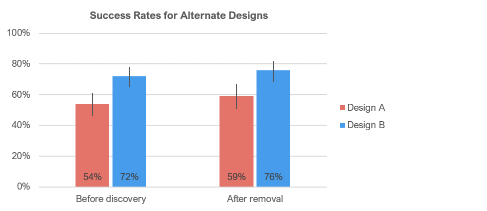
Figure 5: Estimated success rates (with 90% confidence intervals) for two designs before discovery and after removal of bad data.
Summary
Even after data has been cleaned, problems can creep into your analysis. To identify problems, try both bottom-up (looking at raw values first) and top-down (starting with summarized data) approaches, and dig in. After you identify a problem, confirm it is indeed a problem, assess its impact, and see whether removing the data has an impact on your conclusions. In most research, one bad apple won’t spoil the bunch, but if there are a lot of bad apples, you’ve got to find them and get them out of the barrel, or you won’t be able to trust your analysis.