 UX researchers use a lot of rating scales. We recommend using standardized rating scales when possible. One of the benefits of some standardized scales, such as the SUS, SUPR-Q®, and UX-Lite®, is that you have a reference database of historical data.
But there’s not always a standardized questionnaire for everything you’re hoping to measure, so researchers need to create ad hoc ones.
Data collected with ad hoc rating scales can be difficult to interpret, especially if you don’t have any historical data (e.g., from past product performance or competitors).
If you’re comparing multiple conditions (e.g., ratings on attributes for two or more websites), then you can check for significant differences in rating scale means.
But even clear differences in means don’t answer the question about whether a given mean indicates a poor or good user experience.
In this article, we provide a way to interpret five- and seven-point UX rating scales when you don’t have enough historical data for custom benchmarks. We use the well-known distribution of the System Usability Scale (SUS) as the basis for our recommendation.
UX Rating Scales Tend to Be Negatively Skewed
If you’ve never plotted your distributions of rating scale response options, you should. But don’t be surprised when you see a negatively skewed distribution (tail of data points to the left).
Most UX rating scales have this negative skew because (1) most item stems have a positive tone (e.g., “I felt very confident using this website”) and (2) respondents are generally more likely to agree (selecting higher responses). This means that the middle value (e.g., a 3 on a five-point scale) isn’t a good measure of the “average.” This skew doesn’t make the responses necessarily bad or not useful. It just means you need to account for that skew when interpreting them.
For example, you can see the skew in distributions of SUS scores, for which 50 is the middle of the scale (Figure 1), but is not the middle of the distribution (68 is the median).
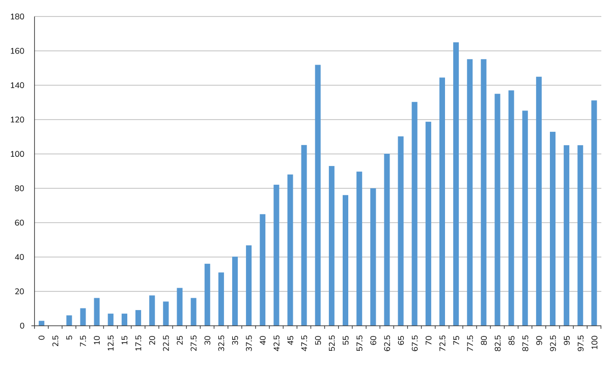
Figure 1: Distribution of 3,187 individual SUS scores (50 is the middle of the scale, but the median is 68).
Default Benchmarks Based on Historical SUS Distribution
Taking advantage of the well-known distribution of the SUS, we created a curved grading scale that is widely used in UX research (Table 1). We’ll use this as a basis for interpreting ad hoc scales.
| SUS Score Range | Grade | Percentile Range |
|---|---|---|
| 84.1–100 | A+ | 96–100 |
| 80.8–84.0 | A | 90–95 |
| 78.9–80.7 | A− | 85–89 |
| 77.2–78.8 | B+ | 80–84 |
| 74.1–77.1 | B | 70–79 |
| 72.6–74.0 | B− | 65–69 |
| 71.1–72.5 | C+ | 60–64 |
| 65.0-71.0 | C | 41–59 |
| 62.7–64.9 | C− | 35–40 |
| 51.7–62.6 | D | 15–34 |
| 0.0–51.6 | F | 0–14 |
Table 1: Curved grading scale for the SUS.
The 50th percentile of this scale is a SUS score of 68, a solid C. Another important benchmark commonly used in practice is an aspirational score of 80 (the upper end of an A−, a bit higher than the 85th percentile). Scores lower than 51.7 are in the F range (just below the 15th percentile).
Based on the SUS research, when we consult with clients who need a benchmark for five- or seven-point scales and there is no historical data, we usually recommend setting a benchmark for average to about 70% of the range of the scale, 80% for good, and 50% for poor—similar to the historical benchmarks for the SUS. For example, this is what we did when we created our standard grading scale for the UX-Lite.
Table 2 shows those values for five- and seven-point scales (the midpoint for a five-point scale is 3, and for a seven-point scale is 4).
| Location on Scale | Interpretation | Five-point | Seven-point |
|---|---|---|---|
| 80% | Good | 4.2 | 5.8 |
| 70% | Average | 3.8 | 5.2 |
| 60% | Below Average | 3.4 | 4.6 |
| 50% | Poor | 3.0 | 4.0 |
Table 2: Initial benchmarks for 70 and 80% of the range of five- and seven-point scales.
The formula for computing these values is based on the methods for interpolating rating scale scores that start with 1 to a 0–100-point scale, algebraically manipulated to compute the benchmark for the rating scale from the target range (e.g., 80% of the scale, expressed as 80 in the computation) and the maximum possible value of the rating scale (e.g., typically 5 or 7 for scales that start with 1):
Benchmark = Target / (100 / (MaxRating − 1)) + 1
For example, to find 70% of the range of a five-point scale, the benchmark would be:
70 / (100 /(5 − 1)) + 1 = 70 / 25 + 1 = 3.8
An alternative approach is to convert five- or seven-point ratings to a 0–100-point scale. John Brooke, the developer of the SUS, described the value of this approach: “Project managers, product managers, and engineers were more likely to understand a scale that went from 0 to 100 than one that went from 10 to 50, and the important thing was to be able to grab their attention in the short space of time they were likely to spend thinking about usability, without having to go into a detailed explanation.”
The general formula for converting a five- or seven-point scale to 0–100 points is:
Rating100 = (Rating − 1) * 100 / (MaxRating − 1)
For example, a five-point mean rating of 4.2 would become 80:
(4.2 − 1) * (100 / (5 − 1)) = 3.2(25) = 80
A seven-point mean rating of 4.0 would become 50:
(4 − 1) * (100 / (7 − 1)) = 3(16.67) ≈ 50
Caveat: Note that these are initial benchmarks to use when UX researchers lack a more grounded rationale for interpreting mean rating scale scores. After a reasonable amount of data collection with the scale, it’s a good idea to revisit the initial benchmarks to see whether they should be adjusted.
Summary
When you’re working with an ad hoc rating scale and have no historical data to lean on, the SUS distribution gives you a principled starting point. Because UX rating scales share a consistent negative skew (driven by positive item wording and respondent agreement bias), benchmarks derived from the SUS translate reasonably well to other five- and seven-point scales. It’s not that there’s something magic about the SUS. It works well because it’s a composite of ten five-point UX rating scales that share the tendency of other UX rating scales to be negatively skewed (more favorable than unfavorable). This means that benchmarks informed by the SUS provide a good initial approximation for other UX rating scales.
The characteristics of UX rating scales that this pattern supports are:
- Setting “Poor” below the midpoint of the scale (50% of the range) because means of positive-tone UX rating scales are consistently higher than the scale midpoint.
- Setting “Good” above 80% of the scale range is the traditional score for a B (above average).
Placing other cut points between 50% and 80% leads to these initial benchmarks:
- Good: Located at 80% of the range of the scale
- Average: Located at 70% of the range of the scale
- Below average: Located at 60% of the range of the scale
- Poor: Located at 50% of the range of the scale (the midpoint)
It’s important to keep in mind that these are reasonable best guesses without a strong normative database. For UX rating scale items that will be used frequently over time, researchers should plan to build normative databases and use them to tune the benchmarks (like we have done with the SEQ®).

