 Want to know what customers are likely to do? You’re not alone. Most organizations would love to predict their customers’ next action or attitude.
Unfortunately, there isn’t an analytics crystal ball that provides a clear and accurate picture of the future. Instead, we have to rely on the much murkier reality of past data to predict the future.
And while the past is no guarantee of the future, it’s often all we have to make decisions. More specifically, we look for correlations between various types of customer analytics to uncover patterns.
For example, you might ask correlation-revealing questions like these:
- Does a longer time on a website result in more purchases?
- Do customers rate tasks easier if they take less time?
- For customer who purchase product A, what other products do they purchase?
- Will coupons increase same-store sales?
- Will a reduced price mean higher sales?
- Is customer loyalty tied to future company growth?
If you want to make predictions based on customer analytics, you need to know how to evaluate relationships between variables—including assessing the strength of the correlations. I discuss correlations in detail in my book, Customer Analytics for Dummies. Here’s a sample.
Visualizing Associations
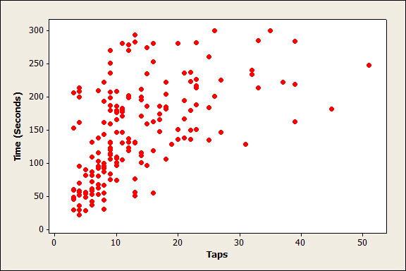
A good first step in looking for relationships with two continuous variables is to graph them in a scatterplot. We might assume, for example, a strong, relationship between (a) the number of clicks or taps a user has to make to complete a web-based sales transaction and (b) the time it takes for the user to complete that transaction.
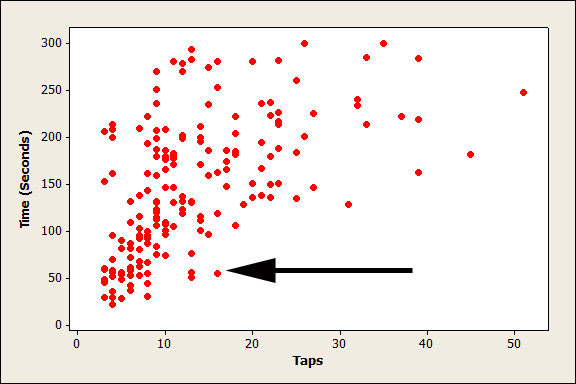
Figure 1 is a scatterplot of the data from a usability study of 181 participants on an e-commerce mobile site. Each dot represents one participant’s experience: the number of taps required to complete the transaction (on the x, or horizontal, axis) and the number of seconds it took the participant to complete the transaction (on the y, or vertical, axis). The arrow indicates the data point plotted for a customer who used 16 taps to complete the transaction in 50 seconds.

Figure 1: A scatterplot between taps and the time it takes to complete a purchase.
An increase in the number of taps tends to accompany an increase in the time it takes the customer to complete the purchase. We can infer a positive and fairly strong association between the two variables.
Quantifying the Strength of a Relationship
To quantify the strength of an association between two continuous variables, such as revenue and time, use the Pearson Product Moment Correlation—more commonly known as r, the correlation coefficient. (I’ll cover the associations between binary variables in another post.)
The correlation coefficient varies from -1 to 1 (see Figure 2):
r = -1 perfect negative correlation
r = 0 no correlation
r = 1 perfect positive correlation
Of course, perfectly correlated variables aren’t helpful. They’re redundant; if you have the value for one variable, you can perfectly predict the other.

Figure 2: Scatterplots of relationships between variables, from left to right: perfect negative correlation (r = -1), no correlation (r = 0), and perfect positive correlation (r = 1).
The correlation coefficient works well when the relationship between variables is linear (forming a line). Linear means a line can reasonably describe the relationship between variables and then be used to predict real-world customer behavior. The less linear your data, the less accurate the correlation—and your ability to accurately predict—becomes. Figure 3 shows what nonlinear relationships might look like when you graph the data (another great reason to graph!).

Figure 3: Patterns of data showing a nonlinear relationship between two variables.
In practice, correlations fall somewhere between weak and strong. For example:
r = .8 Height and weight
r = .5 SAT score and freshman-year GPA
r = .7 Usability and customer loyalty
Correlation between variables, like the ones shown above, mean that either variable can predict the value of the other. If you know a customer’s height, you can estimate his weight, and vice versa. But these aren’t perfect correlations; the closer a correlation is to 0, the less likely it is that one variable predicts the other.
Computing a correlation
You can compute the correlation coefficient by hand, or software like Excel can compute it for you [using, for example, the Pearson Correlation formula: =PEARSON() or =CORREL() ]. I have an Excel sheet with tap and time data in each column for 181 rows of customers. The correlation for the data is .560666. This confirms what we see in Figure 1: a positive, moderately strong correlation between time and taps.
Interpreting the strength of a correlation
Once you compute a correlation, you’ll want to interpret the strength of the relationship. The correlation between taps and time is r = .56. Is that a strong correlation? It depends.
The strength of a correlation is context dependent. A correlation coefficient can be considered strong in one context and weak in another. Like statistical confidence, what’s considered a “strong” relationship depends on how much error you can tolerate and the consequences of being wrong.
Making a bad decision by predicting time from taps probably won’t lead to loss of life or loss of a lot of money, so it’s strong enough to be useful. In fact, it’s about as strong as the association between the SAT and first-year college grades—where there’s a lot at stake! Correlations were the topic in a 2009 CHI paper[pdf] we wrote, in which quantified the correlation in the most common usability metrics. We found correlations ranged from about r= .3 to r= .5.
While correlations are context dependent, it can help to have some guidance on what you’ll likely see with customer analytics data. Jacob Cohen, the author of the seminal book on Power analysis, examined correlations in the behavioral sciences, something similar to measuring customer behavior, and provided the following rules based on how common the correlations were reported in the peer-review literature:
r = .10 small
r = .30 medium
r = .50 large
Based on this scale, our correlation of r = .56 between taps and time would be large. But let’s discuss another way to use this number.
Coefficient of determination R2
Multiplying r by itself (squaring it) produces a metric known as the coefficient of determination. It’s represented as R2–usually expressed as a percentage—and provides a better way of interpreting the strength of a relationship. For example, a correlation of r = .5, when squared, becomes .25 or 25%. For the correlation between taps and time, R2 is 31%: taps explain 31% of the variation in the time, and time explains 31% of the variation in taps. As you can see, even a strong correlation, up to r = .5, still explains only a minority of the variation between variables.
Height for example, explains around 64% of the variation in weight. That means, knowing people’s heights explain most, but not all, of why they are a certain weight. Other factors—perhaps exercise, diet, and genetics—explain 36% of the variation. In the context of usability testing, errors have a correlation of about .5 with task-time; thus, the number of errors users commit while attempting tasks explains 25% of the variation in task times.
Use this approach when correlating any customer metrics. Find the correlation, square it, and then interpret the R2 value. When stakes are high, you want high correlations that explain most of the variation. With customer analytics, we usually find instances of one variable predicting another.
Correlation is not causation
You’re probably heard it before but It bears repeating: correlation is not causation. The ticking clock does not cause the extra taps. The high SAT scores don’t cause the better grades. Higher Net Promoter Scores don’t create higher revenue. Association? Yes. Causation? No. Establishing causation means being able to display a temporal relationship (a precedes b), and ruling out other explanations, usually through a randomized controlled experiment.
It seems like the warning always applies to someone else’s research. But even well trained researchers and scientists get so vested in their ideas that they get caught in the correlation is causation trap. You should always look for alternative explanations when you think there’s a causal relationship
- A new design might have caused the increased website conversion rates or perhaps it was because a main competitor stopped selling a product around the time the design was released.
- Customer coupons might have caused the uptick in same-store sales, or maybe same-store sales were already increasing because of an improving economy or industry
Conclusion
Making an association between customer data is one of the essential tools for predicting future customer (or user) behavior. To better understand relationships between customer data
- visualize the relationship in a scatterplot
- quantify the association with the correlation coefficient r
- interpret the correlation by squaring it
And remember, correlation alone is not enough to establish causation: always look for alternative explanations and look to replicate the association, especially when the consequences of being wrong is high.