

 Tech has improved a lot over the last ten years.
It’s hard to beat the promised convenience of managing health insurance online. Gone are the days of hunting through paper policy booklets, waiting on an employer’s benefits manager, or enduring the endless hold music of a telephone call center.
Modern portals promise complete, on-demand control over your healthcare: real-time network coverage and deductible tracking, a doctor search that works like any other search bar, and a full claims history available any time, day or night.
But this digital autonomy comes with high-stakes drawbacks. Because health insurance portals must organize fragmented clinical, network, and financial data, they frequently lack the intuitive ease that consumers expect from modern digital interfaces. It’s still hard to find out if a doctor is in your insurance network or if parts of your claim won’t be covered.
The circumstances behind the visit can also affect usability. Unlike low-stakes commercial retail websites, where users can casually learn navigational patterns over time, a health insurance portal is rarely visited for leisure. A user’s first interaction often occurs during a high-stress medical event where cognitive load is already strained, and a clunky, unfamiliar layout becomes a barrier to care.
Despite these issues, digital engagement is at an all-time high, with independent market data revealing that 85.5% of insured Americans have created an online account with their health insurance provider. However, because of foundational usability flaws, the baseline experience fails consumers when they need help the most. Recent industry benchmarks show that health plans fail to deliver an easy-to-use digital experience 39% of the time, and their consumer satisfaction scores drastically trail other digital sectors like retail banking and property insurance. This makes the quantitative improvement of health insurance websites’ user experience a critical priority for both insurers and patients.
This isn’t the first time we’ve checked in on this industry. When we benchmarked six major health insurance websites in 2018, the group’s average SUPR-Q score sat at the 67th percentile—solidly above average. Eight years, and presumably a lot of digital investment, later? The group founders at the 30th percentile.
To understand the quality of their online experiences today, we collected UX benchmark metrics on eight common healthcare websites and mobile applications.
- Aetna (CVS Health)
- Blue Cross Blue Shield
- Cigna
- Elevance Health (Anthem)
- Highmark
- Humana
- Kaiser Permanente
- UnitedHealthcare
We computed SUPR-Q® and Net Promoter scores, measured users’ attitudes regarding their experiences, conducted key driver analyses, and analyzed reported usability problems. (Full details are in the downloadable report.)
Benchmark Study Details
From February to March 2026, we asked 391 users of healthcare websites in the U.S. to recall their most recent experience and perceptions of one of these websites on their desktop and mobile app (if applicable) in the past year.
Respondents completed the eight-item SUPR-Q (which includes the Net Promoter Score), the two-item UX-Lite®, and the SUPR-Qm standardized questionnaires, and answered questions about their brand attitudes, usage, and prior experiences.
Quality of the Website User Experience: SUPR‑Q
The SUPR-Q is a standardized questionnaire widely used for measuring attitudes toward the quality of a website user experience. Its norms are computed from a rolling database of around 200 websites across dozens of industries.
SUPR-Q scores are percentile ranks that tell you how a website’s experience ranks relative to other websites (50th percentile is average). The SUPR-Q provides an overall score as well as detailed scores for subdimensions of Usability, Trust, Appearance, and Loyalty.
The mean SUPR-Q across healthcare websites in this study was at the 30th percentile (substantially below average), ranging from the 12th percentile for Highmark to the 49th percentile for Cigna.
Usability Scores
Overall, usability scores were also well below average for the healthcare websites, averaging at the 21st percentile. Highmark had the lowest usability score at the 7th percentile, and Cigna had the highest (57th percentile).
Comments related to usability on Highmark included:
“Certain pages require multiple clicks to get to basic information, and the navigation isn’t always intuitive, which can make the experience a bit frustrating.”
“The layout is confusing. Too much time looking for what I need.”
Loyalty/Net Promoter Scores
By itself, the Net Promoter Scores isn’t necessarily a good metric for health insurance websites, since many users don’t get to choose their insurer (and the site they have to use). A low score could reflect more on the industry, a limited network, or a mandated plan than it does on the user experience. Despite this potential confusion, we still report it for two reasons. First, comparing scores across companies in the same industry (and over time periods) helps identify who’s delivering a relatively better or worse experience, as the underlying constraint is the same for everyone. Second, NPS remains one of the few metrics that needs no explanation in a boardroom: stakeholders already know what a score of 40% versus −20% means, which makes it a useful entry point when discussing more relevant UX metrics associated with the NPS.
All but two healthcare websites, Humana and Aetna (CVS Health), had negative Net Promoter Scores, led by Humana at 14% and followed by Aetna (CVS Health) at a neutral 0%. Highmark scored the worst behind the group at−47%. The average NPS for these websites was −14%, indicating a substantial surplus of brand detractors over promoters across the industry.
Comments related to NPS and loyalty included:
“For a website that has a variety of audiences visiting it who have very different needs, it does a good job and is more simple than having to navigate to a website specific to who you are (employer versus provider versus patient, etc.).” — Blue Cross Blue Shield
“I just don’t think they are the best. I am not sure the information is reliable especially when trying to find a provider or a specialist.” — Highmark
Websites and Mobile App Usage
As a part of this benchmark, we asked respondents how they accessed the healthcare providers online. All respondents reported using their desktop/laptop computers (this was a requirement for participation in the survey), with 67% also using mobile apps and 69% using mobile websites. Most respondents reported visiting their healthcare websites on a desktop or a laptop computer a few times per year. Mobile app users showed more variation, with 40% of Aetna (CVS Health) and 39% of Kaiser Permanente users reporting using mobile apps a few times per month, and 33% of Cigna users reporting using mobile apps a few times per year. The majority of other healthcare website users mostly reported having never used the mobile app.
Key Drivers of UX Quality
To better understand what affects SUPR-Q scores and Likelihood-to-Recommend (LTR) ratings, we asked respondents to rate potentially important attributes of the healthcare websites on a five-point scale from 1 (Strongly disagree) to 5 (Strongly agree). We conducted key driver analyses (regression modeling) to quantify the extent to which ratings on these items drive (account for) variation in overall SUPR-Q scores and, separately, LTR (the rating from which the NPS is derived; full details are in the downloadable report).
The top key driver of the overall SUPR-Q scores was the ease of finding providers (13%), followed by the abilities to find accurate claims information (9%), quickly find information on prior claims (9%), and easily find what they will pay for services (8%). Taken together, eight significant variables accounted for 63% of the variance in SUPR-Q scores.
For likelihood to recommend (LTR), the top key driver was the ease of finding providers (9%), followed by trust that personal and health information are secure (9%). Tying for third are plan coverage being easy to understand (7%) and the ease of finding how much services will cost (7%). Overall, six significant drivers accounted for 46% of the variance in LTR.
Figure 1 shows a scatterplot of the importance and opportunity for improvement for seven key drivers. The combination of importance and opportunity for improvement provides a basis for prioritizing which key drivers to improve. The importance score is the greater of the variance accounted for by the driver in the SUPR-Q and NPS analyses, where larger percentages indicate more importance. The opportunity score is the top-box percentage for the driver, so smaller percentages indicate greater opportunity for improvement (e.g., it would be harder to improve a driver with a top-box percentage of 100% than one with a top-box percentage of 10%).
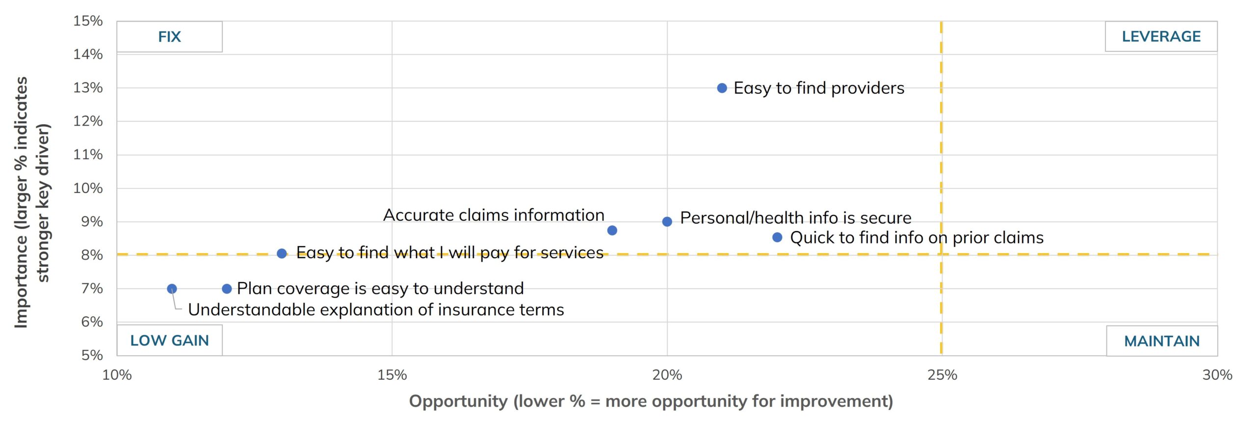
Figure 1: Scatterplot of importance and opportunity for improvement of key drivers.
Five of these seven key drivers fell in the FIX quadrant (upper left) with relatively high importance and higher opportunity for improvement:
- Easy to find providers
- Personal/health information is secure
- Quick to find information on prior claims
- Easy to find what I will pay for services
- Accurate claims information
Blue Cross Blue Shield achieved the highest top-box scores for quickly finding information about prior claims (46%), easily finding covered doctors or providers (32%), and consumer confidence that personal and health information is secure (30%). Humana led for trust in the accuracy of online claims information (24%), while Blue Cross Blue Shield and Cigna tied for the highest top-box score regarding the ease of finding out-of-pocket cost information (18%).
Conversely, the websites with the lowest top-box scores, suggesting the most room for digital improvement, were Humana for tracking prior claims (12%), Highmark for data security confidence (12%), and Humana again for finding covered providers (14%). Highmark scored the lowest for trust in claims information accuracy (9%), while Aetna (CVS Health) registered the worst top-box performance for clear out-of-pocket cost transparency (10%).
UX Problems
We examined the verbatim comments to better understand the problems users had.
Difficulty Finding Information Was a Universal Grievance
This issue affected all eight websites and was the single top complaint across every provider in the study. It was a massive pain point for Kaiser Permanente, Highmark, and UnitedHealthcare.
“Its navigation is non-intuitive.” — Kaiser Permanente
“It is very difficult to find the information I need.” — UnitedHealthcare
“I stumble through a lot of different pages before finally finding what I’m looking for.” — Blue Cross Blue Shield
These comments speak to a navigation problem, not a content problem. The needed information is usually on the site somewhere. It’s just buried under menu structures built around the insurer’s org chart instead of the handful of things a member actually comes to do.
Unreliable Provider Directories Degrade the Experience
For seven of the eight platforms, outdated or inaccurate directory information emerged as a major barrier to care. Users routinely noted a stark disconnect between the doctors listed online and the reality of who actually accepts their insurance.
“They don’t update doctors who are in network and who isn’t.” — Aetna
“It is not always accurate on whether a place/doctor takes your insurance or not.” — Blue Cross Blue Shield
“Caregivers are listed as being in network or accepting new patients, but when I call to make an appointment, that’s not the case.” — UnitedHealthcare
Figure 2 shows a critical directory system error on the Blue Cross Blue Shield search results page. Instead of presenting a diverse list of nearby options, the portal repeats the exact same facility multiple times in a row down the page. This type of technical redundancy unnecessarily inflates the layout, clutters the interface, and requires members to filter through duplicate data entries to locate distinct, alternative care providers.
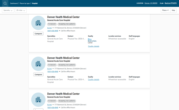
Figure 2: Duplicate provider search results on the Blue Cross Blue Shield platform.
Sluggish Performance and Site Errors Delay Essential Tasks
Users reported slow loading times, timeouts, or complete site outages across all eight websites. Performance issues were especially disruptive for Highmark, Elevance Health (Anthem), and Kaiser Permanente.
“Sometimes when I log in, the site is down.” — Aetna
“It’s clunky, it freezes, it’s under construction, constant error messages.” — Humana
“Sometimes there are error bugs on certain pages although rare. When these different bugs pop up certain information or pages are not accessible.” — Elevance Health (Anthem)
“Occasional slow page loads or timeouts especially during peak hours.” — UnitedHealthcare
“The website is very slow at times and pages fail to load altogether. Getting a generic error message when trying to access my medical records is extremely frustrating.” — Kaiser Permanente
Figure 3 illustrates the exact technical dead end described by these participants. Instead of loading the requested medical records or dashboard utility, the Kaiser Permanente platform encounters a critical error loop, leaving the page blank save for a red exclamation warning badge and a disruptive “Back to Sign In” command. This system failure completely breaks the user session, forcing members to entirely restart the multi-step login process to attempt their task again.
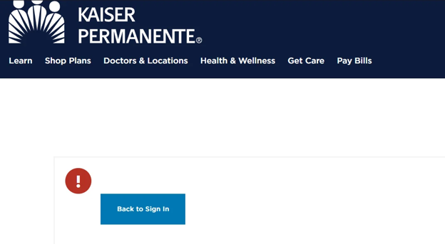
Figure 3: A systemic backend routing error on the Kaiser Permanente portal that blocks member access to internal records and triggers session termination.
These aren’t cosmetic bugs. A frozen page or a timeout in the middle of a claims dispute can mean a missed deadline, not just an annoyance. Every one of the eight sites drew reliability complaints, suggesting that basic uptime and performance are still struggles for an industry pushing members toward digital-only service.
Cluttered Layouts and Irrelevant Popups Prevent Smooth Navigation
Navigational bottlenecks heavily impacted users’ baseline experience. Six of the eight sites suffered from significant login friction, while others overwhelmed users with busy, crowded interfaces.
“Overwhelming amount of information … the website sometimes feels cluttered with information, making it difficult for me to filter out what doesn’t apply to me.” — Humana
Figure 4 shows why: the interface presents an overly dense, text-heavy dashboard layout for accessing basic member documents. Rather than organizing resources into clear, scannable visual segments, the platform confronts users with exhaustive walls of prose, complex text blocks outlining compliance requirements, and generic sidebar links. This format spikes cognitive load, forcing members to meticulously read through paragraphs of operational data just to find a specific form link.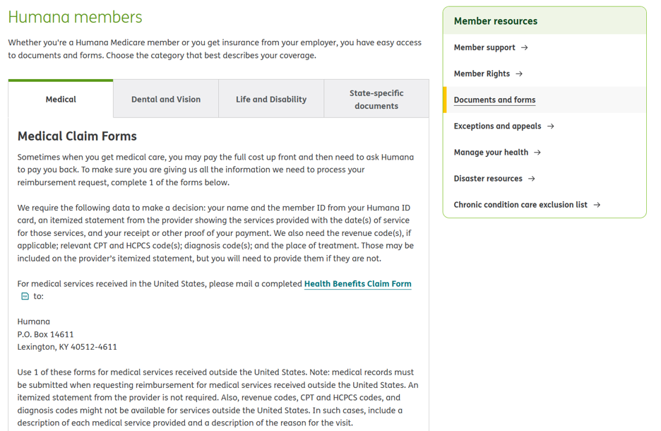
Figure 4: Dense, text-heavy documentation layouts on the Humana platform that contribute to visual clutter and search fatigue.
This layout fatigue is far from an isolated issue; members across other major insurance platforms frequently reported navigating highly saturated interfaces where non-essential material routinely buries functional tools:
“It can be confusing at times due to the website being crowded with information.” — Kaiser Permanente
“There is a lot of fluff and links to articles that I don’t care about or have no bearing on the services provided.” — Elevance Health (Anthem)
Figure 5 shows another source of that clutter: a promotional pop-up covering the entire “Find Care” page on UnitedHealthcare, which members have to dismiss before they can do anything else. A marketing message is blocking the one task this page exists for.
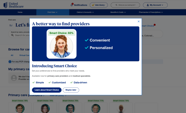
Figure 5: An intrusive modal pop-up on the UnitedHealthcare website.
Summary and Takeaways
Healthcare payers are massive enterprises, serving millions of Americans who increasingly rely on digital self-service tools. An analysis of the user experience of eight major health insurance platforms using benchmark data found:
- Cigna and Humana lead; Highmark lags. Cigna achieved the highest overall SUPR-Q score, falling at the 49th percentile, while Highmark had the lowest score, falling in the 12th percentile. Humana achieved the highest Net Promoter Score at 14%, while Highmark fell the furthest behind the group at −47%.
- Provider verification and claims transparency drive UX scores. The top key driver of overall SUPR-Q scores was the ease of finding doctors or providers covered by the user’s plan (13%), followed by the accuracy of claims information (9%), quickly finding info on prior claims (9%), and and easily finding what they will pay for services (8%). Taken together, eight significant variables accounted for 63% of the variance in the SUPR-Q scores. Other critical drivers include the ability to get information without calling customer service (6%) and confidence that personal/health information is secure (5%).
- The top opportunities for improvement are helping members easily find covered providers and allowing them to quickly track prior claims. One way to prioritize attention to key drivers is to consider both their importance (variability in regression) and how well the websites achieve the stated goal (top-box scores). The two key drivers with the most potential for improvement (high impact percentages and low top-box scores) were the ability to easily find doctors or providers covered by a plan (average top-box score: 21%) and the ability to quickly find information about prior claims (average top-box score: 22%). For finding covered providers and for tracking prior claims, the leader was Blue Cross Blue Shield (Humana lagging).
- Top frustrations are hidden information, website performance issues, and unreliable provider searches. The most frequently reported issue, affecting all eight websites, was a general difficulty in locating information. Website performance and slow loading times were also universal issues logged across all eight platforms. For seven of the eight systems, users specifically cited that the provider search directory was unreliable or difficult to parse. General login and authentication friction was also highly prevalent, acting as a major pain point on six of the platforms.
- Health insurance members have trouble finding vital information. Quantitative and qualitative signals from our findings converge on a clear trend: users of these digital health platforms have trouble efficiently uncovering vital policy information. Quantitative signals emphasize broken pathways toward verifying provider networks, reviewing claims, and estimating out-of-pocket pricing. The qualitative “why” behind the numbers highlights extensive complaints surrounding buried information, clunky login processes, and sluggish site performance. Quantitative metrics and user commentary both suggest that the platforms that would especially benefit from a strong focus on baseline usability are Highmark, UnitedHealthcare, and Elevance Health.
For more details, see the downloadable report.