 For most people, going to the doctor isn’t fun.
Is the doctor in your network?
How much will the visit cost? What if a CT scan is ordered? And when the bill comes, what the heck does EOB mean?
What does or doesn’t your insurance cover?
A visit to your health insurance website should help, but you probably don’t remember your password and when you manage to log in, you probably have trouble finding the information you need.
The health insurance industry in the U.S. is complex with different federal and state rules. Each year plans change, costs increase, and coverage narrows. Finding information on a health insurance website shouldn’t be more painful than the procedure, but it often is.
To understand the online experience of health insurance websites, we benchmarked the desktop and mobile user experience of six of the top health insurance websites:
- Anthem Blue Cross Blue Shield (anthem.com)—which represents 37 regional BCBS orgs
- Aetna (aetna.com)
- Cigna (cigna.com)
- Humana (humana.com)
- Kaiser Permanente (kp.org)
- United Healthcare (uhc.com)
We collected SUPR-Q data, including NPS data, and investigated visitors’ reasons for using the site, website attitudes, understanding of key features, and ability to complete tasks on each of the websites. More details are available in the downloadable report.
Study Details
We recruited 495 participants in June 2018 for perception and usability studies. For the perception study, we asked 302 current health insurance subscribers to reflect on their most recent experience on their insurers’ websites.
Participants in the study answered the 8-item SUPR-Q (including the Net Promoter Score) and questions about their prior experience. In particular, we were interested in visitors’ attitudes toward the site, whether it was usable for different audiences (current and prospective subscribers, Medicare patients, subscribers with insurance through their employer or parent, subscribers who purchase their own insurance), and whether it was easy to find relevant information.
For the usability portion, we asked 193 participants to complete a task—specifically, to locate an in-network healthcare provider as a guest—on one of the six health insurance websites.
Quality of the Health Insurance Website User Experience: SUPR-Q
The SUPR-Q is a standardized measure of the quality of a website’s user experience and is a good way to gauge users’ attitudes. It’s based on a rolling database of around 150 websites across dozens of industries, including healthcare.
Scores are percentile ranks and tell you how a website experience ranks relative to the other websites. The SUPR-Q provides an overall score as well as detailed scores for subdimensions of trust, usability, appearance, and loyalty.
For the perception study, the scores for the six health insurance websites were mostly above average—including several with exceptionally high scores. Between them, the average SUPR-Q is at the 67th percentile (scoring better than 67% of the websites in the database). Anthem Blue Cross Blue Shield has the lowest SUPR-Q score of the group with a score at the 49th percentile. Kaiser Permanente leads the group with a score at the 90th percentile.
We conducted a similar analysis in 2014 that included four of these sites. Anthem and Kaiser had similar scores whereas Aetna and United Healthcare performed statistically better in 2018 compared to our perception data in 2014. The overall SUPR-Q score for Aetna rose from 30% to 76%, whereas United Healthcare rose from 38% to 55%.
In the usability study, Kaiser Permanente also has the highest overall SUPR-Q score of the group (at the 54th percentile) compared to Aetna with the lowest at the 6th percentile.
Usability Scores
For the usability of the health insurance sites, Kaiser Permanente also has the highest score of the group (at the 86th percentile in the perception study and at the 78th percentile in the usability study). Compare these scores with Humana, which has the lowest usability score in the perception study (44%) and Aetna, which scored the lowest in the usability study (3%).
Loyalty/Net Promoter Scores
This year, health insurance websites have an average NPS of about –1% in the perception study and –40% in the usability study. Not too surprisingly, users of health insurance websites are about as likely to recommend the website as a colonoscopy.
This pattern is consistent with how health insurance websites performed in 2014, when the average NPS was about –2%. Among the four insurers tested in both studies, only Aetna showed statistical improvement: from –16% to 6% today. Low Net Promoter Scores may be a function of participants not feeling there’s much choice and the websites themselves are usually secondary to the coverage the insurance provides.
Why People Use Health Insurance Sites
As part of this benchmark, we asked participants about the activities they attempted on their last visit and in the last 12 months. Checking plan information, or comparing plans, was the most common activity reported by 30% of participants on their last visit, with 34% having attempted it in the past year. Searching for a doctor or other care provider was another very popular goal for participants. It was the most common activity reported by 50% of participants in the past year, with 14% having attempted it on the last visit.
We found that 26% of respondents reported using their insurer’s mobile website in the past year, but only 8% had used their app, suggesting a lot still happens on the desktop.
Difficulties Finding
Poor navigation was the top reason participants cited for disliking their health insurance websites.
- “If I don’t find what I am looking for then I need to call them, which I hate doing.” —Anthem Blue Cross Blue Shield user
- “Too much information on one page, having to hunt for what information you are looking for.” —Cigna user
- “In some parts of the website, it can be somewhat hard to find exactly what you are looking for, if you aren’t already aware.” —Kaiser Permanente user
Most participants reported knowing what is covered by insurance (72%) but only about half of Anthem (45%) and United Healthcare (52%) users felt they could estimate how much a procedure would cost. Estimating costs was a common task and appeared as one of the key drivers of the quality of the UX experience as detailed in the report.
Difficult Terms and Abbreviations
It can be even more difficult to find information when the terms and abbreviations aren’t well understood. We asked participants to describe common health insurance terms in their own words and coded these verbatim comments.
For example, for the term “deductible,” a participant incorrectly wrote:
- “It is an amount of money that I can ‘deduct’ from my annual income when it comes time to do taxes.” —Humana user
Our analysis suggested this misunderstanding was more widespread with 36% not understanding deductible, 44% not knowing what EOB (Explanation of Benefits) means, and 46% not knowing what an out-of-pocket maximum is.
Guideline Review Reveals Search Pain
To dig deeper into the causes of poor UX scores, five UX researchers conducted a detailed guideline review of the six websites. The evaluators used the Calibrated Evaluator’s Guide (CEG) that consists of 107 standardized criteria across seven dimensions: navigation, content, search, product pages, purchasing and billing, forms and data entry, help and information, and overall.
Guideline reviews provide a complementary perspective to user evaluations. One of the main findings from the guideline review was that search was a common pain point across all the sites. For sites that mostly turn up unhelpful search results and lack predictive search terms or filtering capabilities, users are much less likely to access what they need.
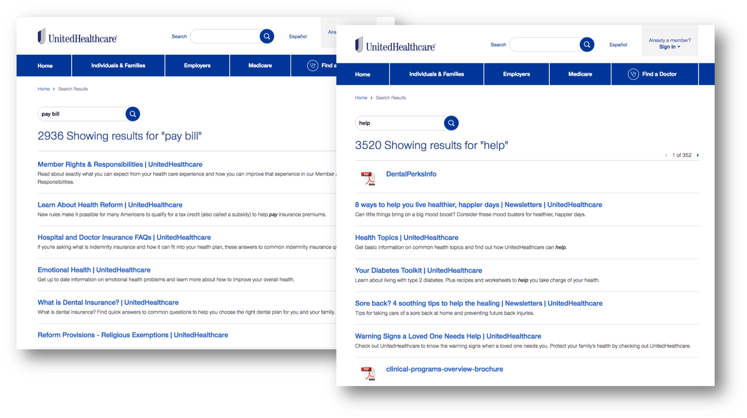
Figure 1: The UnitedHealthcare search contained irrelevant results and links to PDFs for common search terms like “help” and “pay bill.”
A more detailed look at how the sites performed, with each site’s top areas for improvement, can be found in the downloadable report.
Calling Customer Service
Taking calls is expensive for the provider and time consuming for the customer. A substantial 30% of participants reported calling customer service in the last year. Why do people call? One of the top reasons was login troubles. Remembering usernames and passwords and the often-painful process of resetting these resulted in 21% of participants calling in:
“Sometimes it’s hard to login and the process to reset your password is time-consuming.” —Aetna user
Other common reasons for calling support included checking claims, contacting doctors, making payments, and searching for an in-network provider. All the reasons can be found in the downloadable report.
Limited Functionality for Guests
Participants in the perception study were subscribers of the insurance company whose website they were testing. Participants in the usability study, however, were randomly assigned to a website regardless of their personal insurer. This allowed us to gather insights into the experience of both members and prospective customers, and to better understand another common use case by approximation: members who don’t or can’t login.
Prior Perception vs. Current Actions
The average overall SUPR-Q score in the usability study was 31 points lower than in the perception study. The biggest individual differences were with Aetna (72 points lower) and Cigna (67 points lower).
Participants on the Aetna and Cigna websites struggled to find in-network providers without logging in. While it’s possible on both sites to search for doctors as a guest, it’s not always clear where to do so, and member-only searches are emphasized.
Video Example 1:
Video 1: This participant landed in member-only search twice, and incorrectly used the search bar, before finally finding guest search for doctors.
Kaiser Permanente is the leader of the group with the best SUPR-Q score across all the health insurance websites. The Kaiser Permanente website experience was not without issues, however, as the path to finding a provider as a guest required many steps, including several unnecessary filters that could hold users back. The correct path takes at least four clicks and on average it took participants over two minutes to get there (305 seconds). See Video Example 2 from MUIQ.
Video Example 2:
Video 2: The participant took the correct path, but delays were caused by a location filter.
- “I think it was pretty easy, but there were some unnecessary steps including picking a region.” —Kaiser Permanente user
The United Healthcare website had a similar problem that held participants back. To locate a provider, users needed to complete a sequence of filters with little support for errors during the process (Video 3).
Video Example 3:
Video 3: The participant reached the correct place, but initially filtered by mental healthcare by mistake.
Another challenge for participants was finding the right link to search for a provider when it wasn’t immediately present when the site first loaded. On the Anthem Blue Cross Blue Shield website, the most common place participants found this link was in the hamburger “menu” icon. The click map in Figure 2 shows that while 54% looked in the menu, almost half didn’t, likely leading to task failure (32% still failed the task).

Figure 2: A click map shows where participants clicked to find a provider on the Anthem homepage.
- “Find a Doctor” should be a main option on the homepage. If it was, I didn’t see it. I had to go to a pull-down menu.” —Anthem Blue Cross Blue Shield user
Although Humana had the highest task success rate in the usability study (88%), the website suffered from a similar problem: the Find a Doctor link was hidden beneath the fold. Only 29% of participants found it on the first click. Fortunately, the Humana website supported multiple ways of reaching this functionality (Video 4).
Video Example 4:
Video 4: The participant missed the larger Find a Doctor CTA immediately beneath the fold, but found another path through the footer.
Summary
An analysis of the user experience of six health insurance websites found:
1. Poor findability leads to calling customer support.
Participants biggest challenges were with finding key functionality (like finding a doctor) and interpreting often confusing information. Even common terms (like deductible, EOB, and out-of-pocket-maximum) aren’t understood by a substantial number of users. By including plainer language and multiple paths to help users complete core tasks (even without logging in), health insurance companies can likely reduce calls to customer support.
2. Scores dropped dramatically in the usability study.
After random assignment to a health insurance website and completing a task as a guest, the average SUPR-Q score dropped to 26%. Aetna has the worst scores at the 6th percentile, but Kaiser Permanente leads at the 54thpercentile, suggesting that functionality for prospective customers or members who aren’t logged in needs improvement.
3. Finding a provider is a common, but difficult, task.
For participants attempting to find an in-network provider as a guest, the average success rate across insurers was 64%. Half of the sites had unclear or hidden links for this functionality; for another third, it was difficult to access as a guest.