 What are the admission requirements?
What courses are available this semester?
How much exactly does it cost to attend?
Where do I park for the football game?
University websites are the information hubs for prospective and current students, parents, and faculty, who usually come to the site with a specific goal in mind.
With such diverse audiences, these websites need to be accessible enough for users to find where to go to start answering their questions. Yet, many university websites suffer from poor findability with core information such as the cost to attend being buried (intentionally or unintentionally) in a sea of pages.
To understand the online experience of university websites, we benchmarked the desktop user experience of five university websites:
- Colorado State University (colostate.edu)
- DeVry University (devry.edu)
- Harvard University (harvard.edu)
- Penn State University (psu.edu)
- Stanford University (stanford.edu)
We collected SUPR-Q data, including NPS data, and investigated reasons for using the site, website attitudes, understanding of key features, and impact on users’ ability to complete tasks on each of the websites. While these websites represent only a fraction of the university websites in the U.S. and globally, scores about the perception and usability of the websites are great external benchmarks for other universities looking to benchmark and improve their experiences. More details are available in the downloadable report.
Study Details
We recruited 402 participants in March 2018 for perception and usability studies. For the perception study, we asked 250 prospective, current, and former students and parents to reflect on their most recent experience on one of the university sites.
Participants in the study answered the 8-item SUPR-Q (including the Net Promoter Score) and questions about their prior experience. In particular, we were interested in visitors’ attitudes toward the site, whether it was usable for different audiences (prospective students, master’s students, faculty, etc.), and if it was easy to find relevant information.
For the usability portion, we asked 152 participants to complete a task—specifically, to find the application deadline for the Spring 2019 semester—on one of the five university websites.
Quality of the University Website User Experience: SUPR-Q
The SUPR-Q is a standardized measure of the quality of a website’s user experience and is a good way to gauge users’ attitudes. It’s based on a rolling database of around 150 websites across dozens of industries, including higher education.
Scores are percentile ranks and tell you how a website experience ranks relative to the other websites. The SUPR-Q provides an overall score as well as detailed scores for subdimensions of trust, usability, appearance, and loyalty.
For the perception study, the scores for the five university websites were slightly above average. The university desktop average SUPR-Q is at the 60th percentile (scoring better than 60% of the websites in the database). DeVry University has the lowest SUPR-Q score of the group with a score at the 51st percentile. Harvard University leads the group with a score at the 70th percentile.
We conducted a similar analysis in 2012 that included DeVry University. The results showed that the DeVry University website performed statistically better in 2018 compared to our usability data in 2012. The overall SUPR-Q score rose from 18% to 51%.
In the usability study, Harvard also has the highest overall SUPR-Q score of the group (at the 60th percentile) compared to Colorado State University that has the lowest at the 35th percentile.
Usability Scores
For the usability of the university sites, Harvard also has the highest score of the group (at the 74th percentile in the perception study and at the 60th percentile in the usability study). Compared to Penn State, which has the lowest usability score in the perception study (57%) and Colorado State University, which scored the lowest in the usability study (31%).
Loyalty/Net Promoter Scores
This year, university websites have an average NPS of about –4% in the perception study and –10% in the usability study. Users of university websites aren’t readily recommending the experience to their friends. It could be because people had a poor experience on the website or quite simply because they don’t feel they need to recommend a university website (or both).
For DeVry University, the only metric that is worse in 2018 compared to 2012 was the NPS. In 2012, DeVry’s NPS was 5%; in 2018, it dropped to –20%. People may not be inclined to recommend DeVry University because it’s less reputable compared to the other institutions. In the perception study, only 50% of participants agreed with the statement “This institution offers students a quality education” and only 44% agreed that DeVry University is “A reputable university or college” compared to Colorado State and Penn State, the next highest schools at 67% and 76% respectively.
Why People Use University Sites
As part of this benchmark, we asked participants what they attempted to do on their last visit to the university website and also how often they visited in the last year.
The most common reason was learning more about the university (14%). 12% of those respondents were parents or relatives of someone interested in attending or currently attending the college.
- “My daughter is a Junior in High School and has been thinking of going there, so we’ve been looking at the programs.” —Penn State University user
- “I was just looking around the website to get a feel for the school. My son was applying to Harvard so I wanted to explore the website.” —Harvard University user
Not surprisingly, people are also coming to the university websites to look at course information (12%) as well as different programs (11%).
- “Looking at the programs and majors they had.”—Stanford University user
- “I just wanted information on the programs offered.”—DeVry University user
Table 1 below shows the distribution of reasons participants gave (summarized verbatim comments) for visiting the websites.
| Learning about the university | Looking at course information | Looking at different programs | |
|---|---|---|---|
| Colorado State | 10% | 8% | 14% |
| DeVry | 16% | 14% | 12% |
| Harvard | 10% | 14% | 12% |
| Penn State | 18% | 18% | 8% |
| Stanford | 14% | 8% | 10% |
| Overall Average | 14% | 12% | 11% |
Table 1: Reasons participants gave (summarized verbatims) for visiting the websites.
Overwhelming Amount of Information
The top reason participants mentioned disliking the Harvard, Penn State, and Stanford websites was an overwhelming amount of information and too many options, which made it difficult to find the desired information.
- “There are SO MANY OPTIONS and so many pictures. It’s so much content coming at me right from the start that I find it overwhelming at first.” —Stanford user
- “There are a lot of words on the pages, sometimes making it harder to focus on what to read first.” —Penn State user
- “Clustered at the bottom of the page with too many options.” —Harvard user
University websites need to cater to a variety of audiences including current and prospective undergrads, graduates, faculty, staff, alumni, and donors. Only about 60% of DeVry University (64%) and Stanford (62%) participants agreed with the statement, “It’s easy to find the information relevant to each degree level.”
From the usability study, we observed that participants on the Harvard and Stanford websites confused information meant for current students with prospective student information. When trying to find the application deadline, these participants incorrectly went to the “Students” section before heading over to “Admissions & Aid.”
Video Example 1:
Video 1: This participant incorrectly went to Students in the first level of the top navigation on the Harvard website before going to Admissions & Aid below it.
A clearer distinction between the areas for current and prospective students would likely improve findability.
Challenges with Findability
Harvard University is the leader of the group with the best SUPR-Q score across all the university websites. If users started on the correct path, they easily found the deadline for admission. The Harvard website experience was not without issues, however, as the path to finding the admission deadline was quite a lot of steps. The correct path takes at least five clicks and on average it took participants over a minute to get there (70 seconds). See Video Example 2 from MUIQ.
Video Example 2:
Video 2: The participant took the correct path, but it still took a while to reach the information on the Harvard website.
- “I made a few clicks to finally get to where I needed to get. Make it faster and less clicks.” —Harvard University user
We found some challenges with participants getting the first click right when looking for the admission deadline on the DeVry Website. The starting point for finding the degree programs for a specific campus is not obvious to participants.
The click map in Figure 1 shows many participants were split between starting with Degree Programs (incorrect) or On Campus + Online (correct). When website visitors’ first click is not down the right path, their chances of ultimately finding their information is dramatically reduced.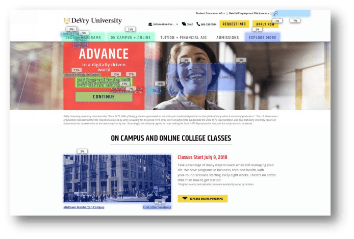
Figure 1: A click map showing where participants clicked to find information about the application deadline on the DeVry homepage.
In the usability study, Colorado State University and Penn State have the lowest overall SUPR-Q score at 35% while Stanford has the worst NPS at –17%.
Colorado State University suffered in the usability study because there is no clear CTA on the admission page for finding the application deadline. The flat formatted “Freshman” button and its location further down on the page make the path more difficult to see.
- “The important information is written in small letters. It should stand out with bold or bigger letters.” —CSU participant
Video Example 3:
Video 3: This participant scrolled right past the “Freshman” button. It’s unnoticeable and doesn’t stand out as a CTA on the Colorado State website.
The Penn State website density on the Undergraduate page and the lack of a clear CTA likely also contributed to poor scores.
- “The site has a lot of info. This is a good thing but it can also get overwhelming as it can get confusing.” —Penn State participant
Video Example 4:
Video 4: This participant was on the correct page but was unable to find the correct information on the Penn State website.
Summary
An analysis of the user experience of five university websites found:
1. Perceptions of the university website experience are above average. When recalling experiences on the university websites, the SUPR-Q scores are above average, falling at the 60th percentile. DeVry University is the lowest at 51% and Harvard leads the pack at the 70th percentile.
2. Scores dropped in the usability study. After completing a task on the websites, the average SUPR-Q score dropped to 45%. Colorado State and Penn State have the worst scores at the 35th percentile and Harvard still leads at the 60th percentile suggesting the sites are harder to use for the first time or infrequent visitors.
3. Catering to a multiple audiences affects findability. As expected, universities have to manage both users who are very familiar with the university (e.g. students and faculty) and those who aren’t (e.g. prospective students and their parents). This challenge led to problems with findability. The most common reason across the university websites was learning more about the university (14%). 12% of those respondents were parents or relatives of someone interested in or attending the college.