 What do people buy online? Behind clothing, consumer electronics are at the top of the list.
Beyond smartphones, people purchase computers, TVs, tablets, gaming consoles, and a myriad of smartphone accessories.
Before purchasing, roughly half of US consumers research details about consumer products online, including features, reviews, and prices.
To understand the electronics researching and purchasing experience, we collected data on a variety of attitudes and intentions towards nine websites (both manufacturer and retail) that sell a variety of electronic devices:
- Apple
- Best Buy
- B&H (Photo Video)
- Dell
- HP
- Lenovo
- Microsoft
- Newegg
- Samsung
We used our MUiQ platform to collect SUPR-Q® and Net Promoter scores, investigated reasons for using the websites, measured users’ attitudes regarding their experiences, conducted key driver analyses, and analyzed reported usability problems.
Benchmark Study Details
In January of 2023, we asked 468 users of electronics websites in the US to recall their most recent experience and tell us their perceptions of one of the listed electronics sites on their desktop and mobile app (if applicable) in the past year.
Participants completed the eight-item SUPR-Q (which includes the Net Promoter Score) and two-item UX-Lite™ standardized questionnaires and answered questions about their brand attitudes, usage, and prior experiences.
In addition to the retrospective survey, we conducted a usability study on three of the electronics websites (Dell, HP, and Lenovo). Participants in the study were randomly assigned to one of the electronics websites to find a 15” laptop for under $1,000.
Quality of the Electronics Website UX: SUPR-Q
The SUPR-Q is a standardized questionnaire widely used for measuring attitudes toward the quality of a website user experience. Its norms are computed from a rolling database of around 200 websites across dozens of industries.
SUPR-Q scores are percentile ranks that tell you how a website’s experience ranks relative to the other websites (the 50th percentile is average). The SUPR-Q provides an overall score, as well as detailed scores for subdimensions of Usability, Trust, Appearance, and Loyalty.
The electronics websites in this study collectively averaged at the 86th percentile. Apple received the highest SUPR-Q score at the 99th percentile, and Newegg scored the lowest at the 50th percentile.
Usability Scores and Trust
We asked participants to rate how easy they thought it was to use the websites and navigate through them. All websites scored above the 50th percentile in usability. Apple had the highest usability score (97th percentile) and Newegg had the lowest (61st percentile). Comments regarding usability for some of the brands included
- “Apple’s website is very user friendly and well organized. It is easy to find exactly what you need with the different section headings at the top of the website. It is also very easy to get in touch with a ‘specialist,’ should that be necessary. The photos of the products are also very high quality, and I appreciate the feature where you can compare products.” — Apple
- “I like being able to compare up to four different items at a time. It is very useful when comparing specs of items, such as ram and processors, in addition to the price and ratings of said items.” — B&H Photo Video
- “The main page is really cluttered. It just looks really unappealing when you first open it. Between the giant banners and videos playing on the homepage I try to leave as soon as possible.” — Newegg
- “Finding a way to contact customer service or troubleshooting a device is impossible. I go down many rabbit holes before I find what I need, and even then, it’s not very straightforward. I always have to contact my IT guy at work.” — HP
We also asked participants to rate the trust and credibility of the websites. Trust scores were similar to usability scores. Apple and B&H had the highest trust score (99th percentile). Five other websites had trust scores above the 90th percentile (Dell, Microsoft, Samsung, HP, and Lenovo). Newegg had the lowest trust score (70th percentile) with a top concern being the low quality of products purchased from the website.
Loyalty/Net Promoter Scores
The average NPS for the electronics websites was 25% (more promoters than detractors), ranging from 10% for HP to 67% for Apple. In general, a better user experience is a good predictor of customer loyalty. Comments about the electronics websites related to NPS ratings included
- “The Apple website has a great interface which makes it very easy to use. The product information is thoroughly given, and user ratings are plentiful. The website appears to be secure, which indicates that my personal information is safe to provide.” — Apple
- “I often end up at the B&H site when shopping for audio or computer equipment. They have lots of variety. Certainly, much more than just photo equipment. The range of things they have is impressive.” — B&H
- “The website is simplistic, but only partially effective when one has a computer issue that might not be explained thoroughly.” — HP
- “The website is a hot mess that literally stutters and lags on my old laptop. But we’ve built whole computers with parts from them and always been satisfied with the quality and price.” — Newegg
More verbatim comments are available in the downloadable report.
Websites and Mobile App Usage
As a part of this benchmark, we asked participants how they accessed the electronics websites. All participants reported using their desktop/laptop computers (this was a requirement for participation in the survey), with 58% also using mobile websites and 29% also using mobile apps.
The typical frequency of use was a few times a year for desktop and mobile websites (on average, fewer than 3% reported daily use on desktop and mobile websites). Apple was the most frequently visited mobile website (overall usage of 83%). For those who reported mobile app use, the typical frequency of use was also a few times a year.
Key Drivers of the Electronics Website Experience
To better understand what affects SUPR-Q scores and Likelihood-to-Recommend (LTR) ratings, we asked respondents to rate 21 attributes of the consumer electronics website experience (full details are in the downloadable report).
We conducted key driver analyses (regression modeling) to quantify the extent to which ratings on these items drive (account for) variation in overall SUPR-Q scores and, separately, LTR (the rating from which the NPS is derived).
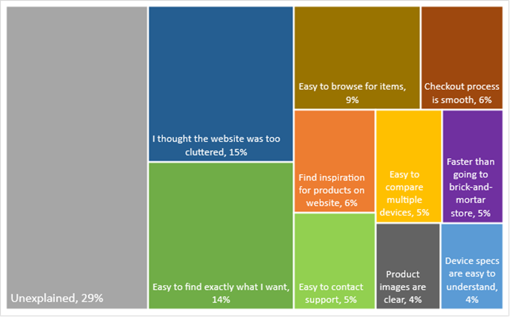
SUPR-Q Drivers. As shown in Figure 1, the top key driver was “I thought the website was too cluttered,” accounting for 15% of the variability in SUPR-Q scores. This was followed by “It’s easy to find exactly what I want” (14%) and “It’s easy to browse for items” (9%). Taken together, ten significant predictors accounted for 71% of the variance in the SUPR-Q scores.
Best and Worst: Key Drivers
Clutter of the electronics websites is the top key driver
“I thought the website was too cluttered” was the top key driver for the electronics websites, accounting for 15% of the variation in SUPR-Q scores. Participants named clutter most frequently as their top problem or frustration with seven of the websites (Best Buy, B&H, Dell, HP, Lenovo, Newegg, and Samsung).
“I wasn’t a fan of all the things popping up when I first visited the page: notifications, chat assistant, etc. My brain didn’t have time to absorb anything before being bombarded with pop ups.” — HP
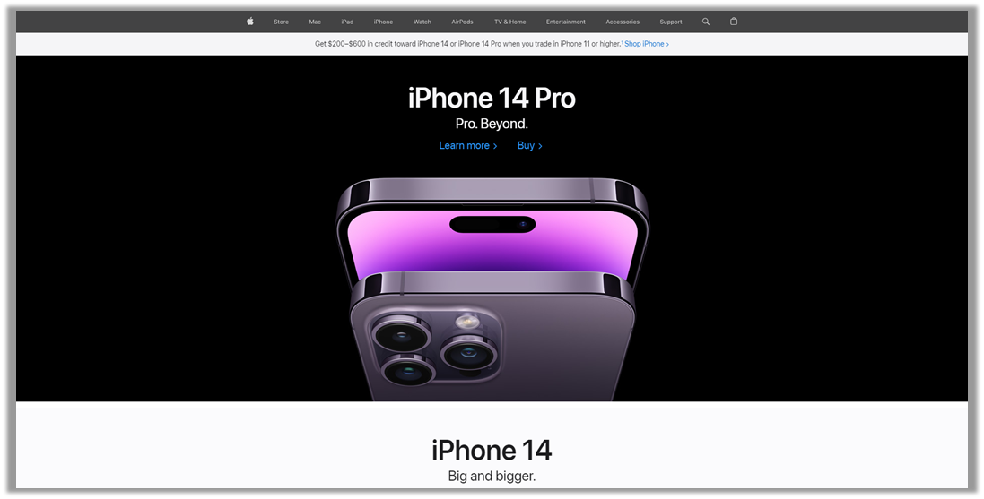
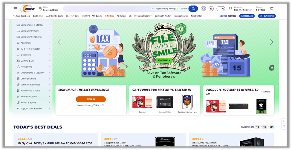
Newegg had the highest clutter score (38.6), with Samsung close behind (38.0). The group average was 31, with Apple having the lowest clutter score (see Figure 2 for screenshots of Apple and Newegg).
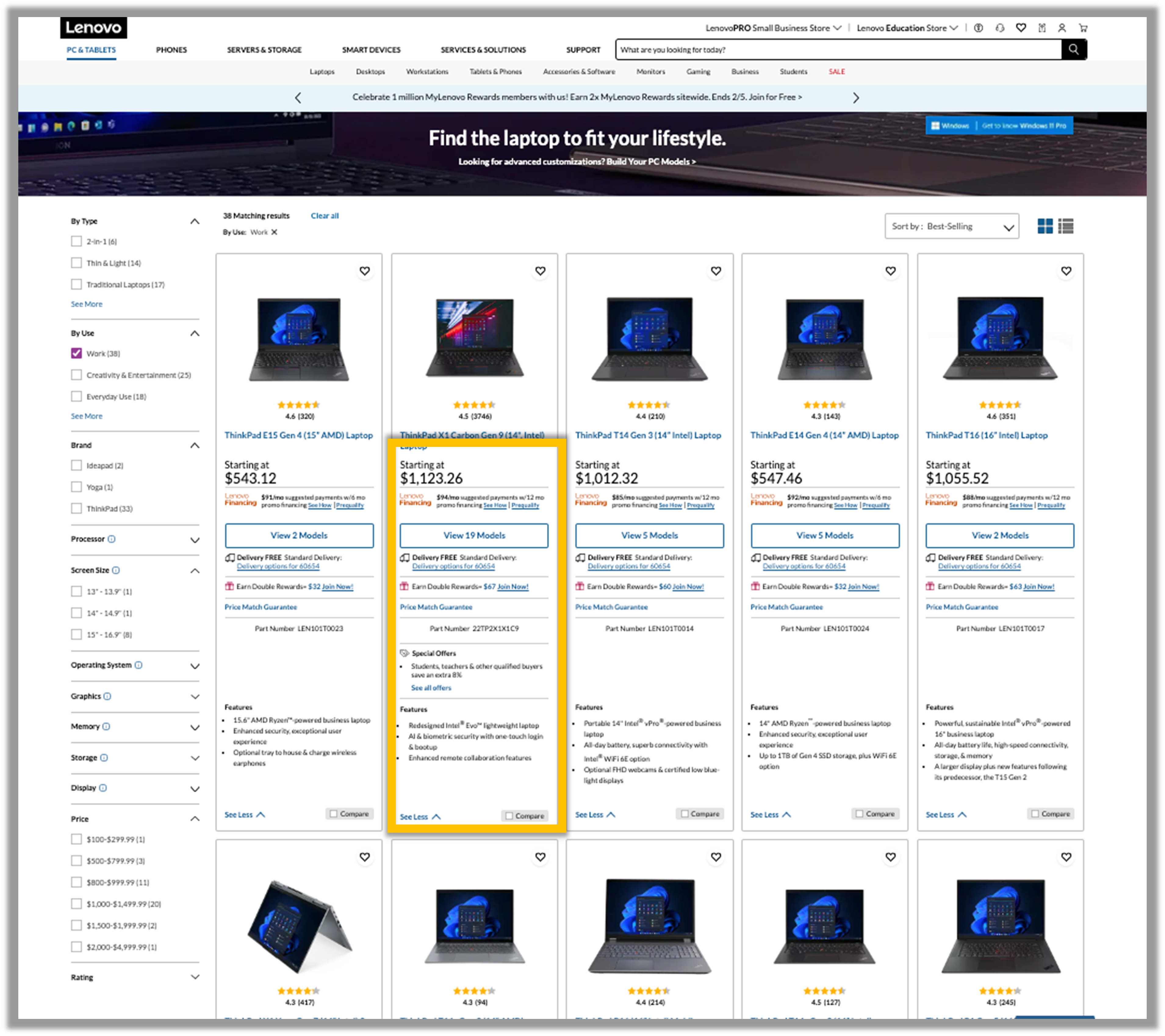
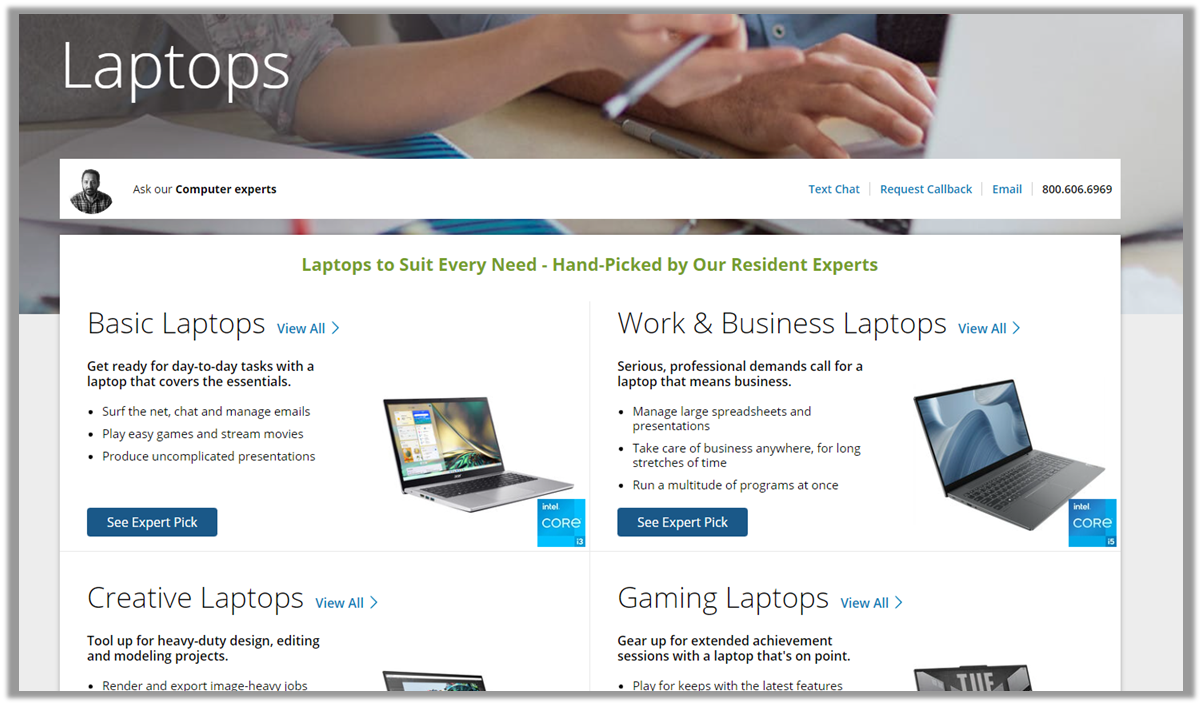
In the usability study, clutter was also found to be an issue on the Lenovo website. When looking at laptops on the Lenovo website, the specs for each laptop on the search results page were small, cluttered, and could be difficult to read (Figure 3). This contributed to difficulty finding a laptop with specific features (15” screen size).
“The site was a bit cluttered or busy. It seemed like a lot of text to sift through on the selection page, when I would have expected more detail on the comparison page. I had a little trouble finding the basic specs for the laptops on the search page after selecting my parameters.” — Lenovo
Narrowing down
“It’s easy to find exactly what I want” was also a top key driver for the electronics website experience, accounting for 14% of the variation in SUPR-Q scores. Participants mentioned “Difficulty locating products/information I need” as a top issue among five of the websites (Best Buy, Dell, HP, Microsoft, and Newegg).
“Using the search feature sometimes returns too many results and I would like to narrow it down further, but I am not always successful in doing that and finding exactly what I am looking for.” — HP
HP had the lowest top-box score on “It’s easy to find exactly what I want,” with only 35% of respondents strongly agreeing that it was easy to find exactly what they needed. Slightly ahead were Lenovo and Newegg, with 36% of respondents strongly agreeing. The group average was 41% with Apple leading.
In the usability study, filters were an important part of the browsing process to help users narrow down the products. Most participants across the electronics websites started the process of browsing for a laptop by using the filters: 86% of HP participants, 71% of Dell participants, and 67% of Lenovo participants selected a filter first when browsing for a 15” laptop under $1,000.
“This was a very helpful way to choose a computer. Really helpful options for searching.” — Lenovo
The HP website had “Quick Filters” at the top of the search results page that were especially helpful because participants could easily select a parameter to narrow the results. The Quick Filters at the top of the HP website were often used, with almost a third of participants (29%) using a Quick Filter as their first click toward finding a laptop. However, the feature doesn’t allow users to select more than one filter at a time, so users had to scroll down to the sidebar to filter for any additional parameters (see Video 1).
“While I was able to use filters to make the website only show laptops under $1000 and that had a 15 in screen, I did notice there was quick filters that would have done the same but much faster that I would likely use in the future the next time I visit the site.” — HP
Video 1: Video of a participant using the quick filters on the HP website. Users are not able to select more than one filter, which was a limitation of the feature. This participant ended up sorting by Price Low-High because they could not select 15” Screen Size and Under $600 at the same time.
Ease of browsing
“It’s easy to browse for items” was a significant key driver for the electronics website experience, accounting for 9% of the variation in SUPR-Q scores.
“I don’t have many issues with the website, but I do find the background art to be really distracting and even a little bit disorienting. It makes it harder to just browse the website.” — Lenovo
“The Newegg website can be a bit cluttered, and I also find it a bit difficult to simply browse through certain sections of the website if I am not confident of the exact product I am looking for.” — Newegg
Lenovo had the lowest top-box score for ease of browsing for items, with 48% of respondents strongly agreeing that it was easy to browse for items on the website, with Newegg slightly ahead at 49% strongly agreeing. The group average was 55%, with Best Buy and Apple leading.
The usability study also highlighted issues with the browsing process on Lenovo. Participants mentioned issues using the filters on the website, which contributed to difficulties browsing through the products. About 10% of participants in the retrospective study also mentioned problems with sorting and filtering on the Lenovo website.
“I thought there were too many criteria to go through on the left and I could not find an option for the price range that I wanted.” — Lenovo
Best and Worst Performers
We drilled into the top drivers to uncover what separated the best and worst performers.
Easier browsing
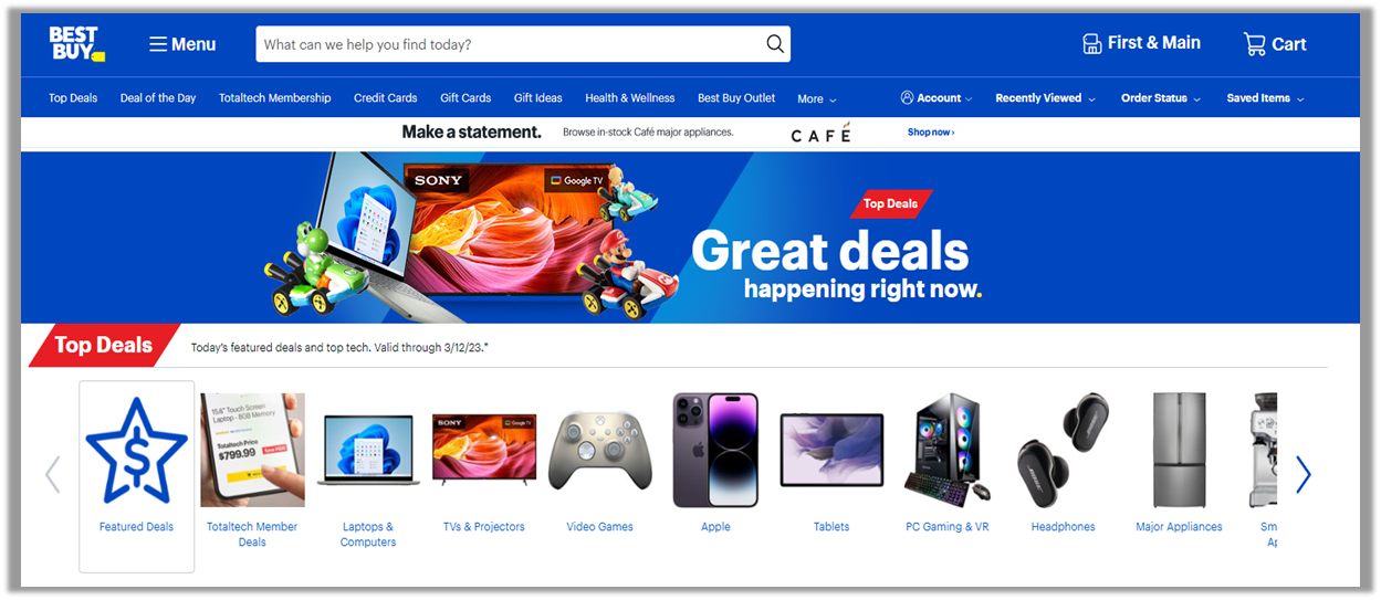
The Best Buy website led, with 71% of consumers selecting “Strongly Agree” for “It’s easy to browse for items.” The website includes multiple headers to browse by, with each header containing separate electronics represented by clear images—see Figure 4.
B&H had the fewest consumers selecting “Strongly Agree” for ease of browsing (44%). Although the breakdown by electronics was clear for navigation, the text on the screen was too dense for some users when navigating the website, leading to a perception of clutter on the website (Figure 5).
Getting to the specs
Apple had the most consumers selecting “Strongly Agree” for “It’s easy to find item specifications” (67%). Navigating to specs on the Apple website only took one click on the item of interest, and the presentation of the information was easy to read and understand (Figure 6).
HP had the fewest consumers selecting “Strongly Agree” for locating item specs (44%). Navigating to the page took multiple clicks. Once on the page, users had to scroll to locate the specs, which were not easy for all users to understand.
Making comparisons easier
Apple had the most consumers selecting “Strongly Agree” for “It’s easy to compare multiple devices I may be interested in” (62%). Navigating to comparisons of their newer models of electronics was easy to do with a few clicks, and it could be done before reaching the product page. Users could also choose to add other products to compare once found.
Newegg had the fewest consumers selecting “Strongly Agree” for ease of comparing specs (35%). Users needed multiple clicks within a product page to find comparisons. Once found, the compare feature would show comparisons only for items the website indicated were similar (Figure 7). There was no way to add other products to compare.

Brand Attitude and SUPR-Q Scores
We collected participants’ attitudes toward the brand as well as UX scores. As we’ve seen with prior SUPR-Q analyses, brand attitude has a significant influence on attitudes toward the website experience. Poor prior experiences and bad reputations tend to lower participants’ brand attitudes that impact attitudes toward trust and intention to use and recommend. Consequently, brands with lower brand attitude scores tend to have lower SUPR-Q scores. In our data, Apple had the highest brand attitude score (6.1), with Samsung close behind (6.0). All other consumer electronics websites had brand attitude scores between 5.4 and 5.8. Even when controlling for the effect of brand attitude on SUPR-Q scores, differences remained consistent between competitors, with the lower-scoring websites (e.g., HP and Newegg) remaining below average.
What to Improve
Participants had a few common problems and frustrations across most of the electronics websites, such as difficulty locating information or products and cluttered web pages with popups/images.
Locating information of interest was a concern for electronics websites
Across all websites, users experienced issues related to finding electronics product information or help information for troubleshooting issues. Websites in which participants had the most difficulty in locating products or help information had lower SUPR-Q and NPS. The HP and Microsoft websites had the most issues.
“There is no clear distinction between products to shop and other Microsoft services, making it hard to know whether you’re browsing the Microsoft Store or just on the general Microsoft website. A clear “Shop” link at the top of the homepage that leads to all products for sale would be much easier for people wishing to purchase from the website.” — Microsoft
“I think there’s too many options on the menu. I think that the “Explore” and “PC” sections from the menu having NINE options is a little much. The same can be said with the rest of the menu options.” — HP
Apple and B&H participants had the fewest number of reported issues navigating the website, indicating that a clean and simple design with clear organization leads to a better experience navigating the websites.
“It seems like the website is very design focused, so the website is easy to view and lays out the features of the product in a way that is easy to digest.” — Apple
“The layout, of which I usually default to “list” mode, makes it easy to scroll through items. Some websites are slow to scroll as items get loaded, but B&H is pretty smooth.” — B&H
Clutter on the electronics websites was a pain point for participants
Website clutter also was a common theme reported by participants. Issues encountered included intrusive popups, too many/moving images, and too many options on the homepage.
“It does feel a bit cluttered – there’s a lot going on, and I wish there were less options on the homepage so that it’d be easier to directly navigate to what you really want to see (product comparisons, reviews, and prices).” — Samsung
Apple had the fewest comments related to clutter on its website, with the lowest overall clutter score (18.1). Respondents liked the use of white space to keep visual distractions to a minimum when searching/browsing for products. Best Buy had the next lowest clutter score (28.9), with respondents liking the professional look and spaced-out information on the web pages.
“I love the white background and how they use the white space to keep it clean and simple to focus on the product.” — Apple
“[I like] that it isn’t cluttered. Everything is spaced out to make it easy to read. Please do not change a thing.” — Best Buy
Summary and Takeaways
An analysis of the user experience of nine electronics websites found that
- Apple leads while HP and Newegg lag. Although SUPR-Q scores were high overall (average 87th percentile), Apple had the highest SUPR-Q rating (99th percentile) and the highest NPS (67%) by a wide margin. Newegg had the poorest SUPR-Q score (50th percentile). HP also had a low SUPR-Q score (69th percentile) and the lowest NPS (10%).
- Clutter on the web pages, ease of finding exactly what they want, and ease of browsing for items were key drivers of the website experience. Website clutter was the top key driver (explaining 15% of the SUPR-Q scores). Other top drivers of the SUPR-Q were “It’s easy to find exactly what I want” (14%) and “It’s easy to browse for items” (9%).
- Key pain points were navigating the websites for product/help information and cluttered web pages. Common problems and frustrations across the electronics websites included navigating the web pages to locate products/information of interest and cluttered web pages with images, videos, or popups. Providing better search options, category organization, filters, and cleaner visuals should help improve the website experience.
- Filters were useful to help narrow down products. In the usability study, participants found the filters to be an important part of the browsing process on the electronics websites. Most participants across the electronics websites started looking for a laptop by using filters to narrow down the choices.
For more details, see the downloadable report.