 Buying clothing starts online for many people.
Despite the impact of the COVID-19 pandemic—during which 27% of US consumers said they intended to spend less on fashion and luxury items—the fashion and clothing sector has persevered as the largest B2C e-commerce market.
Statista reported that the online fashion market is growing about 9.1% each year. In the United States, fashion e-commerce amounted to over 180.5 billion USD in 2021, and by 2025 the market revenue is projected to increase to nearly 296 billion USD.
The online clothing shopping experience is not without its challenges, however. It’s estimated that more than twice as many products bought online are returned (20%) compared to items bought from traditional brick-and-mortar stores (9%). Of those online returns, about 65% are due to discrepancies between advertised products and actual products when delivered (e.g., size too small, size too large, style, or not as described).
We sought to assess the online clothing retail experience for shoppers by collecting UX benchmark data from several of the leading clothing retail websites.
We used our MUiQ platform to collect data on a variety of attitudes and intentions toward thirteen retail websites that sell clothing:
- Anthropologie
- Athleta
- Banana Republic
- Gap
- H&M
- Kohl’s
- Lululemon
- Macy’s
- Neiman Marcus
- Nordstrom
- Old Navy
- Urban Outfitters
- Zara
We computed SUPR-Q® and Net Promoter scores, investigated reasons for using the websites, measured users’ attitudes regarding their experiences, conducted key driver analyses, and analyzed reported usability problems.
Benchmark Study Details
In December 2022, we asked 550 users of clothing retail websites in the U.S. to recall their most recent experience and tell us their perception of one of the listed online clothing sites on their desktop and mobile device (app and/or website) in the past year.
Participants completed the eight-item SUPR-Q (which includes the Net Promoter Score) and the two-item UX-Lite™ standardized questionnaires and answered questions about their brand attitudes, usage, and prior experiences. We also asked 25 users to complete a think-aloud task (search for a woman’s sweatshirt) on one of four randomly assigned clothing retail websites to assess usability issues (H&M, Kohl’s, Macy’s, or Nordstrom).
Quality of the Clothing Retail Website UX: SUPR-Q
The SUPR-Q is a standardized questionnaire widely used for measuring attitudes toward the quality of a website user experience. Its norms are computed from a rolling database of around 200 websites across dozens of industries.
SUPR-Q scores are percentile ranks that tell you how a website’s experience ranks relative to the other websites (50th percentile is average). The SUPR-Q provides an overall score, as well as detailed scores for subdimensions of Usability, Trust, Appearance, and Loyalty.
The clothing websites in this study collectively averaged at the 64th percentile. Anthropologie received the highest SUPR-Q score at the 90th percentile, and Zara scored the lowest at the 15th percentile.
Usability Scores and Trust
We asked participants to rate how easy they thought it was to use and navigate through the websites. Athleta had the highest usability score (99th percentile), and Zara had the lowest (1st percentile). Comments regarding usability for some of the brands included
- “The actual navigation of the Zara website is difficult. It can be hard to get it filtered down to specifically what you are looking for.” — Zara
- “Trying to navigate from the home page, every time you try to scroll it changes from women to men to kids. Took a long time to find the menu bar.” — Zara
- “Some things are a little unorganized like when you click on New items, [it’s a] random assortment and not by category.” — Banana Republic
- “Initially I had trouble finding where to click to see all of the different categories.” — H&M
- “Navigation is really difficult, and the search option sometimes feels useless.” — Old Navy
We also asked participants to rate the trust and credibility of the clothing websites. Trust scores were similar relative to the usability scores. Athleta had the highest trust score (96th percentile) with Nordstrom close behind (95th percentile). Gap had the lowest trust score (63rd percentile), and Zara was the second lowest (65th percentile).
Loyalty/Net Promoter Scores
The average NPS for the clothing retail websites was 2% (slightly more promoters than detractors), ranging from −17% for Zara and Banana Republic to 22% for Anthropologie. In general, a better user experience is a good predictor of customer loyalty. Comments about Zara and Banana Republic related to NPS ratings included:
- “The webpages are way too busy. There is text and graphics EVERYWHERE and pop-ups will appear when you are trying to click on something. Thus, I rate it very low.” — Banana Republic
- “The pictures are much larger and take up too much of the screen now.” — Banana Republic
- “The Zara website is (notoriously) a mess. It is difficult to navigate, and product images are posed so dramatically that it is difficult to get a feel for what the items actually look like.” — Zara
- “I found the website really hard to navigate, and it sucks only seeing 3–4 products on each page and then just a whole bunch of white blank space. Also, the models are kind of disturbing looking.” — Zara
- “The website is pretty chaotic and not user friendly at all. It is bad on a desktop and even worse on a phone.” — Zara
More verbatim comments are available in the downloadable report.
Websites and Mobile App Usage
As a part of this benchmark, we asked participants how they accessed the online clothing retail services. All participants reported using their desktop/laptop computers (this was a requirement for participation in the survey); 27% also used mobile apps and 65% also used mobile websites.
The typical frequency of use was a few times a year for desktop and mobile websites (on average, less than 1% reported daily use on desktop and the mobile website). Gap and H&M were the most frequently visited mobile websites (overall usage of 76.2%). For those who reported mobile app use, the typical frequency of use was also a few times a year. H&M was the most frequently used mobile app (overall usage of 38.1%).
Key Drivers of the Clothing Experience
To better understand what affects SUPR-Q scores and Likelihood-to-Recommend (LTR) ratings, we asked respondents to rate the following attributes of the clothing retail websites on a five-point scale from 1 (Strongly disagree) to 5 (Strongly agree). We conducted key driver analyses (regression modeling) to quantify the extent to which ratings on these items drive (account for) variation in overall SUPR-Q scores and, separately, LTR (the rating from which the NPS is derived).
- It’s easy to find exactly what I want.
- I can quickly find the brands I want.
- The checkout process is smooth.
- I can easily find ratings/reviews for products I’m interested in.
- It’s easy to see exactly how much I’ll be charged.
- It’s easy to browse for items.
- It’s easy to search for items.
- I can find inspiration for products I might want on the website.
- It’s easy to return items if I want.
- It’s faster than going to a brick-and-mortar store.
- Product images are clear.
- I can easily find deals and discounts.
- Shipping costs are clear.
- It’s easy to select sizes and colors.
- It’s easy to find item specifications.
- Product descriptions are clear.
- The search results are relevant.
- It’s easy to determine my size.
- It’s easy to visualize how the clothes will look on me.
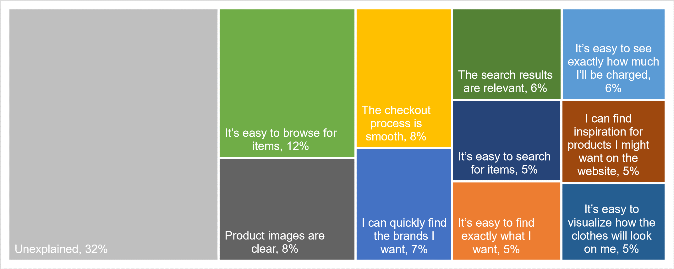
SUPR-Q Drivers. As shown in Figure 1, the top key driver from the list was “It’s easy to browse for items,” accounting for 12% of the variability in SUPR-Q scores. This was followed by “Product images are clear” and “The checkout process is smooth” (8% each). Taken together, ten significant variables explain 68% of the variance in the SUPR-Q scores.
LTR Drivers. At a high level, the top key driver of likelihood-to-recommend was Brand Attitude (20%), followed by Usefulness (“The website’s features meet my needs”) and Usability (both explaining 6%). At a lower level, using the same set of predictors as in the SUPR-Q KDA, the top key driver was “It’s easy to visualize how the clothes will look on me” (5%).
Best and Worst: Key Drivers
Key Driver: “It’s easy to browse for items” is a top key driver
“It’s easy to browse for items” was the top key driver for the clothing retail website experience, accounting for 12% of the variation in SUPR-Q scores.
On ten of the websites evaluated (Anthropologie, Banana Republic, Gap, H&M, Kohl’s, Lululemon, Macy’s, Nordstrom, Old Navy, and Urban Outfitters), “Overwhelming to browse” was mentioned as a top reason to dislike the website.
“There are so many different categories to look through.” — Urban Outfitters
“Sometimes I have felt frustrated because it makes me feel like I am scrolling too much and feels like a process.” — Nordstrom
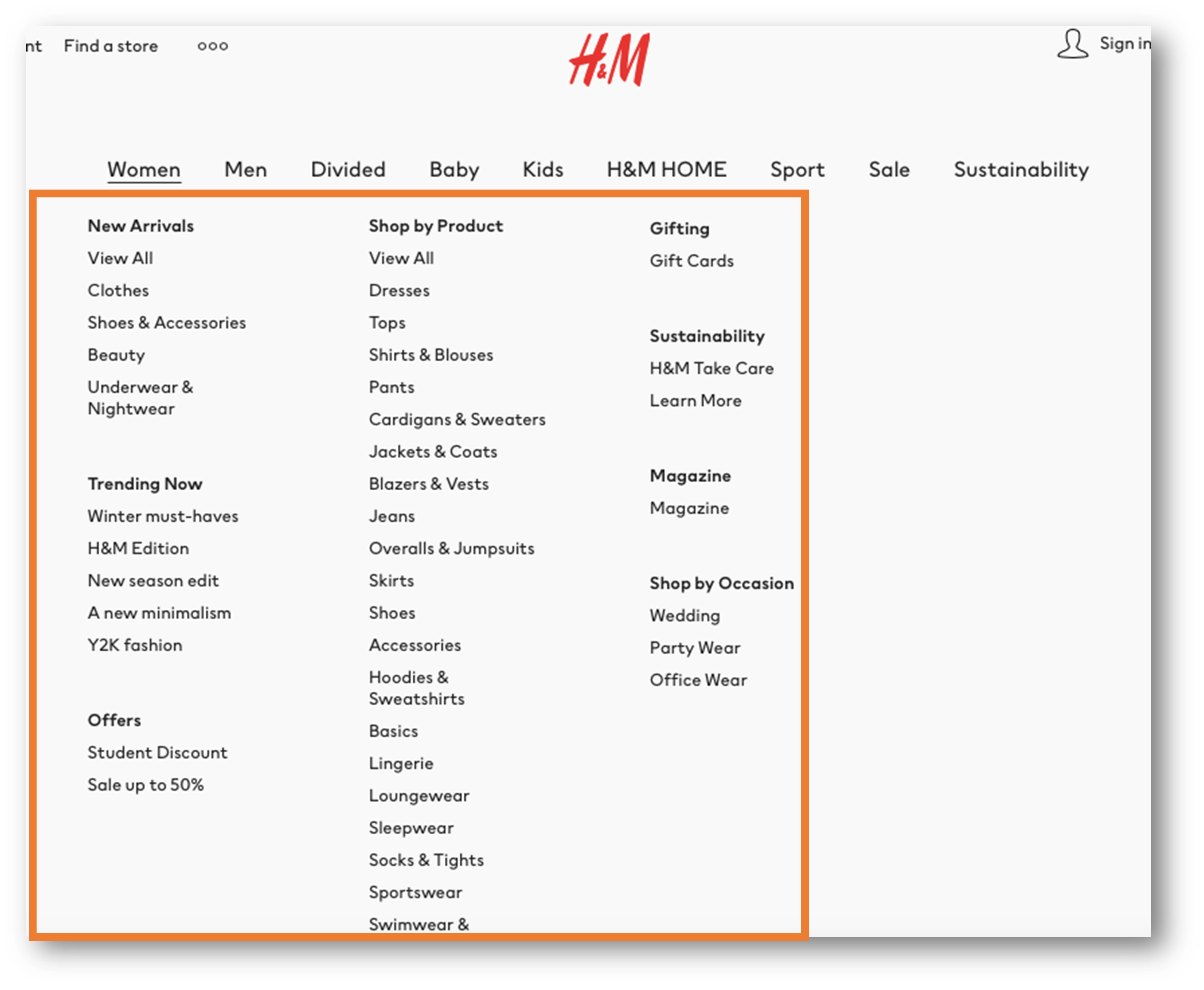
Participants in the think-aloud study also experienced browsing issues while using the H&M and Kohl’s websites due to large, confusing menus and an overwhelming selection of items (see Figure 2).
“Sweatshirts and Sweaters, is there a difference here? Hm… let me double check that because that could be a little confusing.” — H&M
Key Driver: Relevant search results are needed with large inventories
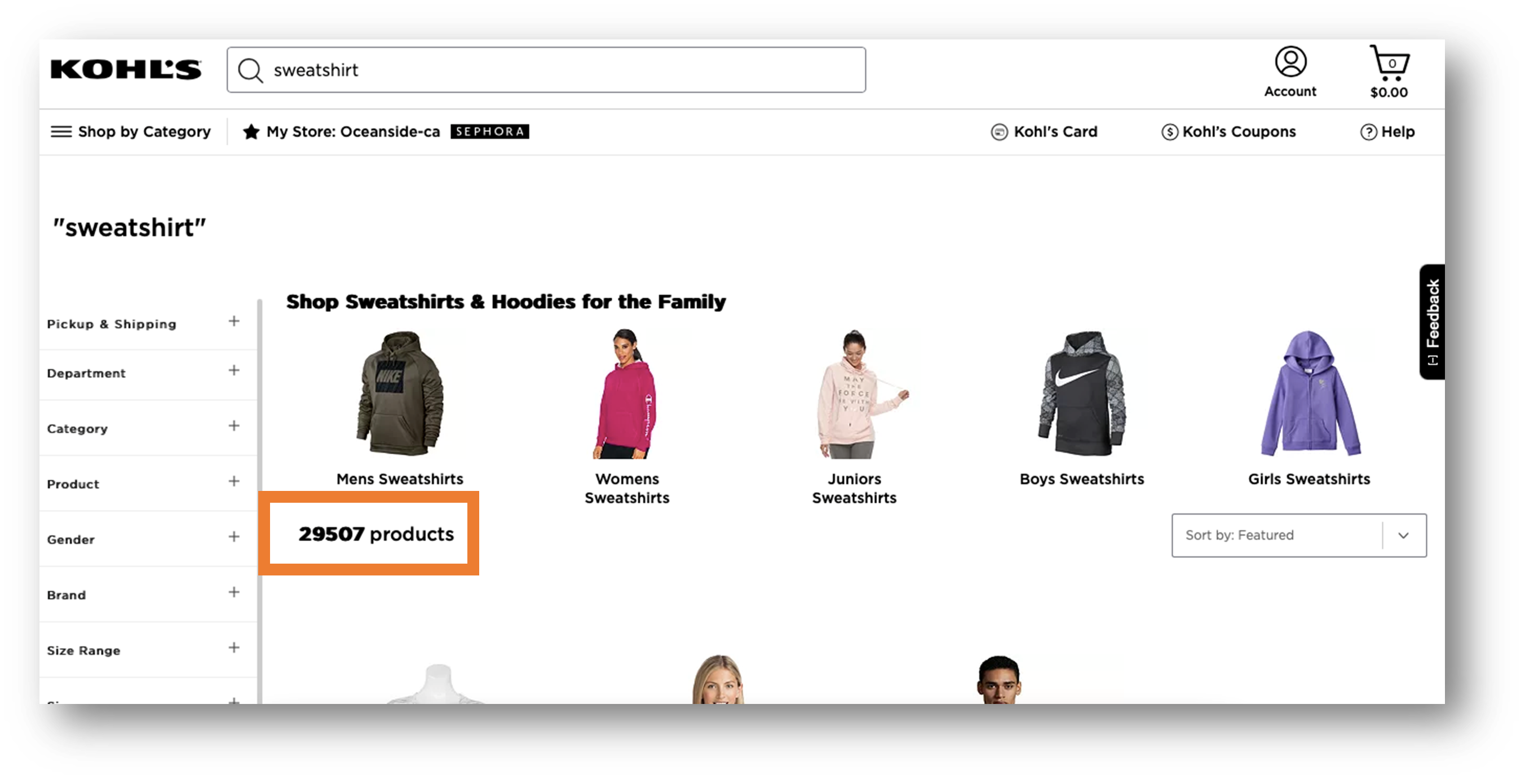
“The search results are relevant” was a significant driver of the clothing retail website experience and explained 6% of the variance in SUPR-Q scores. In the retrospective study, fewer than half of the participants (42%) strongly agreed that search results were relevant across the clothing retail websites.
50% (3/6) of Kohl’s participants in the think-aloud usability study were overwhelmed by the selection of women’s sweatshirts and had a difficult time narrowing down the results (see Figure 3).
“Alright so we got a lot of sweatshirts, 4,944 to look through.” — Kohl’s
Key Driver: Participants agree product images are clear, but they may be too large
“Product images are clear” was also a significant key driver of the clothing retail website experience and explained 8% of the variance in SUPR-Q scores. In the retrospective study, the majority of participants (61%) strongly agreed that the product images were clear across the websites.
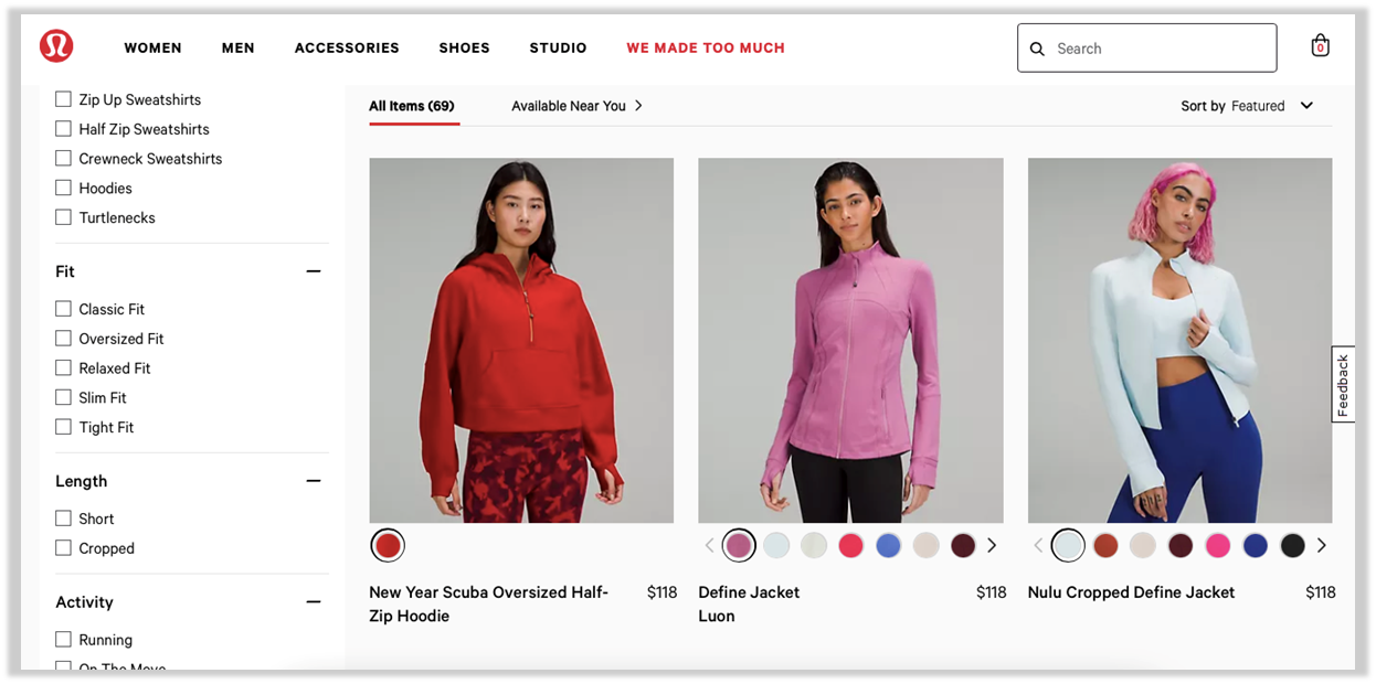
Some participants did however have issues with the size of the images on Banana Republic (5%), Lululemon (20%; see also Figure 4), and Nordstrom (5%). Participants on these websites thought the product images were too large and it contributed to the feeling of clutter on the websites. It also increased the amount of scrolling needed to browse through the pages.
“Said photos are too large and overwhelming on the screen” — Lululemon
“I wish the pictures were smaller. They need thumbnails, not full-size pictures when you get a search result.” — Banana Republic
“Several elements are larger than they should be on desktop, making it take much longer than it should to scroll through pages and browse.” — Nordstrom
What to Improve
Respondents had a few common problems and frustrations across the clothing retail websites, such as nonintuitive website navigation and a cluttered or overwhelming user interface.
Across all the websites, users experienced challenges browsing for clothing, noting that it felt overwhelming at times. Video 1 shows an example of a participant who had trouble browsing for a women’s sweatshirt on the H&M website. The menu categories were not clear, so the participant decided to search for the sweatshirt instead.
“[It] could be in Tops, could be in Cardigans and Sweaters, could be in Jackets and Coats… so you know what? It could be in any of those different sections under Women’s so I’m actually just going to search ‘Sweatshirt’ … just to kind of bring me directly just to sweatshirts.” — H&M
Video 1: A participant searching the H&M website first tries to browse for a sweatshirt but decides to search for the item instead because of the overwhelming menu categories.
Another participant attempting the same task on the Kohl’s website (Video 2) had trouble narrowing down the sweatshirt results and would have liked additional sorting and filtering options. The participant was looking at over 4,000 results for sweatshirts.
Video 2: A participant searching the Kohl’s website for a sweatshirt wanted to sort the results by type of material to narrow down the options.
Other areas of improvement included inaccurate inventory, slow loading times, and excessive pop-ups, to name a few. Specific respondent quotes related to key areas of improvement for each website include:
- Anthropologie: “Sometimes an item will be out of stock when I click to order it.”
- Athleta: “Way too much going on—huge pictures, endless scroll, kind of overwhelming.”
- Banana Republic: “It could be hard for some people to navigate.”
- Gap: “There is a lot of information on a single page and sometimes it can be hard to find what you’re looking for.”
- H&M: “There may be too many options to choose from and it could get a little overwhelming as far as determining what I’m looking for.”
- Kohl’s: “Too many opening page graphics, too flashy at times.”
- Lululemon: “I would prefer to not have to scroll past the large photos and have more focus on the actual clothing listings.”
- Macy’s: “It is extremely slow and it’s exhausting.”
- Neiman Marcus: “The website has loaded slowly for me a few times.”
- Nordstrom: “It can sometimes be hard to find what I’m looking for.”
- Old Navy: “I don’t like the ‘offers’ section that popped up when I immediately got to the website.”
- Urban Outfitters: “Sometimes it can be slightly hard to find exactly what you’re looking for.”
- Zara: “The layout of items is a bit convoluted.”
Summary and Takeaways
An analysis of the user experience of thirteen clothing websites found that
- Anthropologie leads and Zara lags. There was a fairly wide variation in NPS and SUPR-Q scores. Anthropologie had the highest SUPR-Q rating (90th percentile) and the highest NPS (22%). Zara had the poorest SUPR-Q (15th percentile) and NPS (−17%). Banana Republic was also least likely to be recommended (NPS of −17%) and had a below-average SUPR-Q (45th percentile).
- Finding and visualizing the right clothing drives SUPR-Q scores. Ten variables accounted for 68% of the variation in SUPR-Q ratingsThe top key driver was “It’s easy to browse for items,” accounting for 12% of SUPR-Q variation. Other top drivers of the SUPR-Q score were “Product images are clear” and “The checkout process is smooth” (8% each).
- Brand attitude drives LTR. When looking at higher-level constructs, Brand Attitude was the top driver for LTR (20%). Consistent with LTR scores, Anthropologie had a top brand-attitude score among the clothing retail websites. At a lower level, “It’s easy to visualize how the clothes will look on me” was a top key driver for LTR, accounting for 5% of the variance in scores.
- A difficult browsing experience and overwhelming inventories are consistent problems. Respondents had a few common problems and frustrations across the clothing retail websites, such as poor navigation, overwhelming browsing, clutter, and poor website responsiveness.
For more details, see the downloadable report.