 Surveys are a common way to measure attitudes, behaviors, and intentions related to products and services.
But large surveys can include dozens of questions and multiple demographic segments, which can mean hundreds of potential comparisons. How do you present all those results in a way stakeholders can quickly scan?
You can use a slide deck with charts for every question and segment, but that can easily lead to dozens of slides.
Another option is a banner table. While it sounds like something you might see at a trade show, a banner table is a compact way to display many cross-tabulated survey results in a single view.
Banner tables are widely used in market research, but they are less commonly seen in UX research. In a previous article, we listed 18 UX research deliverables classified as interim, final, and artifacts; the banner table was one of the least familiar.
When used appropriately, banner tables provide an efficient way to summarize survey results across multiple segments.
Below is an example showing a banner table displaying brand attitude and reluctance to share political content by two social media platforms and gender (Table 1).
| Metric | Total | Female | Male | Female | Male |
| Brand attitude (Top-2 Box %) | 30% | 28% | 7% | 50% | 35% |
| Reluctance to share political content (Bottom-2 Box %) | 70% | 58% | 73% | 72% | 93% |
| Sample size (n) | 123 | 49 | 25 | 29 | 20 |
Table 1: Example of a banner table.
In this article, we provide more detail about the why and how of banner tables, plus we display an example created with an R script.
Before diving into how banner tables work, it helps to understand where they came from and why they became a standard deliverable in market (and UX) research.
Banner Tables: Common in Market Research, Less Known in UX Research
For large-scale surveys with multiple segments, it’s good to display results in a banner table when you need to provide cross-tabulated results by key segments (e.g., demographics, personas, behaviors) to reveal group differences in a form that is easy to scan (Figure 1).

Figure 1: High-level view of a banner table.
Later in this article, we’ll zoom in on the different parts of this table and dig into its details. What you can see from the high-level view in Figure 1 is a set of metrics in the first column followed by a Totals column. The empty green columns separate crosstabs of the metrics with, in order, six social media platforms, three gender designations, six age groups, and six income levels. When presented as a spreadsheet, it’s common to freeze the top row and the first one or two columns to support easily browsing the contents.
Banner Tables Can Be Traced Back to U.S. Census Practices in 1949
There’s no clear historical record of when the first banner table was published, but it likely coincided with the emergence of large-scale surveys in the mid-20th century. In banner tables, the rows are sometimes called the stub and the columns the banner, and older names for banner tables include stub-and-banner tables or stub-and-boxhead (as in the 1949 U.S. Census Bureau publication, Bureau of the Census Manual of Tabular Presentation). Regardless of the nomenclature, the key to its success is compressing a large number of crosstabs into one wide table.
Banner Tables Are Widely Used in Market Research
Often considered a core piece of survey reporting for market research projects, a “banner run” shows every key question broken out by key segments (e.g., demographics, usage, brand, region). This is a common practice because the sample sizes in market research are often large enough to support a large number of data splits, the format is standardized and repeatable, and it serves the needs of stakeholders who want the same results sliced in different ways.
Banner Tables Are Less Common in UX Research but Have Their Place
It’s possible for a UX researcher to spend decades in the field and never be asked to produce a banner table (we know this from personal experience). Nonetheless, banner tables can play a role when the research methodology is a large-scale survey (especially when focused on segmentation analysis). Even then, in UX research, banner tables will usually be more of a supporting deliverable than a key item, as in marketing research.
Banner Tables Provide a Quick Way to Compare Weighted and Unweighted Results
In our previous article on rake weighting, we demonstrated the use of the anesrake R package to weight data on multiple demographic variables. The practice of demographic weighting is more common in market research and political polling because they have clearer and more accessible reference populations than is typical in UX research.
If the decision has been made to weight data, a banner table provides a convenient way to check on the effect of weighting on research outcomes.
In practice, market research banner tables usually treat weighted results as the “official” estimates but commonly include unweighted bases and percentages for quality control and transparency. UX research tends to follow that practice when weights are known to be based on a strong reference population; otherwise, unweighted results may take precedence over weighted results when reviewing the banner tables.
Banner Table Example
For this example, we return to the data we used in our article on rake weighting so we can produce banner tables with both unweighted and weighted outcomes (for R scripting details, see the appendix).
Social Media: Weighting Brand Attitude and Reluctance to Engage in Political Discourse
The data for this example came from our 2024 SUPR-Q survey of social media platforms. We recruited 324 participants in August 2024 to reflect on their most recent experience with one of six social media platforms: Facebook, Instagram, LinkedIn, Snapchat, TikTok, and X. We were interested in a wide range of UX topics (e.g., overall quality of experience, levels of trust, impact on mood and self-esteem). For the rake weighting article, our examples focused on measuring brand attitude and reluctance to engage in political discourse on the platforms.
We used demographic distributions of the adult U.S. population (18 years of age and older) as the reference population for gender, age, and income because it’s commonly used for that purpose in many research contexts. Note that we do not recommend this as good practice for UX research, as the entire U.S. population is rarely the target audience for a specific product or service, and demographic variables often have little effect on UX metrics. It did, however, work well in our example as a quick check of the value (or lack of value) of employing this kind of demographic weighting in future SUPR-Q retrospective benchmarks.
Figure 2 shows the first ten rows of the source data with the respondent number, the platform, gender, age group, income range, brand attitude (seven-point scale and top-two box), rating of likelihood to share political content (five-point scale and bottom-two-box score), and the case weight determined by the previous rake weighting exercise. The item stems were, respectively, “Overall, how would you rate your attitude toward <platform>?” and “How likely are you to share political content on <platform>?”
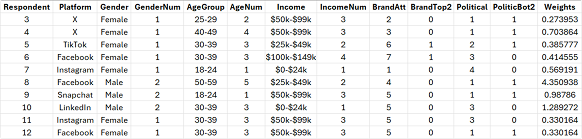
Figure 2: Portion of source data with weights from previous rake weighting exercise.
Banner Table Results
To produce the banner table, we used three R packages:
- openxlsx: Get data from an Excel file and produce formatted results
- dplyr: Manipulation of data frames
- tidyr: Simplified creation of tidy data formats
The complete R script for creating this banner table is in the appendix.
Figures 3 through 6 show each of the crosstabs in the table for the overall effects of Product, Gender, Age Group, and Income. Because the brand attitude metric in the table is a top-two box, larger percentages reflect a more favorable attitude. In contrast, because the item measuring likelihood to engage in political discourse is a bottom-two box (the top boxes were too sparse to provide a meaningful signal), larger percentages indicate greater reluctance to engage.

Figure 3: Effect of platform (TikTok had the highest brand satisfaction; LinkedIn had the highest reluctance to engage in political discourse).
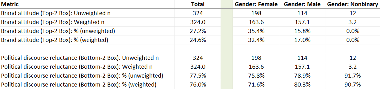
Figure 4: Effect of gender (female users had substantially higher brand attitudes than male users; nonbinary users were the least likely to engage in political discourse).

Figure 5: Effect of age (50–59 had higher brand attitude; 18–24 least likely to engage in political discourse).

Figure 6: Effect of income ($25k–$49k had the highest brand attitude; $200k+ were least likely to engage in political discourse).
Try It!
Table 2 is a TablePress version of the banner table with the top row and the left two columns frozen.
To use the table, click on any row below the header, then use the slider or arrow keys to scroll horizontally.
To switch between the brand attitude and political discourse rows, toggle the 1 and 2 below the right corner of the table, then to resume horizontal scrolling, click on any row below the header.
| Metric | Total | Platform: Facebook | Platform: Instagram | Platform: LinkedIn | Platform: Snapchat | Platform: TikTok | Platform: X | Gender: Female | Gender: Male | Gender: Nonbinary | Age: 18-24 | Age: 25-29 | Age: 30-39 | Age: 40-49 | Age: 50-59 | Age: 60-69 | Income: $0-$24k | Income: $25k-$49k | Income: $50k-$99k | Income: $100k-$149k | Income: $150k-$199k | Income: $200k+ | ||||
|---|---|---|---|---|---|---|---|---|---|---|---|---|---|---|---|---|---|---|---|---|---|---|---|---|---|---|
| Brand attitude (Top-2 Box): Unweighted n | 324 | 53 | 56 | 52 | 50 | 57 | 56 | 198 | 114 | 12 | 68 | 64 | 102 | 51 | 31 | 8 | 50 | 70 | 107 | 56 | 25 | 16 | ||||
| Brand attitude (Top-2 Box): Weighted n | 324.0 | 74.1 | 52.6 | 49.4 | 39.4 | 50.4 | 58.0 | 163.6 | 157.1 | 3.2 | 51.7 | 34.3 | 69.1 | 62.6 | 66.3 | 40.0 | 56.8 | 70.8 | 91.2 | 50.6 | 22.3 | 32.3 | ||||
| Brand attitude (Top-2 Box): % (unweighted) | 27.2% | 24.5% | 25.0% | 23.1% | 26.0% | 50.9% | 12.5% | 35.4% | 15.8% | 0.0% | 22.1% | 31.2% | 22.5% | 33.3% | 35.5% | 25.0% | 20.0% | 30.0% | 29.9% | 28.6% | 24.0% | 18.8% | ||||
| Brand attitude (Top-2 Box): % (weighted) | 24.6% | 21.0% | 27.0% | 31.4% | 21.3% | 43.1% | 7.3% | 32.4% | 17.0% | 0.0% | 16.2% | 27.8% | 18.8% | 26.4% | 33.6% | 25.0% | 21.9% | 32.4% | 26.0% | 28.0% | 17.0% | 8.0% | ||||
| Political discourse reluctance (Bottom-2 Box): Unweighted n | 324 | 53 | 56 | 52 | 50 | 57 | 56 | 198 | 114 | 12 | 68 | 64 | 102 | 51 | 31 | 8 | 50 | 70 | 107 | 56 | 25 | 16 | ||||
| Political discourse reluctance (Bottom-2 Box): Weighted n | 324.0 | 74.1 | 52.6 | 49.4 | 39.4 | 50.4 | 58.0 | 163.6 | 157.1 | 3.2 | 51.7 | 34.3 | 69.1 | 62.6 | 66.3 | 40.0 | 56.8 | 70.8 | 91.2 | 50.6 | 22.3 | 32.3 | ||||
| Political discourse reluctance (Bottom-2 Box): % (unweighted) | 77.5% | 71.7% | 73.2% | 94.2% | 84.0% | 75.4% | 67.9% | 75.8% | 78.9% | 91.7% | 80.9% | 78.1% | 78.4% | 74.5% | 74.2% | 62.5% | 76.0% | 77.1% | 78.5% | 78.6% | 68.0% | 87.5% | ||||
| Political discourse reluctance (Bottom-2 Box): % (weighted) | 76.0% | 63.2% | 70.8% | 92.8% | 85.1% | 80.2% | 73.0% | 71.6% | 80.3% | 90.7% | 80.7% | 76.8% | 80.5% | 79.1% | 72.4% | 62.5% | 63.8% | 79.2% | 74.2% | 83.0% | 73.5% | 86.1% |
Table 2: Working version of the banner table.
Summary
In this article, we went through the why and how of banner tables, ending with an example created with an R script from data collected in a retrospective benchmark study of attitudes toward social media platforms. We discussed that banner tables:
Compress many crosstabs into one viewable table.
The compression of many crosstabs into a single banner table allows stakeholders to quickly scan results without having to flip between multiple slides.
Are created with common analysis tools like R and AI.
Numerous software tools can create banner tables; in our example, we used R packages to generate the table. You can also easily have AI create these for you.
Are ideal for large surveys with segmentation.
Use banner tables to summarize survey results (especially with large sample sizes) when comparing metrics across multiple segments.
Are common in market research but useful in UX.
Banner tables are widely used in market research and, while less frequently requested in UX research, can be the right deliverable when you want to convey cross-tab metrics compactly.
Appendix
Use the link below to download a PDF of the R script. It’s specific to this example but could certainly be edited for use with other data. The script is formatted so you can select all, copy, modify, and then paste the code into R or R Studio.
AI note: We used ChatGPT 5.2 to create and iterate the R script until it worked as desired (which took about six hours, including debugging some weird roundoff errors). For the final table, we did a little additional formatting by hand (e.g., making the empty columns smaller with light green fill, freezing the top row and the left two columns for easier browsing of the crosstab sections).