 Need food fast?
Hate standing in line to place an order?
Restaurant delivery is growing rapidly.
But delivery service providers such as Grubhub, Uber Eats, DoorDash, and Just Eat aren’t the only food services that will deliver right to your office or door and save you a trip to a crowded (and often unremarkable) experience.
Several international restaurant chains have moved beyond providing only menus and calorie counts on their websites to offering their own online ordering service and in some cases even delivery services (cutting out the delivery service providers).
To understand these new online offerings, we benchmarked the user experience of six popular restaurant chain websites that provide delivery to see how people are using these services and where the process can be improved.
- Chick-fil-A (www.chick-fil-a.com)
- Chipotle (www.chipotle.com)
- Panera Bread (www.panerabread.com)
- Pizza Hut (www.pizzahut.com)
- Subway (www.subway.com/en-US)
- Taco Bell (www.tacobell.com)
We collected SUPR-Q data, including NPS data, and investigated reasons for using the website as well as users’ attitudes toward the website. We also conducted a usability study in which participants were asked to complete a task on one of the six restaurant websites. This was also supplemented by an expert review called a PURE analysis. In the PURE task analysis, independent reviewers scored each step in the task to identify pain points in the process (available in the report).
Benchmark Study Details
As with most of our benchmark studies, we like to use a mix of perception and task data to understand both what existing customers think and what new and existing customers do on the websites.
Consequently, we recruited 480 participants in November 2018 for a perception and usability study. For the perception study, we asked 300 participants who had visited one of the restaurant websites in the past year to reflect on their most recent experience using the site.
Participants in the study answered the 8-item SUPR-Q (including the Net Promoter Score) and questions about their prior experience. In particular, we were interested in visitors’ attitudes toward the site, problems they had with the site, and reasons customers use the websites.
For the usability study, we asked 180 participants to complete an online order on a randomly assigned restaurant website.
Quality of the Restaurant Website User Experience: SUPR-Q
The SUPR-Q is a standardized measure of the quality of a website’s user experience and is a good way to gauge users’ attitudes. It’s based on a rolling database of around 150 websites across dozens of industries.
Scores are percentile ranks and tell you how a website experience ranks relative to the other websites. The SUPR-Q provides an overall score as well as detailed scores for subdimensions of trust, usability, appearance, and loyalty.
The scores for the six restaurant websites are above average at the 84th percentile (scoring better than 84% of the websites in the database). In the perception study, Chipotle has the lowest SUPR-Q score in the group (60th percentile) while Chick-fil-A leads the pack with scores at the 98th percentile.
Participants’ perception of the Chipotle user experience was poor compared to the other sites, with the lowest SUPR-Q scores and the lowest brand favorability; however, the website fared much better in the usability study (below). Chipotle’s overall SUPR-Q score (79%) was second only to Chick-fil-A, suggesting a better first-time experience on the Chipotle website.
Trust & Loyalty
Trust scores fluctuated for this group. Participants expressed high trust toward Panera Bread (97%) and Chick-fil-A (95%) but lower for Chipotle (41%). This relatively low trust score is also one of the drivers of the overall lower SUPR-Q score. Chipotle’s negative publicity concerning food safety may still have lingering effects on consumers’ trust in the company (which affects their attitudes toward the website).
The restaurant websites have an average NPS of 28%. This ranges from 10% (Subway) to 48% (Panera Bread). People seem to trust Panera Bread and also want to recommend it. Surprisingly, Chipotle’s NPS for the perception study was 22% (not bad given the lower trust score), coming in 3rd place, alongside Taco Bell.
Desktop and Mobile App Usage
What do people do on restaurant websites? We asked participants how they accessed the restaurant site and the activities recently attempted.
Overall, ordering food is the top reason to visit the restaurant sites (69%), followed by looking at the menu items (51%) and finding a store location (23%). The top tasks were the same across desktop and mobile.
We found that mobile app usage is quite high for restaurants. At least 30% of participants use the mobile app across the sites. In fact, the majority of Chick-fil-A users in the study (64%) reported they use the app most often, compared to a desktop or laptop computer (28%). The mobile app also had a slight majority on Taco Bell.
High mobile app usage isn’t surprising as customers ordering food online are likely on-the-go with their mobile phones in hand. Based on users’ rating of the experience, we found users think it’s faster to order on the mobile app but easier to see the menu items on the desktop or laptop computer.
The UX of Online Ordering
The usability study revealed 15 unique problem types across the websites. The main problems users encountered were: starting an online order, finding a location to place an order, and selecting menu items for an order.
Pizza Hut, Panera Bread, and Taco Bell were the three lowest scorers in the usability study. These sites had the lowest overall SUPR-Q scores, NPS, and task completion rates. Full details on the problems and task metrics are available in the report .
Starting an order is confusing
We saw participants were confused about where to start an order. For example, the Panera Bread website only allows users to start an order from the home page. If users select a location first, or if they go straight to the menu, there’s no option to start the order. As ordering was the top reason to come to the website, it needs to be easier to begin orders from multiple places on the site.
On Pizza Hut, 80% of the users in the videos we watched started their order by selecting the pizza from the menu and adding it to the cart. They were then prompted to enter a location but after doing so, the cart emptied and users were directed to the ordering menu:
Video 1: This compressed video from MUIQ shows the challenge many participants had with Pizza Hut: selecting a pizza, then a location; then having to select their pizza again.
To support an easier ordering experience the websites needs to support both flows (ordering, then selecting a location; selecting a location, then ordering).
Setting a location is difficult
The ability to easily select a store location was found to be the top key driver of the restaurant website user experience (after brand favorability). We also saw it as a major pain point in the usability study. We saw participants struggle to set a location on our low scorers, Panera Bread and Pizza Hut.
On the Panera Bread website, users were unable to start an order from the location finder on the website:
Video 2: This compressed video from MUIQ shows a participant picking a location but being unable to order from the location.
- “You should be able to use the store locator and THEN order your food from the store you pick.”—Panera Bread user
On the Pizza Hut website, the location finder is buried at the bottom of the page. Participants expected it to be at the top of the home page and struggled to find it.
- “I could not find the location finder at the top of the page.”—Pizza Hut user
The location finder needs to be at the top of the home page and there always needs to be an option to start an order from the location finder. Subway had the highest task success rate in the group (90%) and the website made it easy to users to find a location and set it for an order.
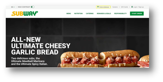
Image 1: FIND A SUBWAY is located at the top of the home page as expected.
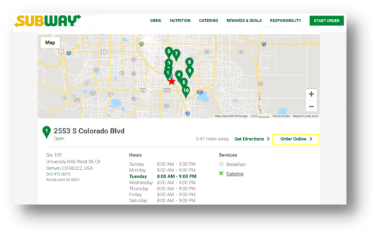
Image 2: Subway also has an ORDER ONLINE option on the location finder, which is helpful for participants. However, we recommend Subway makes this CTA more noticeable.
Menu categories are obscure
Participants on the Panera Bread and Taco Bell websites had trouble finding the proper menu items for the order. Both websites suffered from poor menu categorization, which made it difficult to find specific items on the menu.
For example, we asked participants on the Taco Bell website to find a “Crunchwrap Supreme” but many had difficulty because they didn’t know which menu category it fell under. Categories like “New,” “Deals and Combos,” and “Specialties” aren’t obvious places to look. One participant looked in “Favorites,” which is actually an area for returning users to save orders.
“I had no idea what category of food a ‘crunchwrap supreme’ would fall under.”—Taco Bell user
Panera Bread had a similar issue and participants had trouble finding the correct Caesar Salad. Some menu categories such as “Plant Based,” “Protein Rich,” and “Nutrient Packed” are confusing. The Caesar Salad could very possibly be in “Plant Based,” “Nutrient Packed,” or “Salads.” Clearer category labels would create a more streamlined process.
“Sometimes items I look for aren’t intuitive as to where they would be.”—Panera Bread user
Inability to order from every menu
Another major theme we saw across the restaurant websites was confusion between different menus on the sites. For example, Panera Bread and Chick-fil-A both have a dedicated ordering menu where users can add food items to their carts. However, they also have a menu that shows only nutritional and pricing information. Users were unable to add items from the nutritional and pricing information menu to a cart even though they often started there.
“Unless you select order online, when you look at the menu it doesn’t tell you price. And you can’t order from the menu unless you select order online first. That’s weird to me.” —Panera Bread user
“When I clicked on the items I wanted to get straight to the order but it only showed me screens of product information. That is good info but I wanted to see the prices and start adding stuff to my cart.” —Chick-fil-A user
Participants expected to be able to order from any menu on the site, not specifically through the online ordering flow. In this video example, the user on the Chick-fil-A website couldn’t add a bottled water to the cart from the menu.
Video 3: This compressed video from MUIQ shows a participant trying to order items from the nutritional menu.
Summary
An analysis of the user experience of six restaurant websites found:
- Restaurant UX is above average and trust matters. Current customers find the restaurant website experience above average, with SUPR-Q scores falling at the 84th Chick-fil-A was the winner at the 98thpercentile with Chipotle scoring the lowest at 60% (most likely driven by lower trust scores from lingering bad food safety news).
- Mobile app usage is high. Mobile apps are widely used in this industry with at least 30% of respondents reporting using the app or mobile site within the past year (as high as 64% for Chick-fil-A).
- Starting an order and selecting menu items can be challenging. Users had the most trouble on the Panera Bread, Taco Bell, and Pizza Hut websites in the ordering process. Restaurant websites should allow users to start an order from multiple places on the site, including from the location finder. Menu categories need to be clearly labeled for users to quickly find the food they want.
- Selecting a store is a key driver and major pain point. The ability to easily find a store location is a key driver for the restaurant user experience and participants often struggled to select a location when we observed them in the usability study.
- Ordering menus and nutritional menus should be combined. Some restaurant websites have a dedicated ordering menu where users can add items to their carts as well as a menu that gives nutritional and pricing information. These menus are for different purposes and users were unable to add items to their cart from the nutritional menu. This is confusing for users who expect to be able to order from any menu on the website.


