 Online banking is ubiquitous. Banking websites and apps are an integral part of our financial lives.
They are no longer seen as merely nice-to-have features of a banking relationship. Consumers have come to expect the ability to do simple and complex banking transactions from their computers or phones. This digital transformation especially accelerated during the pandemic, when the number of in-person transactions steeply dropped.
Online banking platforms have drastically changed the way people manage their finances. However, users may face issues when using banking websites and apps, such as security concerns, complex banking processes, and reliance on technology that can be confusing and frustrating (e.g., errors using irrevocable money transfer services like Zelle or FedNow).
We used MUiQ to conducted a benchmark of six personal banking websites, collecting data on a variety of attitudes and intentions toward these websites:
- Bank of America (www.bankofamerica.com)
- Chase (www.chase.com)
- PNC Bank (www.pnc.com)
- TD Bank (www.tdbank.com)
- US Bank (www.usbank.com)
- Wells Fargo (www.wellsfargo.com)
We computed SUPR-Q® and Net Promoter scores, investigated reasons for using the websites, measured users’ attitudes regarding their experiences, conducted key driver analyses, and analyzed reported usability problems.
Benchmark Study Details
In March 2024, we asked 285 users of banking websites in the US to recall their experience and perceptions of the listed banks websites and mobile apps in the past year.
Participants completed the eight-item SUPR-Q (which includes the Net Promoter Score) and the two-item UX-Lite standardized questionnaires, and they answered questions about their brand attitudes, usage, and prior experiences.
Quality of Banking Website UX: SUPR-Q
The SUPR-Q is a standardized questionnaire that is widely used for measuring attitudes toward the quality of a website user experience. Its norms are computed from a rolling database of around 200 websites across dozens of industries.
SUPR-Q scores are percentile ranks that tell you how website experience ranks relative to the other websites (50th percentile is average). The SUPR-Q provides an overall score as well as detailed scores for subdimensions of Usability, Trust, Appearance, and Loyalty.
The banking websites in this study collectively averaged at the 49th percentile. Chase received the highest SUPR-Q score at the 77th percentile. Wells Fargo scored the lowest at the 25th percentile.
Usability Scores and Trust
We asked participants to rate how easy they thought it was to use and navigate the websites. Chase had the highest usability score (68th percentile) and PNC Bank had the lowest (26th percentile). Comments about PNC Bank regarding usability issues included:
- “The design is dated and clunky but functions. I enjoy the easy banking experience otherwise.” — PNC Bank
- “It can be slow to use and some info is hard to find.” — PNC Bank
- “The navigation is clumsy and the layout is cluttered.” — PNC Bank
We also asked participants to rate the trust and credibility of the banking websites. Trust scores were generally more positive than usability scores. Chase and PNC Bank had the highest trust scores (87th percentile), closely followed by US Bank (85th percentile). Wells Fargo had the lowest trust score (41st percentile). Based on respondents’ feedback, this may be related to previous data breaches and overall security concerns. Comments about Wells Fargo related to trust included:
- “I have some reservations about Wells Fargo given previous data breaches, but the site generally meets my needs and expectations.” — Wells Fargo
- “It is a credit card company/banking company and those are rarely referred upon since most are predatory…” — Wells Fargo
Loyalty/Net Promoter Scores (NPS)
The average NPS for the banking websites was −17% (fewer promoters than detractors), ranging from −43% for Wells Fargo to 2% for Chase.
Note: These Net Promoter Scores are about the website specifically and not the overall bank. Although we expect these values to correlate, they usually won’t be identical. People may be more or less likely to recommend the bank and its products and branches than its website.
All banking websites except Chase had fewer promoters than detractors. In general, a better user experience is a good predictor of customer loyalty. Positive comments about the banking websites related to NPS ratings included:
- “Bank of America has a simple and clean interface. I find it easy to use and easy to navigate. I’m always able to do the things I want and need to do, like make payments on my card or check my balance. It’s also easy to find things like your routing and account numbers. It has a nice modern feel and feels secure as well.” — Bank of America
- “As I simply use Chase to manage a credit card, I find it quite easy to recommend to a colleague. The entire process from start to finish is very intuitive and easy to process.” — Chase
The top reasons for not recommending the banking websites included poor customer service, cluttered or outdated website designs, difficulty completing certain tasks on the websites, and poor past experiences. Some participants also mentioned that they just would not recommend a banking website.
- “I have received poor customer service from Bank of America. The services and rates are expensive compared to credit unions.” — Bank of America
- “I think the bank is bad and the website design is terrible. It’s hard to navigate and looks like it’s 10 years in the past. If a bank can’t spend the money on a proper website I question everything else about it.” — Wells Fargo
- “I have had so many significant issues with this bank over the years if I didn’t have so many accounts with them I wouldn’t use them at all.” — PNC Bank
For Wells Fargo in particular, which had the lowest NPS (−43%), a top reason for not recommending the website was mistrust in the company.
- “They created fake accounts a few years ago. That made me question their integrity.” — Wells Fargo
- “Wells Fargo has had some issues in the past and a lot of people I know don’t respect them, so I don’t usually talk about it with anyone.” — Wells Fargo
More verbatim comments are available in the downloadable report.
Website and Mobile App Usage
As a part of this benchmark, we asked participants how they accessed online banking services. All participants reported using their desktop/laptop computers (this was a requirement for participation in the survey), and mobile app usage was also high (79%). Over half (53%) also reported accessing the banking mobile websites at least once in the past year.
The typical frequency of use was a few times a month for desktop/mobile websites (on average, about 4% reported daily use). Mobile app users reported visiting the banking apps even more frequently—a few times a week. Comments related to mobile app usage included:
- “The Bank of America website is easy to use and navigate. It integrates seamlessly with their app.” — Bank of America
- “Chase has been very good for my needs with no problems for years. Their website and app design has been superb and cutting edge.” — Chase
- “The app is easier to sign into, so I’d rather recommend the app to others over the website.” — Chase
- “PNC has been my bank for like 13 years now and I have only had to go to a branch probably 5–6 times total. The mobile app has made everything super easy. I can make transfers, deposit checks, check my balance, etc., and it updates all the time because typically anything I have done as a payment shows up instantly online.” — PNC Bank
When visiting the banking websites on a desktop or laptop computer, participants most frequently reported checking account balances or recent transactions (69%), followed by making a payment or transfer (44%). Other top reasons for visiting the banking websites included managing credit or debit cards (22%), re-ordering checks (16%), and finding a local branch or ATM (14%).
Key Drivers of the Banking Website Experience
To better understand what affects SUPR-Q scores and Likelihood-to-Recommend (LTR) ratings, we asked respondents to rate potentially important attributes of the banking websites on a five-point scale from 1 (Strongly disagree) to 5 (Strongly agree). We conducted key driver analyses (regression modeling) to quantify the extent to which ratings on these items drive (account for) variation in overall SUPR-Q scores and, separately, LTR (the rating from which the NPS is derived; full details are in the downloadable report).
The top key drivers of the banking website experience were “Clutter” and “It’s easy to manage my credit or debit cards” (each accounting for 16% of SUPR-Q variation). Other significant key drivers included “It’s easy to manage my investment portfolio” (12%) and “My finances are in safe hands with my bank” (11%).
At a high level, the top key driver of LTR was brand attitude (28%). At a lower level, using the same set of predictors as in the SUPR-Q analysis, the top key drivers were “Clutter” (13%) and “It’s easy to open a new account (12%).
Common frustrations mentioned by participants included cluttered webpages (particularly frequent ads and overwhelming information), difficulty completing tasks such as managing credit or debit cards and setting up fraud alerts, and issues around security.
Clutter on the banking websites was a pain point
Clutter on the websites was a top key driver of both the SUPR-Q and the LTR and, as mentioned previously, was also a common frustration reported by participants. Users on all six sites complained of clutter and said they frequently encounter busy webpages, annoying ads (Figure 1), and overwhelming options.
- “It’s a little busy with ads promoting other Chase services and sometimes it can be tough to find some additional card services like notifications as they’re buried in the menus a bit.” — Chase
- “It can be a bit cluttered and hard to find exactly what you are looking for at a glance.” — Chase
- “I find it more cluttered and confusing than others.” — US Bank
- “Speaking more upon the cluttering issue. The website has a cluttering problem that only seems to get worse over time. Constantly adding new and unnecessary features.” — Wells Fargo
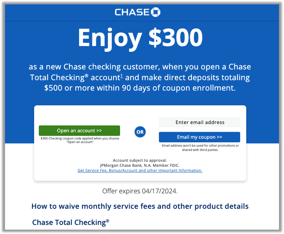
Figure 1: Participants felt that the Chase website was cluttered with too many ads like this one promoting other Chase products and services.
Managing credit or debit cards is a frequent task and a key driver
Around 22% of participants reported using the banking websites to manage their credit or debit cards on their last visit to the site. The ease of managing credit or debit cards was also a top key driver of both the overall website experience (SUPR-Q) and LTR.
On average, about half of the participants in the study strongly agreed that it was easy to manage their cards online. On the low end, only 41% of PNC Bank users agreed to this compared to 67% of Chase users.
Common issues with managing cards included difficulty stopping or locking cards due to fraud, unclear rewards programs, difficulty making payments, and issues updating cards.
Comments about stopping or locking cards due to fraud included:
- “I have had difficulty finding the lock card feature.” — Chase
- “It would be nice if I could lock my card from the first page after login on the website, in case it gets stolen.” — Bank of America
Comments regarding difficulty understanding and finding rewards included:
- “I can’t find any information about the credit card welcome bonus I’m expecting or why it hasn’t been paid yet.” — Wells Fargo
- “I think figuring out how to use perk deals on my credit card is cluttered and difficult to use.” — Bank of America
- “Sometimes I have had trouble navigating to information about my credit card rewards/benefits.” — Chase
Comments about the difficulty of making payments included:
- “In the past, I’ve been confused about how to properly make payment to my credit card (from my checking account). There are options to either ‘Make a payment’ or to ‘Transfer funds’ and the steps/pages are slightly different while effectively doing the same thing. I wished for clear guidance on how to proceed when paying that bill between my accounts.” — Bank of America (see Figure 2)
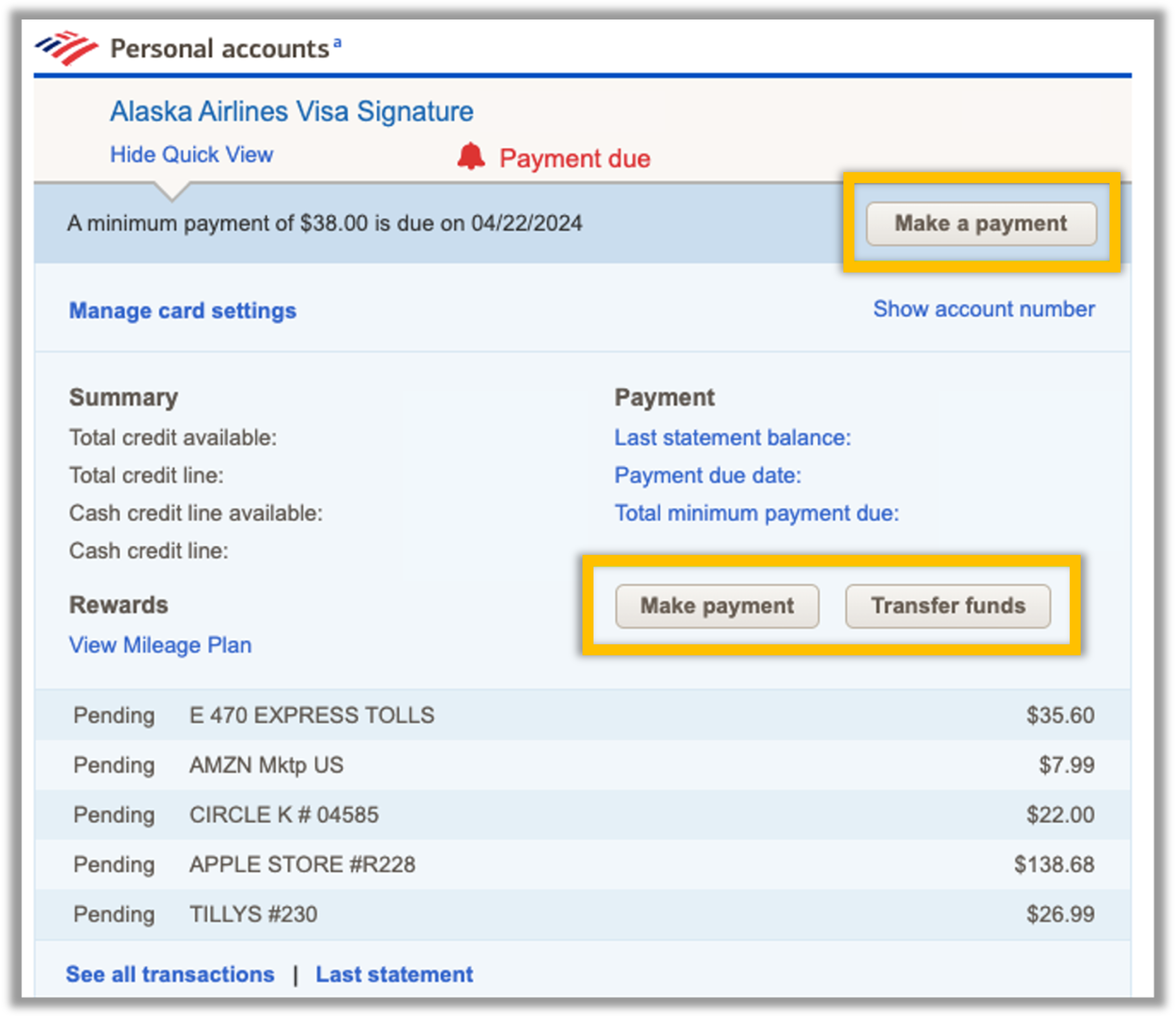
Figure 2: Participants felt that Bank of America made it difficult to make credit card payments from the Personal Accounts page due to unclear calls to action (i.e., “Make payment” vs. “Transfer funds”).
Comments about difficulty updating card settings included:
- “It is a bit hard to navigate where your debit card settings are on the website.” — PNC Bank
- “[It’s difficult to navigate] less used options such as updating a card when traveling.” — PNC Bank
- “It took me a minute to find the area I needed to activate a new debit card.” — TD Bank
Security is a concern
Unsurprisingly, security, privacy, and fraud were foremost in the users’ minds. “My finances are in safe hands with my bank” was a top key driver of the overall banking website experience. “It’s easy to set up a fraud alert for my account” was also a significant driver of the SUPR-Q and LTR.
Fewer than half of participants strongly agreed that their bank is secure (47%). On the low end, only 33% of US Bank users strongly agreed with this statement compared to 60% of Bank of America users.
Overall, this suggests that helping users feel that their money is secure should be a priority and will help to improve the users’ overall experience. For example, the Bank of America website has a dedicated Security Center where users can learn about new trends such as the “Phantom Hacker scam” and how to identify and prevent fraud (Figure 3).
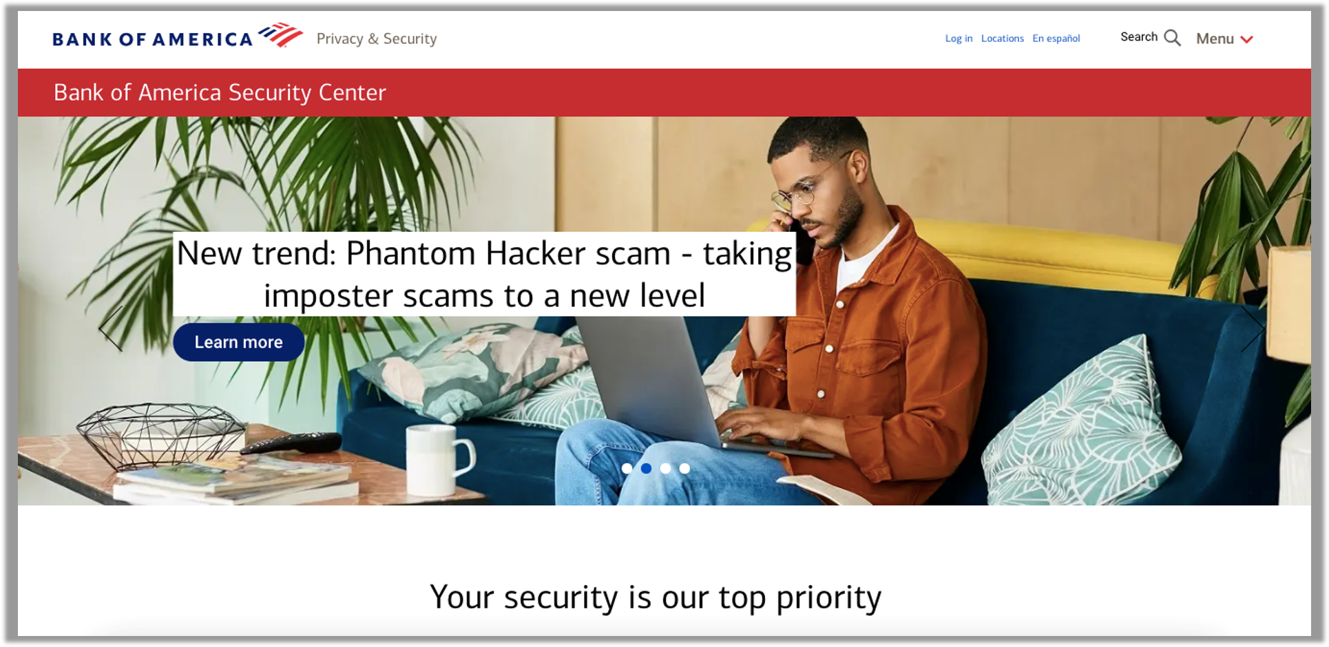
Figure 3: Bank of America gives customers information via its Security Center.
Setting up fraud alerts was also an important feature for participants who want to keep a careful eye on their finances, and there was relatively low agreement to the statement that this was an easy task (30%). US Bank participants had the lowest agreement, with only 17% strongly agreeing that it’s easy to set up fraud alerts on the website (see Figure 4).
Comments related to fraud alerts included:
- “I could not easily find out about the fraud alerts.” — Wells Fargo
- “Slow help with fraud.” — Bank of America
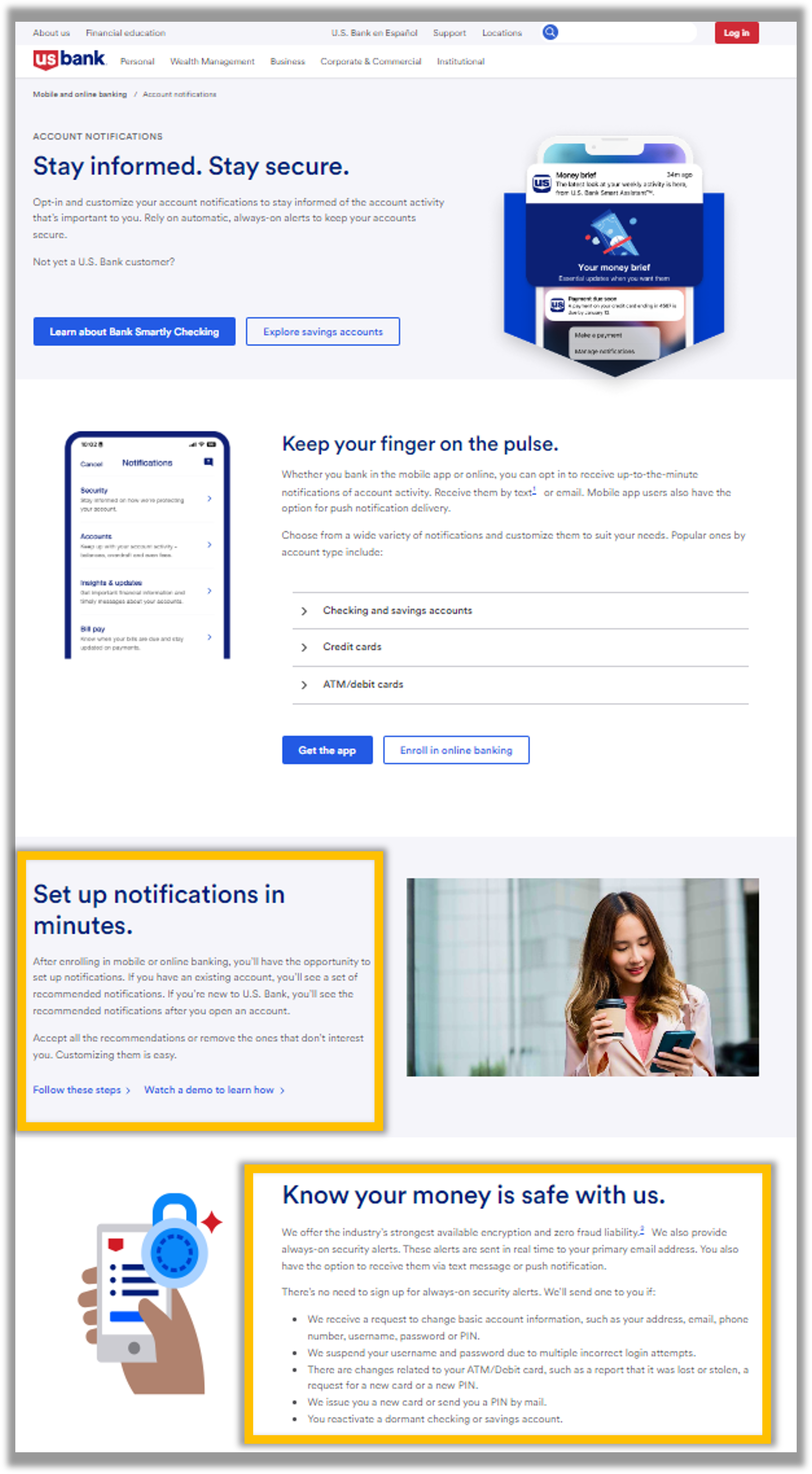
Figure 4: Participants liked that the US Bank Account Notifications page included information about security alerts at the bottom of the page (“Know your money is safe with us”). However, the link to set up the notifications (“Follow these steps”) was a dead end, so users were unsure how to set up the security alerts. Instead, users had to click “Watch a demo to learn how.”
Findability and navigation need improvement
Difficulty finding specific functions or features was mentioned as a top issue for all six banking websites, which highlights that improvements in navigation should be made.
- “Certain features are hard to find or access.” — Bank of America
- “Some of the finer details regarding payments and other account options are at times difficult to find and navigate through menus for.” — Chase
- “Some menu options aren’t under the section where you instinctively would check.” — PNC Bank
- “There is reasonably limited functionality in the app, but there’s way too much functionality on the website which made it difficult for me to navigate exactly what I was looking for.” — TD Bank
- “I find it a bit disorganized and it can take some extra time to find what I need.” — US Bank
- “Sometimes it can be hard to find certain information not associated with checking my checking/savings accounts.” — Wells Fargo
Participants generally said the most common tasks (e.g., checking account balances, transferring funds, etc.) were easy to complete, but finding information about and executing less common tasks was more difficult.
Summary and Takeaways
An analysis of the user experience of six banking websites found:
The user experience of banking websites is about average. The banking websites in this study collectively performed just below average, falling in the 49th percentile. Chase received the highest SUPR-Q score at the 77th percentile, while Wells Fargo scored the lowest at the 25th percentile. Participants also had the most favorable attitudes toward Chase and were most likely to recommend that bank.
Cluttered websites with frequent ads encumber the experience. Clutter was a top key driver of the overall SUPR-Q and LTR scores, and it was an issue mentioned by participants on all six banking websites. Cluttered webpages, frequent and annoying ads, and overwhelming information frustrated users as they navigated the banking websites.
Managing credit and debit cards can be difficult. Managing credit or debit cards was a frequent task and a key driver of the overall SUPR-Q and LTR, and there was low agreement that this was an easy task across the banking websites. Common issues with managing cards included difficulty stopping or locking cards due to fraud, unclear rewards programs, difficulty making payments, and issues updating cards.
Security is a concern. Issues around security, privacy, and fraud were top of mind for users of the banking websites. “My finances are in safe hands with my bank” was a top key driver of the overall banking website experience. Banks should make it a priority to help users feel that their money is secure.
For more details, see the downloadable report.
")
")
")