 Important decisions should be informed by data. And one of the most common ways of displaying data is by using graphs to better visualize relationships.
Graphs can be powerful tools to compactly illustrate patterns. But the type of graph and the visual elements selected can lead to (usually) unintentional misinterpretation.
For example, we have written about how using raw versus difference scores affects interpretation and about whether all graphs should start at 0.
No doubt you’ve seen your share of graphs during the COVID-19 pandemic. There are controversies on whether graphs should account for population size and whether the y-axis should be log or linear scaled.
Some of the most commonly seen graphs are cumulative graphs. During the pandemic, they have been used to display everything from the number of cases and hospitalizations and to number of deaths. The Worldometer graph in Figure 1 shows the cumulative (total) number of cases in the United States as of April 12.

Figure 1: A cumulative graph from Worldometer.
Cumulative charts have always been used for displaying company or product growth over time, but often with criticism. For example, in 2013 Apple CEO Tim Cook presented a version of the following graph of iPad sales. It shows the same sigmoidal pattern as the virus graph in Figure 1.

Figure 2: Cumulative iPad sales chart provided by Apple in 2013 (source).
However, Apple was criticized for displaying this graph, which many felt hid the slowing in iPad sales.
Whereas a standard bar chart will show the daily number of cases or sales, they don’t show the total number by month or quarter. Cumulative graphs have the advantage of showing both the total (cumulative) number and the change in growth by time period (e.g., day, month, or quarter). But to interpret the rate of change you need to look past steep lines to decipher subtler changes by time period. It’s like doing visual calculus.
While the choice of graph can be based on a number of considerations and intentions (e.g., the message someone wants to send), the actual interpretation of the graph may differ. As others have pointed out, people may misinterpret the rate of change from these graphs.
With the ubiquity of the cumulative graphs covering the pandemic presented over the last few weeks, we wanted to understand whether people are indeed misinterpreting growth and, if so, the extent of the problem.
Two Studies Comparing Daily vs. Cumulative Graphs Interpretation
To find out, we conducted two studies to compare the interpretation of daily bar graphs and cumulative bar graphs. In each study, we examined two variables, graph type (cumulative vs. daily styles) and data type (hospitalizations vs. product sales contexts).
We programmed the study in our MUIQ platform. The study used a balanced Greco-Latin Square design in which participants were shown one product sales graph and one hospitalization graph, with one of each showing cumulative or daily data. The presentation of the two graphs was randomized and allowed us to examine responses in a generally positive context (product sales) and negative context (hospitalizations). The four graphs are shown in Figure 3.
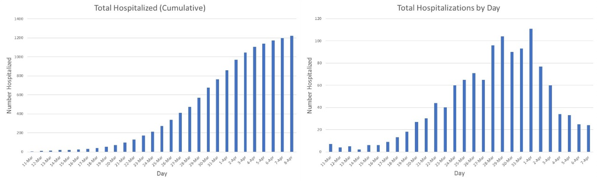

Figure 3: Cumulative vs daily graphs for hospitalizations and sales
To create the graphs, we took the hospitalization data provided by the Colorado Department of Health from March 11 to April 8 (data retrieved on April 10). To create the product data, we used the same hospitalization data but changed the dates to September 3 to October 1.
For Study 1, below each of the graphs we asked participants to answer the following question:
Which of the following can you conclude from the most recent data on the graph shown above? Over the last week, the number of products sold/hospitalizations is:
- Rapidly increasing
- Somewhat increasing
- Staying the same
- Somewhat decreasing
- Rapidly decreasing
- Not enough information to draw a conclusion
For all graphs we considered the correct answer to be either somewhat decreasing or rapidly decreasing. After answering the question, participants also answered how confident they were that they came to the right conclusion (seven-point scale) and how easy the graph was to interpret (using the standard seven-point SEQ). All questions were presented on the same page as the graph so participants could refer to the graph when answering the questions.
Study 1: Results
On April 13 we recruited 50 U.S.-based online panel participants to take the study. It took a median time of three minutes to complete. The participants were a mix of gender (52% female); almost all (94%) were between 18–44 and most had a bachelor’s degree or higher (60%).
Figure 4 shows the percentage of correct interpretations for the two types of graphs and the two data contexts.
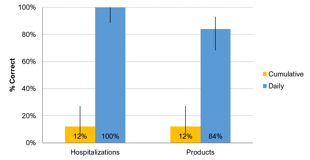
Figure 4: Percent of respondents selecting “Rapidly Decreasing” or “Somewhat Decreasing” for cumulative and daily graphs for hospitalizations and product sales.
The differences in correct responses based on the type of graph were substantial and statistically significant (z = 8.0, p < .0001). Virtually all participants selected one of the correct answers when the daily graph was shown for both hospitalizations and product sales (100% and 84%) whereas few participants selected the correct answers for the cumulative graphs (12% for both).
Averaging across both products and hospitalizations, respondents were seven times more likely to incorrectly interpret the direction of daily change on cumulative graphs compared to daily graphs (88% incorrect for cumulative; 12% for daily).
Despite the difference in interpretive accuracy, we found no statistical differences in the mean confidence or ease ratings, which tended to be quite high (all means higher than 5.4 on a seven-point scale). Right or wrong, participants in general were confident in their interpretation.
Study 2: Replication with Wording Change
We were not expecting results this extreme, so we wondered whether the question phrasing might have confused participants. We replicated Study 1 using the same graphs but changed the question to be more explicit about basing interpretations of trends on the change in each day, focusing on the last week in the graph.
Which of the following can you conclude from the most recent data on the graph shown above? Over the last week, the number of products sold/hospitalizations each day is:
- Rapidly increasing
- Somewhat increasing
- Staying the same
- Somewhat decreasing
- Rapidly decreasing
- Not enough information to draw a conclusion
As in Study 1, for all graphs we considered the correct answer to be either somewhat decreasing or rapidly decreasing. On the same page as the graph, participants again rated their confidence and the SEQ, as well as an optional open-ended comment question about any confusion.
Study 2 Results
On April 13 we recruited another 51 U.S.-based online panel participants to take the study. It took a median time of three minutes to complete. The participants were a mix of gender (52% female); almost all (92%) were between 18–44 and many had a bachelor’s degree or higher (43%).
Figure 6 shows the percentage of correct interpretations for the two types of graphs and the two data contexts.
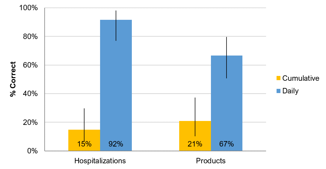
Figure 6: Percent of respondents selecting “Rapidly Decreasing” or “Somewhat Decreasing” for cumulative and daily graphs for hospitalizations and product sales.
Similar to Study 1, the differences in correct responses based on the type of graph were substantial and statistically significant (z = 9.7, p < .0001). Virtually all participants selected one of the correct answers when the daily graph was shown for both hospitalizations (92%) but fewer for product sales (67%). The percent of participants selecting the correct answers for the cumulative graphs was 15% and 21% respectively.
Averaging across both products and hospitalizations, respondents were four times more likely to incorrectly interpret the pace of change on cumulative graphs compared to daily graphs (82% incorrect for cumulative and 22% for daily).
Again, there were no statistical differences in the mean confidence or ease ratings (all of which had means of 5.6 or more). Despite the change in how the primary question was worded, respondents were confidently incorrect when interpreting the cumulative graphs.
Some respondents were confused by the question wording and which dates to refer to. For example, one respondent wrote:
“The question says over the last week, but the dates shown in the graph are nowhere near the date of last week.”
However, due to the balanced design, we would expect any confusion related to this wording (and dates) to have a similar effect on interpretations of the daily and cumulative graphs that displayed the same dates.
When aggregating the data across both studies you can see the large differences in interpretation between the cumulative graphs and daily graphs. Most participants interpreted the cumulative graphs as increasing rates.
| Interpretation | Cumulative Graphs | Daily Graphs |
|---|---|---|
| Rapidly increasing | 24% | 2% |
| Somewhat increasing | 56% | 7% |
| Staying the same | 2% | 0% |
| Somewhat decreasing | 11% | 25% |
| Rapidly decreasing | 4% | 60% |
| Not enough information to draw a conclusion | 3% | 6% |
Table 1: Answer choices, selected based on graph type, show that participants interpret cumulative graphs as increasing and daily graphs as decreasing (both show the same underlying data).
Summary and Discussion
Across two studies comparing cumulative and daily graphs we found:
People misinterpret the rate of change on cumulative graphs. Across two studies respondents were between four and seven times more likely to misinterpret the rate of change on cumulative graphs compared to daily graphs (z = 10.0, p < .001). Cumulative graphs, by definition, can only increase (or stay flat), and so don’t clearly indicate when a periodic trend turns downward.
There was misinterpretation of both product sales and hospitalizations. The misinterpretation of the rate of change in cumulative graphs applied to both product sales and hospitalizations. This misinterpretation held even after instructing respondents to focus on the change each day.
Misinterpretation was coupled with high confidence. Respondents were equally confident in their interpretations of daily and cumulative graphs, but they were not equally accurate. It’s one thing to be wrong but feel unsure about the interpretation; the coupling of high confidence with misinterpretation is especially troubling (called a disaster).
Use cumulative graphs with caution. While the authors of these graphs may NOT intend readers to use cumulative graphs to interpret the rate of change, people will likely do this and will likely be incorrect in their interpretation if the rate of change is decreasing. Note that our sample was more highly educated than the general U.S. populace. It’s hard for anyone to look at an increasing line and conclude things (hospitalizations, sales, deaths, or infections) are decreasing (a slowdown).
Combining elements may help. It’s possible that combining a daily graph with a cumulative line may improve comprehension, such as the examples below on daily and cumulative hospital cases and an alternative iPad sales graph from Apple. It’s something we’ll take up in a future study.


Look for the data. When making important decisions from data presented in a cumulative graph, look for the source data to help understand whether things really are increasing, decreasing, or staying the same.