 In our earlier article, Jim Lewis and I reviewed the published literature on labeling scales.
Despite some recommendations and “best practice” wisdom, we didn’t find that fully labeled scales were measurably superior to partially labeled scales across the 17 published studies that we read.
In reviewing the studies in more detail, we found many had confounding effects when comparing between full labeling and partial labeling—meaning it was hard to isolate the effects of labeling.
When comparisons were well controlled (no confounding), labeling differences weren’t statistically significant. In cases where there were effects of labeling, the scales used were more similar to rubrics (e.g., rating faculty performance or clinical judgments) rather than measures of sentiment such as satisfaction or agreement.
We felt there was need for more data, so we conducted two new studies that better isolated the effects of labeling on more commonly used scales of sentiment in UX and customer research.
Study 1: Fully vs. Partially Labeled Five-Point Scale
In September 2019, we asked 202 U.S.-based online panel participants to rate how satisfied they were with their smartphone and respond to three versions of a five-point satisfaction item.
The first version of the satisfaction item had only the endpoints labeled (Figure 1); the second version was labeled with the end and middle points (Figure 2); and the third version was fully labeled (Figure 3). All variations included numbers.
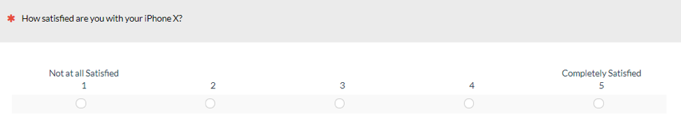
Figure 1: The endpoint version of the five-point satisfaction scale.
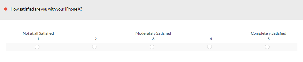
Figure 2: The end- and middle-point version of the five-point satisfaction scale.
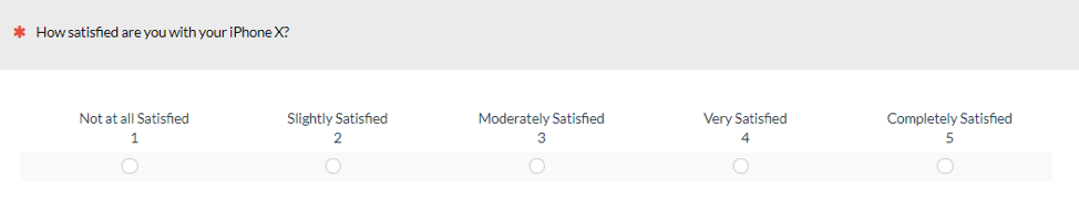
Figure 3: The fully labeled version of the five-point satisfaction scale.
We used a within-subjects study to allow us to detect small differences in scores. In this within-subjects study, participants saw all versions of the satisfaction scale. Only participants who reported having a smartphone were asked to participate in the study.
These three questions were part of a larger survey, and the three variants were randomly shown at different points in the middle of the survey. Between the three satisfaction questions were other questions regarding attitudes toward website design elements and other measures of brand attitude, and their intent to recommend products.
Study 1 Results
Figure 4 shows an overall slight and statistically significant pattern of satisfaction scores lower as more labels are added (using a paired t-test). When only the endpoints are labeled, the mean score is 4.34, 1% higher than when a neutral label is added (mean = 4.29; p = .029) and 2% higher than the fully labeled variant (mean = 4.26; p = .002).
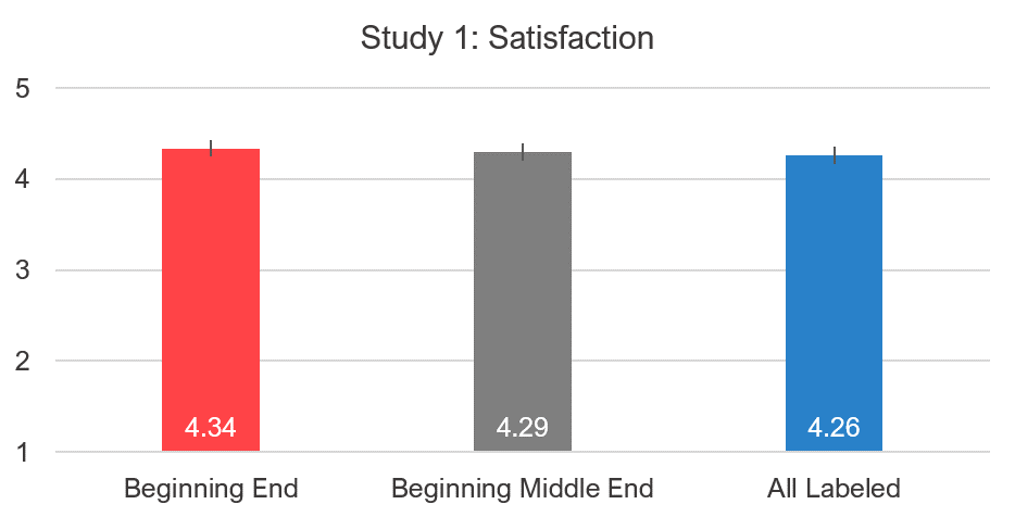
Figure 4: Differences in mean satisfaction between the fully and partially labeled versions.
We also examined the effects on top-box scores, shown in Figure 5, and saw a similar, albeit more attenuated, pattern. Slightly more selected the highest score when only the endpoints were labeled (49% vs 48% and 45% for the other two conditions). Similar to our earlier study on the effects of the neutral score, when only the endpoints are labeled, they tend to attract respondents.
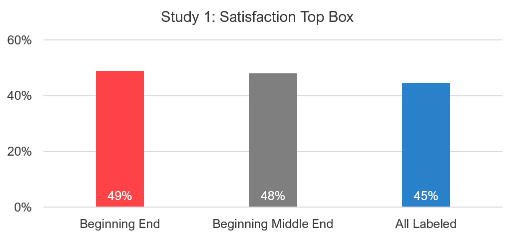
Figure 5: Top box between the fully and partially labeled versions.
We next looked at the shift in extreme responses—those that moved between 4 and 5 (Tables 1–3). As with the mean scores, the largest difference was between the endpoints-only labels and the fully labeled condition. The fully labeled condition reduced the number of top-box responses by a net difference of 4.4 percentage points (6.4% increase minus a 2% decrease) (Table 3).
| Beginning End - Beginning Middle End | Total | % |
|---|---|---|
| 4 to 5 | 2 | 1.0% |
| 5 to 4 | 4 | 2.0% |
Table 1: Shift to and from top-box responses between endpoints and middle.
| Beginning Middle End – Fully Labeled | Total | % |
|---|---|---|
| 4 to 5 | 3 | 1.5% |
| 5 to 4 | 10 | 5% |
Table 2: Shift to and from top-box responses between middle labels and full labels.
| Beginning End – Fully Labeled | Total | % |
|---|---|---|
| 4 to 5 | 4 | 2.0% |
| 5 to 4 | 13 | 6.4% |
Table 3: Shift to and from top-box responses between endpoints and full labels.
The results of Study 1 identified a modest pattern. Scores were slightly reduced when more labels were added (both the means and extreme responses) using a five-point satisfaction item about attitudes towards smartphones. We next looked to replicate the findings with a seven-point scale in a follow-up study.
Study 2: Fully vs. Partially Labeled 7-Point Scale
In October 2019, we asked 213 U.S.-based online panel participants to respond to three versions of a seven-point satisfaction item.
Similar to Study 1, the first version of the satisfaction item had the endpoints labeled (Figure 6); the second version was labeled with the end and middle points (Figure 7); and the third version was fully labeled (Figure 8).
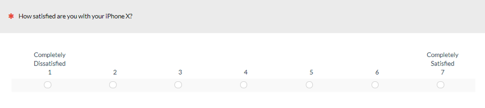
Figure 6: The endpoint version of the seven-point satisfaction scale.
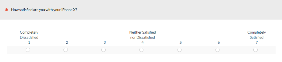
Figure 7: The end- and middle-point version of the seven-point satisfaction scale.
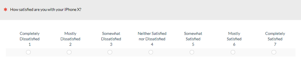
Figure 8: The fully labeled version of the seven-point satisfaction scale.
We again used a within-subjects study with the three variations displayed in random order at the beginning, middle, or end of a larger study that also asked about other brand attitudes, product experiences, and intent to recommend. Only participants who reported having a smartphone were asked to respond to all satisfaction variations.
Study 2 Results
Unlike in Study 1 with the five-point scale, there wasn’t a clear pattern in scores between the variants. None of the difference in means were statistically significant and the pattern of decreasing scores with more labels wasn’t seen with this seven-point satisfaction scale (Figure 9).
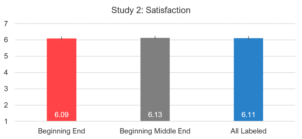
Figure 9: Differences in mean satisfaction between the fully and partially labeled versions.
This time, slightly more, but not statistically more, respondents selected the top-box response when the scale was labeled with the endpoints and neutral point (Figure 10).
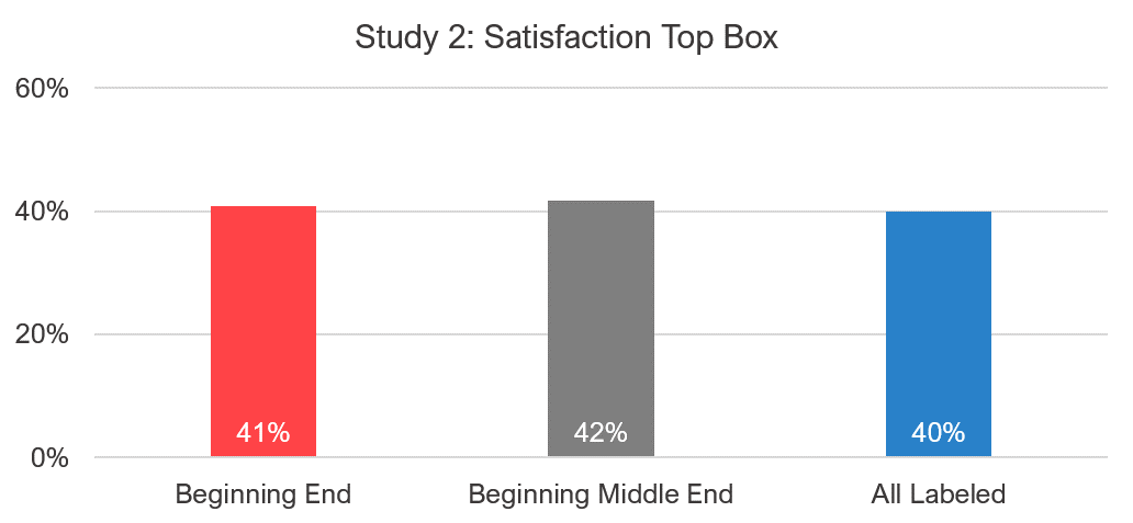
Figure 10: Top box between the fully and partially labeled versions.
The shifting in the extreme responses was also less clear (Tables 4–6). The largest difference was between the fully labeled variant and the endpoint plus middle variant. But even in this case the difference was only a net decrease of 1.9 percentage points (see Table 6: 2.8% minus 0.9%).
Beginning End – Beginning Middle End Total %
6 to 7 4 1.9%
7 to 6 2 0.9%
Table 4: Shift to and from top-box responses between the endpoint-only label condition and the endpoint-plus-middle label condition.
Beginning Middle End – Fully Labeled Total %
6 to 7 2 0.9%
7 to 6 6 2.8%
Table 5: Shift to and from top-box responses between the fully labeled condition and the endpoint-plus-middle label condition.
Beginning End – Fully Labeled Total %
6 to 7 3 1.4%
7 to 6 5 2.3%
Table 6: Shift to and from top-box responses between the fully labeled condition and the endpoint-only labeled condition.
Summary and Discussion
Across two studies measuring the impact of labeling on responses from 415 respondents to different versions of five-point and seven-point satisfaction items, we found:
Key Points
There is no clear pattern from labeling. In our first study with the five-point satisfaction scale, we found a small (~2%) decrease in mean scores when the scale was fully labeled compared to the endpoint-only scale, and a 1% difference compared to a scale with endpoints and neutral point labeled. However, this pattern was not replicated when we used a seven-point variation. The fully labeled seven-point scale in the second study actually had the opposite effect—slightly increasing scores compared to the endpoint only labeled version.
There’s a possible but weak effect of attraction to labeled response options. As discussed by Krosnick (2009) [pdf] in regard to neutral labels, when participants have low interest in a topic they may be more likely to respond to neutral labels and endpoints. This may explain the slightly higher number of respondents selecting points with labels in Study 1, but if this strongly affects how participants select response options, we would have expected replication in Study 2.
The claim that full labeling is always better isn’t supported. Both our earlier literature review and this study showed that always labeling categories isn’t necessarily better. Some studies found negligible results, but in at least some cases partial labeling offered superior results in both predictive validity and reliability. It’s likely that fully labeled scales will be superior when the scale is being used more as a rubric than a rating scale of simple (and non-controversial) attitudes.
Limitations
It isn’t possible in this area of research to run one study that answers all possible questions—there are just too many potential independent variables. The key limitations of these two studies were:
It didn’t measure validity. Across our two studies we examined differences in scores (which were small), but we didn’t have any measures of validity (e.g., correlating scores to another measure or outcome).
Only two versions were tested. We only tested two types of scales in the context of respondents reflecting on their current smartphone. The mixed results in the literature suggest that there are certainly contexts in which a fully labeled scale offers higher reliability and validity. Future studies can examine more variations on labeling, including conducting an Item Analysis using a Rasch model.
We always included numbers. One possible reason for the small (or no) differences observed between the five- and seven-point scales was that all scale variants included numbers, even the fully labeled version. The numbers may act as an additional cue to respondents on how to interpret the labels. A future study can examine the effects of removing the numbers from the fully labeled version. We suspect that any differences would be small.
We used a within-subjects experimental design. An advantage of within-subjects designs is their sensitivity for achieving statistical significance for small differences. For example, in Study 1, a mean difference of just .05 on a 5-point scale was determined to be statistically significant—in other words, unlikely to have occurred by chance if there really was no difference. Whether a difference this small would be of practical significance is another question. A disadvantage is the possibility of differential carryover effects; although if this were the case in this kind of research, you’d expect consistent effects in both studies, which didn’t happen. To cover the bases, though, it would be reasonable for some future research to use between-subjects designs.
Main Takeaway
You should focus on what matters. This research adds to the growing list of item format differences that people love to argue about but, at least in UX research, don’t seem to really matter that much. When planning research, spend your time on the substantive research issues rather than engaging in extensive discussion about item format differences that have trivial effects on measurement. Then be consistent with your scale choice.