 Booking a flight online involves more than selecting two cities and departure times.
Airlines have given consumers many more choices when booking a flight.
Do you want:
- Economy, basic economy, sub-basic economy?
- 2 bags, no bags, 1 carry on, no carry on?
- Board early, board late?
- Pick a seat, get assigned a seat?
Each choice requires a decision and has a cost implication. In fact, fees from these choices and other add-ons now account for the bulk of the profits for many airlines.
More choices also come with more opportunities for errors. To better understand the online booking process, we benchmarked the user experience of seven popular airline websites to see how people are using these services and where the processes can be improved.
● Alaska Airlines
● American Airlines
● Delta
● Frontier
● jetBlue
● Southwest
● United
This study had three parts:
- A retrospective benchmark on the five most popular airlines collecting SUPR-Q and NPS data
- A task-based benchmark on all seven airlines allowing us to observe problems as participants attempted to book flights
- A PURE analysis of websites involving independent evaluators assessing friction points in the booking process
Full details are available in the downloadable report. Here are the highlights.
Study & Participant Details
We used a combination of perception and task data to understand both what existing customers think and what new and existing customers do on the websites. We recruited 461 participants in January 2019 for perception and usability studies.
For the perception study, we asked 246 participants who had visited either American Airlines, Delta, jetBlue, Southwest, or United in the past year to reflect on their most recent experience using the site.
Participants in the study answered the 8-item SUPR-Q (including the Net Promoter Score) and questions about their prior experience. In particular, we were interested in visitors’ attitudes toward the site, problems they had with the site, and reasons they use the website.
For the task-based usability study, we asked 215 participants to book a flight on one of the seven websites (assignment was random and included a mix of first time and existing users) and recorded their experience on MUIQ.
Measuring the Airline Website UX: SUPR-Q
The SUPR-Q is a standardized measure of the quality of a website’s user experience and is a good way to gauge users’ attitudes. It’s based on a rolling database of around 150 websites across dozens of industries.
Scores are percentile ranks and tell you how a website experience ranks relative to the other websites. The SUPR-Q provides an overall score as well as detailed scores for subdimensions of trust, usability, appearance, and loyalty. Its ease item can also predict an accurate SUS equivalent score.
The scores for the five airline websites in the perception study (using only existing users) are above average at the 81st percentile (scoring better than 81% of the websites in the database). This average is almost identical to the 79th percentile we found in our 2014 benchmark .
There was still a lot of variation between airlines. American Airlines has the lowest SUPR-Q score in the group (70th percentile SUPR-Q score and SUS equivalent score of 77), while Southwest leads with scores at the 92nd percentile and a SUS equivalent score of 81.
Since our last benchmark of airlines in 2014, the overall user experience hasn’t changed much. Southwest was also the leader in 2014 and its score has remained the same.
United has made some progress in trust (going from the 76th percentile to the 96th) and appearance (going from the 35th percentile to the 51st). Delta has had some declines in loyalty, from the 79th percentile in 2014 to the 66th today. Other than that, however, overall SUPR-Q scores haven’t changed significantly in the intervening years.
The task-based usability study used both new and existing customers to gauge infrequent or first time usage. Consequently, all SUPR-Q scores were lower. Frontier and United had the lowest SUPR-Q scores (and lowest SUS equivalents of 65 and 61 respectively). American Airlines had the lowest task success scores, driven by unnoticeable and inefficient forms for multiple passengers (see below).
Trust & Loyalty
The airline websites had high trust scores, with an average of 93%. Participants expressed highest trust toward Southwest (98%), followed by United at 96%. Although still high, the lowest trust scores belonged to American Airlines and jetBlue (90%).
While users trust the airline websites, they’re unlikely to recommend them. The average NPS score was 8%, suggesting that few airline websites (and consequently airlines) enjoy a loyal customer base and that most customers choose an airline based on other factors, such as price and routes. People were least likely to recommend United (-8%) and American Airlines (-6%), and most likely to recommend jetBlue (29%) and Southwest (23%).
Desktop vs. Mobile App Usage
To get a sense of what kinds of activities participants most often do when they visit the airline sites, we asked how they accessed the site and the tasks recently attempted.
Unsurprisingly, the majority of participants reported only visiting airline websites a few times a year, which fits with how often[pdf] most people travel by air.
Looking at airfares was the top reason participants reported for visiting an airline website on a desktop or laptop computer (61%), followed by purchasing an airline ticket (48%), and checking in to a flight (24%). Interestingly, the top tasks differed on mobile; we found that participants use the mobile app most often to check in to a flight (52%), check the status of a flight (35%), and retrieve boarding passes (34%).
Some participants mentioned they use a desktop or laptop to purchase tickets because it feels more secure and is easier on the larger screen:
“The desktop version of the site is much easier to navigate for routine bookings…it makes me feel more confident when I can see it on a larger screen.” (United user)
“Just easier to book flights [on a desktop] because I don’t want to risk that on mobile.” (United user)
Overall, mobile app usage is low for airlines (16% across airlines). jetBlue and Delta had the highest percentage of mobile app users (19% and 18%, respectively). As expected, participants reported using the mobile app more when they’re traveling and in the airport.
“It’s easier to find things and make reservations on the desktop. I use the app when I’m at the airport or traveling.” (American Airlines user)
“I’ve used [the Southwest app] mainly just to check in on my flight and retrieve my reservations.” (Southwest user)
Problems in the Booking Process
The usability study revealed 15 unique problem types across the websites. The main problems users encountered were unclear filtering options, difficulty selecting seats, an abundance of passenger information required, and issues using the calendar selectors.
American Airlines, Alaska Airlines, Frontier, and United were the four lowest scorers in the usability study, with the lowest overall SUPR-Q scores and task completion rates. Full details on the problems and task metrics are available in the report.
Filtering and Sorting Options Are Unnoticeable
Sorting and filtering the available flight results was found to be a key driver of the airline website experience, explaining about 6% of the variation in SUPR-Q scores. Yet we observed that many participants missed the filtering options on the American Airlines, Delta, jetBlue, and Southwest websites suggesting this is a clear opportunity for improvement.
In particular, 40% of users failed to notice the filtering and sorting options on the American Airlines website making it difficult to find the cheapest flight, which contributed to it having the lowest task success rates in the group (40%). American Airlines also had the lowest SUPR-Q score in the retrospective study (70%).
“Whenever I had to look through all the selections available, they were not in order of the time of departure. It would be nicer if the time of departure were set in order so it can be easily selected throughout the process without taking too much time.” (American Airlines user)
American Airlines and Delta also had the lowest agreement rates with the statement: “It’s easy for me to filter through the flights on the website.” Only 76% of participants agreed with that statement about the American Airlines and Delta websites, whereas 91% agreed that it was easy on Southwest.
We recommend making the options to sort and filter flights more noticeable to improve the booking experience. Being able to narrow flights will allow users to find the right flight.
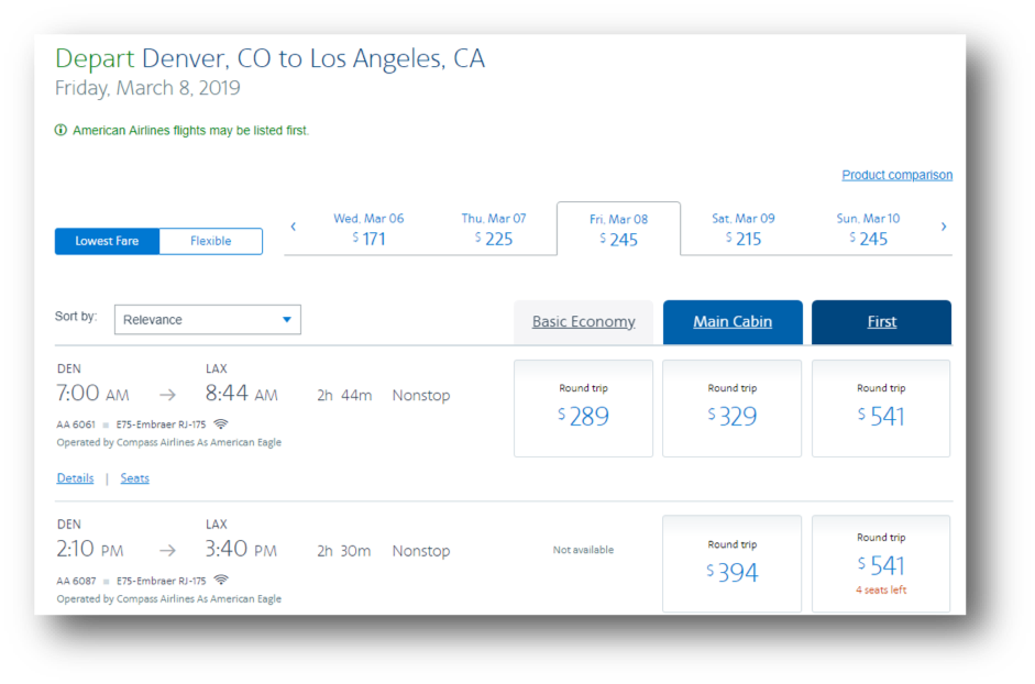
Figure 1: There is a lack of filtering options on the American Airlines website (e.g. nonstop flights, morning flights, Wi-Fi enabled, etc.). The Sort By drop-down list was not used (likely unnoticed by many participants).

Figure 2: The Filters and Sort By functions are not noticeable on Delta either. The banner looks nice but likely distracts users and makes it easy for people to skip straight to the different cabin experiences.
Seat Selection Is Problematic
The seat selection process was challenging on some of the airline websites; in particular, Frontier had the lowest task success rate for selecting a seat. Only 41% of the participants correctly selected the proper ticket to include seat choice.
“I wasn’t sure how to pick my own seats.” (Frontier user)
From the video analysis, we also saw 2 of 5 participants struggle to understand which passenger and flight they were selecting a seat for. The seat selector on Frontier was clunky and it wasn’t immediately clear which seats were available. When users did select a seat, the check mark was presented very briefly, making selected seats indistinguishable from unavailable seats. A clearer legend close to the seating chart and better messaging would have helped participants.
Video 1: Video showing a participant struggling with seat selection (watch for the disappearing check mark). A legend located closer to the seating chart would also be beneficial to help users understand why some seats cost extra.
The seating problem also came up in our PURE analysis. All four of the airlines with a Yellow overall PURE score had issues with seat selection that our expert reviewers expected would create significant cognitive load or delays for users. For Alaska Airlines (which had a Red score), the seat selection process can sometimes be impossible to complete through the website if the flight is through a partner airline.
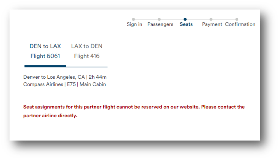
Image 4: For third-party flights, no clear instructions or links indicate to the user how to finish seat selection, making failure likely and giving Alaska Airlines a Red overall score.
Each airline also has a different way of designating which seats cost extra. Furthermore, many airlines have different ticket pricing schemes that allow certain privileges such as seating choice, 24-hour cancellation, and refreshments. This can become confusing with options like “Basic Economy,” “Economy,” and “Main Cabin.” While similarly named, each comes with different privileges. This unclear terminology lowered user confidence.
It was difficult for participants to quickly understand the pricing for each ticket between regular and premium seating on Alaska Airlines, Frontier, jetBlue, and United.
“Did not seem initially very clear that I required economy to choose seats until after I had chosen my tickets, requiring me to go back and change the flights. I think this may have been partly due to the terminology used making it less obvious.” (United user)
“It was confusing if you were charged extra for choosing seats, and if that option would be available.” (Alaska Airlines user)
We also asked participants their attitudes about being charged for a seat and what type of seating is worth extra to them. Almost half (45%) of participants felt it was unacceptable to be charged extra for seat selection in coach and over a quarter (26%) were unwilling to pay extra for any type of seating.
“The different costs for different seats is a terrible feature … First baggage fees, now seat charges.”
“The biggest thing about seat selection is being able to sit with my kids. jetBlue is good about having the seats together. Some other airlines charge for that!”
However, the majority of participants (61%) said they were willing to pay for a premium such as economy plus, business class, or first class. 19% said they would pay for a window seat and 11% would pay for an exit row seat.
Making the pricing options more obvious to users may reduce the frustration and confusion of seating travel companions together (although it will also likely reduce fees collected). Passengers may begrudgingly begin to accept fees for seat selection (similar to the accepted bag fees) so we’ll revisit this sentiment in our next airline benchmark.
Calendar Date Selectors Are Difficult to Use and May Lead to Mistakes
The calendars for choosing travel dates on the Frontier and Delta websites were quite cumbersome. On Delta, users had a hard time understanding the departure and return date selection. The branding of the header blends into the selection details making it difficult to know where to click (problems with the affordances).
On Delta, users are prompted to select both their departure and return dates from a single calendar. This interaction confused 1 out of 5 observed participants and can be seen in the video example below.
Video 2: Video showing a participant struggling with selecting the dates in the unified Delta calendar.
“Initially, I didn’t realize the depart and return were separate buttons. I didn’t realize I needed to click the depart button to enter a departure date, I figured it’d just automatically pop up again to ask for a departure date.”
Delta had the highest reported percentage (10%) of customers reporting making a booking mistake (almost twice as high as other carriers). This poor calendar experience may contribute to the problem.
The calendar on the Frontier website was overly sensitive and skipped around on participants:
“The calendar was a bit confusing. One time it was on another month that I didn’t choose.”
We also observed that the calendar date selector, while a handy interaction pattern for selecting dates for upcoming travel, was heavily relied upon by most of the airlines for any date inputs, including date of birth. It can be inefficient to select a date 18–60 years in the past, whereas typing a birthdate is much faster and, with proper error handling, can be just as effective.
Multiple Traveler Forms Are Burdensome
Buying airline tickets means filling out required information such as full legal names, addresses, phone numbers, and ages (all often required by the TSA). But traveling with companions, including spouses and children, often means entering the same information repeatedly.
For example, on American Airlines, users are required to input two separate forms of contact (phone and email) as well as state and country of residence for each passenger. If users are booking a family of four, this turns into quite a large form. This frustrated some participants and made the booking process longer.
“The details option was tedious to fill as well. Why do I need to fill the residence for each of the people flying with me if they are my kids? Of course, it [will] be the same.”
This was also a problem on Alaska Airlines where participants were asked to fill in information multiple times. For example, the website asks for the country of residence and email more than once. This type of information should be automatically prefilled wherever possible (e.g., country can be inferred from state) to shorten the booking time.
Summary
An analysis of the user experience of seven airline websites found:
- Compared to other industries, airline UX is high, but some websites have room for improvement. Current users find the airline website experience above average, with SUPR-Q scores falling at the 81st percentile (the same as in our 2014 analysis). Southwest was the overall winner for the retrospective study at the 92nd percentile, with American Airlines scoring the lowest at the 70th percentile. For infrequent and new users measured in the task-based usability study, Southwest came out on top again (48%) while Frontier had the lowest score (13%).
- People visit airline desktop websites a few times a year to check airfares. The majority of participants reported visiting the airline websites several times per year. When using the desktop, the most common activities were looking at airfares and purchasing a ticket. 18% of participants reported using the mobile app. These participants mainly use the app to check in to flights, look up flight statuses, and retrieve boarding documents.
- Filters are a challenge and opportunity. The ability to filter flights was found to be a significant key driver of the airline website experience, explaining about 6% of the SUPR-Q scores. In the video analysis, we saw participants skip over the filtering options on American Airlines, Delta, jetBlue, and Southwest. We recommend making these options more noticeable to improve the booking experience.
- Seat selection process can be confusing. The multitude of ticketing and seating options has made this process confusing for many users. The different terminology used by each airline for ticket privileges can be hard to understand. For example, the distinction between “Basic Economy” and “Economy” isn’t clear, and making the pricing options more obvious to users would reduce the frustration of choosing seats next to their traveling companions.
- People resist paying for non-premium seats. 45% of participants felt it was unacceptable to be charged for a seat and 26% were unwilling to pay extra for any type of seating. However, the majority of participants (61%) said they were willing to pay for a premium such as economy plus, business, or first class. We recommend making the pricing schemes for seating and ticketing more transparent to the user.