 Buying and selling stocks has dramatically changed since the advent of the web.
Online brokerages have made trades more accessible, faster, and dramatically cheaper for the retail investor.
Prior to the web, it was common for a full-service broker to charge 2.5% for a stock trade. Now transactions are low-cost commodities with many trades costing less than $10 (or even free).
But the ease of executing trades, access to account data, and the tsunami of financial information available online hasn’t taken away some common challenges for the typical investor.
To understand this experience, we benchmarked the user experience of six top US-based brokerage websites to understand how people are using these services and where the process can be improved.
We benchmarked the desktop and mobile user experiences of the following six brokerage websites:
- Charles Schwab (schwab.com)
- E*Trade (us.etrade.com)
- Fidelity Investments (fidelity.com)
- Merrill Lynch (ml.com)
- TD Ameritrade (tdameritrade.com)
- Vanguard (investor.vanguard.com)
We collected SUPR-Q data, including NPS data, and investigated reasons for using the website, users’ attitudes toward the website, and how well people understood key terms and features. We also supplemented the empirical data with a guideline review using the Calibrated Evaluator’s Guide (CEG) where evaluators score the websites using 107 standardized criteria that have been shown to impact the user experience.
Benchmark Study Details
We recruited 199 participants in August 2018 for a retrospective study where we asked current brokerage account holders to reflect on their most recent experiences using their brokerage company’s website.
Participants in the study answered the 8-item SUPR-Q (including the Net Promoter Score) and questions about their prior experiences.
Quality of the Brokerage Website User Experience: SUPR-Q
The SUPR-Q is a standardized measure of the quality of a website’s user experience and is a good way to gauge users’ attitudes. It’s based on a rolling database of around 150 websites across dozens of industries, including brokerages.
Scores are percentile ranks and tell you how a website experience ranks relative to the other websites. The SUPR-Q provides an overall score as well as detailed scores for subdimensions of trust, usability, appearance, and loyalty.
The scores for the six brokerage websites are well above average, which isn’t too surprising given the financial incentive to make transactions easy and frequent. The average SUPR-Q is at the 92nd percentile (scoring better than 92% of the websites in the database). Merrill Lynch has the lowest SUPR-Q of the group with a score at the 88th percentile. E*Trade and TD Ameritrade lead the group with scores at the 95th percentile. Brokerages as a group also scored higher than the banking websites we recently evaluated.
Usability Scores & Trust
We asked participants to reflect on how easy they thought it was to use and to navigate through their brokerage websites. Fidelity has the highest score in the group (at the 93rd percentile) and Vanguard has the lowest usability score at the 77th percentile.
Not surprisingly, trust scores for this group are also high as users are confident in the companies that handle their money. Participants rated their brokerage companies very high in trust and credibility, and all sites in our study scored between the 92nd and 99th percentiles. This is higher than our group of retail banking websites, which had trust scores between the 76th and 95th percentiles.
Loyalty/Net Promoter Scores
The brokerage websites have an average NPS of about 41%. While we’ve seen that users are more reluctant to recommend their banking websites (with an average NPS of 16%), the same was not the case with other financial websites. This relatively high likelihood to recommend could also be from the effects of a long-term bull market and 401k retirement accounts are at all time highs[pdf]. U.S. equities are up about 40% in the prior two years leading up to the data collection period in August 2018. That is, people may be more interested in purchasing stocks, viewing mutual fund balances, and recommending to friends because of positive financial experiences (as opposed to actual differences in website changes).
Use of Brokerage Sites & Mobile Apps
As a part of this benchmark, we asked participants how they accessed their brokerage site and the activities they attempted on their last visit and in the last year. Not surprisingly, most participants use a desktop or laptop computer to access their brokerage site. However, on average, about 35% of participants reported using their mobile devices (about equally between the mobile website or mobile app).
The mobile app is most popular for checking portfolios while the desktop site is used for tasks such as investment research and transferring funds. The brokerage mobile app usage is lower than the banking app usage, which showed significantly more mobile app and mobile website usage (46% and 64%, respectively).
Overall, checking account balances is the top reason to visit the brokerage sites (27%), followed by looking at the recent performance of stocks and investments (24%). The top tasks were the same across desktop and mobile. More details on the mobile app experience are available in the report.
The Learning Curve & Understanding Jargon
Users on some of the brokerage sites (Charles Schwab, E*Trade, and Vanguard) mentioned a steep learning curve at the start of use, especially with complex jargon.
- “To the uncertain investor they have a lot of information that is complex and it can be very overwhelming looking at all of the investing lingo they have on their website. Such as looking at their EFTS, bonds, stocks, 401k, and IRA options—there are a lot of things that you can choose from and getting started is complex.”—Vanguard user
- “Honestly, my only problems were at the beginning, when I was still learning their site’s features and layout.”—Charles Schwab user
- “I was a little lost and there wasn’t a lot of guidance. I had to do a lot of my own research to get started.”—E*Trade user
To further assess how participants understood common jargon, we asked participants to describe three common brokerage terms in their own words. A YTD return was the most widely known term (91%), whereas only 64% of participants knew what a prospectus was, and 73% knew what an ETF was. This comprehension was generally higher than the health insurance websites.
Calling Customer Service
As with banking websites, taking calls is expensive and time consuming. On average, 13% of brokerage website respondents reported contacting customer service in the last year (lower than the 20% on banking websites and 30% for health insurance websites). Being able to accomplish the task without calling customer service was one of the key drivers of UX quality; it explained 8% of the variation in SUPR-Q scores.
Also, like the banking websites, the top reason for brokerage respondents to call customer support is login troubles. However, this only accounted for 5% of participants calling in (compared to 29% for banking and 21% for health insurance). Other common reasons for calling in were researching particular products (stocks, bonds, ETFs) (5%), and transferring funds (3%).
Having an online chat system can help reduce the number of calls to customer support and it’s something our respondents were looking for.
“I wish they had a way to contact customer service other than by phone. I prefer using email or chat to contact customer service so that I can have text to refer back to if I’m trying to get help with something, but they only seem to allow phone contact.”—Vanguard user
In the guideline review (more info can be found in the report), Vanguard has the lowest scores on Help & Information partly because it doesn’t have an online chat option.
Product Pages Challenging
While we didn’t conduct a usability evaluation for this industry, to identify problem areas, we did conduct a detailed guideline review using the CEG. The top weakness identified by evaluators on both Merrill Lynch and Fidelity was the organization of the product pages.
For Merrill Lynch, the website lacks a clear path to finding investment products as the information is not organized effectively. The page seems to lack an element hierarchy or sidebar to narrow choices into products like ETFs, Retirement Accounts, Stocks, or Mutual Funds.
“It’s a little hard to navigate unless you know exactly what you’re looking for. Otherwise, it takes time to navigate and look at all of their options.”—Merrill Lynch user
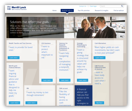
Image 1: Product pages form the Merrill Lynch website shows a lack of hierarchy on the page.
A similar challenge is on the Fidelity website. While it has a better visual arrangement, the vast number of products are hard to differentiate for the typical retail investor as Fidelity has no apparent overall product comparison page to understand and differentiate the financial products.
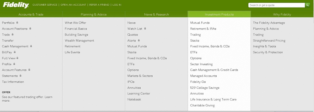
Image 2: There’s no overall investment products page where users can look at products with descriptions from a high-level view.
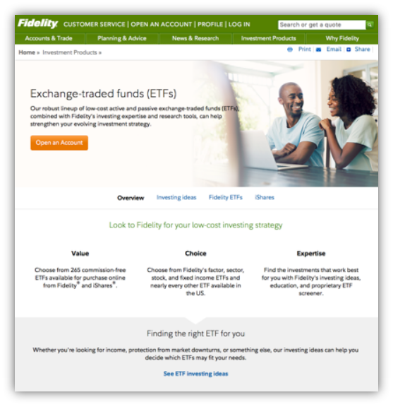
Image 3: Users must navigate to each individual product page to get any information, which can seem tedious.
The websites that performed well in the product pages category, like E*Trade, have an overview of the investment products with short descriptions and an option to learn more on a detailed product page.
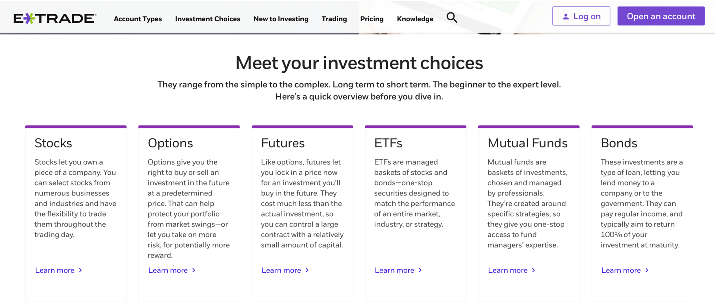
Image 4: E*Trade makes it easy for users to quickly digest the different product options and see where they want to dive deeper.
Key Drivers
To better understand what’s affecting SUPR-Q scores, we asked respondents to agree/disagree to the following attributes of their brokerage website on a five-point scale from 1=strongly disagree to 5=strongly agree.
- My portfolio dashboard is clear and understandable.
- I can buy or sell stocks and bonds easily.
- The [Brokerage] site is consistent however I use it.
- I can find and understand my investment fees and taxes.
- I can accomplish what I want to do without calling customer support.
- The [Brokerage] site helps me to research and understand investment products.
- The [Brokerage] website keeps my information secure.
- I can find my account details quickly and securely.
Information Security & Dashboards
The top key driver for the brokerage website user experience is keeping user information safe and secure. “The brokerage website keeps my information secure” explained 16% of the variation in SUPR-Q scores.
The second biggest driver of the perception of the website UX quality is having a clear portfolio dashboard.
Clear dashboards explain 12% of the variation in SUPR-Q scores. Checking portfolio balances is also a top task for this group, so it’s not surprising this is found to be so important to the quality of the brokerage website experience.
The six sites we tested all scored high for the item “My portfolio dashboard is clear and understandable” (Item 1). The lowest score is on TD Ameritrade where only 88% agreed or strongly agreed compared to the highest for Vanguard and Charles Schwab (both 94%).
Summary
An analysis of the user experience of six brokerage websites found:
1. Brokerage websites offer above average UX across devices. Current users find their brokerage website experience well above average, with SUPR-Q scores falling at the 92nd percentile. Merrill Lynch scored the lowest but still above average at 88% while E*Trade and TD Ameritrade lead the pack at the 95th percentile. Mobile apps are widely used in this industry with 35% of respondents reporting using the app or website within the past year.
2. Users need to overcome a steep learning curve and overwhelming product pages. Respondents on half of the brokerage sites (Charles Schwab, E*Trade, and Vanguard) mentioned a learning curve when first using the website. Many said the brokerage sites didn’t lend themselves to novice investors and some jargon was confusing to learn at first. Improved on-boarding and more common language could improve the experience on these sites. The product pages, in particular, may be difficult for less experienced users to differentiate and select.
3. An understandable dashboard and security are key drivers of UX. The top two key drivers of the brokerage website user experience were an understandable portfolio dashboard (12%) and information security (16%). Users want a quick and easy view of their portfolio and they don’t want to worry about their personal information being compromised (they probably also want their portfolio balances to increase).
Full details are available in the downloadable report.