 The Net Promoter Score (NPS) is a popular metric for measuring customer loyalty.
For many companies, it’s THE only metric that matters.
With such wide usage across different industries, departments, and companies of various sizes, it’s no surprise many questions and controversies arise.
Some are systemic—should the NPS be used as a key metric?—and some are trivial—should the NPS be treated as a percentage?
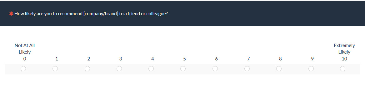
In case you aren’t familiar with it, the NPS is based on a single question, “How likely are you to recommend a product to a friend or colleague?” Participants respond on an 11-point scale (0 = not at all likely to recommend and 10 = extremely likely to recommend).
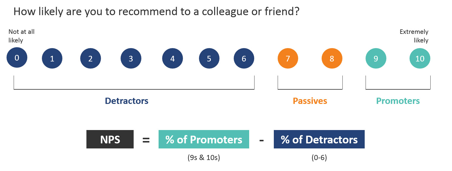 Responses of 9 and 10 are considered “promoters,” 7 and 8 “passives,” and 0-6 “detractors.” Detractors are customers likely saying bad things about your product or service and even discouraging others to use it. Promoters are customers most likely to spread positive word of mouth.
The “Net” in Net Promoter Score comes from subtracting the percentage of detractors from the percentage of promoters. A negative score means you have more detractors than promoters and a positive score means your promoters outweigh your detractors (that is, more positive word of mouth than negative word of mouth).
Why 11 points? Why not 10, 7, or 5?
One question that’s come up about the NPS is whether the 11-point scale is necessary. Fred Reichheld who originally wrote about the NPS describes the 11 response options with 0 being a clear signal to respondents that 1 doesn’t mean the best. “The confusion rarely occurs with a 0 to 10 scale.” pg 99
Reichheld himself acknowledges variation in the number: “Other scales seem to work” and cites as an example Enterprise Rental Car’s 5-point scale. pg 98
Outside the NPS world, the number of scale points itself has had its own controversy (overblown in my opinion). The number of response options does have an effect on the data, but it’s not typically overwhelming. The fewer the items in a questionnaire, the more changing the number of response options changes the score. All other things being equal, the more response options, the better. So, reducing the number of scale steps from 11 to 9, 7, or 5 actually causes more harm than good (albeit slightly).
But concerns over the 11-point scale are usually a practical and not statistical issue. The likelihood to recommend question (LTR) is often presented along with other items in a survey. Many items usually have 5- or 7-point Likert-type questions. Including the 11-point scale requires respondents to switch scales—often from the 5- or 10-point scales an organization uses. What’s more, the width of an 11-point scale makes viewing it on compact in-product surveys and mobile screens harder.
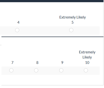
The result is some organizations I’ve worked with use a 10-point version (1 to 10) and others use a dramatically changed 5-point scale for the LTR item. Does this change matter and if so, how much?
Does changing the number of response options have an effect?
To understand what effect changing the number of response options would have on the Net Promoter Score, we examined the difference in scores using three response option variations: 11 point original, with 10 and 5 point variations (shown respectively below).


We collected data from 520 U.S.-based participants with a mix of age, gender, and occupation using an online panel in Nov 2017. There were two studies: a retrospective analysis and an unmoderated UX benchmark study.
Our goal was to include brands and products with a range of Net Promoter Scores (high to low performers). In the retrospective study, we recruited participants that had used a product or service from the following companies (49 to 53 responses were collected per company/product).
U.S. Airlines
- United
- Delta
- American Airlines
Entertainment/Media
- Netflix
- iTunes
Satellite/TV providers
- Dish
- DirecTV
- Comcast
In the UX benchmark study, participants were randomly assigned to one of two online learning platforms (Lynda.com—part of LinkedIn—or Udemy) and asked to complete two tasks on the website using the MUIQ research platform.
In both studies, participants were assigned all three variations of the NPS question in randomized order to avoid sequence effects. The questions were not presented on the same page and in the retrospective study an additional question asking about their experience was placed between each variation of the NPS item.
We used the following scoring rubrics to convert all raw responses to a Net Promoter Score with promoters, passives, and detractors by company/product.
| Variation | Promoters | Passives | Detractors |
|---|---|---|---|
| 11 Point | 9-10s | 7-8s | 0-6s |
| 10 Point | 9-10s | 7-8s | 1-6s |
| 5 Point | 5s | 4s | 1-3s |
Results
The results in the table below show the Net Promoter Scores by scale type and product after removing eight respondents for unusual response patterns (see removal notes below). As expected, we saw a good range in Net Promoter Scores using the original 11-point scale: Netflix had the highest NPS at 63% and Comcast the lowest at -55%.
The response scales indeed had an effect on the Net Promoter Score. The two most notable differences came from Delta and Comcast. Delta had a 14-point difference between the 11-point scale and the 10-point scale, from a -10% NPS to a 4% NPS (p<.10 difference for detractors). Comcast had an 8 point difference between the 11- and 5-point scales (-55% and -63% respectively). Recall that these people responded to the same question in randomized order with only the number of scale options changed.
| NPS 11 | NPS 10 | NPS 5 | |
|---|---|---|---|
| American | -8% | -6% | -8% |
| Comcast | -55% | -53% | -63% |
| Delta | -10% | 4% | -8% |
| DirecTV | -14% | -12% | -20% |
| Dish | -16% | -8% | -16% |
| 29% | 31% | 21% | |
| iTunes | 8% | 2% | 2% |
| Lynda | -15% | -15% | -21% |
| Netflix | 63% | 63% | 61% |
| Udemy | 0% | 3% | 6% |
| United | -15% | -8% | -13% |
Unusual Response Patterns
An examination of the raw responses shows that some participants provided dramatically different responses. The table below shows five unusual responses between 10 and 11 points from the same participant and three between the 5- and 11-point responses.
| Participant # | NPS10 | NPS11 | NPS5 | |
|---|---|---|---|---|
| Delta Airlines | 144 | 9 | 2 | |
| 293 | 8 | 3 | ||
| Dish Network | 217 | 2 | 6 | |
| Comcast | 93 | 3 | 7 | |
| Netflix | 383 | 7 | 3 | |
| Dish Network | 237 | 9 | 2 | |
| American | 28 | 5 | 5 | |
| United | 417 | 3 | 4 |
For example, participant #144 was a promoter (response of 9) when presented with the 10-point option but a detractor (response of 2) when presented with the 11-point option. Participant #417 was a detractor (giving a response of 3) for the 11-point scale but a passive (giving 4) with regard to the 5-point scale.
It could be these participants made a mistake or weren’t paying attention when responding. It’s also likely that some participants may have been influenced by the prior questions and either got confused when the scale changed or attempted to be consistent by providing the same or similar response. I removed these eight egregious responses from the dataset when computing the Net Promoter Scores from the table above. However, even after removing these unusual responses, differences remained.
Differences Across Scales
The table below shows both the absolute and raw differences between the 10 vs. 11 point and 5 vs. 11 point variations by company/brand and the total mean differences across all 11 companies/brands.
| 11 vs 10 (Abs. Value) | 11 vs 10 | 11 vs 5 (Abs. Value) | 11 vs 5 | |
|---|---|---|---|---|
| American | 2% | 2% | 0% | 0% |
| Comcast | 2% | 2% | 8% | -8% |
| Delta | 14% | 14% | 2% | 2% |
| DirecTV | 2% | 2% | 6% | -6% |
| Dish | 8% | 8% | 0% | 0% |
| 2% | 2% | 8% | -8% | |
| iTunes | 6% | -6% | 6% | -6% |
| Lynda | 0% | 0% | 6% | -6% |
| Netflix | 0% | 0% | 2% | -2% |
| Udemy | 3% | 3% | 6% | 6% |
| United | 8% | 8% | 2% | 2% |
| Mean Difference | 4% | 2% | 4% | -2% |
Interestingly, both the 11 vs. 5 and 11 vs. 10-point scales have the same mean absolute difference of four percentage points.
Reduction in Detractors
Not surprisingly, removing the lower part of the scale (Reichheld’s 0) increased the score for the 10-point scale. This can be seen in the 11 vs. 10 column where 10 of the 11 Net Promoter Scores are higher or the same than the 11 point (only iTunes was lower in the 10-point condition).
Across both the 10- and 5-point variations, the total number of detractors dropped. The 11-point variation went from 197 to 185 out of 512 retained responses—a statistically significant 7.6% reduction (p = .01). For the 5-point variation, the number of detractors also decreased by 8.6% (197 to 180; p <.01).
Reduction in Promoters for 5-Point Scales
There was a much more negligible effect on promoters for the 10-point variation. The total number of promoters slightly increased from 184 to 188 out of 512 (a 2.2% increase in promoters).
However, the number of promoters substantially decreased for the 5-point variation from 184 to 153 out of 512 (a 16.8% decrease; p <.01). Consequently, the differences in scores were not as upwardly biased as the 10-point version. For the 5-point version, 5 of the 11 scores remained the same or increased and 6 of 11 decreased relative to the 11-point version.
Summary & Discussion
This analysis showed a number of things about changing the scales used in computing the Net Promoter Score and some takeaways.
- Changing the NPS scale affects the scores (a little): The average absolute difference when changing scales is around 4 percentage points (for sample sizes of around 50) but fluctuated as high as 14 points (for Delta Airlines).
- 5 vs. 10 point scales have about the same error: Interestingly, there wasn’t a notable difference in the average difference between the 10 and 5-point versions—both had average absolute errors of around 4 percentage points.
- Reduction in detractors for 10-point scales: The 10-point variation reduced the proportion of detractors (around 8%) without a corresponding reducing in promoters (they slightly increased). This increased the Net Promoter Score with 10 of the 11 brands having the same or higher Net Promoter Score compared to the 11-point version.
- 5-point scales reduced detractors and promoters: With fewer response options, fewer participants selected the extreme “5” response. This resulted in fewer promoters (17%), which was generally offset by fewer detractors (8% reduction). The change in scores was more nuanced with about half of the brands increasing or decreasing.
- The 10-point scale is a worse substitute: Somewhat surprisingly, the subtle difference between the 11- and 10-point scale’s reduction of detractors makes it less interchangeable. A future article will examine other approaches of making the most with these 10-point scales (using the mean instead).
- Net Promoter Scores stayed within a range: For the most part, regardless of the scale used (5, 10, or 11), the Net Promoter Score was in a similar range. For example, Netflix consistently had a high score (in the 60s), Facebook an average score (20s to 30s), and Comcast a very low score (-50s to -60s).
- Loss of external benchmark: The main disadvantage in using 5-or 10-point versions is external benchmarks will differ. This analysis suggests the difference could be around 4% between your scores and published benchmarks.
- Differences may be more noticeable: The observed differences (some statistically significant) can seem large but even the most extreme difference (14 point shifts) only represents a 7% change on the 200 percentage point Net Promoter Score range.
- Beware of sampling error: With larger sample sizes, most of the differences observed here will become statistically significant and using confidence intervals and statistical tests can help reduce the sampling “noise” from the loyalty signal.
- Participant variation: Some differences between scales may come from the inevitable variation in participant responses. For example, participants may vacillate between a 6 or 7 when posed with the likelihood to recommend item. This one-point shift will have a more noticeable effect on the NPS (passives to detractors). A future analysis can estimate how much fluctuation to expect within the same study by asking the same 11-point LTR item repeatedly.
- Keep consistent: This analysis suggests if you have historical data using a 10- or 5-point version, stick with what you’re using. There’s little benefit in changing to an 11-point version but keep in mind your NPS scores will have some comparison error (this analysis suggests around +/- 4%).
Thanks to Jim Lewis for commenting on an earlier version of this article.


