 Card sorting is a popular activity that researchers use to understand how people group and associate items such as products or information.
Using a research platform like MUIQ®, card sorting is typically done electronically and often without an attending moderator. One advantage of digital over physical card sorting is that it’s easier to add images and even videos to cards as shown in Figure 1.
Figure 1: Examples of videos (animated GIFs) in a card sort.
But does adding images affect the results of a card sort? In an earlier article, we examined whether there were differences in dropout rates, completion times, and perceived ease/cognitive load among participants who were randomly assigned to one of three card-sorting groups: Text-Only, Image-Only, and Image+Text.
We found that participants took about 17% longer with Image+Text compared to Text-Only, but despite this extra time (or perhaps because Image+Text provides two types of information about items to be sorted), participants rated the task (using the SEQ®) as statistically easier for the Image+Text condition. Most notably, we found that participants were twice as likely to drop out of the study if only images were used—suggesting the added effort of sorting images without any textual clues is more burdensome than text with or without images.
Although it’s good that images with text were perceived as being easier for participants, does the presentation of images result in a different or “better” card sort result?
In this article, we look at potential qualitative and quantitative differences in the output of card sorting: organizational structures visualized in dendrograms, the number of categories used by participants, and the category names generated by participants.
Card Sort Study Overview
In January and December 2022, we recruited 623 participants from a US-based panel to complete a card-sorting exercise. Participants were presented with 40 cards for products available from the Best Buy website. The products were selected from various departments and included items such as toasters, fans, speakers, drones, and dishwashers. Participants were randomly assigned to one of three conditions:
- Text-Only: Cards were presented using only text for the product description.
- Image-Only: Cards were presented using only the product picture.
- Image+Text: Cards were presented with both the product description and the picture.
More study details are available in our earlier article.
Comparing Organizational Structures (Dendrograms)
To compare how items were sorted, we used both qualitative and quantitative approaches. First, we visually compared the dendrograms and then quantitatively compared the differences in similarity matrices between the three conditions to identify the largest differences.
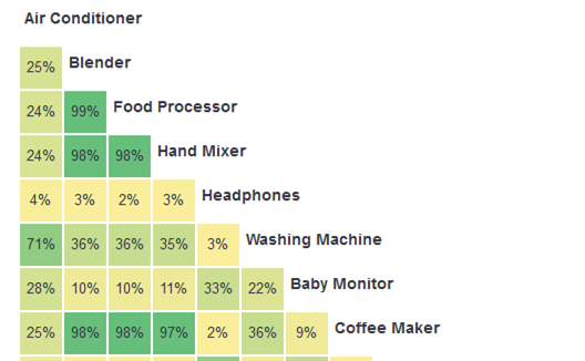
Dendrograms are the visual depiction of how closely items were placed together and look like branching trees (dendro comes from dendron, the Greek word for tree). Dendrograms are generated using one of many computer algorithms, but all start with the similarity matrix as the input (or a distance matrix, which is the mirror opposite of the similarity matrix). The similarity matrix is the percentage of time each item was sorted in the same group with another item. Items always sorted in the same category together have a similarity score of 1, and items never sorted in the same group have a similarity score of 0 (these extreme values are rare). Dendrograms are related to similarity matrices, but they also show relationships between clusters of multiple items, not just pairs of items.
Figure 2 shows a selection of the similarity matrix from the Text-Only condition from MUIQ. For example, the Food Processor and Blender products were sorted into the same category 99% of the time, whereas the Blender and Headphones were placed in the same category only 3% of the time.
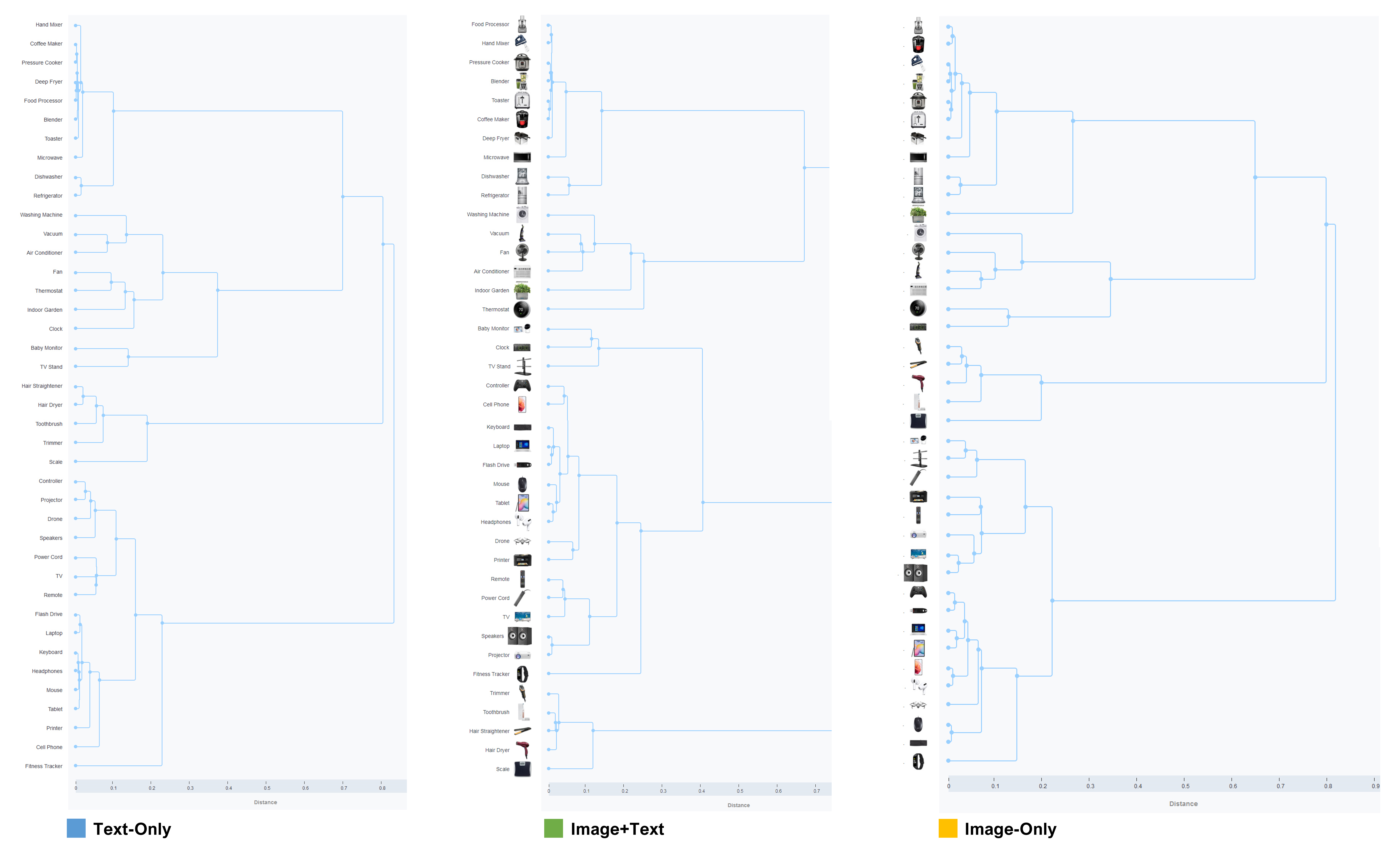
The dendrograms for the three conditions are shown in Figure 3 (click to enlarge). There’s a clear visual similarity in the structures, but they are not identical (e.g., some changing of orders).
The Challenges with Comparing Dendrograms (Structures)
Comparing the dendrograms is difficult because the expected random variation between people in each sample obscures potential image effects. Dendrogram algorithms are sensitive to changes in the input (MUIQ uses the multidimensional scaling and K-means clustering algorithm recommended by Paea & Baird, 2018).
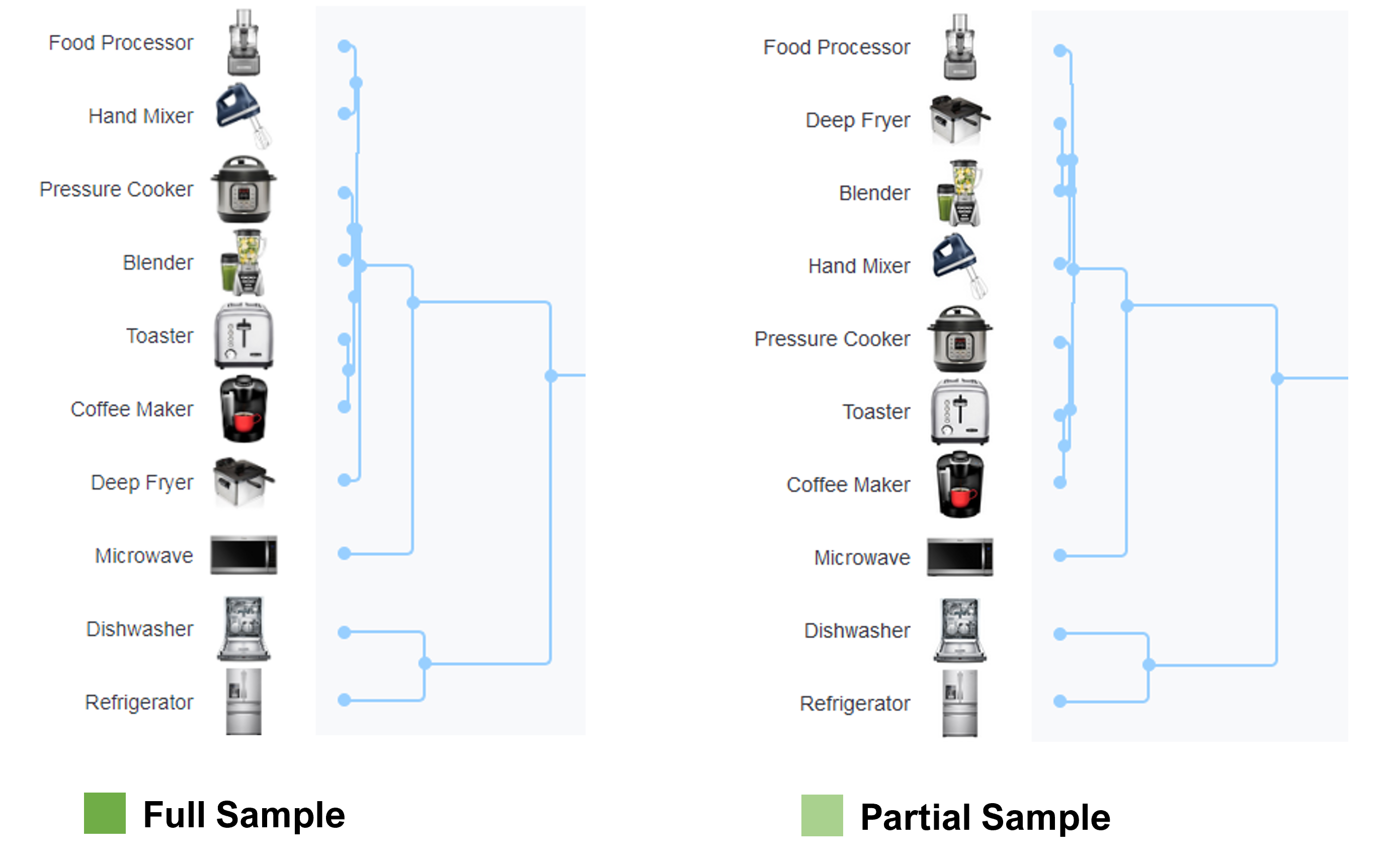
To illustrate this variation, we temporarily removed roughly 10% of the sample in the Image+Text condition (removed 21 participants, leaving 184) and regenerated the dendrogram in MUIQ. Although the structure is very similar, this manipulation caused differences in the order and similarity in the well-defined structure of the group of kitchen appliances. Figure 4 shows how the order of the Hand Mixer and Deep Fryer (among other items) shifted.
To compare the structures, we focused on large movements in how items were categorized rather than more subtle shifts in order. To do so, we first identified large groupings and then subsets within the larger groupings based on how close they were placed to each other and their parent nodes. As is the case when inspecting clusters, there is some judgment when deciding which item belongs in which group.
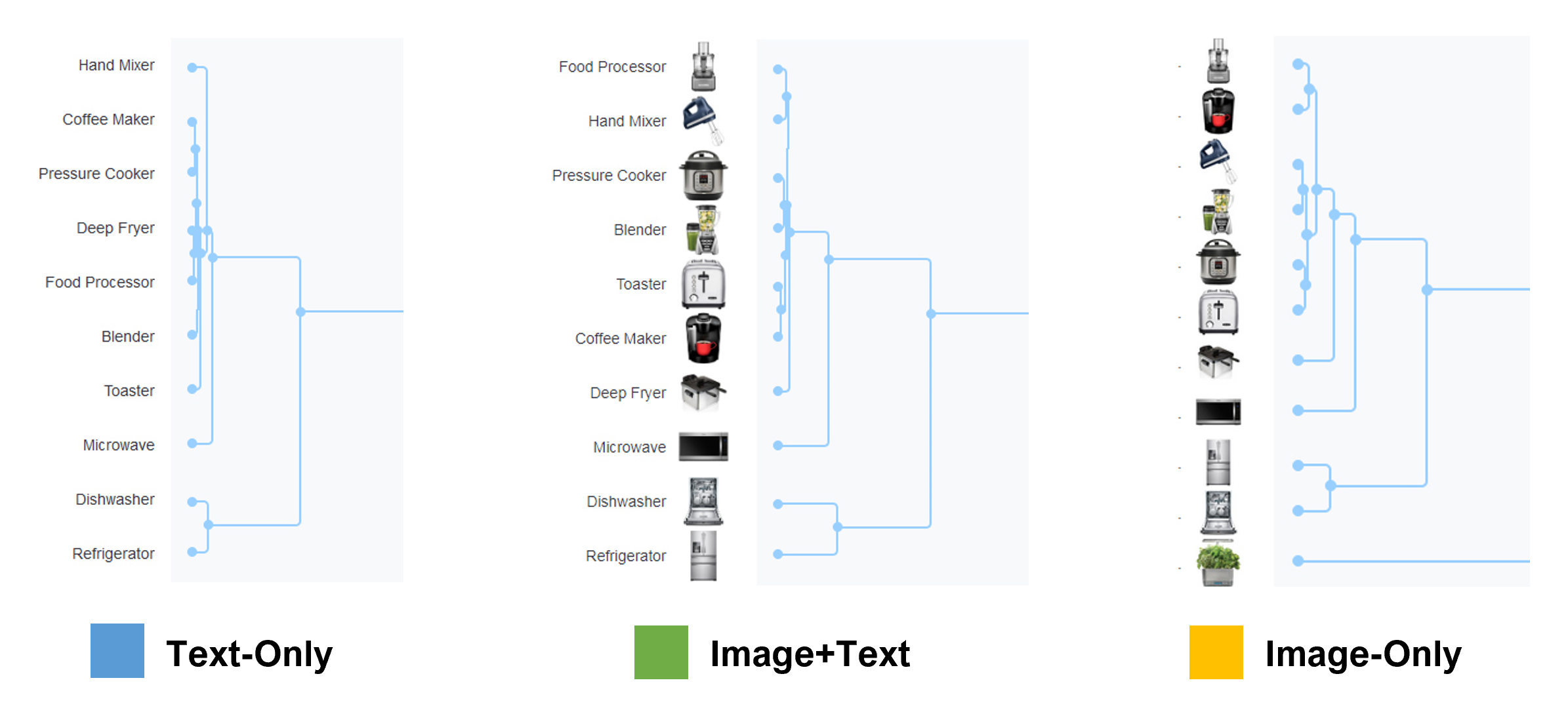
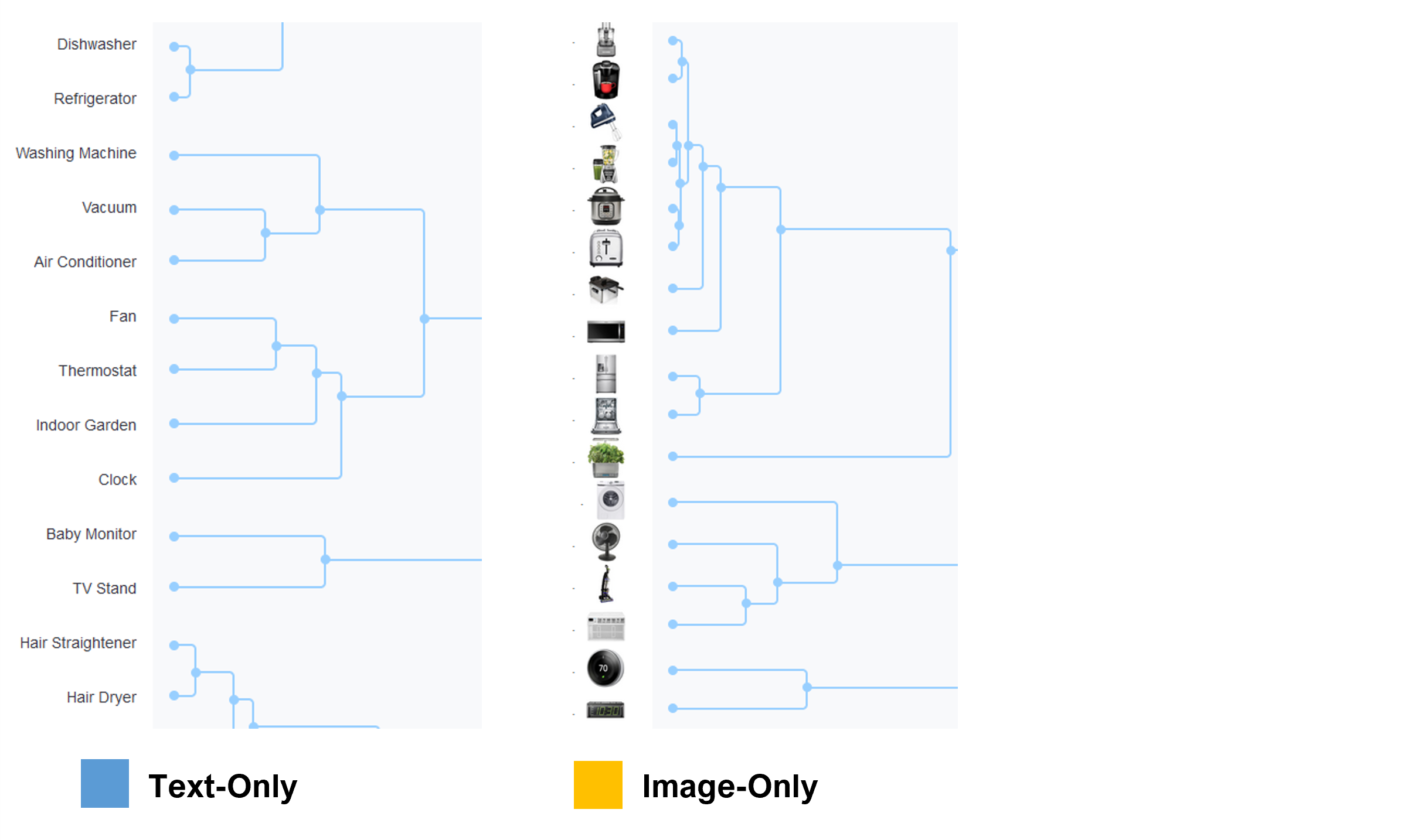
For example, Figure 5 shows that all three conditions had a cluster of kitchen appliances (e.g., Blender, Hand Mixer) and a subgroup including the Dishwasher and Refrigerator. In the Image-Only condition, the Indoor Garden appeared under the Dishwasher and Refrigerator but was not in this group at all for Text-Only or Image+Text.
To make the comparison easier, Table 1 shows a side-by-side comparison of the 40 product names and our groupings pulled from the dendrograms. The products fell into roughly 4–6 large groupings and roughly 11–12 smaller groupings.
| Group | Text-Only | Group | Image+Text | Group | Image-Only | ||
|---|---|---|---|---|---|---|---|
| 1 | Hand mixer | 1 | Food processor | 1 | Food processor | ||
| 1 | Coffee maker | 1 | Hand mixer | 1 | Coffee maker | ||
| 1 | Pressure cooker | 1 | Pressure cooker | 1 | Hand mixer | ||
| 1 | Deep fryer | 1 | Blender | 1 | Blender | ||
| 1 | Food processor | 1 | Toaster | 1 | Pressure cooker | ||
| 1 | Blender | 1 | Coffee maker | 1 | Toaster | ||
| 1 | Toaster | 1 | Deep fryer | 1 | Deep fryer | ||
| 1 | Microwave | 1 | Microwave | 1 | Microwave | ||
| 2 | Dishwasher | 2 | Dishwasher | 2 | Refrigerator | ||
| 2 | Refrigerator | 2 | Refrigerator | 2 | Dishwasher | ||
| 2 | Indoor garden | ||||||
| 3 | Washing machine | 3 | Washing machine | 3 | Washing machine | ||
| 3 | Vacuum | 3 | Vacuum | 3 | Fan | ||
| 3 | Air conditioner | 3 | Fan | 3 | Vacuum | ||
| 3 | Air conditioner | 3 | Air conditioner | ||||
| 4 | Fan | 3 | Indoor garden | 3 | Thermostat | ||
| 4 | Thermostat | 3 | Thermostat | 3 | Clock | ||
| 4 | Indoor garden | ||||||
| 4 | Clock | 4 | Trimmer | ||||
| 4 | Hair straightener | ||||||
| 5 | Baby monitor | 4 | Baby monitor | 4 | Hair dryer | ||
| 5 | TV stand | 4 | Clock | 4 | Toothbrush | ||
| 4 | TV stand | 4 | Scale | ||||
| 6 | Hair straightener | ||||||
| 6 | Hair dryer | 5 | Controller | ||||
| 6 | Toothbrush | 5 | Cell phone | 5 | Baby monitor | ||
| 6 | Trimmer | 5 | TV stand | ||||
| 6 | Scale | 6 | Keyboard | 5 | Power cord | ||
| 6 | Laptop | ||||||
| 7 | Controller | 6 | Flash drive | 6 | Printer | ||
| 7 | Projector | 6 | Mouse | 6 | Remote | ||
| 7 | Drone | 6 | Tablet | 6 | Projector | ||
| 7 | Speakers | 6 | Headphones | 6 | TV | ||
| 6 | Speakers | ||||||
| 7 | Power cord | 7 | Drone | ||||
| 7 | TV | 7 | Printer | 7 | Controller | ||
| 7 | Remote | 7 | Flash drive | ||||
| 8 | Remote | ||||||
| 8 | Power cord | 8 | Laptop | ||||
| 8 | Flash drive | 8 | TV | 8 | Tablet | ||
| 8 | Laptop | ||||||
| 9 | Speakers | 9 | Cell phone | ||||
| 9 | Keyboard | 9 | Projector | 9 | Headphones | ||
| 9 | Headphones | ||||||
| 9 | Mouse | 10 | Fitness tracker | 10 | Drone | ||
| 9 | Tablet | ||||||
| 9 | Printer | 11 | Trimmer | 11 | Mouse | ||
| 11 | Toothbrush | 11 | Keyboard | ||||
| 10 | Cell phone | 11 | Hair straightener | ||||
| 11 | Hair dryer | 12 | Fitness tracker | ||||
| 11 | Fitness Tracker | 11 | Scale |
Table 1: Comparison of groupings for the three conditions (Text-Only, Image+Text, Image-Only).
There was some shuffling of the order of groups. For example, the self-care products (e.g., Trimmer, Hair Dryer, Hair Straightener) were in different locations on the dendrogram in the Image+Text condition compared to the other two conditions, but all three still contained all the same items. We also identified somewhat different subgroupings (e.g., Mouse and Keyboard in the Image-Only condition clustered into a subgroup, but this didn’t happen in the other two conditions). The two largest differences between the organizations for each condition were with the Controller and Drone products (Figure 6).
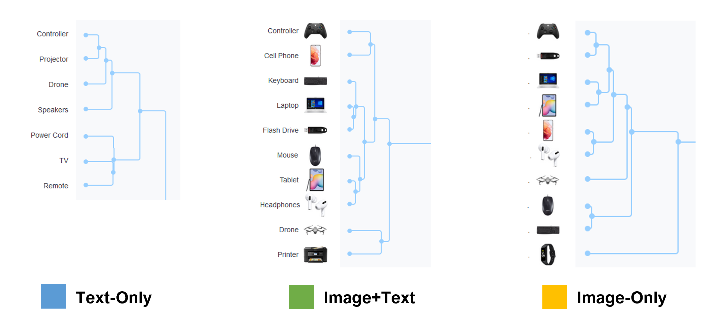
Figure 6 shows that in the Text-Only condition, the Controller was placed alongside the Projector and Drone (possibly interpreted as controllers for these products rather than a game controller). By contrast, in the two image conditions, the Controller and Drone were more widely separated. This suggests that images can disambiguate some text labels and some text labels can disambiguate images.
Figure 7 shows the images for the Controller and the Drone products. In these card sorts, the word “Controller” was used for a video game console controller (e.g., an Xbox controller). But without an image, “Controller” does seem a bit ambiguous. A controller for what? Figure 7 shows the more recognizable shape of a game controller product, so this additional visual likely helped resolve the potential ambiguity, leading to its placement with Cell Phone and other electronics and away from the Projector and Drone.

To a lesser extent, the Drone was also placed further from other similar products in the Image-Only condition. Because some participants might not easily recognize the Drone, this is likely a case where the inclusion of a text label clarified an unfamiliar image (especially in its thumbnail form).
Comparing Similarity Matrices
We compared the absolute value of the differences in similarities for all pairs of products and then averaged the similarity differences. Figure 8 shows a subset of this difference matrix. For example, the Blender was placed with the Indoor Garden 54% of the time in the Image-Only condition but only 14% of the time in the Text-Only condition. This difference of 40% in similarities was the largest difference observed between all items and conditions.
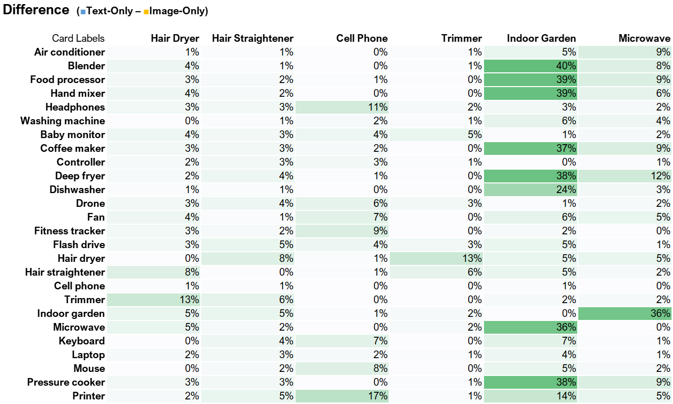
The largest discrepancies computed across item similarity matrices using this method revealed four comparisons with average differences greater than 8%: the Indoor Garden, Speakers, and Printer from the Text-Only compared to Image-Only conditions and the Indoor Garden difference in the Image+Text and Text-Only conditions. Figure 9 shows a selection of the dendrograms focusing on the Indoor Garden product between the Text-Only and Image-Only conditions. In the Text-Only condition, the Indoor Garder was placed with the Fan, Thermostat, and Clock, whereas in the Image-Only condition was placed by itself adjacent to the kitchen appliances.
Numbers of Categories Used
We next examined differences in the number of categories used. Participants were allowed to create as many categories as they wanted to sort the 40 cards. We found a slight difference in the mean number of total categories used by condition. The Image-Only condition had a slightly lower mean (5) than Text-Only (5.4) and Image+Text conditions (5.5), a statistically significant difference (F(2, 620) = 2.39, p = .09).
An examination of the frequency of the number of categories revealed that a few participants in the Image+Text and Text-Only conditions used a lot of categories (16, 24, and 37), which likely skewed the results upward. The median number of categories for all three conditions was 5, suggesting the mean differences were skewed by a few participants who created an unusually large number of categories.
Figure 10 shows the frequency distribution of the number of categories used by participants for each of the three conditions after collapsing more than ten categories into one group.
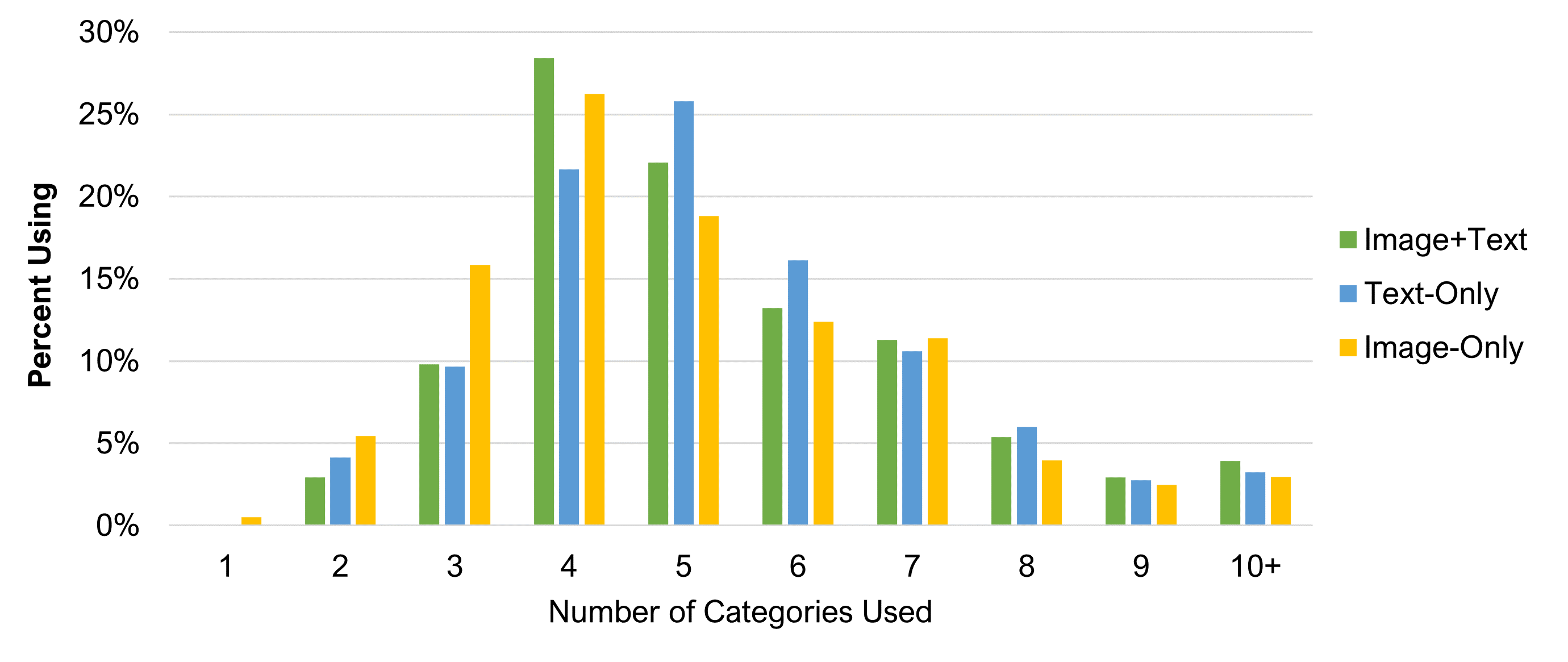
Table 2 shows the top ten categories participants generated for each of the three conditions and the percentage of times they were used. For example, “Electronics” was used the most in all three conditions and was listed 6% of the time in Image+Text, 8% in Text-Only, and 5% in Image-Only.
We converted all categories to uppercase to remove duplicates due to case sensitivity but retained categories that had minor variations in spacing, tense, and pluralization (e.g., appliance versus appliances). That left a lot of unique category names, over 1,000 for each condition.
| Order | Image+Text | % | Text-Only | % | Image-Only | % |
|---|---|---|---|---|---|---|
| 1 | ELECTRONICS | 6 | ELECTRONICS | 8 | ELECTRONICS | 5 |
| 2 | KITCHEN | 5 | APPLIANCES | 4 | KITCHEN | 5 |
| 3 | BATHROOM | 4 | KITCHEN | 4 | APPLIANCES | 4 |
| 4 | KITCHEN APPLIANCES | 4 | BATHROOM | 4 | KITCHEN APPLIANCES | 3 |
| 5 | APPLIANCES | 3 | KITCHEN APPLIANCES | 3 | ENTERTAINMENT | 3 |
| 6 | ENTERTAINMENT | 3 | PERSONAL CARE | 2 | PERSONAL CARE | 3 |
| 7 | PERSONAL CARE | 2 | FURNITURE | 2 | BATHROOM | 2 |
| 8 | LARGE APPLIANCES | 1 | HOME | 2 | HOUSEHOLD | 2 |
| 9 | TECHNOLOGY | 1 | LIVING ROOM | 2 | HOUSEHOLD APPLIANCES | 1 |
| 10 | HOUSEHOLD ITEMS | 1 | BATHROOM ITEMS | 1 | COMPUTER | 1 |
Table 2: Top ten open categories used and the percentage using the category by condition (percentages computed by dividing the number of times the category name was used by the total number of unique category names—1,116 for Image+Text, 1,170 for Text-Only, and 1,005 for Image-Only).
There was a lot of overlap in the top ten categories. Across all three experimental conditions, Electronics, Kitchen, Appliances, and Kitchen Appliances were in the top five. The top five would have been identical in all three conditions, except the Image-Only condition had Entertainment in the top five and Bathroom in the bottom five.
Discussion and Summary
Our analysis of 623 participants randomly assigned to perform a card sort in one of three conditions (Text-Only, Image-Only, Image+Text) revealed:
Images had minor effects on organizational structures. Although there were some relatively minor differences in product orders and categorization, in general, the similarity matrices and resulting organizational structures were similar for the Text-Only, Image-Only, and Image+Text experimental conditions. It’s possible (though not knowable from this study) that the few differences that did occur could have real-world effects on user experiences (e.g., difficulty finding a game controller or indoor garden), but for assessing the potential impacts from adding images, we found only modest differences.
The number of categories used was similar. The median number of categories that participants created for the open sort (5) was essentially the same across experimental conditions, suggesting that the presentation of images had little impact on how many categories were used.
User-generated categories were very similar. The labels generated by participants for the categories also revealed strong agreement. Although in a slightly different order, the top five categories that participants created for the Image+Text and Text-Only conditions (likely the two most common approaches for practical UX research) were the same.
Designers should not rely too much on category labels created in open card sorts. Participants in open card sorts are not professional designers. The category labels they create in an open card sort can inform the design of an information architecture but should not be relied upon too heavily.
Words can help clarify the ambiguity of images. The change in placement with the Indoor Garden and Drone demonstrates that sometimes text descriptions can help clarify images that may not be universally understood.
Images can help clarify the ambiguity of words. Words alone don’t necessarily clarify ambiguity. For example, the game controller (simply labeled “Controller”) was sorted differently in the Text-Only and Image-Only conditions. While a better description (e.g., Game Controller) might have cleared up this textual ambiguity, it’s not always clear to researchers which descriptions are adequate or which need more clarification (while not making the descriptions too verbose) until data have been collected (and sometimes, not even then).
Do images change card sort results? Mostly no, but there are some exceptional cases. It looks like using images in place of or in addition to text labels usually does not affect the relative location of the cards in the dendrograms or the open sort categories that participants create. The exceptions occur when a text label (e.g., Controller) is ambiguous, or an image (e.g., Indoor Garden) is difficult to recognize. This is why we generally recommend using both text and images in card sorts unless there is a strong reason to do otherwise, even though it takes a little longer for participants to complete the sorting task.
Limitations: Unlike a typical card sort, we did not have a clear set of research questions related to the selected products and where to place them in an information architecture. Instead, our goal was to identify differences in structures due to the presentation of product images. Also, these are the results of just one study, which limits their generalizability.
Future research: Future research may assess how using descriptions that appear on hover, along with shorter labels (e.g., “Corporate Governance” is shown and “the structure of rules, practices, and processes used to direct and manage a company” appears on hover) may impact sorting behaviors