Who, as a person, doesn’t want to be desirable?
And if you’re in the business of developing products or services, who doesn’t want those to be desirable?
There is a deep satisfaction beyond the monetary rewards of providing something that people want (and of course, the money’s nice, too).
While we’ve found wide interest in wanting to conduct “desirability testing,” there is much less agreement on how exactly you measure desirability.
One approach would be to develop a psychometrically qualified measure of desirability, either as a single item or multiple items, that demonstrated a statistical relationship to the concept of desirability, similar to the development of the Trust and Appearance subscales of the SUPR-Q.
This approach has been taken for measuring the personality trait of social desirability bias, but as far as we know, no one has used psychometric theory to create a UX-relevant measure of product or service desirability.
The closest thing is the Desirability Toolkit. Here are ten things to know about the Microsoft Desirability Toolkit.
- It was published by Microsoft Research. In 2002, Joey Benedek and Trish Miner [.doc] published the Microsoft Desirability Toolkit, which is based on exploratory services they were using at Microsoft to assess product desirability. According to Google Scholar, their paper has been cited over 370 times, making it quite popular.
- The original toolkit had two tools. One was the Faces Questionnaire, which had participants look at photographs of different facial expressions and rate the extent to which the expression matched how they felt while using a product. Benedek and Miner found that this worked well with some participants, but enough people had trouble with this type of rating that they did not recommend its use. The other is the now well-known product reaction cards tool.
- The term “Microsoft Desirability Toolkit” has become synonymous with the product reaction cards tool. Their more successful and enduring tool was a set of over 100 product reaction cards, each containing a positive or negative adjective from which participants would select cards representative of their experience. When you see someone refer to the Microsoft Desirability Toolkit, they’re almost always just referring to the product reaction cards tool.
- Product reaction cards are used to assess intangible aspects of UX. The reaction card method is less formal than the use of a psychometrically qualified instrument, but more structured than an interview because participants do not need to generate the words themselves.
- The “final” set of 118 adjectives was arrived at through iteration. In the first iteration, a set of 75 words was selected from a larger set obtained from prior research, marketing materials, and team brainstorming, with the goal of having a mix of positive and at least 40% negative adjectives (these are the cards). Pilot testing in four lab-based usability studies led to the inclusion of an additional 64 words and phrases. This was followed by two card sorts to identify (1) overly similar and (2) less suitable adjectives to reduce the set. After reduction, the balance of 60% positive and 40% negative adjectives was restored by adding some additional negative cards, resulting in the final set of 118 cards.
- The “final” set really isn’t final. Although many researchers use the original adjective set, they are free to adapt the adjective set as needed. For example, Kate Moran at the Nielsen Norman Group adapted the method to assess the attractiveness of flat designs, selecting just 18 adjectives for the evaluation. This is common in our experience with many of our clients preferring to select their own subset, often based on how well they are aligned to brand attributes.
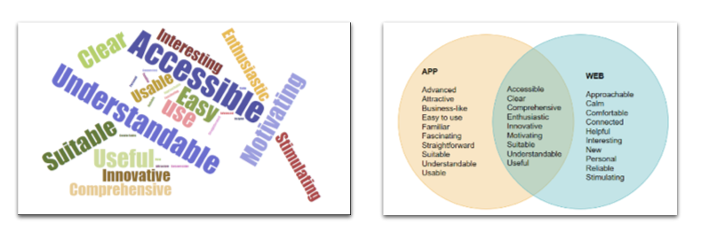
- Reaction cards seem to work well in qualitative UX research. In the original method, after completing the target experience, participants pick without limit the cards that best describe the product and how it made them feel. The next step is for participants to select the top five cards, which are then used to guide what the test moderator asks the participant in the post-study interview. When used in surveys, an alternative to card manipulation is to have respondents selecting adjectives from a randomized checklist, followed by the selection of the top five. Analysis of the resulting data can include verbal protocol analysis of the statements made during the interview, word clouds based on all selected cards or the top five, and Venn diagrams. For example, here’s a top-five word cloud and Venn diagram comparing mobile app and web reactions using data from Tables 3 and 4 of a study of software designed to stimulate physical activity. For other approaches to visualizing reaction card data, see Barnum and Palmer (2010).
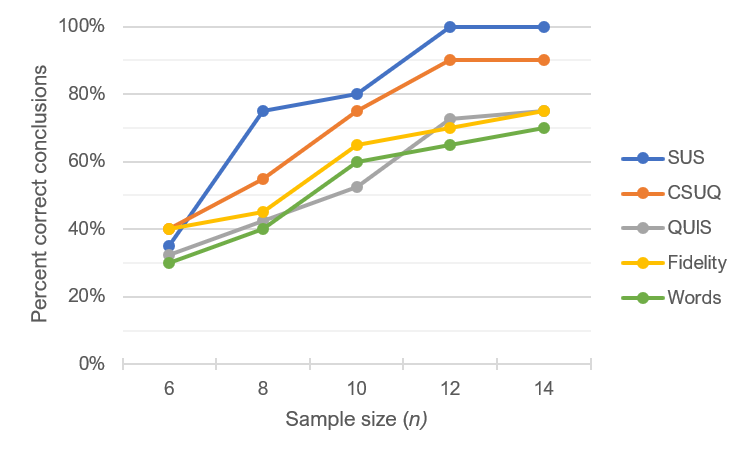
- There have been some attempts to quantify reaction card data. One obvious way to quantify reaction card data is to count the number of positive and negative cards selected by a participant, then compute a positivity ratio—Positive/(Positive + Negative)—which is typically expressed as a percentage. This was the approach taken by Tullis and Stetson in a 2004 comparison of questionnaires for assessing website usability. Unfortunately, this metric did not do well in comparison to other measures included in their study, such as the SUS (see a copy of their figure below). Participants in the study rated two websites with five different rating instruments. The key analysis in their study was to see how well the various measures worked when sample sizes were small by comparing the outcomes of t-tests made with subsets of the data to the outcomes made with the full data set. With sample sizes of 12 or more, the SUS outcomes always matched the full data, but the reaction card positivity ratio only matched the full set about 70% of the time when the sample size was 14 (the largest included in Tullis and Stetson’s comparison).

- There are no published benchmarks. One of the strengths of standardized measurement is the establishment of norms for interpreting scores as relatively poor or good. As currently used, the reaction cards of the Desirability Toolkit are a qualitative rather than a quantitative tool. They are useful for gaining qualitative insights but do not provide information about relative levels of user experience. It is possible to develop benchmarks based on the positivity ratio discussed above and other methods of quantifying the frequency each word is selected, but that’s a topic for a future article.
- There is no evidence that the Desirability Toolkit actually measures desirability. As useful as it appears to be as a qualitative UX research tool, there is no evidence that the reaction cards tool measures desirability. You could argue that the use of the reaction cards provides an operational definition of desirability—in other words, whatever it is that you get using the cards, as long as you follow a standard set of operations, you are, by operational definition, measuring desirability. This approach to measurement is, however, less scientifically satisfying than using one or more methods of psychometric validation, such as concurrent or construct validity. After all, of the 118 cards in the standard deck, only one has the word “desirable,” and we can only speculate regarding the extent to which the adjectives on other cards, such as “advanced,” “busy,” “connected,” or “stable,” relate to Desirability. As far as we know, no one has yet attempted to use psychometric validation techniques to assess the strength of the relationship of the Desirability Toolkit adjectives to an underlying construct of Desirability (something we’ll take up in a future article).