 We use our mobile phones a lot. Planning trips, sending money, following our favorite influencers, keeping in touch with friends and family.
While it seems commonplace now, the capabilities of our mobile phones and their applications provide a high level of convenience and speed (for better or worse) to our leisure and business.
The mobile app experience is a unique and defining aspect of our interactions with our devices. While the experience shares many characteristics with using software and websites on a traditional desktop/monitor, the mobility, screen size, and interaction style make the experience distinct. Consequently, we developed a questionnaire, the SUPR-Qm®, to measure attitudes toward the mobile app user experience.
In this article, we discuss ten things to know about the SUPR-Qm (now in its second version), from the statistical to the practical.
- The SUPR-Qm is the most efficient published measure of the UX of mobile apps. We know of three published questionnaires that measure the UX of mobile apps. Two of them (MPUQ and the Aug-MOD) are lengthy diagnostic questionnaires with over 70 items each, neither of which has published norms for interpreting their scores. Furthermore, detailed diagnostic UX questionnaires tend to have items that become less relevant over time (e.g., from the MPUQ, “Are the HOME and MENU buttons sufficiently easy to locate for all operations?”). The third questionnaire (the original 16-item SUPR-Qm from 2017) is experiential (meaning it provides an overall, non-diagnostic score) with normed data available for interpretation. The SUPR-Qm V2 is a new streamlined five-item questionnaire derived from the SUPR-Qm.
- The SUPR-Qm is easy to administer and connects to the SUS. The five items in the SUPR-Qm V2 are simple, five-point agreement scales that are easy and quick to administer and score (Figure 1). The items have been extensively tested (demonstrating reliability and validity) and have content that offers continuity with existing questionnaires like the SUS. Specifically, the item “The app is easy to use” can be used to compute an estimated SUS score with our regression equation.
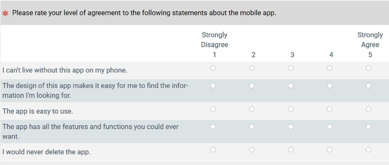
Figure 1: The SUPR-Qm V2 questionnaire.
- It’s scored on a 0–100 scale. The traditional way to score a Rasch scale composed of multipoint rating scales is to add a respondent’s ratings. For the SUPR-Qm V2, this would produce a scale from 5 to 25. To get a score that is easier to interpret, we convert the average of the selected ratings to a score from 0 to 100 using linear interpolation. For example, a raw SUPR-Qm V2 mean of 3.0 would be reported as 50 (((3 − 1) / (5 − 1))(25) = 50). The SUPR-Qm calculator will do this automatically for you.
- It’s easy to interpret with a curved grading scale. Grades are universally loathed by students but universally understood by executives. To develop a curved grading scale for the SUPR-Qm V2, we computed the associated logits, transformed the logits to probabilities, and assigned standard letter grades and grade points to those probabilities using common probability ranges for the grades, as shown in Table 1.
| SUPR-Qm V2 Score | Curved Grade | Grade Point | Probability Range |
|---|---|---|---|
| 87.0–100.0 | A+ | 4.0 | 96–100% |
| 79.0–86.9 | A | 4.0 | 90–95% |
| 74.5–78.9 | A− | 3.7 | 85–89% |
| 70.5–74.4 | B+ | 3.3 | 80–84% |
| 63.5–70.4 | B | 3.0 | 70–79% |
| 60.5–63.4 | B− | 2.7 | 65–69% |
| 57.5–60.4 | C+ | 2.3 | 60–64% |
| 46.5–57.4 | C | 2.0 | 41–59% |
| 42.8–46.4 | C− | 1.7 | 35–40% |
| 27.5–42.7 | D | 1.0 | 15–34% |
| 0.0–27.4 | F | 0.0 | 0–14% |
Table 1: Curved grading scale for interpreting SUPR-Qm V2 scores.
To illustrate the scoring system with real data, we used SUPR-Qm V2 ratings we collected of Spotify’s free (n = 46) and paid (n = 60) services (results shown in Figure 2). After interpolating the raw scores to a 0–100-point scale, the mean rating for the free service was 62.4 (a grade of B−) and for the paid service was 71.3 (a grade of B+). This difference was statistically significant (t(104) = 2.28, p = .025). For the free service, the 95% confidence interval ranged from 56.3 (C) to 68.5 (B), and for the paid service, the interval ranged from 66.3 (B) to 76.2 (A−). This means it’s implausible that the population mean for the free service to have a grade lower than C or higher than B, while for the paid service, the population mean is unlikely to have a grade lower than B or higher than A−.

Figure 2: SUPR-Qm V2 comparison of Spotify free and paid services (error bars are 95% confidence intervals, with the paid version scoring significantly higher than the free version).
- The SUPR-Qm is not meant to be diagnostic. The SUPR-Qm provides an overall score of a mobile app’s user experience, but it won’t tell you what to fix. Its strengths are that it’s quick to take (five items) and easy to interpret. Historically, there have been two approaches to UX questionnaires. One is to have lots of items with the diagnostic goal of using the answers to point to problematic design areas (e.g., the 90-item Version 2 of the QUIS with ratings of system characteristics such as readability, response speed, helpfulness of error messages). The other, more experiential approach is to have rating scales that broadly assess how users feel about the system (e.g., the perceived ease-of-use and perceived usefulness items of the UX-Lite®). In this framework, the SUPR-Qm is an experiential questionnaire.
- It evolved from 16 dynamic to five fixed items. The original SUPR-Qm contained 16 items developed with a technique called Rasch scaling, where items get progressively harder to agree with. It was designed to be administered adaptively using software (when people agreed, a more difficult item would be presented, and vice-versa). Under this adaptive approach, most participants would answer only four to seven items.
But in practice, it isn’t always practical to administer adaptively using software like MUiQ®, so researchers would often use all 16 items. To streamline the questionnaire, we analyzed responses from thousands of participants and used the Wright map shown in Figure 3 to identify a set of five key items. These items were selected to represent the full range of difficulty, from easiest to hardest, with coverage at key points in between. The result is the SUPR-Qm V2: a shorter, fixed five-item version that maintains the measurement precision of the original scale.

Figure 3: Wright map of the original SUPR-Qm with the selected items for the SUPR-Qm V2 indicated in boxes.
Note: A Wright map is organized as two vertical histograms with the items and respondents (persons) arranged from easiest (most likely to agree) on the bottom to most difficult (least likely to agree) on the top. For example, most participants agreed or strongly agreed (4s and 5s) with the items “Easy” and “EasyNav.” In contrast, few participants highly rated apps as “AppBest.” On the left side, the Wright map shows the mean (M) and two standard deviation points (S = one SD and T = two SD) for the measurement of participants’ tendency to agree. On the right side of the map, the mean difficulty of the items (M) and two standard deviation points (S = one SD and T = two SD) for the items are shown.
- Three items aren’t enough. If we’re looking to cut, why not just use three items (easiest, hardest, and in the middle)? To see if three would do, we ran an experiment where we randomly assigned participants to an initial three-item or five-item version. Participants in both groups then answered the remaining 13 or 11 items (order randomized) so we could compute the full SUPR-Qm score for comparison. The score from the five-item version matched the full score, whereas the three-item version didn’t (Figure 4). So, we selected SUPR-Qm05 as the best candidate for SUPR-Qm V2.

Figure 4: Comparison of three- and five-item versions of the SUPR-Qm with concurrently collected 16-item versions.
- Scores were stable over five years. An advantage of Rasch scaling is the theoretical stability of scales across changes in time, with some empirical estimates of Rasch scales being stable for as long as 15 years. To investigate the stability of the SUPR-Qm V2, we analyzed data collected with our MUiQ platform from February 2019 through May 2023, dividing the total sample size of 4,149 respondents into groups A (February 2019 through August 2021, n = 2,143) and B (February 2022 through May 2023, n = 2,006). As shown in Figure 5, the locations of scores on the underlying logit scales were nearly identical for both Group A and Group B, demonstrating the scale stability of the SUPR-Qm V2 with varying dates and industries.

Figure 5: Stability of the Rasch scales for SUPR-Qm V2, indicated by the overlap of lines for Groups A and B.
- When using the SUPR-Qm V2, be sure to randomize the presentation of the items. Because the items are clearly different in how easy they are for respondents to agree with, it is important to avoid always showing them in either an easiest-to-hardest or hardest-to-easiest order. The best strategy for item presentation is randomization.
- Use the SUPR-Qm V2 calculator to quickly score your data. We now have an Excel calculator designed specifically for use with the SUPR-Qm V2, making it easy to conduct analyses and produce a variety of useful graphs (Figure 6). To see the calculator in action, view the video tour.
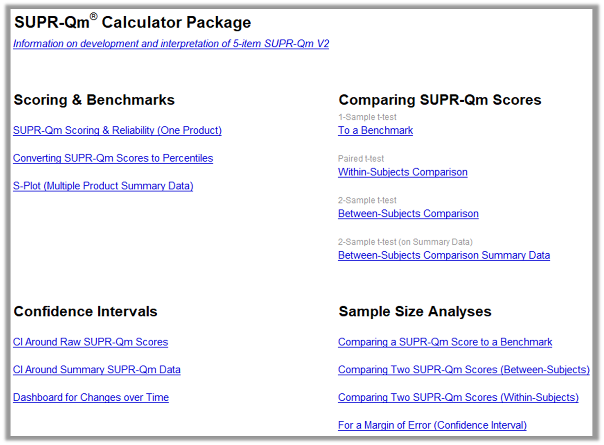
Figure 6: Home page of the SUPR-Qm V2 calculator.