 In earlier articles, we investigated the effects of manipulating item formats on rating behaviors—specifically, we compared sliders to traditional five-point and eleven-point radio button numeric scales.
For those analyses, we collected data from 212 respondents (U.S. panel agency, late January 2021) who used radio buttons and sliders to rate online shopping websites (e.g., Amazon) and seller marketplaces (e.g., eBay). The survey used the UX-Lite questionnaire (two five-point items) and a single eleven-point Likelihood-to-Recommend (LTR) item. About half (109) of the respondents completed the survey on a desktop computer, and the other half (103) used a mobile device.
The main takeaway from analyses of means and response distributions was that, for these item designs, there did not appear to be large enough differences in rating behaviors between radio button numeric scales and sliders or between desktop and mobile variables to achieve statistical significance.
On one hand, this finding suggests that sliders don’t offer a clear measurement benefit, at least in the data we’ve collected and in the published papers we’ve examined. On the other hand, it also suggests that sliders may be an adequate substitute for traditional radio buttons when a survey designer may have a reason to use them in a survey (for example, because they take up less screen real estate).
But beyond the main measurement differences we examined in those earlier articles (means and frequency distributions), we also wanted to understand other considerations that suggest sliders might offer some benefit on either desktop or mobile interfaces.
In this article, we report how long it took participants to complete ratings with slider and numeric scales and examine user preference for the scale formats.
Design of the Numeric and Slider Scales
Figures 1 and 2 show examples of numeric scale and slider versions of the UX-Lite on a desktop web browser. Figures 3 and 4 show how these scales appeared on mobile devices.
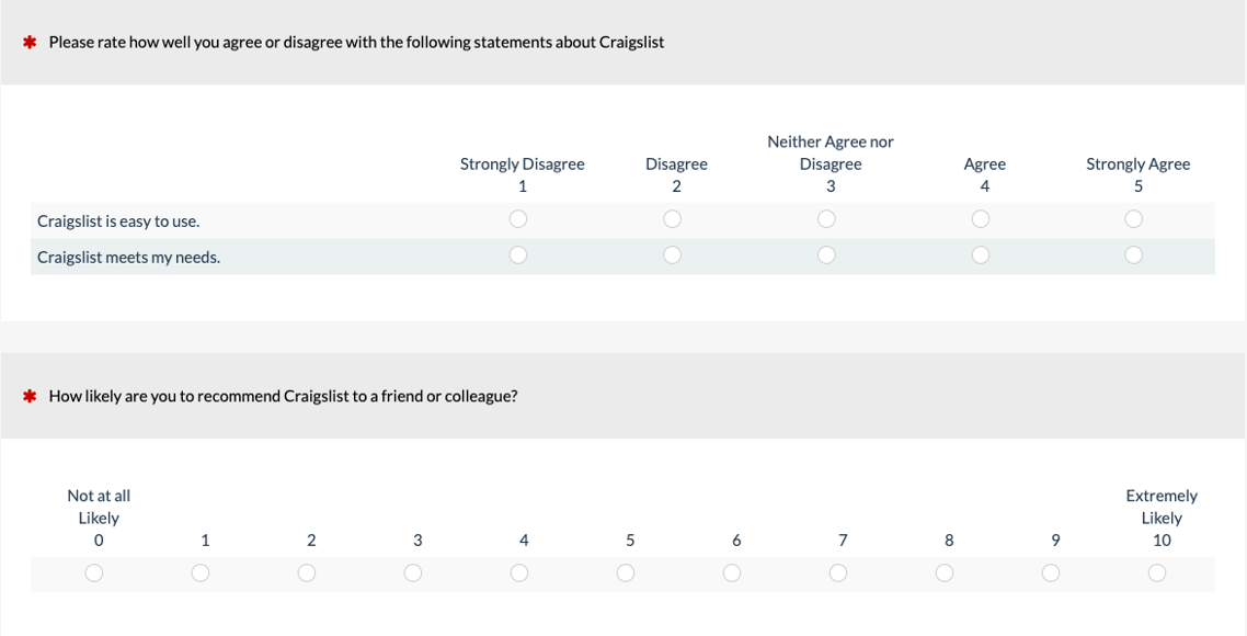
Figure 1: Example of numeric versions of the UX-Lite and the NPS on a desktop web browser (created with MUIQ®).

Figure 2: Example of slider versions of the UX-Lite and the NPS on a desktop web browser (created with MUIQ).
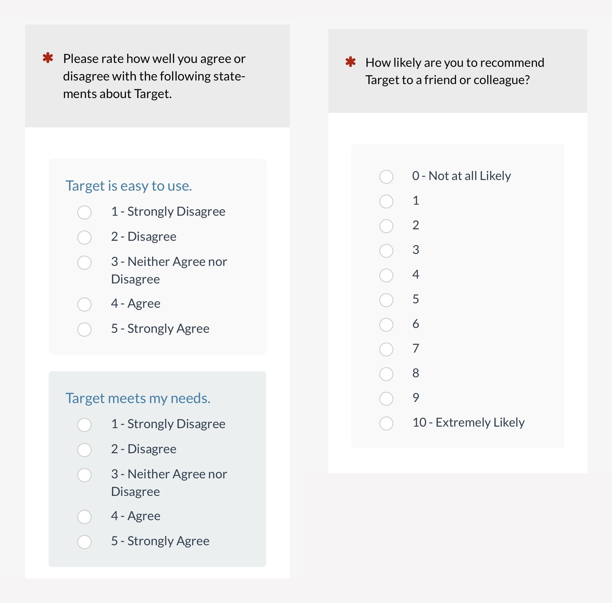
Figure 3: Example of numeric versions of the UX-Lite and the NPS on a mobile screen (created with MUIQ).
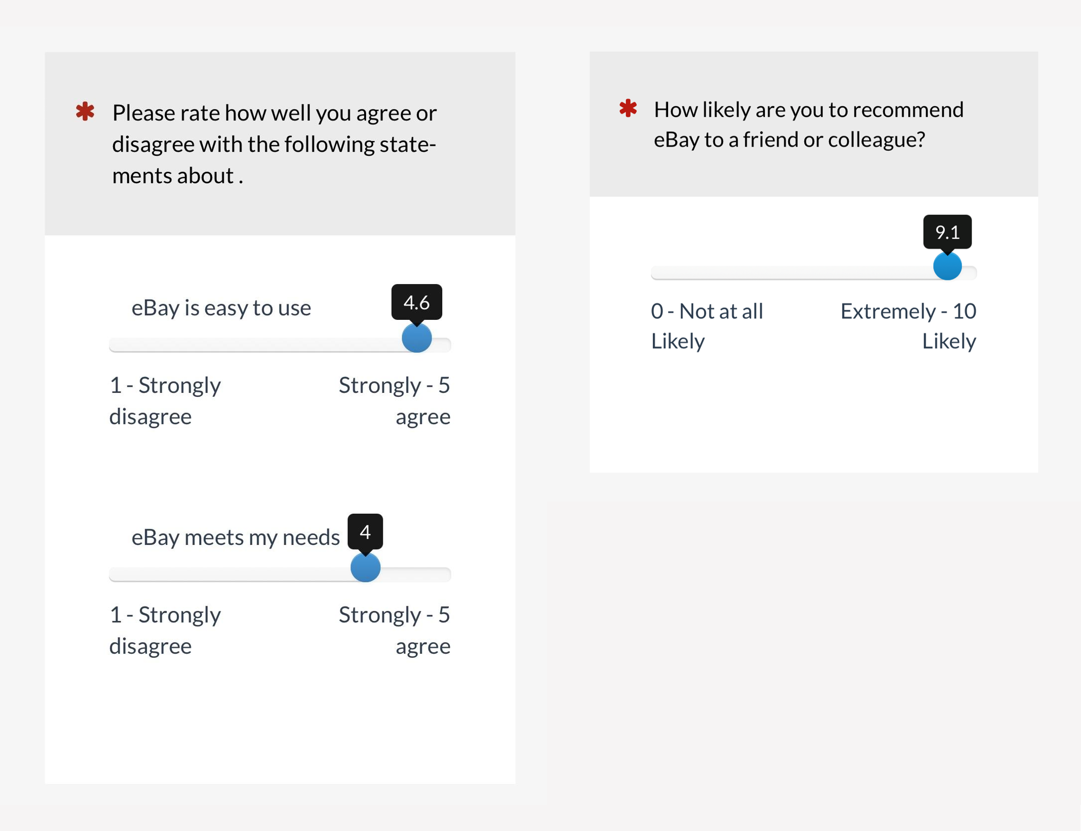
Figure 4: Example of slider versions of the UX-Lite and the NPS on a mobile screen (created with MUIQ).
Results
Completion Time
Previous research has indicated that it can take longer for respondents to select a rating with sliders than with radio buttons (e.g., Couper et al., 2006; Rausch & Zehetleitner, 2014). After all, selection of a radio button requires just one click, while selection with a slider, depending on its design, can take as little as one click (which MUIQ sliders support), but can also entail grabbing and dragging the slider, then making additional manipulations to get it exactly in the desired location.
To assess main effects and interactions for scale format and device completion times, we conducted an analysis of variance on log-transformed completion times. The interaction between format and device was not significant (F(1, 210) = 0.75, p = .39), but each of the main effects were highly significant (Format: F(1, 210) = 30.9, p < .0001; Device: F(1, 210) = 6.2, p = .01).
Figure 5 shows the medians (with 95% confidence intervals) for each of these main effects. It took respondents about 37% longer to complete ratings with the sliders than with the radio buttons, and it took 18% longer to complete ratings on mobile devices than on desktop computers (both differences were statistically significant).
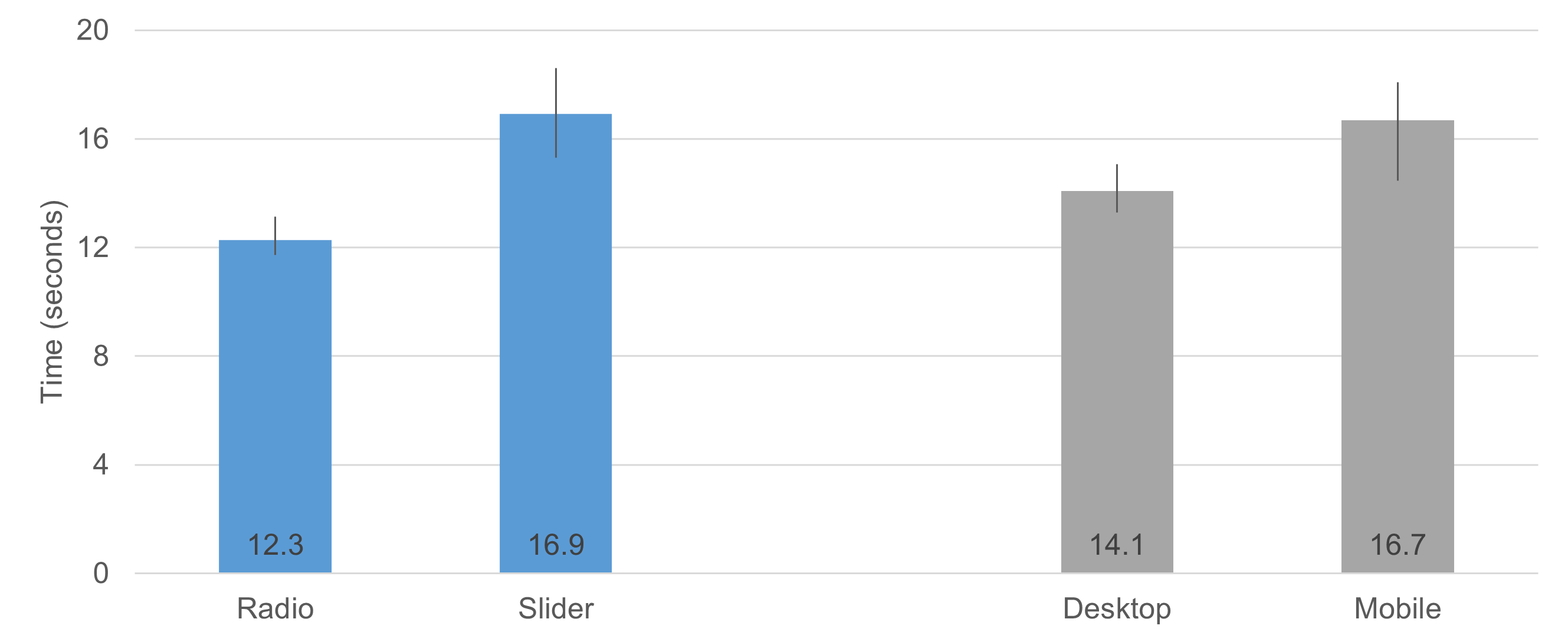
Figure 5: Median completion times (with 95% confidence intervals) as a function of item format (radio button numeric vs. slider) and device (desktop vs. mobile).
User Preference
Figure 6 shows which format participants preferred. Just over a quarter of respondents had no preference, but for those who had one, the preference for radio button numeric scales was significantly greater than that for sliders by over two to one (N-1 Two Proportion Test, Z = 6.2, p < .00001). The preference distributions as a function of device (desktop vs. mobile) were not significantly different (c2(2) = 2.4, p = .30).
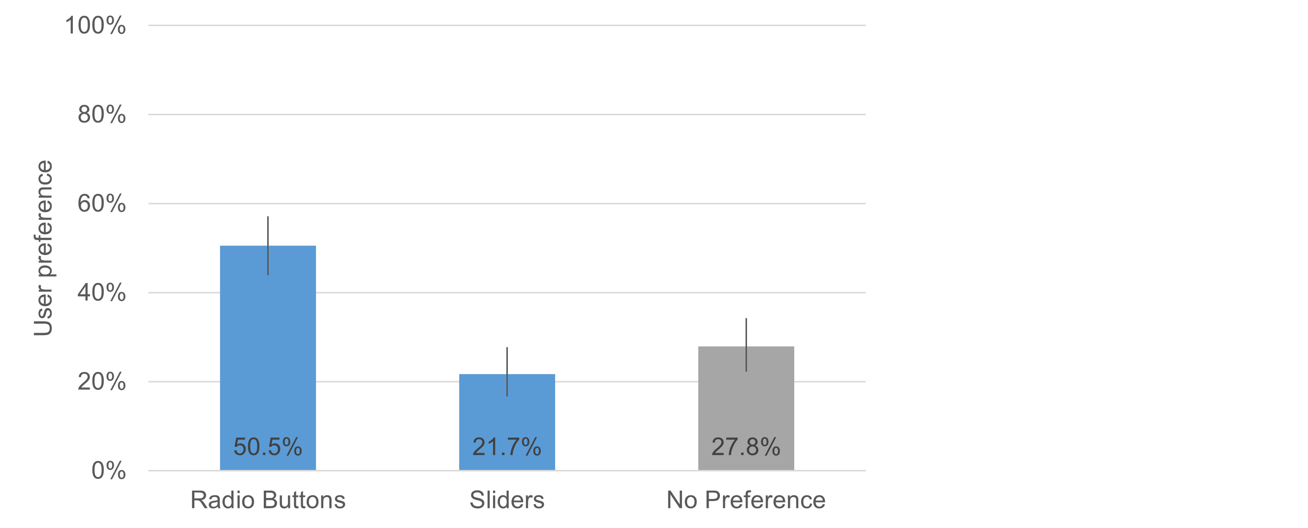
Figure 6: User preference for radio button numeric scales versus sliders.
When asked why they chose radio buttons or sliders, 47% of respondents who preferred radio buttons said they were easier to use, while 37% of those who preferred sliders said the same of sliders.
Preference for radio buttons was associated with efficiency, with terms like “fast” (7%), “quick” (7%), “time” (6%), along with negative descriptions of sliders, including terms like “hard” (12%) and “annoying” (4%).
“I hate having to slide to a specific spot. Radio buttons are easier to use.” — Mobile user
“Especially on a phone interface, sliders can be very finicky and while ostensibly offer a level of granular detail, in reality they tend to feel a bit more haphazard. “ — Mobile User
Preference for sliders was associated with control, with terms like “more” (48% used terms like “more options,” “more variable,” “more nuanced,” “more in control,” etc.), “precise” (13%), “flexible” (4%), and “visual” (4%), along with delight terms including “like” (15%) and “fun” (2%).
“I like to slide the circle to where I want to.” — Desktop user
“Sliders help me feel more in control of the input that I give as part of the research.“ — Desktop user
Users who liked the sliders felt like they could more effectively represent their impressions than they could on a 1–5 scale, while the overall tenor of the users who preferred radio buttons was that they didn’t feel the need for such precision and were irritated by various quirks of the sliders (getting focused on trying to stop it at the right value, controlling it with their mouse or finger, etc.), while radio buttons felt more familiar, allowing them to just click (tap) and move on.
Summary and Takeaways
As detailed in previous articles, we did not find compelling differences in data quality as a function of scale format (radio button numeric scale vs. sliders) or the device on which respondents took the survey (desktop vs. mobile) for either the five-point scales of the UX-Lite or the eleven-point LTR item.
Specifically, we found no significant difference in means, either as a function of scale format, device, or their interaction. We also found no significant differences in top-box or top-two-box scores from the frequency distributions. Keep in mind that our sample size (n = 212) was large enough to have the power to detect medium to large differences, but there may be small real differences due to scale format or device. It is not, however, plausible that these manipulations have large effects.
On the other hand, our analyses of completion times and user preference found large and statistically significant differences.
Sliders took 37% longer to complete. Respondents were faster with radio button numeric scales than with sliders, and they were faster on desktops than on mobile devices.
Radio buttons were preferred two to one. Regardless of device, respondents overwhelmingly preferred the radio button numeric scales to the sliders, primarily citing differences in their ease of use.
The bottom line is that there is little to gain by using sliders to collect ratings in online surveys, but much to lose concerning the respondent experience due to increased completion time and difficulty of use relative to radio button numeric scales.
On the other hand, careful design of sliders to avoid their current pain points might (or might not) increase their acceptability to a larger proportion of respondents. That will be a topic for future research.
Acknowledgment
Thanks to Jonathan Clancy for his efforts in designing and conducting this experiment, analyzing data, and writing the initial drafts of this article.