 What does 4.1 on a 5-point scale mean? Or 5.6 on a 7-point scale?
Interpreting rating scale data can be difficult in the absence of an external benchmark or historical norms.
A popular technique used often by marketers to interpret rating scale data is the so-called “top box” and “top-two box” scoring approach.
For example, on a 5-point scale, such as the one shown in Figure 1, counting the number of respondents who selected the most favorable response (“strongly agree”) fall into the top box. (See how it looks like a box and is the “top” response to select?)
| Top-Box | ||||
| Strongly-Disagree | Disagree | Undecided | Agree | Strongly-Agree |
| 1 | 2 | 3 | 4 | 5 |
Figure 1: Top box of a 5-point question.
Likewise, the top-two box counts responses in the two most extreme responses (4 and 5 in Figure 1). This approach is popular when the number of response options are between 7 and 11 points. For example, the 11-point Net Promoter Question (“How likely are you to recommend this product to a friend”) has the top-two boxes of 9 and 10 designated as “Promoters” (Figure 2).
The idea behind this practice is that you’re getting only those that have the strongest feelings toward a statement. This applies to standard Likert item options (Strongly Disagree to Strongly Agree) and to other response options (Definitely Will Not Purchase to Definitely Will Purchase). The Net Promoter Score not only uses the top-two box, but also the bottom-seven box approach in computing the score, which captures both the extreme responders (likely to recommend and likely to dissuade others).
| Top 2 Box | ||||||||||
|---|---|---|---|---|---|---|---|---|---|---|
all Likely |
Likely |
|||||||||
Figure 2: Top-two box for the 11-point Likelihood to Recommend (LTR) question used for the Net Promoter Score.
Of course, shifting the analysis from using means to top box percentages may seem like it provides more meaning even though it doesn’t. For example, what does it mean when 56% of respondents select 4 or 5 on a 5-point scale or 63% select 6 or 7 on a 7-point scale? Do you really have more information than with the mean? Without an external benchmark, you still don’t know whether these are good, indifferent, or poor percentages.
Loss of Information
The major problem with the top box approach is that you lose information in the transformation from rating scale to proportion. Should a person who responds with 1 on a 5-point scale be treated the same (computationally) as those who provide a neutral (3) response? The issues seem even more concerning on the 11-point LTR item. Are 0s and 1s really the same as 5s and 6s when determining detractors?
For example, from an analysis of 87 software products, we found converting the 11 points into essentially a two-point scale lost 4% of the information.
The negative impact is:
- Wider margins of error (more uncertainty)
- Needing a larger sample size to detect differences
- Changes over time or to competitors become less easy to detect with the same sample size (loss of precision)
This increase in the margin of error (and its effect on sample size) can be seen in the responses of 53 participants to their Likelihood to Recommend scores toward the brand Coca-Cola in Figure 3. Using the mean LTR response, the confidence interval width is 5.2% of the range (.57/11); for the NPS computation, the confidence interval width is 9.4% of the range (18.7/200).
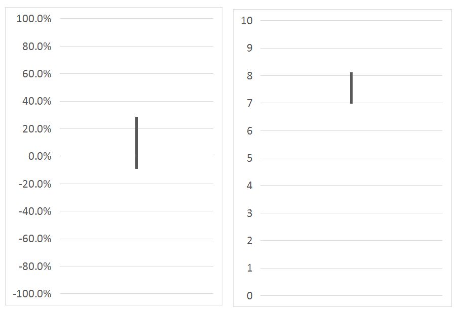
Figure 3: Difference in width of confidence intervals using the mean (right panel) or the official NPS (left panel) from LTR toward Coca-Cola. The NPS margin of error is almost twice the width of the mean (twice the uncertainty).
Moving the Mean or the Extremes?
The intent of using measures like customer satisfaction, likelihood to recommend, and perceived usability is of course not just an exercise in moving the mean from 4.5 to 5.1. It should be about using generally easy to collect leading indicators to predict harder to measure behavior.
This is the general idea behind models like the service profit chain: Increased customer satisfaction is expected to lead to greater customer retention. Improved customer retention leads to greater profitability.
Reichheld and others have argued though that, in fact, it’s not the mean companies should be concerned with, but rather the extreme responders, which have a better association with repurchasing (growth). In his 2003 HBR article, Reichheld says
“Promoters,” the customers with the highest rates of repurchase and referral, gave ratings of nine or ten to the [likelihood to recommend] question.”
Reichheld also talks about the impact of extremely low responses (detractors). But is there other evidence to support the connection between extreme attitudes and behavior that Reichheld found?
The Extremes of Attitudes
There is evidence that attitudes (at least in some situations) don’t follow a simple linear pattern and in fact, it’s the extremes in attitudes, which are better predictors of behavior.
Oliver et al. (1997) suggest that moderate attitudes fall into a ”zone of indifference” and only when attitudes become extremely positive or negative do they begin to map to behavior.
Anderson and Mittal (2000) also echo this non-linear relationship and asymmetry and note that often a decrease in satisfaction will have a greater impact on behavior than an equivalent increase. They describe two types of attributes:
- Satisfaction-maintaining attributes are what customers expect and are more likely to exhibit “negative asymmetry.” For example, consumers have come to expect clear calls and good coverage from their wireless provider; when the clarity and coverage goes down, consumers get angry. As such, performance changes in the middle of a satisfaction scale are more consequential than those at the upper extreme of satisfaction (i.e. 5 out of 5).
- Satisfaction-enhancing attributes exhibit positive asymmetry. These are often called delighters and changes in the upper range have more consequence than the middle range. For example, having free Wi-Fi on an airplane may delight customers and lead to higher levels of repeat purchasing and recommending. In this case, changes in the upper extremes of satisfaction have a better link to behavior.
van Doorn et al. (2007) conducted two studies from Dutch consumers to understand the relationship between attitudes and behavior. In the first study, they surveyed 266 Dutch consumers using five 6-point rating scales on environmental consciousness. They found an exponential relationship between attitude to the environment and number of categories of organic products purchased (e.g. meat, eggs, fruit).
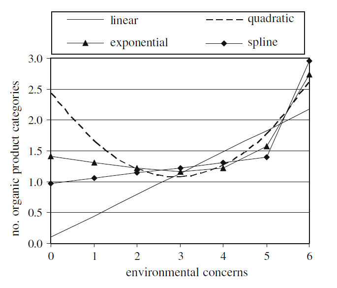
Figure 4: Relationship between the number of organic products purchased and environmental concerns from van Doorn et al. (2007) show a non-linear pattern.
They found the relationship between environmental concern and the number of organic product categories purchased is negligible for environmental concern below 5, but for extremely high levels of environmental concern, the relation is much stronger than in the linear model (see Figure 4).
In a second study, they examined the relationship between the number of loyalty cards and attitudes toward privacy from 3,657 Dutch respondents in 2004. They used two 5-point items asking about privacy concerns. In this study though, they found weaker evidence for the non-linear relationship but still found that privacy scores below 2.5 didn’t have much impact on loyalty cards. For privacy scores above 2.5 (see Figure 5), the average number of customer cards decreased more rapidly (less linear).
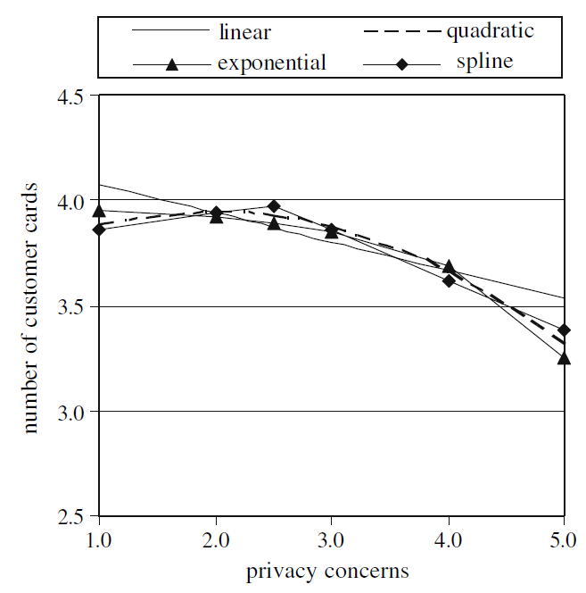
Figure 5: Relationship between privacy concerns and number of loyalty cards from van Doorn et al. (2007) also show a non-linear pattern.
van Doorn et al. (2007) concluded it makes sense to target only those consumers close to or at the extreme points of the attitudinal scale: bottom-two box and top-two box.
The authors argue that in some circumstances it makes more sense to pay attention to the extremes (echoing Anderson and Mittal). Customers with very low satisfaction (bottom box) may have a greater effect on things like churn. Likewise, high satisfaction (top-two box) customers are likely to drive customer retention, which means that efforts should be made to shift customers just beneath the top-two box to above the threshold.
This asymmetry was also seen with Mittal, Ross, and Baldasare (1998). [pdf] Three studies in the healthcare and the automotive industry found that overall satisfaction and repurchase intentions are affected asymmetrically: negative outcomes had a disproportionate impact on satisfaction.
But not all studies show this effect with extremes. Morgan and Rego (2006), in their analysis of U.S. companies, showed that top-two box scores are a good predictor of future business performance, but actually perform slightly worse than using average satisfaction (they used a Net Promoter type question in their analysis).
de Haan et al. (2015), using data from 93 Dutch services firms from 18 industries, found that top-two box customer satisfaction performs best for predicting customer retention from 1,375 customers from a two-year follow-up survey. They found the top-two box satisfaction and officially scored NPS using its top-two minus bottom-seven approach were slightly better predictors than using their full-scale mean on customer retention (Sat Mean r = .15 vs Sat Top 2 Box; r=.18 and NPS Mean r = .16 vs NPS Scored r=.17). They suggested it’s useful to transform scores to focus on very positive (or very negative) groups and to predict customer metrics, including customer retention and tenure.
Extremes of UX Attitudes
Echoing this extreme attitude on behavior in an analysis I conducted in 2012 for a wireless carrier, I looked at the relationship between the attitude toward the usability (using SUS) and likelihood to recommend (NPS) a phone handset and their relationship on return rates.
In running a linear regression on both SUS and NPS to predict return rates at a product (not individual level), I was able to explain 8% and 14% of return rates respectively. However, when I transformed the data into extremes (SUS > 80 = high and SUS < 68 = low; NPS > 30% = high and NPS < -25% = low), I was able to more than double the explanatory power of attitude predicting behavior to 20% and to 27% R-square respectively.
This can be seen in Figure 6 (the pictures are for illustration only). Handsets with the highest SUS scores had less than half the return rate than handsets that scored average or below. This illustrates the non-linear relationship: movement of SUS scores from horrible (in the 30s-40s) to below average (50s-60s) didn’t affect the return rate.
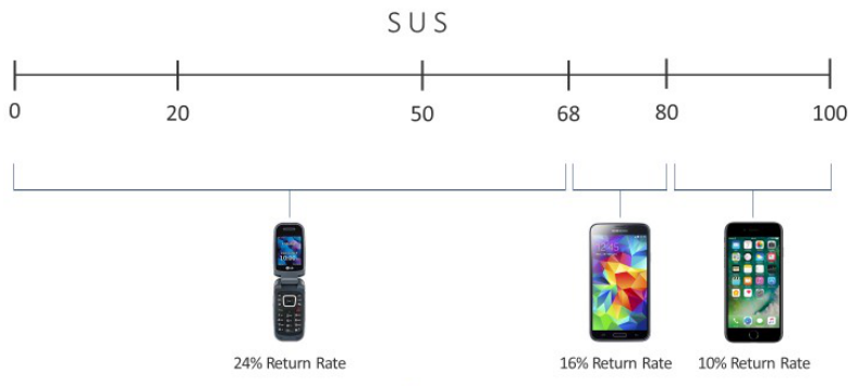
Figure 6: Non-linear relationship between SUS (usability) and 30-day return rates (phone images are for illustration purposes and don’t represent the actual phones in the analysis).
Summary & Takeaways
This analysis of the literature and our own research found:
Using top box scores loses information and increases uncertainty around the mean. The actual loss will depend on the data, but we found it was around 4% in one study. The margin of error around the estimate will in many situations approximately double when going from mean to NPS. This leads to needing larger sample sizes to detect the same differences over time or against competitors.
Data lost using top or bottom box scoring might be worth shedding. Some published research and our own analysis have found that in some situations, when predicting behavior, that more extreme responses are a better predictor. More research is needed to understand the limitations and extent of this relationship.
The relationship between attitudinal and behavior may be non-linear (in some cases). In situations where there is non-linear behavior, top box and bottom box scoring may capture this non-linearity better than using the mean (or other transformations), lending credence to the NPS approach.
Context matters. Not all studies showed a non-linear relationship and superiority of the top box scoring approach. In some cases, the mean was a better predictor of behavior (albeit slightly) and using both as measures of behavior seems prudent.
Bottom box might be as important. While top box scoring tends to be more common, in many cases it’s not the top box, but the bottom box that matters more. There is some evidence that extreme negative attitudes (e.g. losing what’s expected) predicts behavior better, especially in cases when customers expect an attribute in a product or service.
Thanks to Jim Lewis for commenting on an earlier draft of this article.