 Businesses are full of metrics.
Increasingly those metrics quantify the user experience (which is a good thing).
Collecting consistent and standardized metrics allows organizations to better understand the current user experience of websites, software, and apps.
It allows teams to track changes over time and compare to competitors and industry benchmarks. The idea of quantifying experiences is still new for many people, which is one of the reasons I wrote the practical book on Benchmarking the User experience.
UX benchmark studies are an ideal way to systematically collect UX metrics. In an earlier article, I discussed popular UX metrics to collect in benchmark studies.
A UX scorecard is great way to quickly visualize these metrics. UX scorecards are of course not a substitute for digging into the reasons behind the metrics and trying to improve the experience. But they can be a good way for tracking and promoting your design change efforts. I also like to keep scorecards that feature data from actual users separate from scorecards that may feature metrics from a PURE evaluation or expert review. This article focuses on displaying UX metrics collected empirically.
While you’ll want to tailor each scorecard to each organization, here are some common elements we provide as part of our UX benchmark studies and ways we visualize them (and some advice for creating your own). Figures 1, 2, and 3 show example scorecards (with names and details redacted or changed) that can be shown electronically or printed.
Study-level metrics: Include broader measures of the overall user experience. These usually include SUPR-Q, SUS, UMUX-Lite, product satisfaction, and/or NPS. Figures 1 and 2 include study-level metrics in the top part of each figure. See Chapter 5 in Benchmarking the User Experience for more.
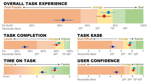
Task-level metrics: The core task-level metrics address the ISO 9241 pt 11 aspects of usability: effectiveness (completion rates), efficiency (task time), and satisfaction (task-level ease using the SEQ). Figure 1 shows these metrics aggregated into a Single Usability Metric (SUM) and in disaggregated form at the bottom of the scorecard for three competitor websites. Figure 3 also shows task-level metrics for two dimensions: platform (desktop and mobile) and competitor (base product and two competitors).
Making the Metrics More Meaningful
While UX scorecards should contain some combination of study-level and task-level metrics, displaying all this data in one scorecard, or even a couple scorecards, has its challenges. Here’s some advice on what we do to make them more digestible.
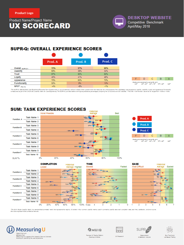
Figure 1: Example scorecard for three consumer desktop websites. The scorecard shows overall SUPR-Q scores (top) and task-based scores that are aggregated (SUM) and stand-alone (completion, time, ease).
Provide comparisons.
A competitive benchmark study provides ideal comparison for all metrics. Both Figures 1 and 3 feature three products (one base and two competitors). Even without a competitive benchmark, you can use external competitive data. This is one of the advantages of using standardized measures as many often have free or proprietary comparisons. The scorecard in Figure 2 features data that wasn’t collected as part of a competitive benchmark but shows the difference between three competitors from our SUPR-Q, UMUX-Lite, and NPS databases. For this product, most scores exceed these industry leaders (except desktop usability scores shown in yellow). Other benchmarks can be average scores for common measures (e.g. 68 for SUS, 50% for SUPR-Q) or even other comparable products

Figure 2: Example UX scorecard (non-competitive) comparing experiences across device types.
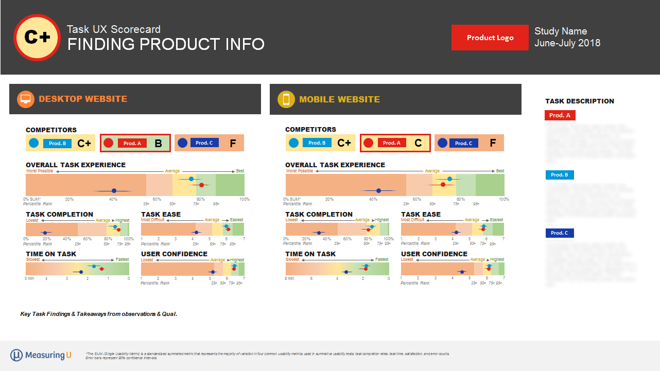
Figure 3: Example task-level score card that dives deeper into the task-level experience and metrics between three competitors on two platforms. Names and details intentionally obscured.
Go from general to specific.
We usually start our scorecards with our broadest measure of the user experience first (at the top) and then provide the more granular detail the tasks provide (at the bottom). We create separate scorecards for each task that allow teams to dig into more specific task measures or understand what’s causing problems (Figure 3).
Use visual indicators of performance.
We use colors, grades, and distances to visually qualify the data and make it more digestible.
- Colors: Executives are used to red (meaning bad), yellow (OK), and green (good) and usually shades of these colors (although too much red can be a bit hard to look at). Both study and task-level scorecards include these color levels (and shades) for a quick answer to the question: Is that number bad or good?
- Grades: Converting scores to letter grades (A to F) can provide more degrees of discrimination than colors and helps build on a school metaphor most people are very familiar with. For example, we created a scale to associate grades for the SUS where scores above 80 are “A.” Assigning grades involves judgment: We start by assigning the clearly best-in-class performance an A and then identifying the poorest performance with an F. The grades in between require more judgment, especially when accounting for multiple platforms and metrics. For example, in the scorecard in Figure 3 we assigned the task experience a C+ (which indicates slightly better than average performance) based on the task metrics and performance relative to the two competitors. Some organizations react negatively to grades (maybe bad memories from school). If people get hung up on the grades, they might not be worth including.
- Distances: Space permitting, we place our task metrics on a continuum from poor to excellent. Seeing a task score far from competitors or other tasks will call attention to the relatively good or bad performance. You can see Task 3 in Figure 2 shows desktop and mobile web performance lagging behind the native app experience. The overall task experience of Product C significantly lags behind Products A and B in Figure 3.
Indicate precision.
Confidence intervals are an excellent way to describe the precision of your UX metrics. They can, however, be difficult to interpret and include in scorecards. We’ve found providing visual error bars help balance showing the precision without overwhelming the audience. The task metrics in Figures 1, 2, and 3 have small horizontal lines showing the precision of the estimate. (They look like Star Wars Tie fighters.) Wider intervals mean less precision (and are a consequence of using smaller sample sizes). Showing this precision can be especially important when tracking changes over time. If metric changes don’t move past the error bars, it’s hard to differentiate the movement from sampling error. All sample sizes in these scorecards are relatively large (>100) and have relatively narrow intervals.
Aggregate.
The Single Usability Metric (SUM) is an average of the most common task-level metrics and can be easier to digest when you’re looking to summarize task experiences. Figures 1, 2, and 3 all show examples of the SUM.
Consider multiple scorecards.
Executives may be interested in only the broader level measures whereas product teams will want more granular details. It’s not always possible to include both on one scorecard so consider using different ones that are linked by common metrics. We usually provide overall study scorecards (with task and study summary metrics) and individual task-level scorecards. In some cases, we also provide separate scorecards with legends or more detail on actual task instructions, and data collection details (metrics definitions, sample characteristics) that more inquiring minds can visit. Figure 4 shows an example overview scorecard.
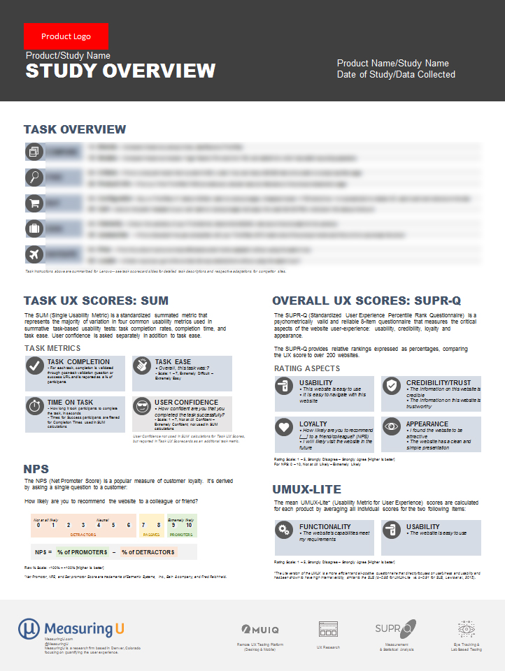
Figure 4: Example “overview” card that can be linked or reference on scorecards for more detail on study metrics and task details.
Consider the audience.
You need to consider the audience and organization. Non-UX execs will want the bottom line: red, yellow, and green, and maybe grades. UX pros will want to dig into the metrics and will be more familiar with core metrics like completion, time, etc. Don’t feel like you need to stick with a one-sized-fits-all scorecard. Standardization is good, but not if it gets in the way of communicating and helping prioritize and understand improvements to the experience.
Identify targets.
With multiple visualization of metrics, external benchmarks, or competitors, it becomes much easier to identify where you want to go. You’ll want to be in the green, get As and Bs, and have metrics at least the same or ahead of competitors and as far into the best-in-class zone on the continuums (far right side of graphs in Figures 1, 2, and 3).
Allow for multiple points in time.
The example scorecards here only show one point in time from a single benchmark study. Follow-up benchmark studies can show how each metric has hopefully improved (using the same data collection procedures). This adds an additional dimension and likely means removing the competitors or finding other ways to visualize improvements (or lack thereof).
Summary & Takeaways
UX scorecards are an excellent way to visually display UX metrics. They can be used to more visibly track (and communicate) how design changes have quantifiably improved the user experience. They should be tailored to an organization’s goals and feature a mix of broad (study-level/product-level) and specific (task-level) metrics. Use multiple ways to visualize metric performance (colors, grades, and distances) and include external benchmarks, competitor data, and levels of precision when possible.