 Smartphones are ubiquitous in modern life globally and in the US. Almost all Americans have smartphones (85%), with US sales expected to exceed 74 billion dollars. But people don’t just own them, they (we) use them—a lot!
Average monthly data use worldwide is expected to increase from 19GB in 2023 to 46GB in 2028 (55GB in North America), and increasing usage may drive consumer desire to find ideal service plans.
AT&T, Verizon, and T-Mobile dominate most of the US wireless market share; however, several smaller providers have begun to offer comparable and lower-cost options (while using the major providers’ networks).
Smartphone makers like Apple have famously spent a lot of effort crafting a world-class user experience for the physical phone, its interface, the charger, and even the box. But most people’s experience picking a plan starts online. As a result, they may have to navigate wireless websites to find service providers, interpret plans with mysterious fees, buy new phones, and pay bills. These experiences are far from world-class.
To understand the wireless experience, we used our MUiQ platform to collect data on a variety of attitudes and intentions toward ten US-based wireless service providers that offer phones and phone plans:
- AT&T
- Boost Mobile
- Cricket Wireless
- Google Fi
- Mint Mobile
- Spectrum Mobile
- Straight Talk Wireless
- T-Mobile
- Verizon
- Xfinity Mobile
We computed SUPR-Q® and Net Promoter scores, investigated reasons for using the websites, measured users’ attitudes regarding their experiences, conducted key driver analyses, and analyzed reported usability problems.
Benchmark Study Details
In December 2022 and January 2023, we asked 523 users of wireless carrier websites in the US to recall their most recent experience and tell us their perceptions of one of the listed wireless provider desktop sites and mobile apps (if applicable) in the past year.
Participants completed the eight-item SUPR-Q (which includes the Net Promoter Score) and two-item UX-Lite™ standardized questionnaires, and they answered questions about their brand attitudes, usage, and prior experiences. Eighteen additional users completed a think-aloud task (search for the price of a Samsung Galaxy S22 with a plan) on one of four randomly assigned wireless provider websites to assess usability issues (AT&T, Mint Mobile, Google Fi, or Xfinity Mobile).
Quality of the Wireless Provider Website UX: SUPR-Q
The SUPR-Q is a standardized questionnaire widely used for measuring attitudes toward the quality of a website user experience. Its norms are computed from a rolling database of around 200 websites across dozens of industries.
SUPR-Q scores are percentile ranks that tell you how a website’s experience ranks relative to the other websites (50th percentile is average). The SUPR-Q provides an overall score as well as detailed scores for subdimensions of Usability, Trust, Appearance, and Loyalty.
The wireless service provider websites in this study collectively averaged at the 40th percentile. Mint Mobile received the highest SUPR-Q score at the 97th percentile, and AT&T scored the lowest at the 7th percentile.
Usability Scores and Trust
We asked participants to rate how easy they thought it was to use and navigate around the websites. Mint Mobile had the highest usability score (99th percentile), and Verizon had the lowest (10th percentile). Comments regarding usability for some of the brands included
- “I have been happy with the Mint Mobile service and have recommended it to several friends and family. I find the site easy to navigate even for my parents who are 80. They were able to successfully sign up for the service, which definitely means the site is easy to use.” — Mint Mobile
- “The organization of the site is slightly overwhelming, and the amount of information can be both lacking in some areas and too much in others.” — Verizon
- “I used the site to help a loved one update their payment settings. Finding the page to do this and updating the settings wasn’t as intuitive as it could have been. I recall having to view several pages and a lot of scrolling to get the task accomplished.” — Verizon
- “The website has all the information you need in easily accessible locations. The banner is a bit large, but gives you all information necessary. The website also isn’t slow to load, which makes navigation easier.” — Google Fi
- “I absolutely love how easy it is to use the Mint Mobile website. I always find what I am looking for within minutes.” — Mint Mobile
We also asked participants to rate the trust and credibility of the wireless websites. Trust scores were similar to usability scores. Mint Mobile had the highest trust score (93rd percentile) followed by Google Fi (82nd percentile). AT&T had the lowest trust score (10th percentile), with Xfinity Mobile being the second lowest (23rd percentile).
Loyalty/Net Promoter Scores
The average NPS for the wireless provider websites was −7% (slightly fewer promoters than detractors), ranging from −44% for AT&T to 43% for Mint Mobile. In general, a better user experience is a good predictor of customer loyalty. Comments related to NPS ratings included
- “I do not like AT&T. Everything they advertise invariably costs more than they say. I a[m] an unsatisfied former AT&T customer. I visited their website because a friend switched to their prepaid plan and was happy with the deal and service.” — AT&T
- “It’s a budget carrier, so things might be a bit lacking for those who are used to alternative services. That said, it functions well for a budget provider and is relatively inexpensive.” — Boost Mobile
- “Their website is fine. It’s their service/plans that I have a problem with, so I wouldn’t recommend a person to sign up with them maybe, but to visit their website is a different matter.” — Xfinity Mobile
- “The website is mostly easy to use and navigate, and it is a trustworthy source that will not scam you, but the main reason I would recommend any wireless website to a friend or colleague is if they were in the market for a wireless provider and the reason I rate T-Mobile 6 is that T-Mobile is not among the first recommendations I would make. I would eventually recommend the T-Mobile website, but only as a premium offering in the wireless market space.” — T-Mobile
- “I mean, I’d only recommend the website as a way of interacting with the company to receive the service, not because I think the website itself is special.” — Mint Mobile
- “I have been a Mint Mobile customer for a couple of years now and their website is one of the reasons why I opted for their service in the first place. It is really easy to use and is fun to interact with. I have already recommended family to check out their site so would not hesitate to do it again in the future.” — Mint Mobile
More verbatim comments are available in the downloadable report.
Websites and Mobile App Usage
As a part of this benchmark, we asked participants how they accessed wireless provider services. All participants reported using their desktop/laptop computers (this was a requirement for participation in the survey), with 63% using mobile apps and 56% using mobile websites.
The typical frequency of use was a few times a year for desktop and mobile websites (on average, fewer than 3% reported daily use on the desktop website and the mobile website). Boost Mobile was the most frequently visited mobile website (overall usage of 76%). For those who reported mobile app use, the typical frequency of use was also a few times a year. Google Fi was the most frequently used mobile app (overall usage of 71%).
Top Tasks
While people use their smartphones for entertainment, we suspect most people don’t go to carrier websites for fun. What do people do there? As part of the retrospective study, we asked participants to report what they were doing on their most recent visit (Figure 1).
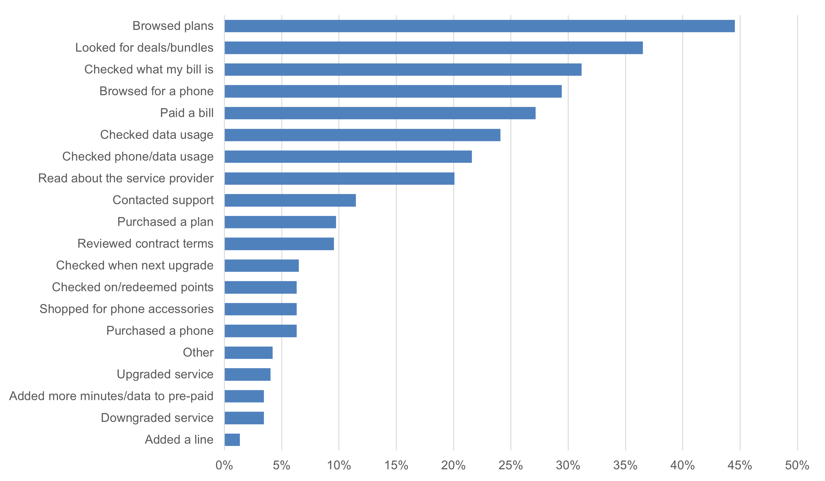
On the desktop sites, the actions people completed most often included browsing plans (45%), looking at deals and bundles (37%), and checking their bills (31%). Browsing plans was the most commonly reported behavior for AT&T, Mint Mobile, Spectrum Mobile, Straight Talk Wireless, and Verizon. Among those who indicated using the mobile app, participants most often reported checking their data usage (32%), checking phone usage (30%), and checking their bills (29%). Checking data usage was the most common activity for Mint Mobile and Google (tied with checking phone usage). Checking a bill was the most common activity for AT&T, Spectrum Mobile, and Xfinity Mobile.
Key Drivers of the Wireless Experience
To better understand what affects SUPR-Q scores and Likelihood-to-Recommend (LTR) ratings, we asked respondents to rate 24 attributes of the wireless website experience (full details are in the report).
We conducted key driver analyses (regression modeling) to quantify the extent to which ratings on these items drive (account for) variation in overall SUPR-Q scores and, separately, LTR (the rating from which the NPS is derived).
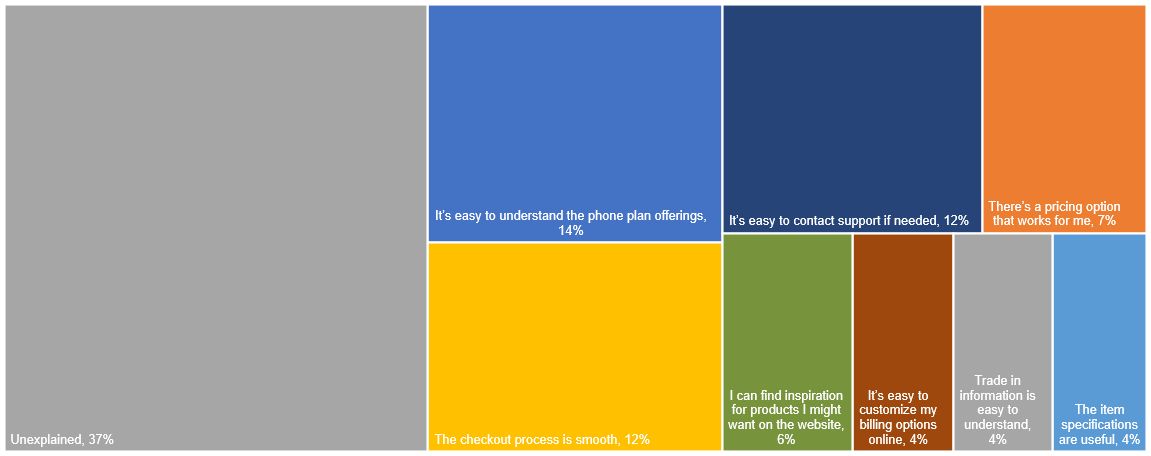
SUPR-Q Drivers. As shown in Figure 2, the top key driver was “It’s easy to understand the phone plan offerings,” accounting for 14% of the variability in SUPR-Q scores. This was followed by “The checkout process is smooth” (12%) and “It’s easy to contact support if needed” (12%). Taken together, eight significant variables account for 63% of the variance in the SUPR-Q scores.
Best and Worst: Key Drivers
Ease of understanding phone plan offerings is the top key driver
“It’s easy to understand the phone plan offerings” was the top key driver for the wireless provider website experience, accounting for 14% of the variation in SUPR-Q scores.
On all of the websites evaluated, “Hard to find desired information” was mentioned as a top issue.
“The promotions and deals are really big, and the actual plans link (not part of the deal) is a lot smaller.” — AT&T
AT&T had by far the lowest top-box score on the ease of finding plans, with only 17% of respondents strongly agreeing that it was easy to find a data plan that works for them. The group average was 43%, with Mint and Google leading.
“Information can be hard to find. Shopping deals and promotions, there are often a lot of minor details that may go unnoticed.” — Verizon
Participants in the think-aloud study were somewhat successful in finding pricing for a Samsung Galaxy S22 with a phone plan, but some participants reported incorrect amounts or found only the price of the phone and not the price of the plan, while others were unsure that the price they found was completely accurate. In video 1, the participant found the price of the phone and plan but did not seem to notice that the default setting for the plan was for a group of four people.
“Starts at 12.50 a month. Going to click order Samsung Galaxy S22 with Fi to see if more plan options come up. Ok yeah I see, unlimited 20 a month, flexible, unlimited plans, looks easy enough to find this information” — Google Fi
Video 1: A participant on Google Fi finds the price of a phone with a phone plan but fails to notice the default setting for plans is for a group of four people. Most sites provided the price of a phone initially, with more searching required to find the combined price with a plan.
The smoothness of checkout processes influenced ratings
“The checkout process is smooth” was a significant driver of the wireless service provider website experience, accounting for 12% the of variance in SUPR-Q scores. In the retrospective study, fewer than half of the participants (42%) strongly agreed that the checkout process was smooth across the wireless provider websites.
The think-aloud study task did not require participants to complete checkout, and the participants who reached log-in screens were averse to entering their information (see Figure 3). This could be due to a reluctance to show personal information while being recorded in a usability study, but even in real life, people may avoid the effort of logging in to find the price of a phone plan. Recall of purchase experiences influenced ratings, suggesting that ease of making purchases improves the consumer experience on wireless websites.
Ease of access to support services is an important component of the user experience
“It’s easy to contact support if needed” was also a significant key driver of the wireless provider website experience, accounting for 12% of the variance in SUPR-Q scores. In the retrospective study, fewer than half of the participants (40%) strongly agreed that it is easy to contact support if needed.
Some participants specifically mentioned issues with support (5%). These issues tended to focus on the amount of time required to receive help and the quality of help provided.
“Their customer service is the biggest issue. They are not trained in using redemption points or other areas of help.” — Straight Talk Wireless
“The only problem I had was that sometimes the wait time to speak or chat with customer support is a bit long.” — Spectrum Mobile
“Last time we needed support the chat queue was hours long and the representative wasn’t really familiar with their service.” — Mint Mobile (Figure 4)

Brand Attitude and SUPR-Q scores
We collected participants’ attitudes toward the brand as well as UX scores. As we’ve seen with prior SUPR-Q analyses, brand attitude has a significant influence on attitudes toward the website experience. Poor prior experiences and bad reputations tend to lower participants’ brand attitudes, impacting attitudes toward trust and intention to use/recommend. Consequently, brands with lower brand attitude scores tend to have lower SUPR-Q scores (and vice-versa). In our data, Mint Mobile had the highest brand attitude score (6.1), whereas AT&T had the lowest score (4.4). Notably, controlling for the effect of brand attitude when looking at the effect of condition on SUPR-Q scores reduced differences in scores between competitors. However, even after controlling for attitude, the lower-scoring websites (e.g. AT&T, Verizon, and Xfinity) remained below average. See the full report for more details.
What to Improve
Respondents had a few common problems and frustrations across the wireless service provider websites, such as difficulty finding desired information, trouble navigating, and sites loading slowly.
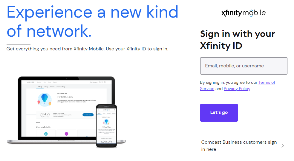
Across all the websites, users experienced issues trying to find correct information related to phones and service plans. Video 2 shows a participant who had trouble finding a specific phone on the Xfinity Mobile website. When looking for a Samsung Galaxy S22, this participant saw an advertisement for a specific phone at the top of the screen and interpreted that button as the area to shop more generally for Samsung phones because of a misleading label.
“I want a Samsung, so that box was fairly easy to find, and then it says shop Samsung, and … it’s not giving me the phone that I’m looking for, so I scroll down the page and this is just accessories. So, I am going back to phones again and I am going to click on Samsung again and then shop Samsung, and it’s just … ok now I see … no it’s only showing me the same Samsung Galaxy A13 5G, so that is not the phone that I am looking for.” — Xfinity Mobile
Video 2: A participant searching the Xfinity Mobile website first tries to click through an advertisement multiple times before scrolling down to see other phone offerings.
Another participant attempting the same task on the AT&T website (Video 3) expressed some uncertainty about where to find information about plans after finding the price of the phone.
Video 3: A participant searching the AT&T website for a Galaxy S22 was initially uncertain about where to find plan information.
Other areas of improvement and additional verbatim comments are included in the downloadable report.
Summary and Takeaways
An analysis of the user experience of ten US wireless service providers found that
- Mint Mobile leads and AT&T lags. There was a wide variation in NPS and SUPR-Q scores. Mint Mobile had the highest SUPR-Q rating (97th percentile) and the highest NPS (43%). AT&T had the poorest SUPR-Q (7th percentile), and NPS (−44%). Verizon and Xfinity Mobile both had low SUPR-Q ratings (16th percentile) and Xfinity Mobile had the second-lowest NPS rating (−23%).
- Understandable plans, a smooth checkout, and easy access to support drive the website experience. Understanding plan offerings was the top key driver (accounting for 14% of SUPR-Q scores). Other top drivers of the SUPR-Q score were “The checkout process is smooth” (12%) and “It’s easy to contact support if needed” (12%).
- Brand attitude drives LTR. When looking at higher-level constructs, Brand Attitude was the top driver for LTR (46%). Consistent with LTR scores, Mint Mobile had a top brand attitude score among the wireless service provider websites (6.1). At a lower level, “There’s a pricing option that works for me” was a top key driver for LTR, accounting for 14% of the variance in scores. Further, controlling for brand attitude reduced SUPR-Q differences among the brands.
- Figuring out plans and pricing was painful. Common problems and frustrations across wireless service providers included difficulty finding plans that worked, trouble navigating, and slowly loading sites. Providing simple and clear pricing and plan options should help improve the website experience.
For more details, see the downloadable report.
")
")
")