 In Benchmarking the User Experience, I write about the importance of a regular plan for quantifying the user experience of your websites, apps, or devices.
This involves collecting metrics, usually at both task and study levels.
But the point of benchmarking isn’t just to collect metrics to put on a dashboard, it’s to ultimately improve them.
A common question we receive when conducting benchmark studies is what to set the metric targets to. That is, what values should organizations aim for in their next benchmark? While it depends a bit on the context and consequences of the experience (and the metric itself), here are the target options I discuss that provide reasonable goals.
Above Average
A logical target to start with is having all metrics be at least above average. Let’s call this the Lake Wobegon target. We’ve collected data for the most common UX metrics to provide context and define what “average” is, at least for a broad set of contexts and products. Here are five common averages to use:
- Completion rate average: 78%
- Single Ease Question average: ~5.1
- SUS average: 68
- SUPR-Q average: 50%
- Net Promoter Score for consumer software: 21%
Above Industry Average
To get more specific with using an average, narrow in on a relevant industry. Industry averages can be found from external reports or your own benchmarking analysis. We report many industry averages for websites and software. Here are a few averages by industry for SUPR-Q and SUS scores:
- Hotel average SUPR-Q: 76%
- Airline & aggregator website SUPR-Q: 83%
- Retail websites SUPR-Q: 78%
- Consumer software SUS: 75
- Business software SUS: 66
Above a Competitor
If your website or product has a clear competitor, you should strive to at least meet or exceed it on key metrics (like the metrics listed above). Competitor data can be collected from conducting your own competitive benchmark or from published reports or databases. For example, Dropbox has a SUS score of 78 in our consumer software report and Netflix has a SUPR-Q score at the 95th percentile. A competitor, more generally speaking, can also be an old or existing product and any new version should at least meet or exceed the benchmark metrics of the legacy experience.
Above a Percentile Rank
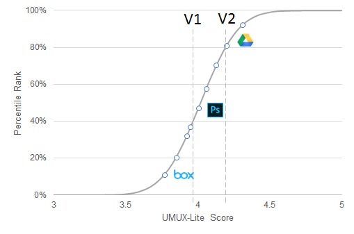
For some measures that have enough data points, raw scores can be converted into percentiles ranks. Percentiles tell you where a score falls relative to all the scores in a database (often after a transformation to make the data normally distributed). This is a key characteristic of the SUPR-Q (hence the percentile rank in its name). A SUPR-Q percentile rank of 75% means the score is higher than 75% of the websites in the database.
For high-traffic retail websites, setting a target of above 90% makes sense as a target because it’s both above average for the retail website industry and a superior UX experience here has a closer association to revenue (and ROI)—meaning you want to aim high. Even if you aren’t a retail website, it makes sense to be at least above the 50th percentile (average) as a target for any metric.
Above a Grade
Percentile ranks can themselves be translated into letter grades (like the ones you got in school), which may help in interpretation and set additional target thresholds. Jim Lewis and I did this with the System Usability Scale as shown in Table 1. To achieve an “A” grade, you need to obtain a SUS score in the 90th percentile or above, which translates to at least a raw SUS score of 81. To have at least a “passing grade” you should target at minimum a SUS score of 52. But like a “D” in school, it’s hardly anything to be proud of!
| Grade | SUS | Percentile Range |
|---|---|---|
| A+ | 84.1-100 | 96-100 |
| A | 80.8-84.0 | 90-95 |
| A- | 78.9-80.7 | 85-89 |
| B+ | 77.2-78.8 | 80-84 |
| B | 74.1-77.1 | 70-79 |
| B- | 72.6-74.0 | 65-69 |
| C+ | 71.1-72.5 | 60-64 |
| C | 65.0-71.0 | 41-59 |
| C- | 62.7-64.9 | 35-40 |
| D | 51.7-62.6 | 15-34 |
| F | 0-51.6 | 0-14 |
Table 1: SUS scores, grades, and percentile ranks.
Use Norms, Context, and Competitors Together to Set Targets
Averages, competitors, percentiles, and grades provide comparison points to set targets, but the target your organization settles on usually involves a combination of them all and often starts with the context of the interface. For example, certain business-to-business software applications— like accounting software—are inherently more complicated than, say, a consumer website. We see this difference between our consumer and business software benchmarks too. For example, the average SUS score is 66 for B2B software products (a “C” grade) and 75 for B2C software products (a “B” grade). While it would be good to set a target of 90% for a SUS score (an A grade), it might be unachievable for enterprise accounting software compared to a search engine (although the users would appreciate it!).
This importance of product type and context is also supported by research from Kortum and Bangor. They conducted a large retrospective benchmark of everyday products (for example, microwaves, search engines, and Excel spreadsheets) using the SUS. The SUS for Excel in their dataset was 56 (a “D”) while web browsers (for example, Google Chrome) scored 88 (A+). While their Excel SUS was much lower than our Excel SUS (likely because they used a within- rather than between-subjects approach and users had low experiences), it does illustrate the different standards between classes of products. Excel is by many measures a very commercially successful product even though it scores much lower than Google Chrome.
When setting a target for your benchmark, aim high (higher than average, higher than your competitors and previous versions) but not so high as to set unrealistic targets.