 What forms do I need to file my taxes this year?
How much is a National Park Pass?
How do I renew my passport?
Federal government websites are helpful for a wide variety of activities, from mailing a package to booking a camping site to filing taxes.
Many federal branches have begun to computerize their services to streamline these tasks. But with the proliferation of websites for different department and functions of the federal government comes confusion on where to go to find information and how to complete common tasks.
To understand the online experience of federal government websites, we benchmarked the desktop user experience of a selection of U.S. government websites:
- IRS (IRS.gov)
- NASA (NASA.gov)
- National Park Service (NPS.gov)
- United States Government (USA.gov)
- USPS (USPS.gov)
We collected SUPR-Q data, including NPS data, and investigated visitors’ reasons for using the site, website attitudes, understanding of key features, and ability to complete tasks on each of the websites. Full details are available in the downloadable report.
Study Details
We recruited 402 participants in February 2018 for a perception and usability study to test the federal government sites. For the perception portion, we asked 252 users to reflect on their most recent experience on each of the federal government sites. Participants in the studies answered the 8-item SUPR-Q (including the Net Promoter Score) and questions about their prior experience. In particular, we were interested in current users’ attitudes toward the site, and whether they felt the information was complete and easy to find.
For the usability portion, we asked 150 participants to complete a task on one of the five federal government websites:
- IRS: Find tax form 1040.
- NASA: Find a page on NASA’s history.
- National Park Service: Find how much an annual national park pass costs.
- USA.gov: Find eligibility requirements to renew a passport.
- USPS: Find out how long priority mail shipping takes to arrive.
Participants also answered the 8-item SUPR-Q (including the Net Promoter Score) and questions about their experience completing the tasks on the website.
Quality of the Federal Government Website User Experience: SUPR-Q
The SUPR-Q is a standardized measure of the quality of a website’s user experience and is a good way to gauge users’ attitudes. It’s based on a rolling database of around 150 websites across dozens of industries. Scores are percentile ranks and tell you how a website experience ranks relative to the other websites. The SUPR-Q provides an overall score as well as detailed scores for subdimensions of trust, usability, appearance, and loyalty.
For the perception study, the scores for the five federal government websites range from a bit below average to well above average. The federal government desktop average SUPR-Q is at the 67th percentile (scoring better than 67% of the websites in the database). The IRS website has the lowest SUPR-Q score of the group with a score at the 41st percentile. The National Park Service website leads the group with scores at the 96th percentile.
In the usability study, the National Park Service website also has the highest overall SUPR-Q score of the group (at the 99th percentile) compared to IRS.gov that has the lowest at the 71st percentile.
Usability Scores
For the usability of the federal government sites, the IRS website has the lowest scores of the group (at the 26th percentile in the perception study and at the 63rd percentile in the usability study). Compared to the National Park Service that has the highest usability scores for both the perception and usability studies (92% and 99% respectively).
Loyalty/Net Promoter Scores
This year, federal government websites have average Net Promoter Scores at about 8% in the perception study and 21% in the usability study. Likelihood to recommend the federal government websites was higher after users had completed a task on the website. The scores are surprisingly high, especially compared to health insurance, social media, and state government websites.
Why People Use Federal Government Sites
To make the most of limited federal budgets, these organizations should understand what tasks are most important to users online and optimize for them. Consequently, we asked participants what they were attempting to do on their last visit to the website and how often they visited in the last year.
For IRS.gov, 59% of participants reported visiting the site a few times per year. 35% of NASA respondents come to the website a few times per year, but more than a quarter of them (29%) come to the site a few times per month. 54% of National Park Service website users visit a few times a year. Similarly, 50% of USA.gov respondents visit the site a few times per year, but a quarter of them visit a few times per month. 31% of USPS users come to the site a few times per month.
| Federal government website | Visit a few times a month | Visit a few times in the past year |
|---|---|---|
| IRS | 8% | 59% |
| NASA | 29% | 35% |
| National Park Service | 19% | 54% |
| USA.gov | 25% | 50% |
| USPS | 31% | 44% |
The federal government websites have such diverse functions that the reasons for participants’ last visit were quite different across the sites. For example, the most common reasons to visit the IRS website was to look up tax information (25%) and download forms (14%).
- “I was trying to find the answer to a specific question that might affect my tax situation.”—IRS user
- “Download the forms that I’ll need to file my taxes this year.”—IRS user
While for NASA it was to look up mission updates (16%) and find information about planets (15%).
- “I was reading about the Jupiter mission and just wanted to see what information was posted.”—NASA user
- “I am interested in the new planets that are being discovered with the Kepler and, to some degree, Hubble telescopes.”—NASA user
19% of participants go to the National Park Service website to learn about visiting a park (e.g. driving directions, closures, etc.) and 18% were looking for a local state park.
- “Get information on visiting Yosemite park.”—NPS.gov user
- “I was looking for National Parks in my home state.”—NPS.gov user
Almost a quarter of USA.gov participants went to the site to apply for a job (23%) and 13% went to find passport information.
- “I used it to apply for some jobs and recently to research how to start a small business.”—USA.gov user
- “To find info on getting a passport.”—USA.gov user
Not surprisingly, 39% of USPS participants came to the site to track a package and 11% came to estimate a shipping price.
- “Track one of my packages I sent.”—USPS user
- “To look up the rates for postage.”—USPS user
Understanding What the Website Can Do
With such diverse functions, it’s not surprising that understanding what the website can be used to accomplish is a key driver of federal government website user experience. Basically, users need to know what they can and should do with the site, and if that’s unclear, then the website user experience suffers. The statement, “It was clear to me what I would be able to use the website to accomplish” explains 18% of the variance in SUPR-Q scores.
USA.gov and the IRS are the lowest scorers in the group with only 70% of participants agreeing with the statement “It was clear to me what I would be able to use this website to accomplish.”
- “I still don’t know what I can actually do on the website besides reading lots of information. How do I use it besides looking up general information? It almost seems like information overload. Maybe there’s a better way to organize the information available on the website.” –USA.gov user
The other three sites—National Park Service, NASA, and USPS—had much clearer use cases to participants. Their agreement with the statement, “It was clear to me what I would be able to use this website to accomplish” is much higher, 96%, 75%, and 83% respectively, with NASA on the lower side.
Overwhelming Information Not Organized Clearly
In addition to having the lowest SUPR-Q and NPS scores in both the perception and usability studies, USA.gov also had the lowest task success rate with less than half (47%) of participants successfully finding the correct information about passport eligibility.
The main reason the site suffered was ambiguous category labels that caused confusion about the correct path for finding the passport renewal information. For example, the categories “Recreation and Travel within the U.S.,” “Visas, Tourists, and Temporary Visitors,” and “U.S. Citizens Traveling Abroad” were lengthy and didn’t stand out as an obvious path for participants.
- “There are a lot of links, which can get confusing.”—USA.gov user
Furthermore, the top reason for disliking the website in the perception study was too much information making the experience overwhelming.
- “It’s so much information on it, which of course is useful, but it can be overwhelming.”—USA.gov user
With the huge variety of information necessary to cover on a website like USA.gov, it’s important that the category labels are clear and provide an obvious path for users looking for specific types of information.
Looking at the heat map from MUIQ for the USA.gov homepage, it’s evident that the path for finding passport renewal eligibility information was not obvious to participants.
USA.gov heat map: 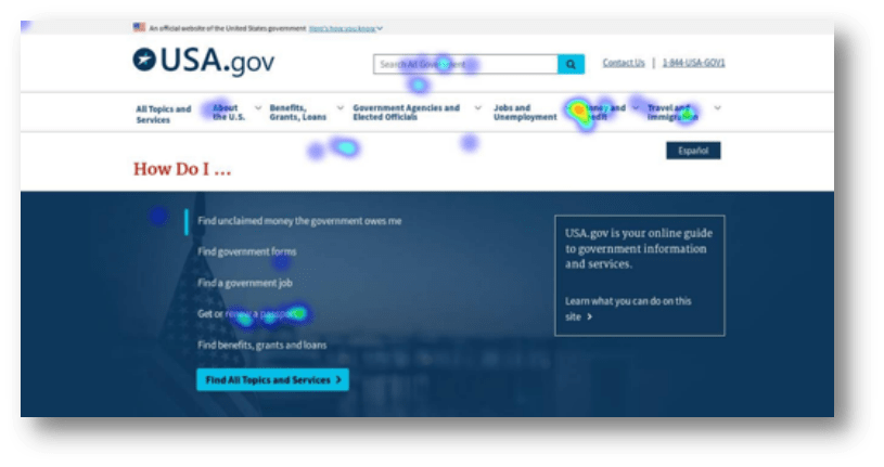
The Best and the Worst
The National Park Service website is the leader of the group with the best SUPR-Q scores across all the federal government sites. Participants on the site had among the highest task success scores, along with NASA.gov (97%). The process of finding the price of a park pass was fairly streamlined for most participants. The category labels were concise and easy for users to understand and navigate through. The high scores may also be a function of task simplicity.
Video Example 1: easy category labels on NPS.gov
“Passes” was clear and easy to find in the top navigation menu.
USA.gov has the worst SUPR-Q scores in the group and lowest task success rates. Participants also had low favorability toward the site as well as low trust.
There is also an overwhelming amount of information and confusing category labels in the top navigation. Participants mentioned they had a hard time digging through the amount of information.
- “It’s a lot of information in one place and can be frustrating trying to find a specific answer.”—USA.gov user
In the task, participants didn’t see a clear path for finding eligibility rules for renewing a passport. Participants had a hard time differentiating between category labels like “Recreation and Travel within the U.S” and “U.S. Citizens Traveling Abroad.” Shorter category labels such as “Passports” or “Travel” would likely make it clearer for participants to digest and navigate through large amounts of information.
Video Example 2:
The participant had a hard time deciding where to go and looked through most of the categories in the menu.
The low task success scores combined with low brand favorability, low trust, and unclear use cases were a recipe for a poor user experience on USA.gov. More videos examples are available in the report.
Summary
An analysis of the user experience of five U.S. federal government websites found:
1. Brand attitude is a key driver in SUPR-Q scores. We found that 20% of the variability in the federal government SUPR-Q scores can be explained by brand favorability. The sites that participants felt more favorable toward (National Park, NASA, and USPS) scored better compared to the sites that participants felt less favorably toward (IRS and USA.gov). Because participants are likely already familiar with the various federal government services, it’s not surprising these preconceived attitudes drove SUPR-Q scores.
2. People need to know what they can do. Understanding what the website can be used to accomplish was also a key driver of federal government website user experience. Users need to know what they can accomplish on a site. For the low scorers (USA.gov and IRS), only 70% of users agreed with the statement “It was clear to me what I would be able to use this website to accomplish.”
3. Trust and favorability usually go hand in hand, but not with the IRS. Interestingly, IRS.gov has the lowest brand favorability (maybe not surprising), but it scored in the 82nd percentile for trust. So, people trust the IRS but still don’t like it.
4. An overwhelming amount of info is on USA.gov. USA.gov has the lowest task completion rates in the group. Participants thought the amount of information was overwhelming and it was unclear where to start the task due to confusing category labels and poor site organization. Combined with low favorability, trust, and unclear use cases, it’s not surprising that USA.gov is the worst in the group.

")
")