 Buying and selling a car usually starts online.
While few people purchase cars online without seeing them in person first, the vast majority conduct substantial research online before they set foot in a dealership.
Sellers are also equipped with the fair market value of their cars and what they can expect in a trade-in to a dealer or when selling it to private parties.
Much of the research for buyers and sellers happens on third-party automotive websites. These websites showcase detailed information about all brands of cars. They make money from advertising, connecting potential buyers with dealers, and displaying paid listings for cars.
To better understand the third-party automotive website experience, we benchmarked eight popular websites to see how people are using them and where the processes can be improved.
This study had two parts:
- A retrospective benchmark on the four most popular auto websites collecting SUPR-Q and NPS data.
- A task-based benchmark on all eight auto websites allowing us to observe problems as participants attempted to look for information.
Full details are available in the downloadable report. Here are the highlights.
Study & Participant Details
We recruited 476 participants in February 2019 for perception and usability studies on our MUIQ testing platform.
For the perception study, we asked 216 participants who had visited either Autotrader, Carfax, Cars.com, or Kelley Blue Book in the past year to reflect on their most recent experience.
Participants in the study answered the 8-item SUPR-Q (including the Net Promoter Score) and questions about their prior experience. In particular, we were interested in visitors’ attitudes toward the site, problems they had with the site, and reasons they used the website.
For the task-based usability study, we asked 260 participants who reported researching cars online to find the MSRP of a specific vehicle on one of the eight websites (assignment was random and included a mix of first-time and existing users).
Measuring the Website UX: SUPR-Q
The SUPR-Q is a standardized measure of the quality of a website’s user experience and is a good way to gauge users’ attitudes. It’s based on a rolling database of around 150 websites across dozens of industries.
Scores are percentile ranks and tell you how a website experience ranks relative to the other websites. The SUPR-Q provides an overall score as well as detailed scores for subdimensions of trust, usability, appearance, and loyalty. Its ease item can also predict an accurate SUS equivalent score.
The scores for the four auto websites in the perception study (using only existing users) are above average at the 79th percentile (scoring better than 79% of the websites in the database). SUPR-Q scores for this group ranged from the 69th percentile (Autotrader) to the 85th percentile (Cars.com and Kelley Blue Book). Cars.com scored slightly better than Kelley Blue Book with an overall SUPR-Q score of 85%.
We compared these scores to our last benchmark of auto websites in 2014. Kelley Blue Book was also a leader in the 2014 perception study, but its overall SUPR-Q score dropped about 5 points in 2019 compared to 2014. Cars.com scored much better across all SUPR-Q subsets in the 2019 perception study compared to 2014. Autotrader scores mostly declined, except trust, which increased. Graphs and details are available in the report.
The task-based usability study used participants that had recently researched or were researching cars online but included both new and existing customers to each website to gauge infrequent or first-time usage. Consequently, all SUPR-Q scores were lower for the usability study.
Kelley Blue Book led the pack in the usability study as well, with an overall SUPR-Q score at the 54th percentile (and SUS equivalent score of 73). This was likely driven by Kelley Blue Book’s task success rate, which was also the highest. Carfax had the lowest SUPR-Q score in the usability study (12th percentile). Participants also rated the task the most difficult on Carfax and felt the least confident on the website (also tied with the lowest SUS equivalent score of a 57). TrueCar had the lowest task success scores due to an unclear starting point and difficulty in finding a specific vehicle. Its SUS equivalent score was around average at 70.
Trust & Loyalty
Trust scores varied among the auto websites, with an average of 77% in the perception study and 35% in the usability study. Participants expressed the highest trust toward Kelley Blue Book (91% in the perception study and 60% in the usability study). Carfax had the lowest trust scores in the usability study (19%) while Autotrader was the least trustworthy in the perception study (67%).
The NPS was similar to the trust scores. Kelley Blue Book, the most trusted website, was also the most likely to be recommended with an NPS of 36% in the perception study and 23% in the usability study. Overall, the average NPS was 19% in the perception study.
Desktop vs. Mobile App Usage
To get a sense of what activities participants most often do when they visit the auto sites, we asked how they accessed the site and the tasks recently attempted.
Looking at vehicles for sale was the top reason to visit auto websites (69%), followed by researching vehicle information (56%) and comparing vehicles (46%). This is similar to other sources of information about third-party automotive usage.
Mobile usage is high for automotive websites. At least 60% of participants have used the mobile website for one of the brands in the past 12 months; 86% of Cars.com participants reported using the mobile website. Mobile app usage ranged between 14% (KBB) and 45% (Cars.com), which is a bit lower usage than with the consumer banking industry.
Participants report liking the mobile app because it’s faster than going to the dealership, they can quickly contact the seller, and it’s easy to sell vehicles.
Problems in the Vehicle Search
The usability study revealed 15 unique problem types across the websites. The main problems users encountered were: difficulty finding new car info, difficulty in finding specific vehicle information, and overwhelming search results with a poor filtering process. Below, we take a deeper look at each of those with examples. Full details on the problems and task metrics are available in the report.
Unclear Starting Point for Finding New Car Information
The auto websites emphasize searching for used cars, so participants had difficulty finding information on new cars—including the MSRP, which was required as part of the task scenario.
“I didn’t like how it was focused on used cars and had new car info as an afterthought in the ‘research’ tab.”— Carfax user
Most auto websites feature a search function on the home page, but it’s set to search for used cars. Many participants didn’t notice this default and searched for used cars instead of new cars (affecting the task metrics).

Figure 1: CarGurus participants didn’t notice the “Used Car,” “New Car,” and “Certified Pre-Owned” filtering tabs on the home page search function. Participants didn’t know it was defaulted to “Used Car” and had to restart their search.
Some top navigation category labels such as “Research,” “Value My Car,” and “Car Research and Reviews” were not clear places for finding the price of a new vehicle; therefore, participants ended up using the home page search that emphasizes used cars.
It’s likely many of the websites emphasize used cars due to both the financial model (e.g. paid listings) and enough visitor interest in used cars.
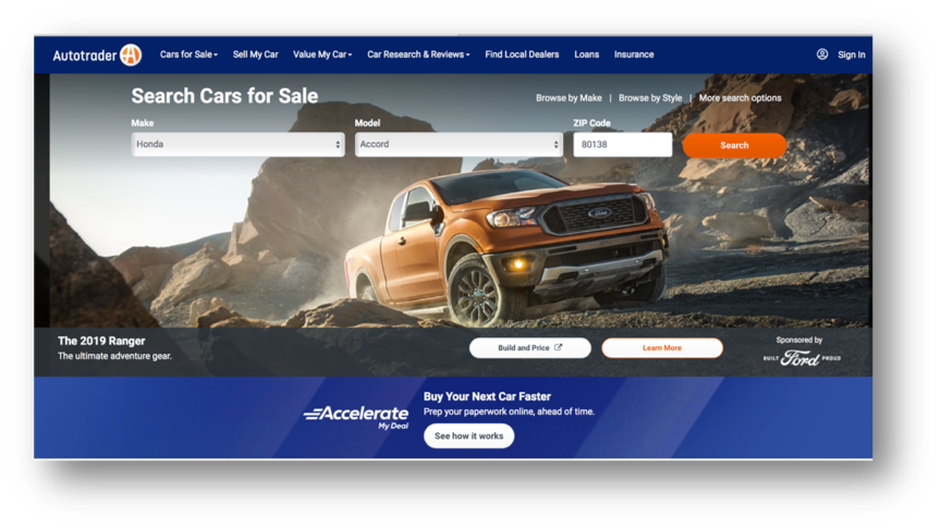
Figure 2: On Autotrader, participants weren’t sure where to start looking for new car vehicle information. Most participants used the search function on the home page, which emphasizes used cars. The top navigation category options didn’t fit well with searching for the price of a new car.
“I had to hunt a little bit for the options I was looking for.” —Autotrader participant
Intuitive website navigation is a key driver for the auto website user experience, explaining about 16% of the variance in SUPR-Q scores. Having an intuitive path for finding a specific vehicle would improve the experience considerably. Our study suggests better balancing the new and used car options may help the perception of navigation (which KBB seems to do well—see below).
Finding Specific Vehicle Information Is Difficult
Many of the new car detail pages didn’t list one price, but instead offered a range of prices for the MSRP. For example, on the Carfax website, the Honda Accord details page gives a MSRP range of $23,570–$35,800. To get the specific price of the Honda Accord LX base model, participants had to hunt through an overwhelming amount of information.
Participants should be able to filter for the specific vehicle (trim, body type, etc.) on the new car page to find their MSRP for their vehicle of interest.
“The site is set up to find used cars, so I had a bit of an issue finding a new quote. And it was actually a range: $23,570–$35,800.” —Carfax participant
“I was able to see a range of MSRP ($23,570–$35,800) and assumed that the base model would be at the lowest of the range, but I am not 100% sure that’s correct.” —Carfax participant

Figure 3: MSRP is listed as a range with no clear way to drill down to specific style, trim, etc.
Similarly, on Edmunds, while it was easy to find the new Honda Accord page, it was more difficult to find information on the specific LX style. On the Honda Accord details page, participants had to scroll all the way down the page to find information on the LX base model.
“MSRPs listed in a range with no quick way to drill down to the desired make-model, and it was also initially unclear on how to find the desired make-model to look up its specific MSRP.” —Edmunds participant
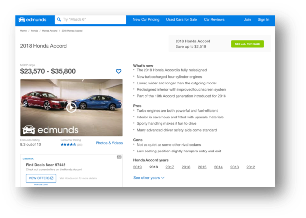
Figure 4: MSRP is listed as a range and the only filtering option is for year, not trim or body style. Users have to wade through a lot of information before seeing the MSRP values for each style.
Edmunds does list the fuel economy of the car prominently (Figure 3), which earlier research has found is critical information car buyers are interested in, but which can get buried in all the other car details if not prominently displayed.
Overwhelming Search Results with Poor Filtering Process
When using the search function, participants are presented with a lot of search results and no intuitive way to narrow down the cars. The Autotrader and Cars.com websites have a huge number of filters on the search results page. While having multiple ways to filter is usually a good thing, it seemed to work against participants’ ability to narrow their search in our task.
“The search feature is cluttered and hard to use.” —Cars.com participant
“I feel like it took a lot of steps to get the MSRP of the trim on the model I was looking at.” —Cars.com participant
Participants seemed overwhelmed by the filtering options and didn’t know how to quickly drill down to their vehicle of interest. Furthermore, many of the seemingly endless filters were collapsed and many participants didn’t notice them or open them.
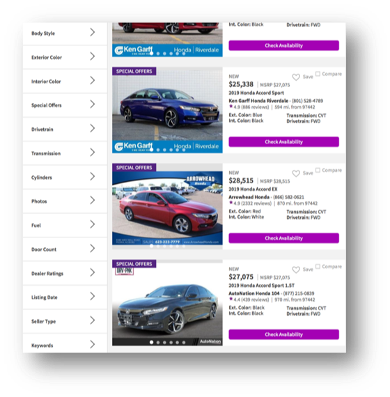

Figure 5: The filters on the Cars.com website were just too much for participants to wade through and the collapsed categories like “Body Style,” “Drivetrain,” and “Door Count” were left unopened.
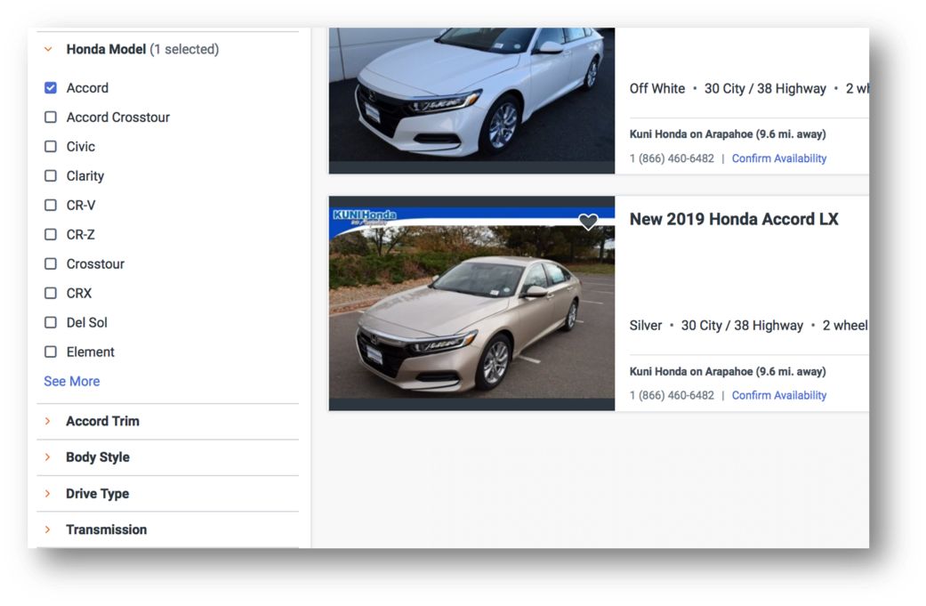
Figure 6: On the Autotrader website, the LX filter (which would have been helpful for participants in the task) was under “Accord Trim,” but many didn’t open the category because of an unclear label or it was less noticeable than the already opened filters.
“There isn’t an option to filter out certain models of cars. There is only an initial filtering, which is asking for the Make and the type of car, which gathers a lot of different results.” —Autotrader participant
On the other hand, the flow for narrowing down a car on the Kelley Blue Book website seemed more seamless and probably contributed to its high overall scores in the usability study. The site takes the user through a series of pages, narrowing down the options for the specific vehicle, rather than traditional filters on a Search Results Page. This worked well for the participants who used it as shown in the video below from MUIQ.
Video 1: Example of a participant successfully navigating the KBB website from MUIQ.
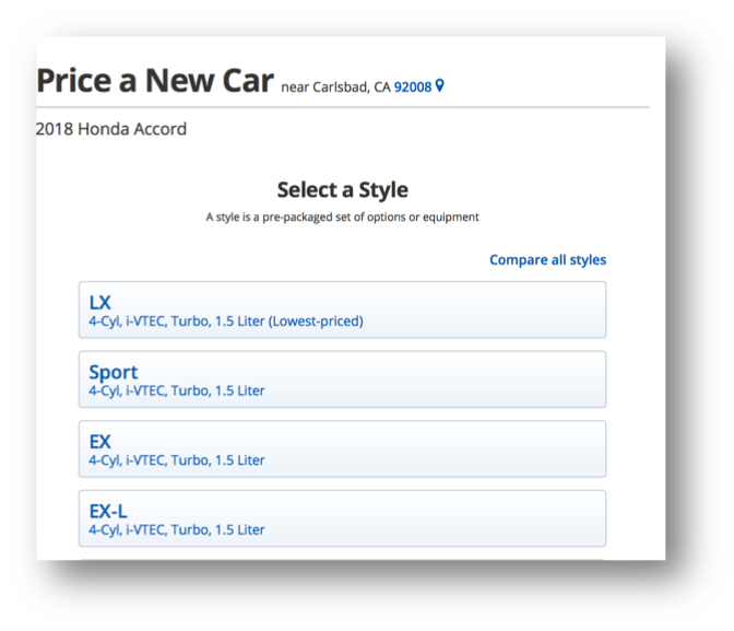
Figure 7: Example of a filtering style on the KBB website participants had more success within our study.
For example, the page for filtering by “Style” (Figure 7) worked well for finding the Honda LX.
Participants struggled to filter for the LX on the other auto sites.
“It had many options in order to assist me on my search. I never felt lost and was able to navigate myself to the MSRP fluidly without any obstacles.” —KBB participant
Summary
An analysis of the user experience of eight auto websites found:
- Compared to other industries, auto site UX is above average, but some websites have room for improvement. Current users find the auto website experience above average, with SUPR-Q scores falling at the 79th percentile on average. Cars.com and Kelley Blue Book were the overall winners for the retrospective study at the 85th percentile, with Autotrader scoring the lowest at the 69th percentile. For infrequent and new users measured in the task-based usability study, Kelley Blue Book had the highest SUPR-Q score (54th percentile) while Carfax had the lowest score (12th percentile).
- People visit auto websites primarily to find cars for sale, and mobile usage is high. The majority of participants reported visiting the desktop versions of the auto websites to find cars for sale, research vehicle information, and compare vehicles. Mobile usage is high. At least 60% of participants have used the mobile website for each of the companies in the past 12 months. Most popular is Cars.com, with 86% having reported using the mobile website and 45% having used the mobile app.
- The emphasis on used car sales made it difficult to find information about new cars. The auto websites emphasize searching for used cars, so participants had difficulty finding information on new cars, such as the MSRP. Having a better path for both used and new vehicles (and allowing users to easily switch between new and used) will likely improve SUPR-Q scores (a key driver in this study), especially for infrequent or first-time users.
- The filtering process could be improved. When using the search function, participants are presented with a long list of search results and not always a great way to narrow the results. The overwhelming amount of filtering options worked against users who had a hard time quickly drilling down to a specific vehicle. Kelley Blue Book had the most efficient filtering system, which contributed to its high overall scores.


