 Despite the attention consumer-based mobile apps, websites, and software get, a lot of the world depends on business software. Business software supports core functions for organizations such as productivity tracking, communication, accounting, and sales.
Several products also have a fair amount of crossover between business and consumer usage.
Along with their features and capabilities, the user experience of software is a key determinant of how likely users adopt new technology and recommend the product.
Benchmarking is an essential step in a UX measurement plan, which aids in making systematic improvements in a product’s user experience.
We’ve found that usability accounts for between 30% and 60% of the variation in Net Promoter Scores. A positive experience leads customers to recommend a product. A negative experience, predictably, causes customers to actively discourage others from buying a product.
From October through December of 2019, we collected data from 674 participants to learn about their attitudes toward the functionality and usability of common business-related software. Measuring user attitudes toward the experience is an important step in benchmarking and improving a product.
This is an update to data we collected on a similar set of products in 2017 using a similar methodology. We increased the number of products benchmarked and, as we did in 2017, separately reported business-focused software (this article) and consumer-focused software (coming in a future article).
The 19 business products include a mix of productivity and communications software (both web and desktop):
- AutoCAD
- Blackboard
- Box
- Canvas
- GitHub
- GoToMeeting
- QuickBooks
- Salesforce
- Shopify
- Slack
- Squarespace
- Tableau
- VMware
- WebEx
- Wix.com
- WordPress
- Zendesk
- ZipRecruiter
- Zoom
Participants came from the United States. A bit over half (53%) were male and tended to be younger, with 66% under 35. Participants were asked to reflect on their most recent experiences with the software and answer a number of items, including the System Usability Scale (SUS) and the standard likelihood-to-recommend question used to compute the NPS. The full details are available in the report. Here are some highlights.
Loyalty
Net Promoter Scores
The most popular method to measure loyalty is the Net Promoter Score (NPS). It’s calculated with the 11-point likelihood-to-recommend question: the percentage of detractors (responses from 0 to 6) subtracted from the percentage of promoters (9 or 10) gives the NPS.
Across the 19 products, the average Net Promoter Score was −3%, with a range of −29% to 25% and a 90% confidence interval across products from −11% to 5%. This average is reasonably consistent with the NPS businesses got in our 2017 benchmark (−11%).
We have several years of data for five business software products (QuickBooks, AutoCAD, Salesforce, GoToMeeting, and WebEx). Of these five products, AutoCAD had the best recovery, improving from −36% in 2017 to 8% in 2020. The biggest drop we observed was from WebEx with an NPS of −16%, down from 14% in 2014. Respondents reported that the major issues with WebEx were poor connectivity, responsiveness, and audio quality. Figure 1 shows the differences in scores for AutoCAD and WebEx.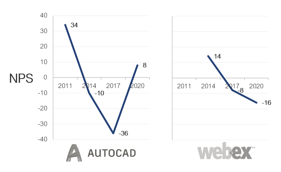
Figure 1: Previous and current NPS scores from WebEx and AutoCAD.
System Usability Scale (SUS) Scores
We used the System Usability Scale (SUS) to compute the perceived ease of use of the 19 products. The SUS is a ten-item questionnaire that generates scores ranging from 0 to 100. The average SUS score from over 500 products (including business software) is 68. The average SUS score from this group is 68, with a low score of 58 and a high score of 76.
Raw SUS scores were converted to percentile ranks, which translated the average raw score into 50%—meaning this group of products scores at the historical average in perceived usability.
The product with the lowest SUS score in this dataset is Tableau, with a SUS score of 58 (at the 25th percentile—almost identical to its SUS percentile in 2017). What’s interesting is that Tableau is largely intended to make visualizing data and using spreadsheets easier. The most frequent user comments regarding how to improve Tableau concern its steep learning curve (31% of verbatim comments) and poor responsiveness (13%).
The SUS scores for the five products from the previous reports had reasonably stable SUS scores, with two products dropping two points and three improving from three to six points. GoToMeeting had the greatest improvement, from 70 to 76.
Usefulness and Ease
In the report, we include our findings for the UMUX-LITE, as it’s an important benchmark for many organizations thanks to its using a single (succinct) score to quantify software acceptance and satisfaction. It’s derived from the Technology Acceptance Model (TAM) but includes only one item each for ease (how easy the software is to use) and usefulness (how well the software meets the user’s needs). It provides a measure of acceptance and, more broadly, satisfaction or quality of the product.
Figure 2 shows a scatterplot of the two components of UMUX-LITE scores. The dotted red lines indicate the historical mean of the UMUX-LITE across a number of studies (68). Consistent with the overall UMUX-LITE scores, most UMUX-LITE item scores were above average for both items. When below average, low usability was more common than low usefulness. Products with below-average usability were GitHub, AutoCAD, WordPress, Zendesk, and Tableau. ZipRecruiter had below-average usefulness.
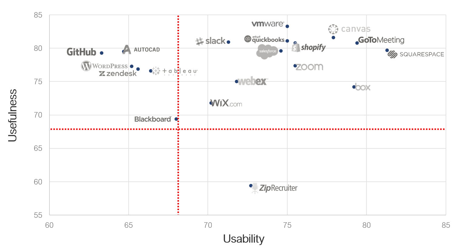
Figure 2: Scatterplot of UMUX-LITE subscales.
Perceived Usability Affects Loyalty
Figure 3 shows the SUS scores for detractors, passives, and promoters (computed at the individual level for all responses; all differences significant with p < .05).

Figure 3: SUS scores.
This figure shows that on average promoters have SUS scores of around 77. This pattern is consistent with previous research we conducted that found that SUS scores above 80 have a good chance of having promoters. The mean SUS for passives was 68, consistent with the global average SUS score. For detractors, the mean SUS was 58 (the 25th percentile).
Desirability
In this report, we have included a new section on the assessment of desirability. Our Desirability Analysis is based on the Microsoft Desirability Toolkit. To modify it for this type of survey, we started with a list of 118 adjectives (70 positive, 9 neutral, 39 negative). Each respondent saw 12 adjectives randomly selected from that list and chose up to three. For each product, we computed the total number of adjectives selected, then computed the percentage of positive and negative adjectives. We also noted the most frequently selected adjectives per product, reporting the top one, two, three, or four, depending on the pattern of responses.
The products with the most frequently chosen positive adjectives were VMware (87%: usable, easy to use, helpful) and GoToMeeting (85%: usable). The product with the most frequently chosen negative adjectives was Blackboard (26%: complex).
Summary
Benchmarking is an important step in improving the user experience of software and should include measures of usability and loyalty. Third-party benchmarks such as the ones described here complement internal benchmarking programs by providing more context. It’s a lot easier to know how well your product is doing when you know where it stands relative to the competition or the industry average.
The full list of benchmarks and analysis of verbatim responses are available for purchase in the 2020 Net Promoter & UX Benchmark Report for Business Software.